


Picking out your wedding colors is a defining moment that shapes the entire feel of your celebration. The palette you land on touches every detail, from the mood and the styling to the overall visual story of your day.
This guide walks through why those color choices carry so much weight and offers expert support to help you zero in on a palette that fits your wedding vision and aesthetic perfectly.
From enduring favorites that never lose their luster to fresh trends making waves right now, you’ll discover a range of color pairings that bridge the ages, helping your celebration feel like a seamless mix of modern polish and timeless beauty.
Newest Wedding Colors

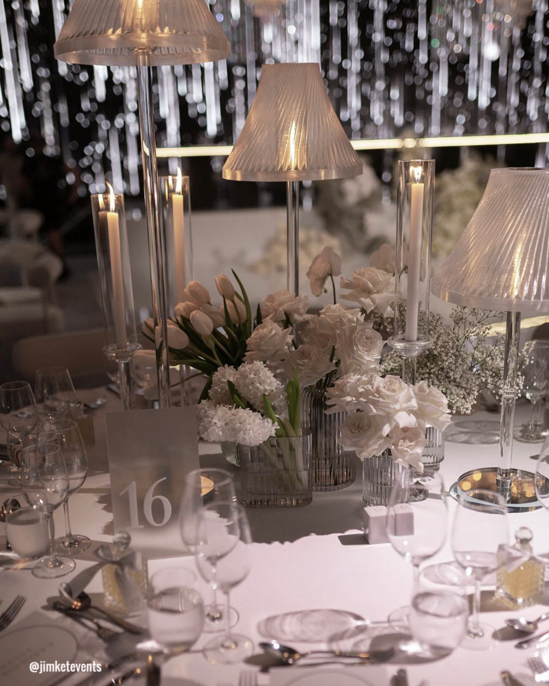
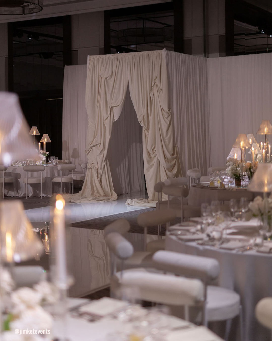
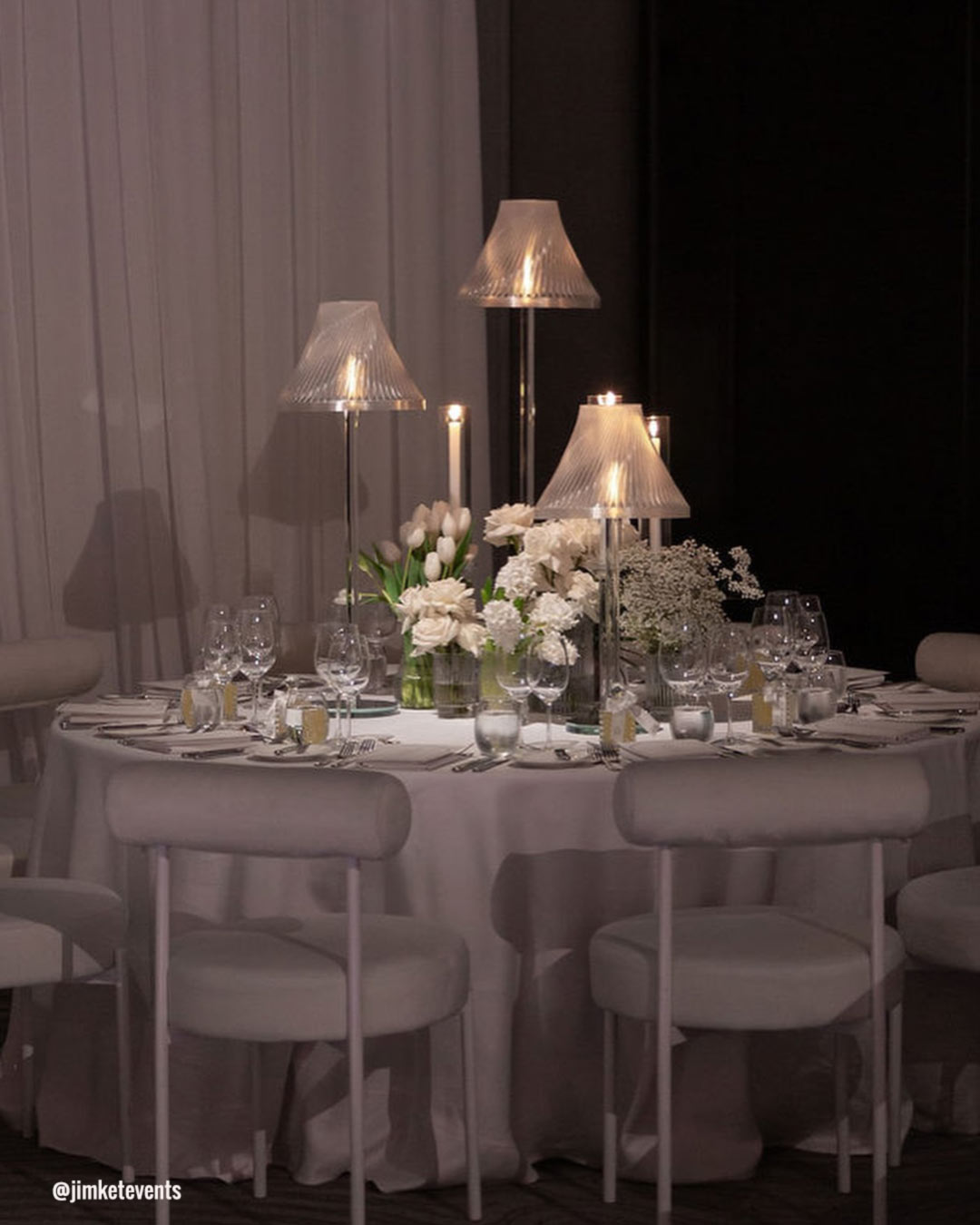
After designing more than 100 weddings, one professional has observed that white continues to claim the top spot, showing up as the primary shade in roughly 70% of the events she’s worked on. It’s classic, refined, and deeply traditional, and the love affair with white is not fading anytime soon, according to Natalie from Giant Flowers Australia & Bali.
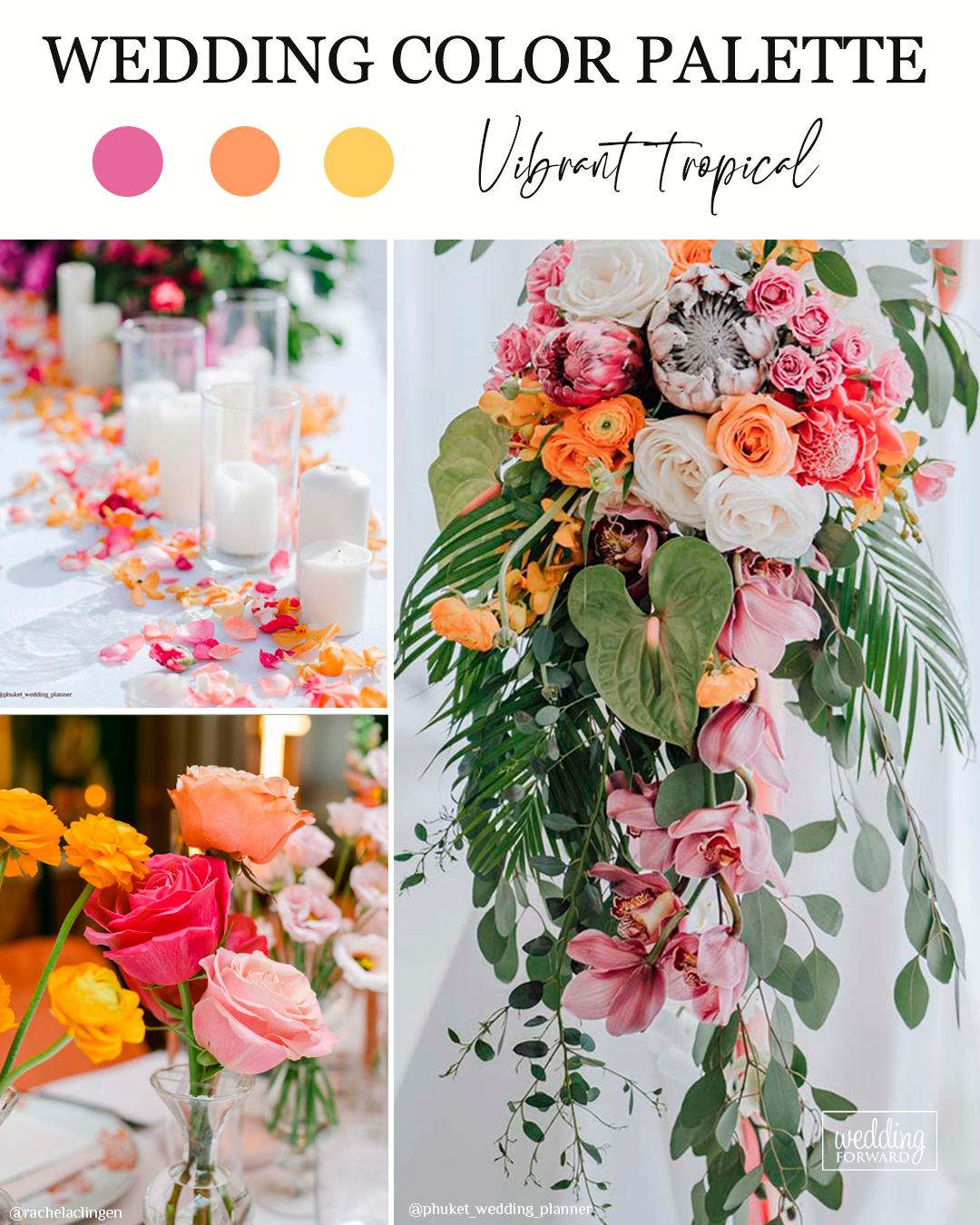
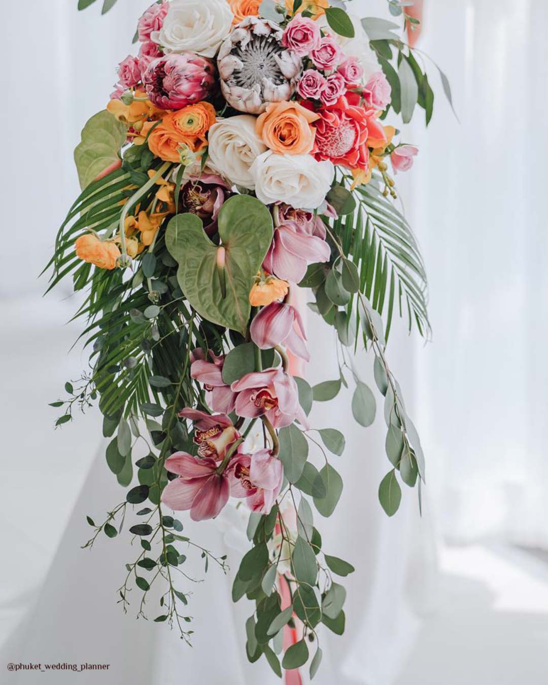
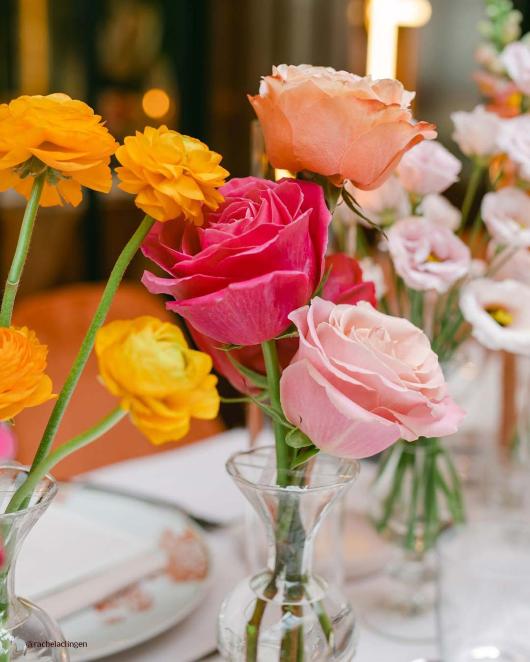

Natalie from Giant Flowers Australia & Bali also points out that we are seeing a thrilling move toward vivid tropical hues like pink, peach, and yellow. These cheerful, sun-drenched colors are a natural fit for destination celebrations or warm-weather summer ceremonies.
She’s already got multiple weddings on the books built around these tones, a clear sign this trend is gaining real momentum.
It’s A Match:
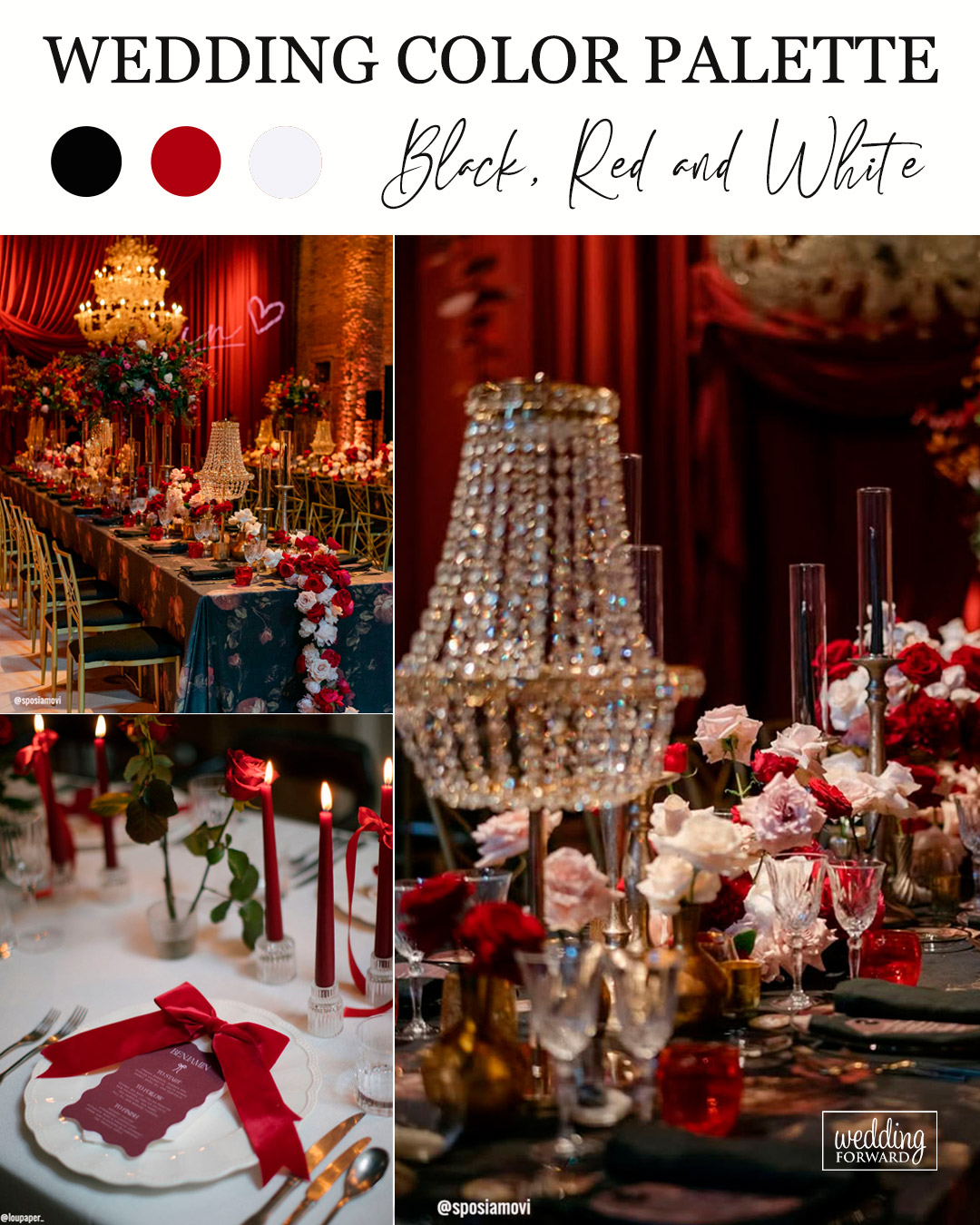
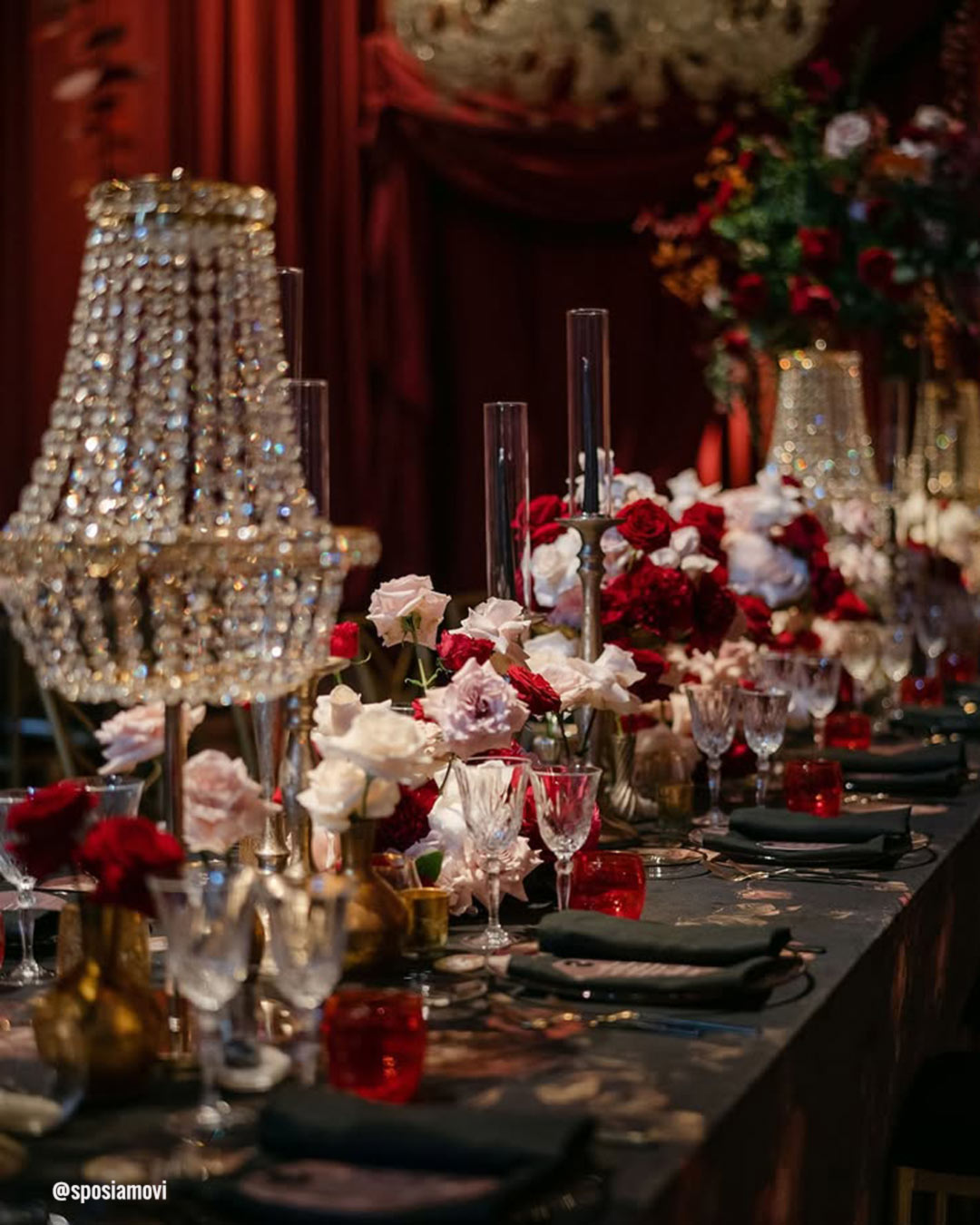
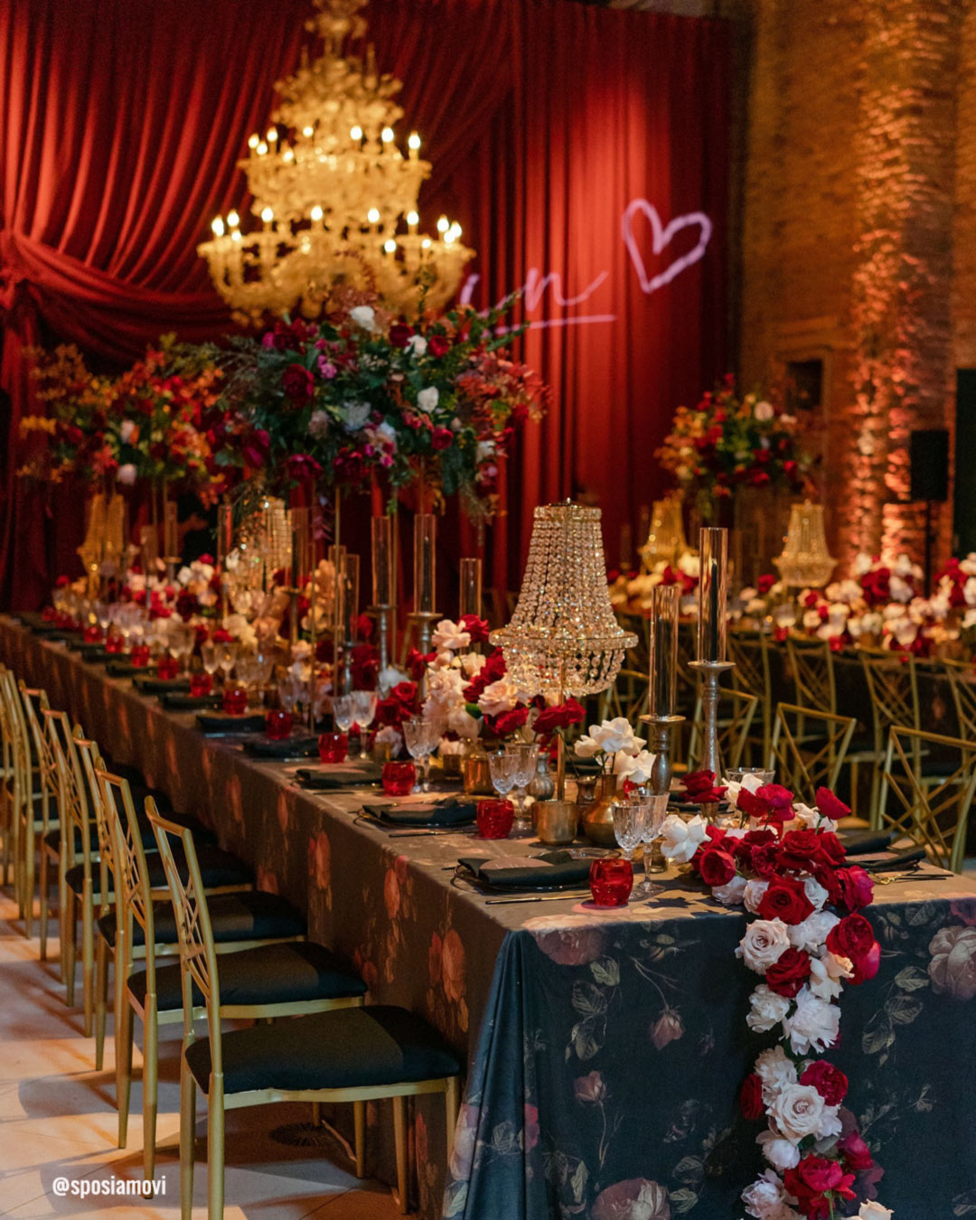
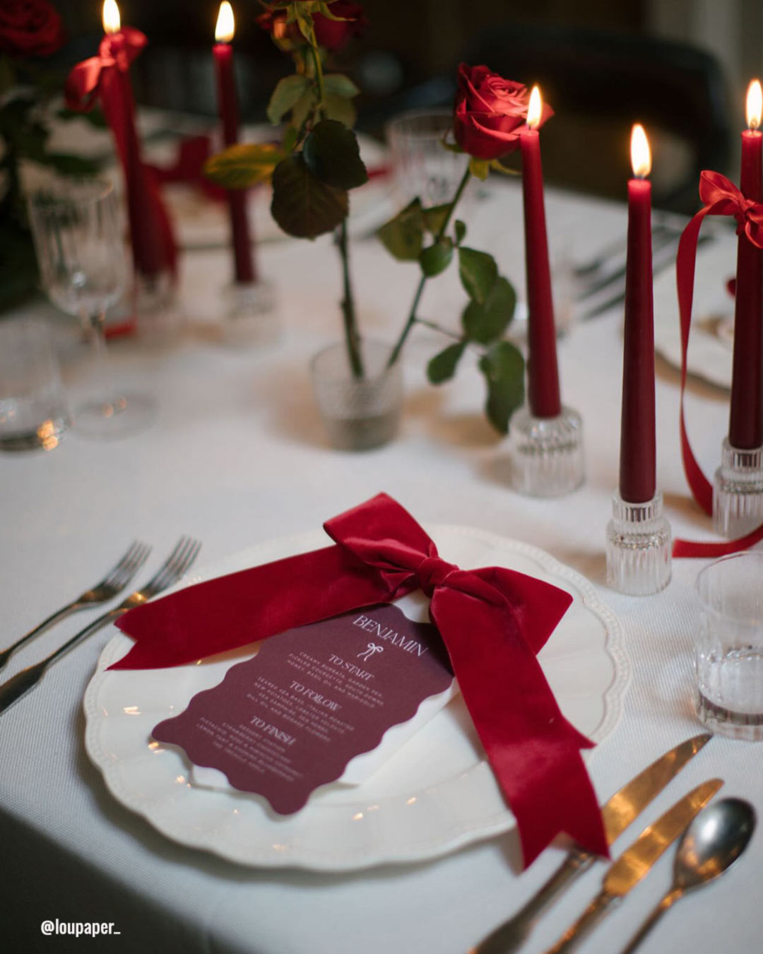
The iconic team of Black, Red, and White delivers a bold, theatrical impact. Black anchors the look with sleek sophistication, Red brings the fire and emotional charge, while White introduces a note of purity and equilibrium.
This potent mix suits Modern Glam or Luxury style weddings, conjuring a mood that feels both commanding and impossible to forget.
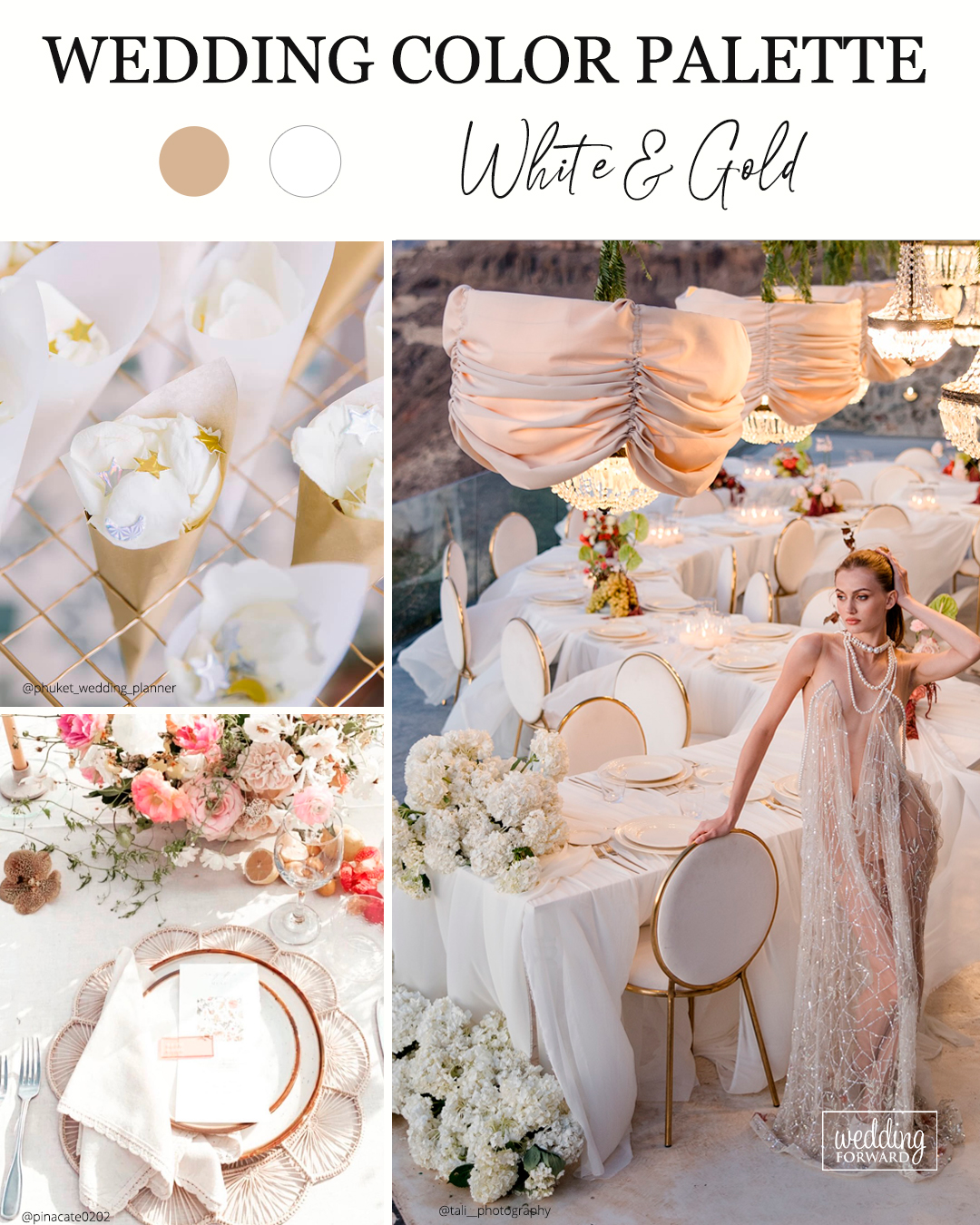
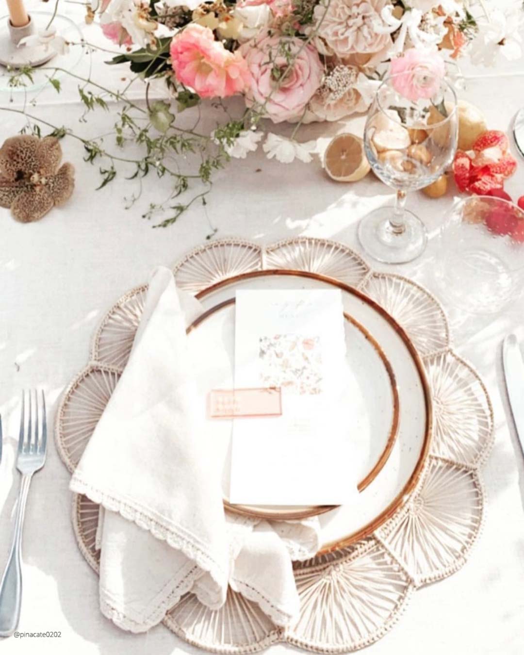
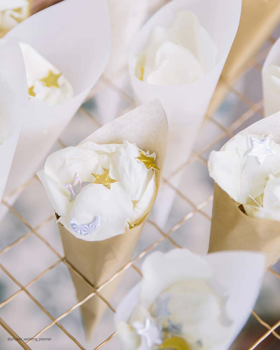
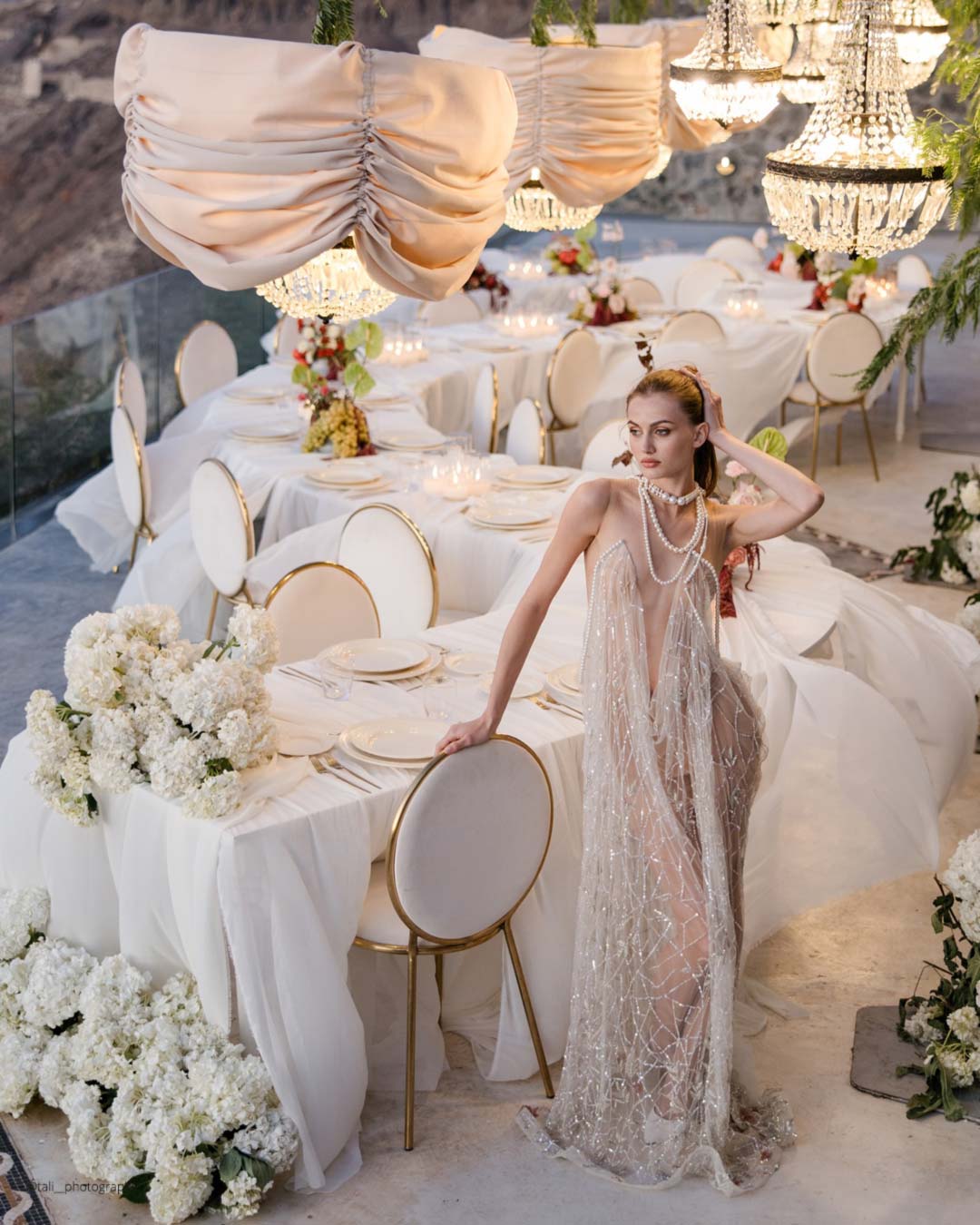
It’s A Match: Classic white paired with gold will keep its crown as a top pick for couples chasing a plush, high-glamour wedding look. As Natalie from Giant Flowers Australia & Bali puts it, “White and gold continues to be popular for a luxurious, glamorous look.” This forever pairing radiates sophistication and poise, which keeps it a reliable favorite for formal affairs and lavish settings.
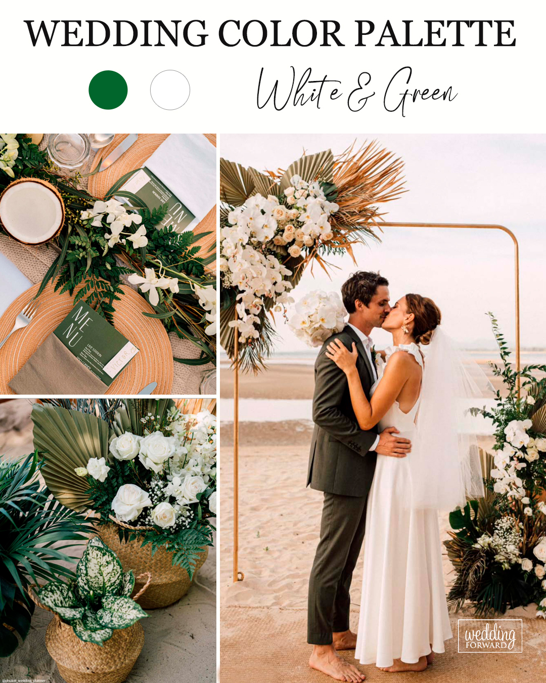


A white and green palette delivers a crisp, natural sensibility, making it an ideal choice for garden celebrations or any event held in the open air, notes Natalie of Giant Flowers Australia & Bali.
It’s A Match: This duo bottles the spirit of clean simplicity and calm, suiting alfresco ceremonies just as beautifully as polished indoor receptions. Whether you lean into abundant greenery, soft white blossoms, or refined table designs, the green and white mix creates a flexible and well-rounded palette that flatters a wide range of wedding aesthetics.
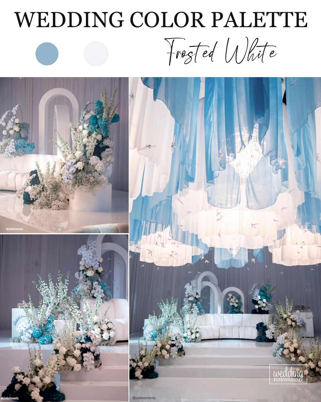
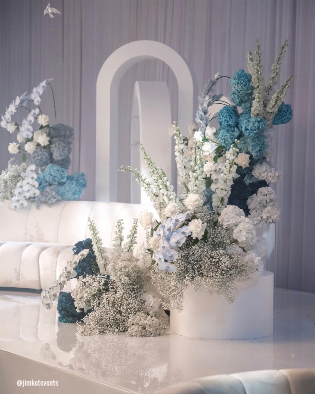


It’s A Match: Cool, frosty whites kissed with subtle blue or silver undertones will gain serious traction for weddings, bringing a tranquil and crisp visual language. This icy tint introduces a modern edge to wedding styling, most notably when layered beside deeper shades to build contrast, refinement, and a sleek, current atmosphere.


It’s A Match:
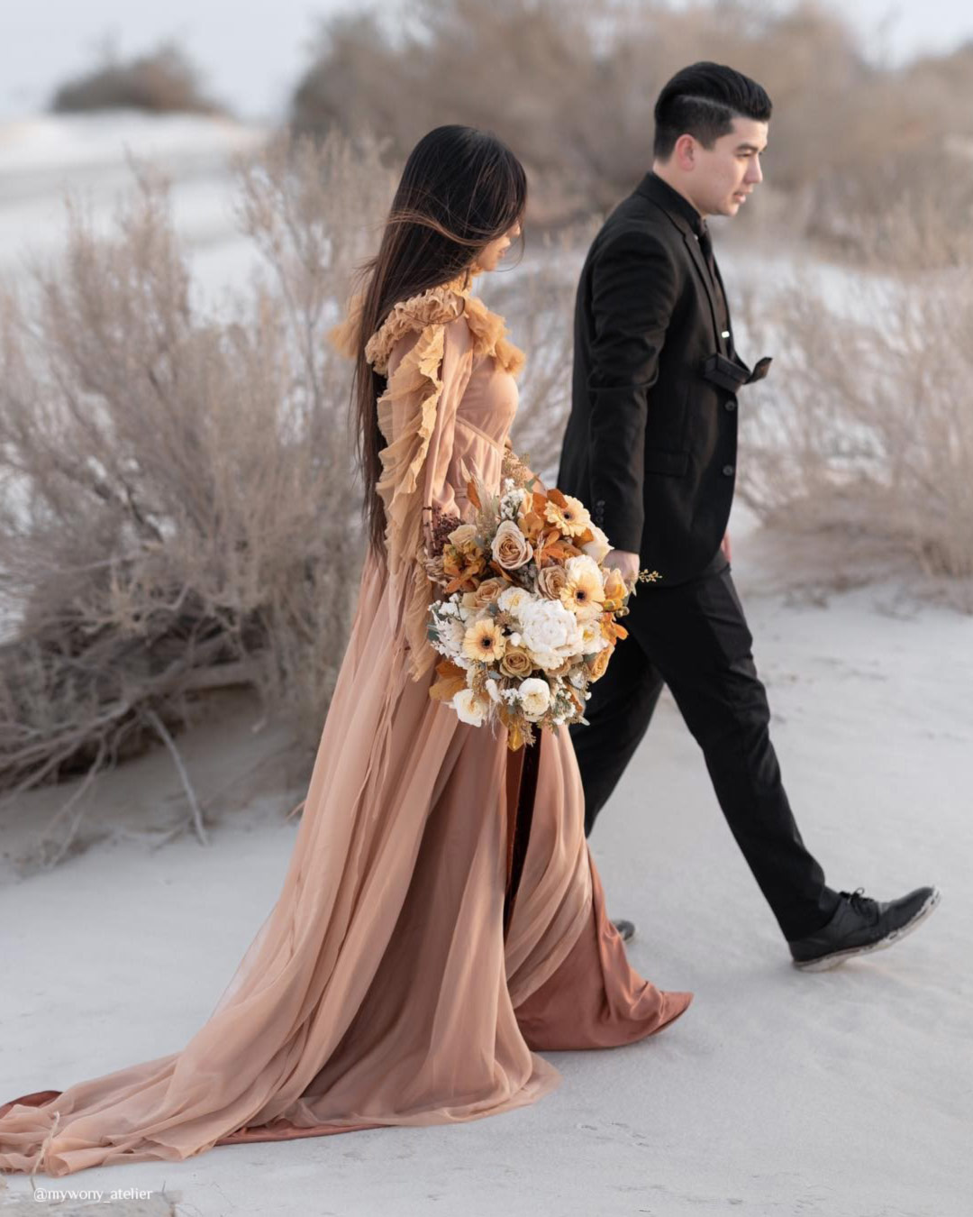
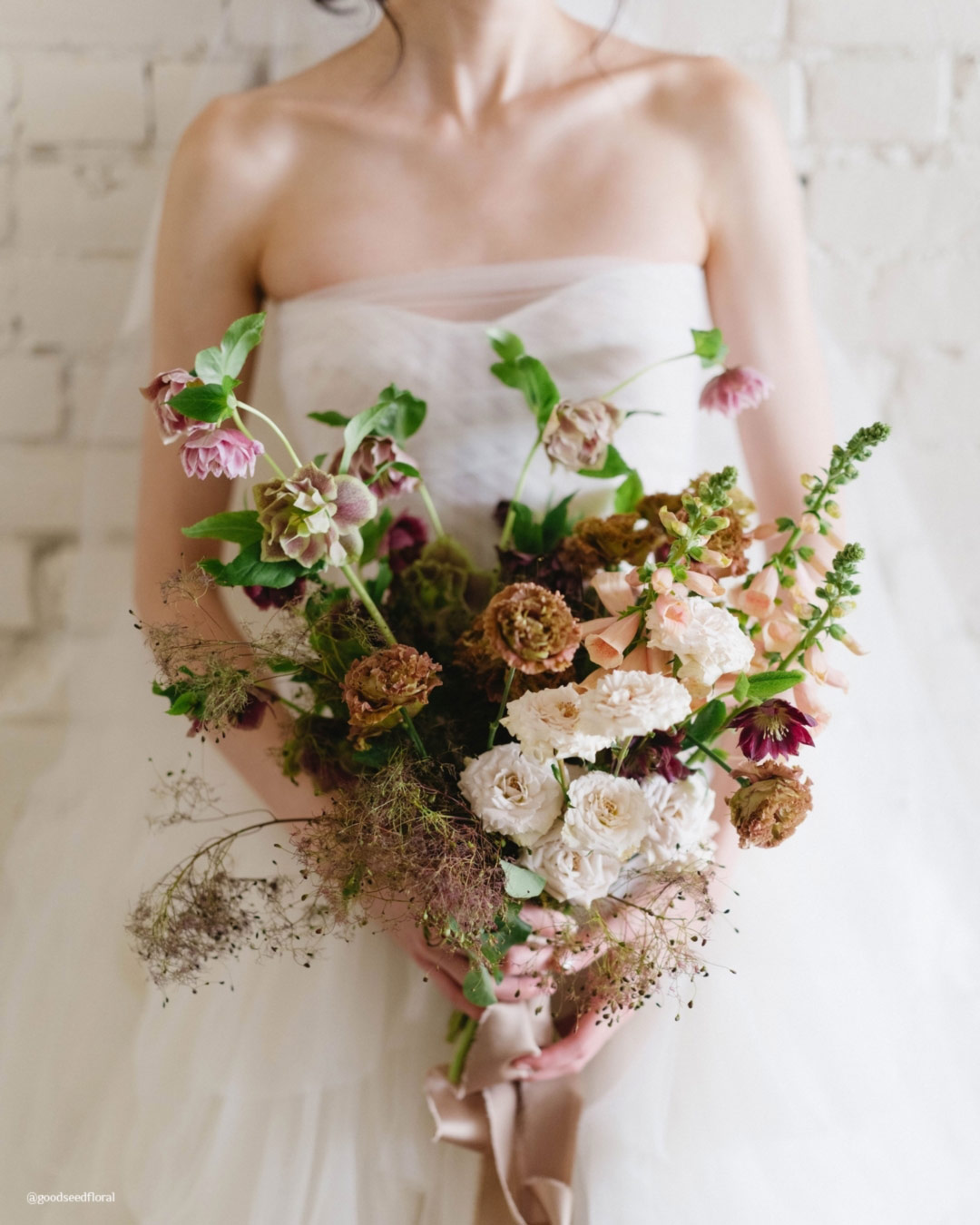
Grounded neutrals including light beige, gentle greys, and greige will become wedding staples, prized for their easy elegance and adaptability. A notable Pantone choice, Pantone 18-1318 (“Mocha Muss”), a rich earthy brown laced with creamy undertones, reinforces the rising pull toward nature-driven color stories and mindful, sustainable styling.

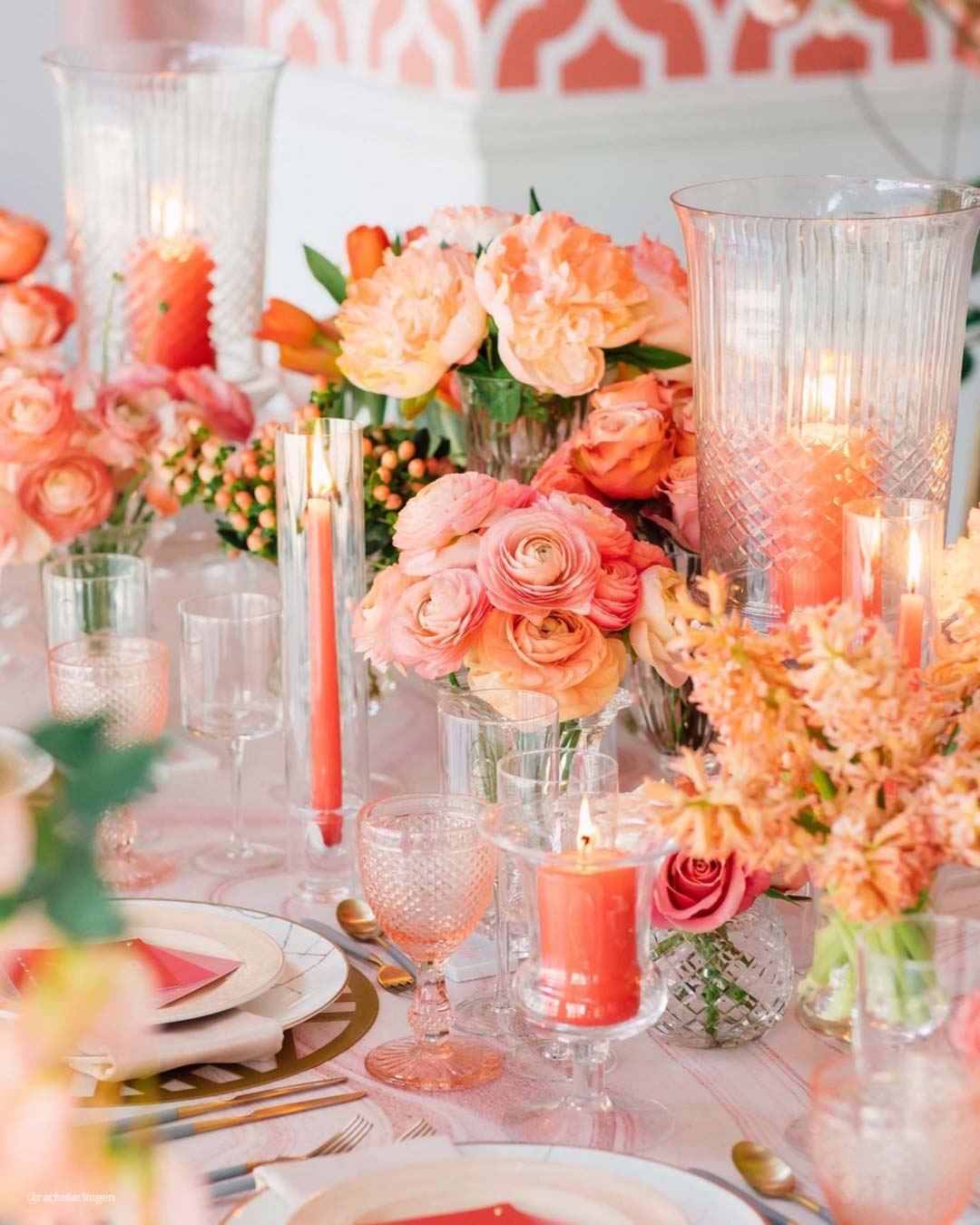
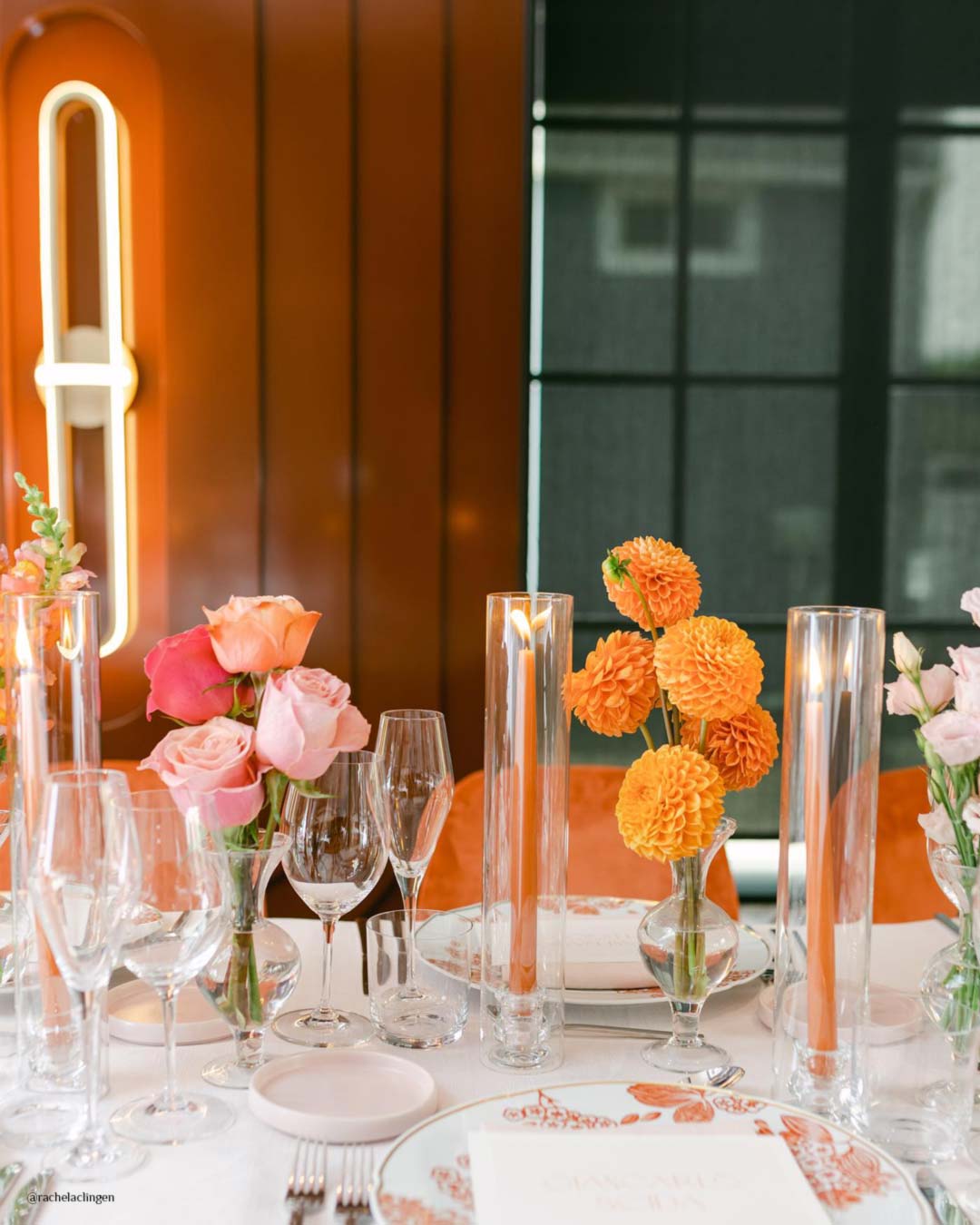
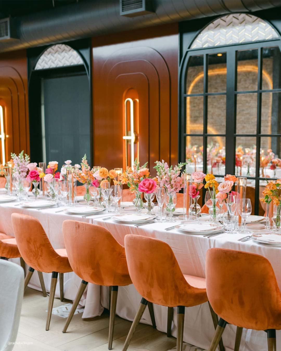

It’s A Match: Bold, spirited orange will step forward as an adventurous wedding color, injecting a jolt of energy and joy into the party. This punchy shade grabs attention in everything from bouquets to reception tablescapes.
It’s a smart move for couples dreaming up a contemporary, high-voltage ambiance, layering in plenty of warmth and delight.
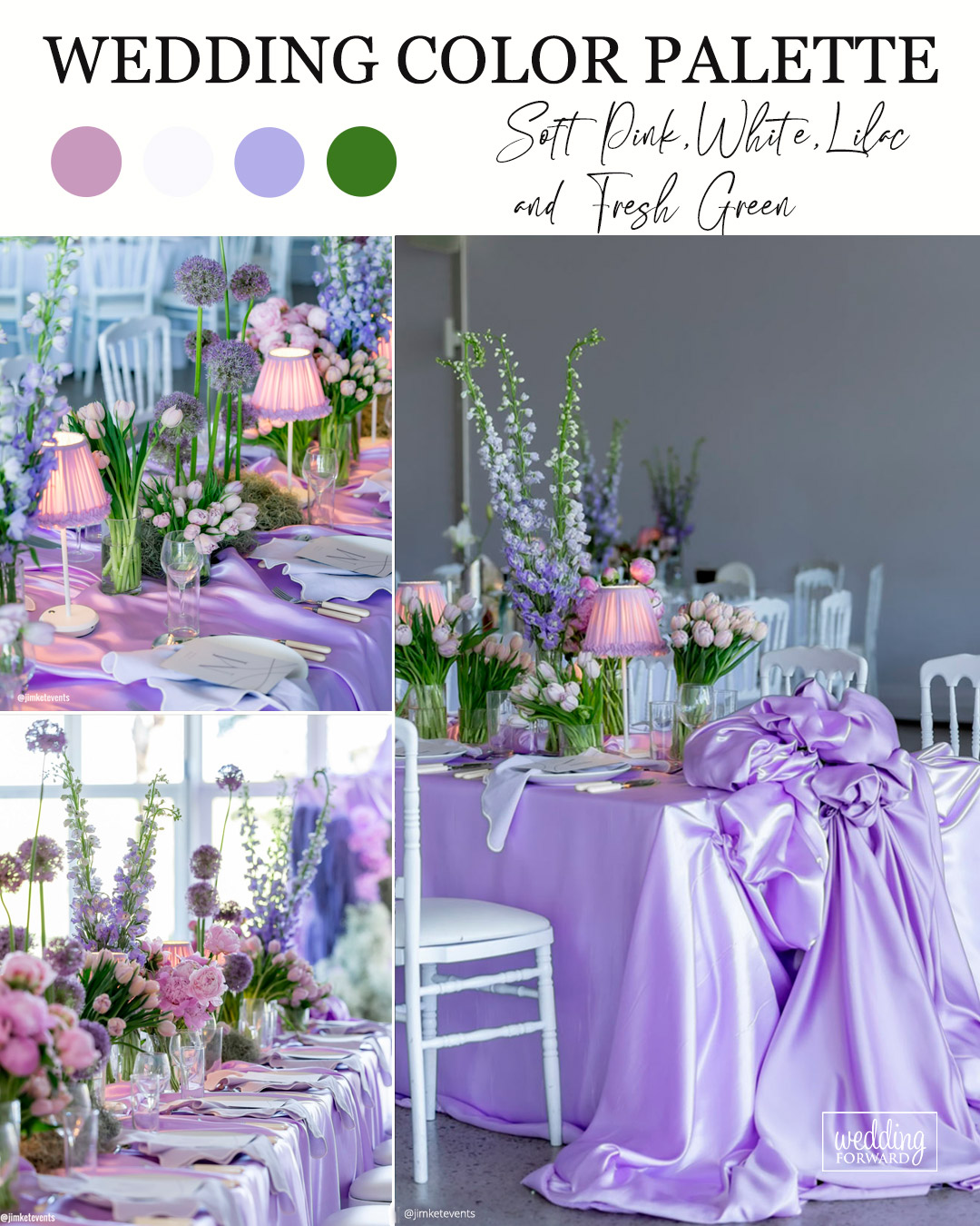
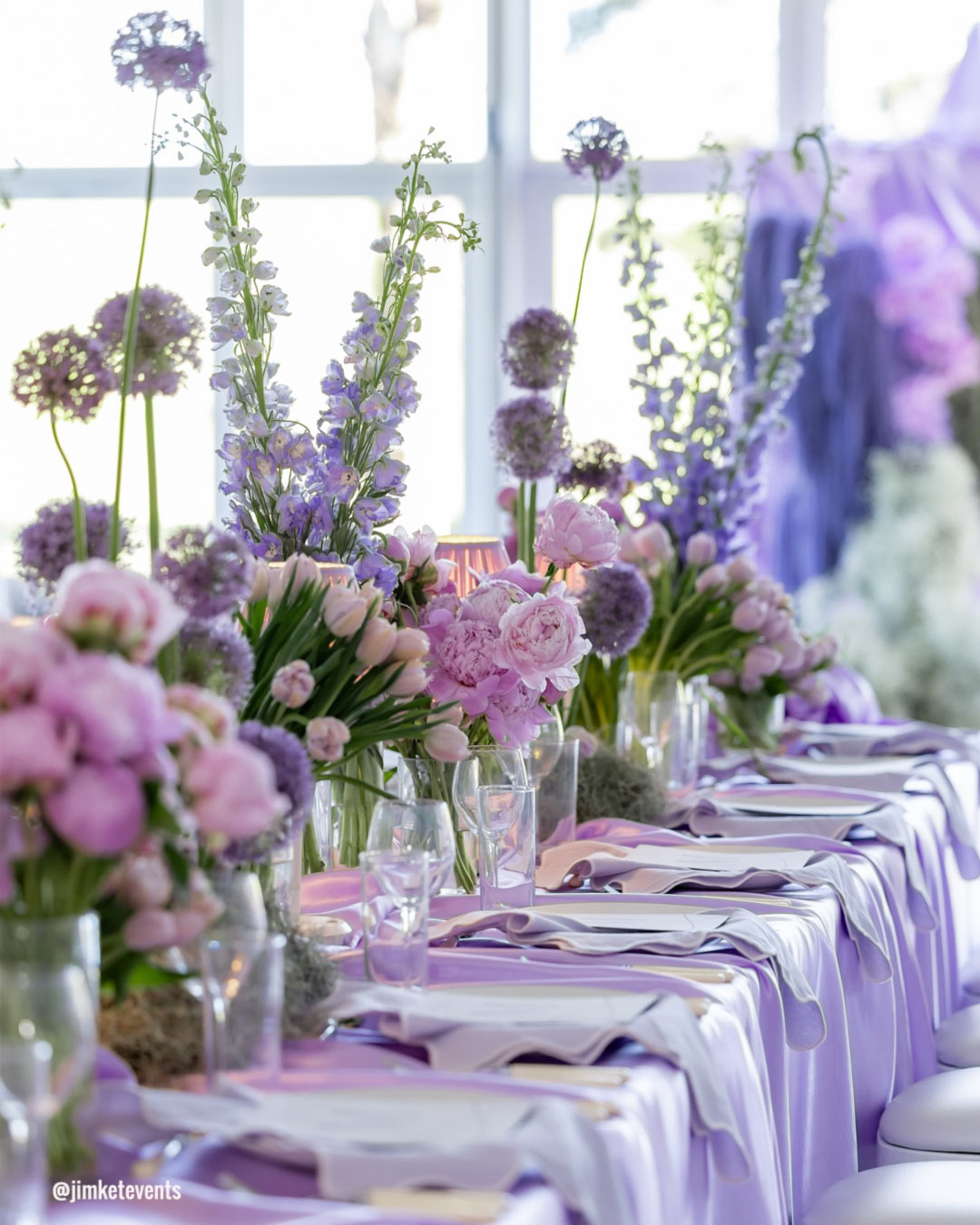
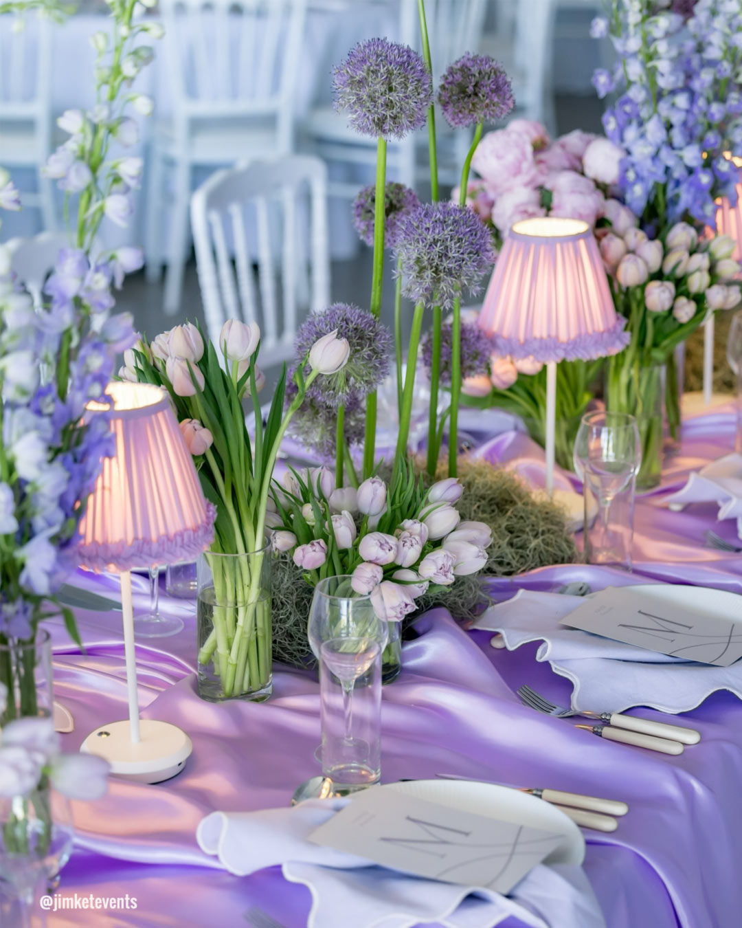

It’s A Match: A delicate wash of Soft Pink, White, and Soft Lilac stirs up a lovely, otherworldly quality. Soft Pink hums with romance, White clears the visual noise with a timeless base, and Soft Lilac dusts in just a hint of fantasy.
This palette feels tailor-made for Garden or Fairytale style celebrations, sweeping your guests into a peaceful and magical experience.

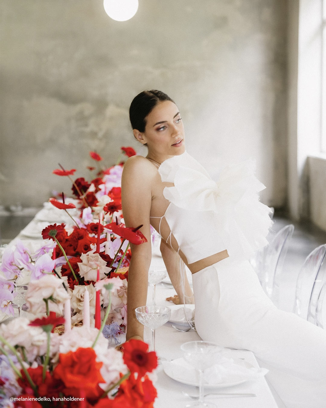

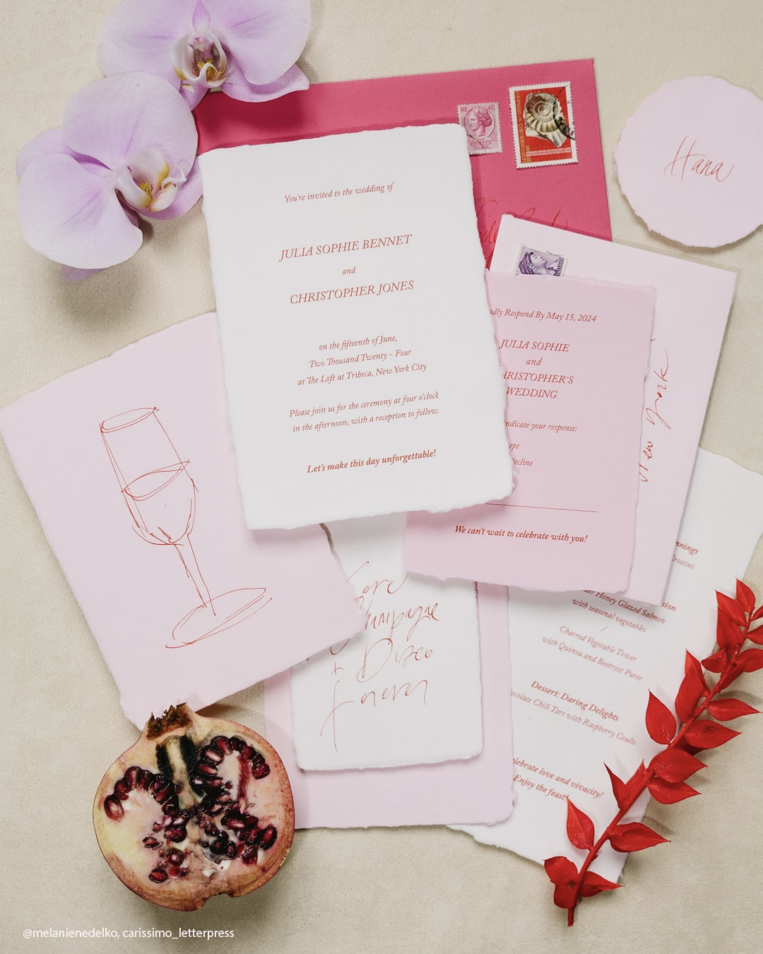
It’s A Match:
Step straight into a realm of romance and refinement with a palette that binds red, lavender, pink, and white together. Red supplies the spark and vitality, while lavender weaves in notes of poise and serenity.
Pink deepens the loving atmosphere, and white rounds everything out with clarity and harmony. As a group, these shades build a gorgeous, gracefully balanced story that overflows with allure and polished sweetness.
Suited to a Romantic or Garden themed wedding, this mix crafts a spellbinding ambiance, transforming every single moment into a breathtaking tribute to love and happiness.
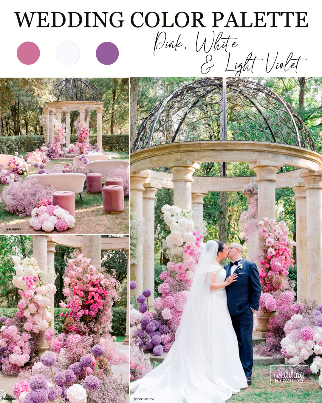
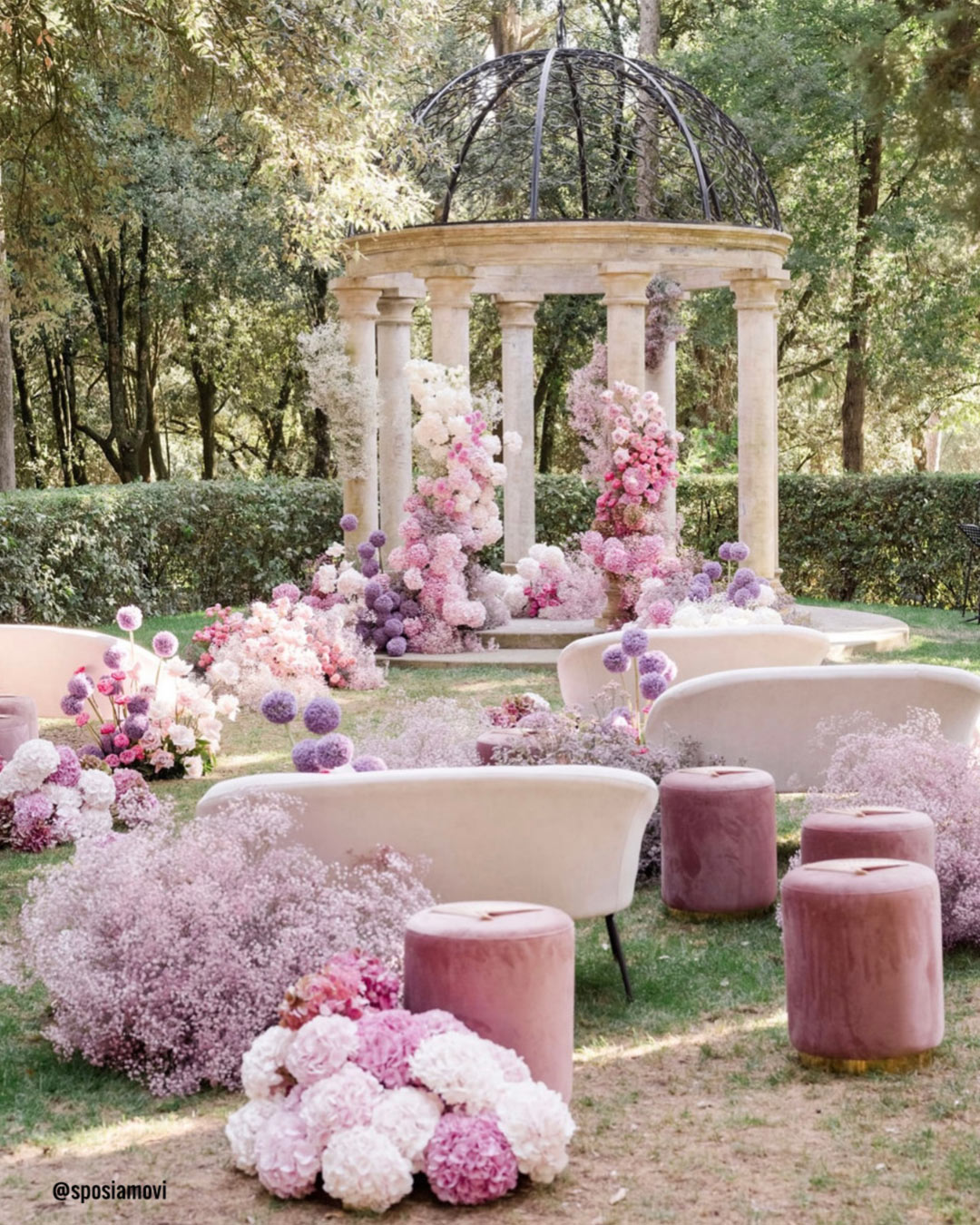
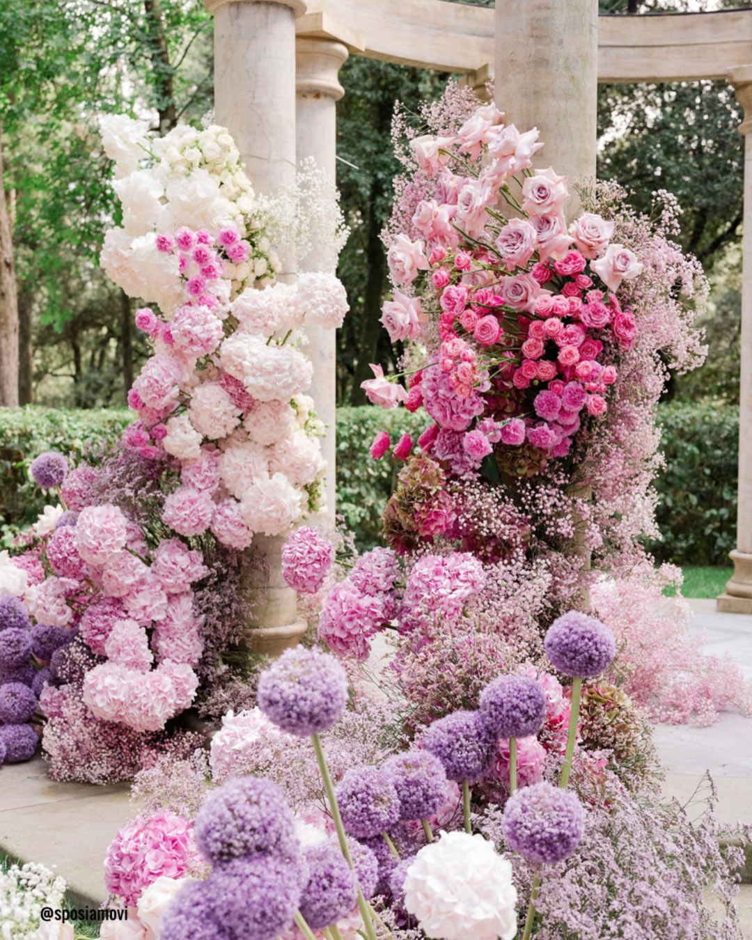
It’s A Match: The marriage of Pink, White, and Light Violet reads as effortlessly chic. Pink offers sweetness and a gentle magnetism, White preserves the look’s crisp and enduring quality, and Light Violet introduces a whisper of understated refinement.
Ideally matched with Romantic or Spring inspired events, this palette feels gentle, graceful, and impeccably harmonious.
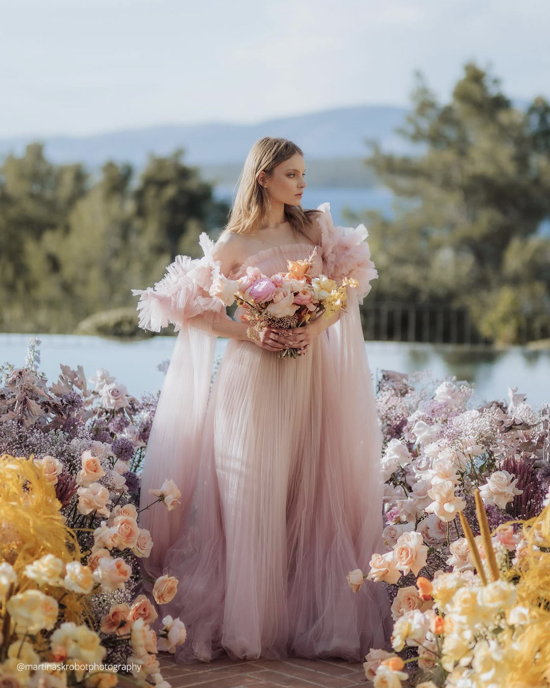


It’s A Match:
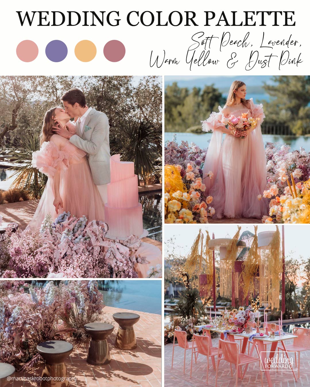
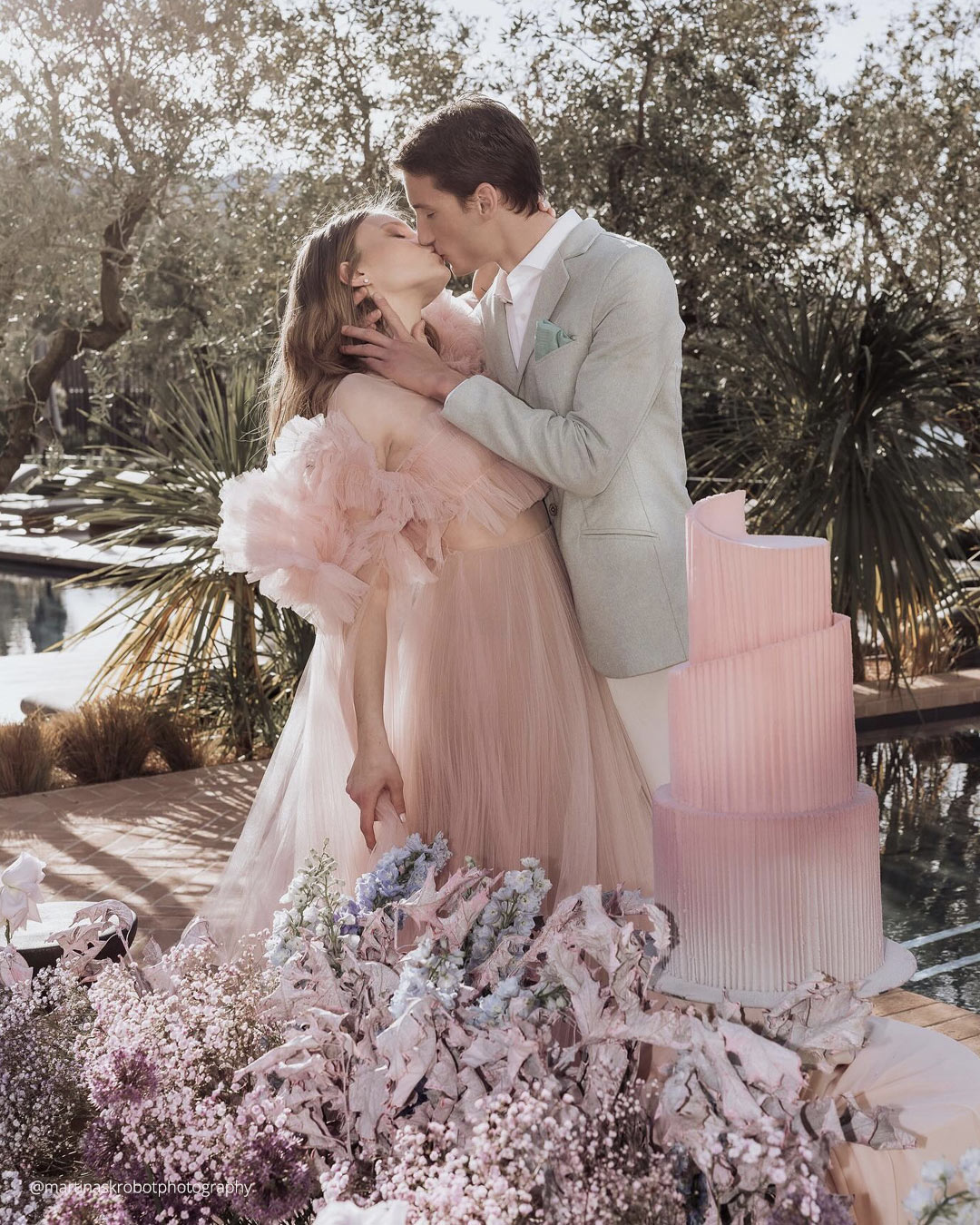
As wedding color explorations become more adventurous, the grouping of Soft Peach, Lavender, Warm Yellow, and Dust Pink will glow brightly. Soft Peach and Dust Pink extend a tender warmth, while Lavender lends an elegant touch.
Warm Yellow floods the palette with sunny energy, resulting in an environment that feels equally refined and inviting.
This blend works wonders for a Romantic or Vintage driven wedding, shaping an elegant and captivating mood that welcomes guests to linger in its lovely, luminous glow.
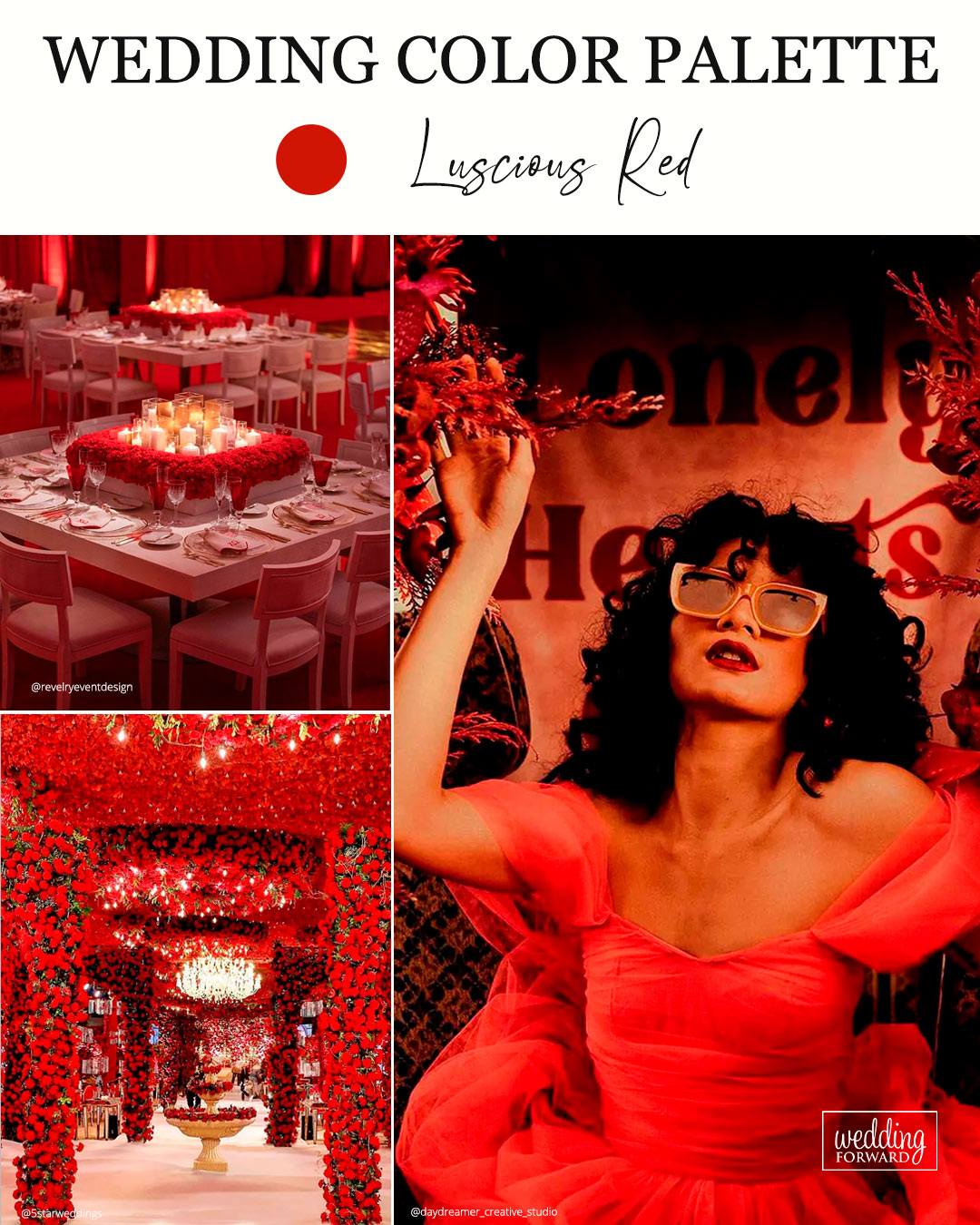
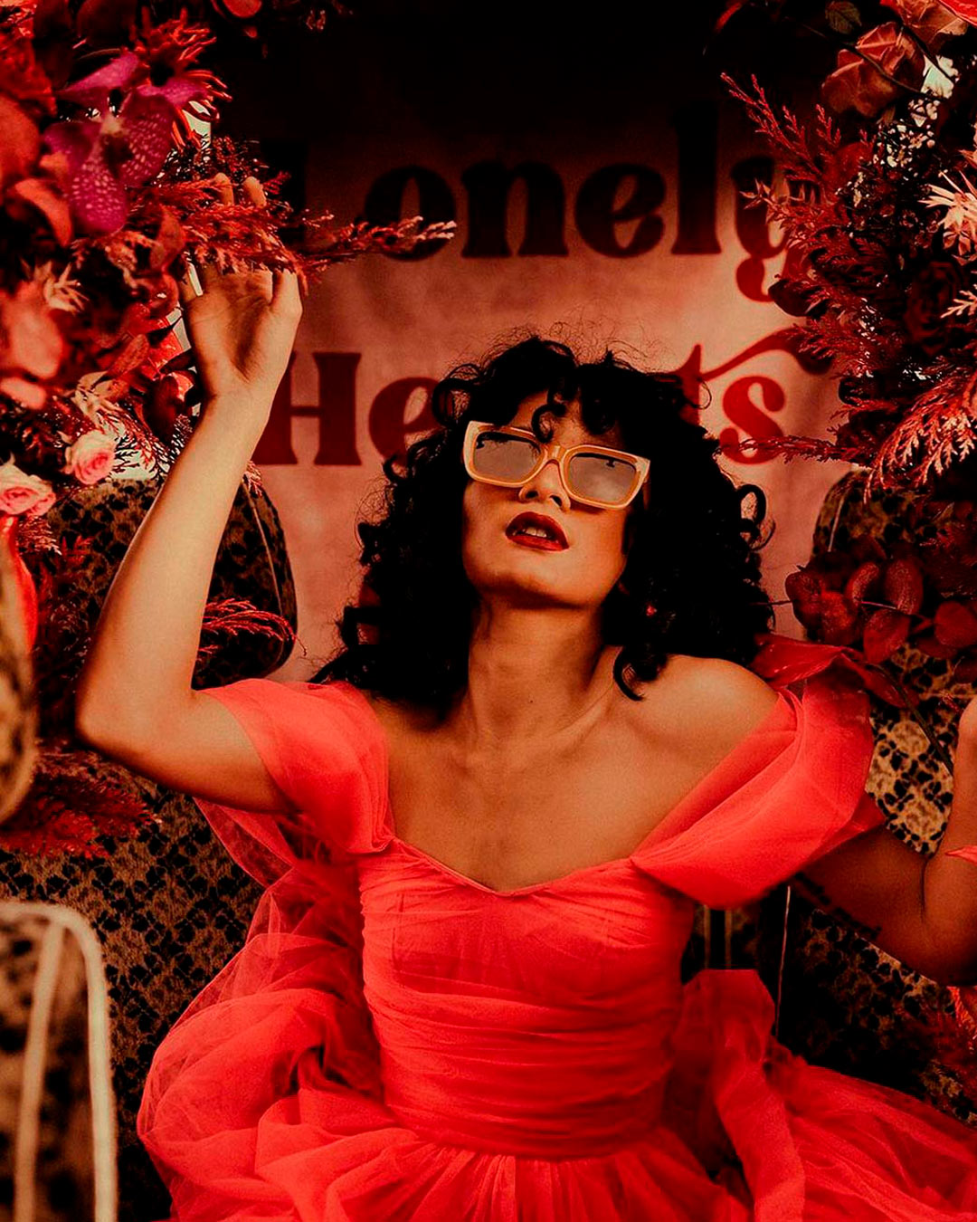

It’s A Match: Rich, luscious red stands out as one of the sharpest wedding color ideas couples can deploy as a powerful accent thread throughout their day. Try weaving lush red shades alongside light variations of blue across certain spots in your venue styling, like the dessert display or floral installations.
Yellow and pink also make excellent companions for lush red. Aim to keep other areas of your design fairly neutral so the overall look stays grounded.
Summer Wedding Colors
Balmy rays and golden weather make nearly any shade feel right at home, so the strongest colors for a summer celebration mirror everything the season does best. From breezy, washed out blues to spirited shocks of pink and green, summer celebrations bring an incredible range of wedding palette possibilities to the table.

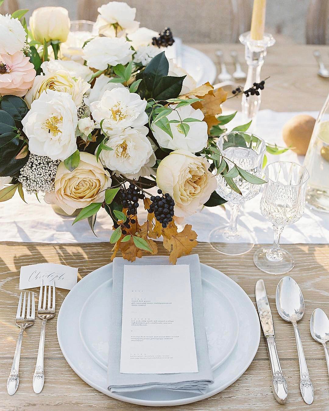

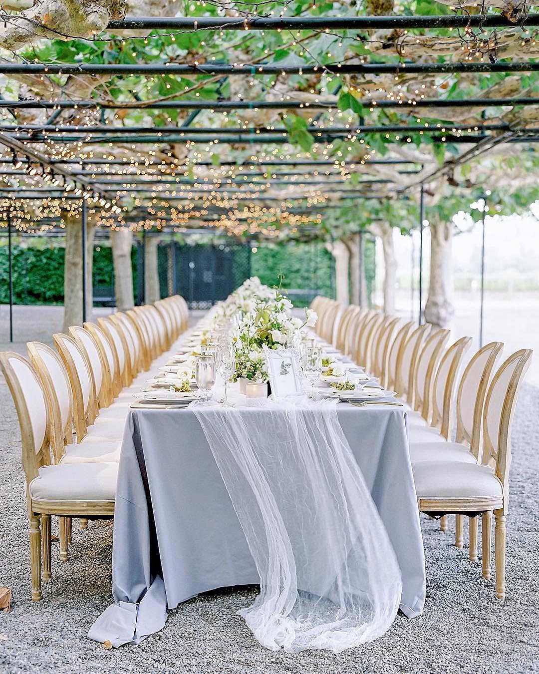
It’s A Match: This mix feels purpose built for a traditional al fresco wedding, complete with sunshine yellow arrangements, navy bridesmaid looks, and graceful linen choices. If this color story speaks to you, it’s a reliable one to keep close because it adapts beautifully across venue types, particularly vineyards, country clubs, and historic estates.
A big part of why couples gravitate toward this palette is how flattering navy dresses and suiting look on both sides of the wedding party, especially when accented with yellow or grey accents that make the charming wedding colors feel fully alive.
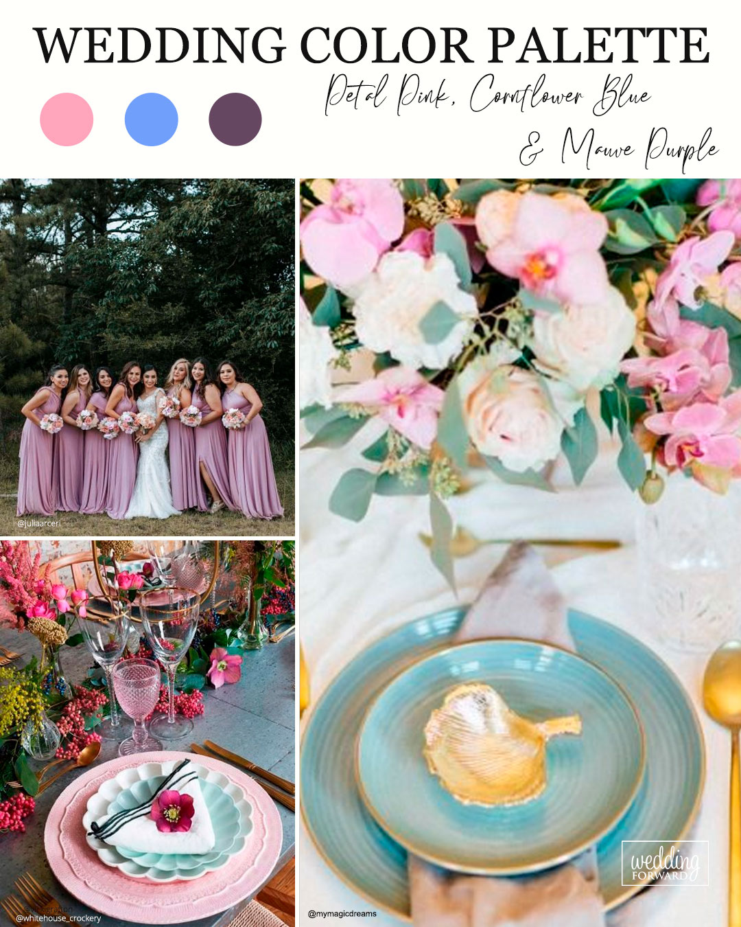

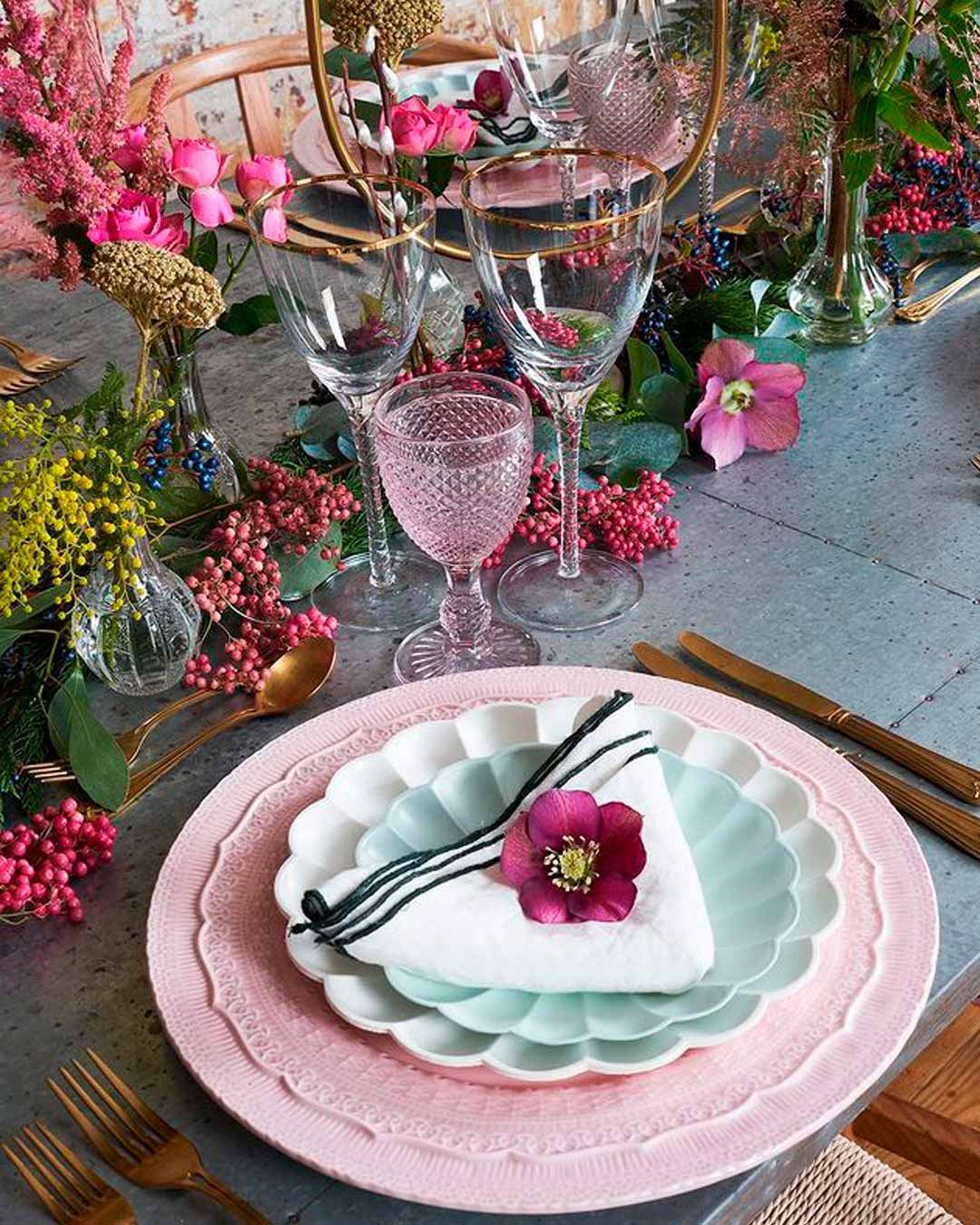

It’s A Match: When a peaceful and refined color story is the goal for your summer wedding, this one delivers completely. The interplay of petal pink, cornflower blue, and mauve purple evokes an elevated garden feel and sings during a daytime celebration.
While petal pink and mauve purple contribute a soft, tender quality, cornflower blue delivers a beautiful splash of vibrancy and echoes the brilliance of a summer sky. Hydrangea blooms and roses become the natural floral stars here, and flowing bridesmaid silhouettes in either petal pink or mauve purple feel like a perfect fit.

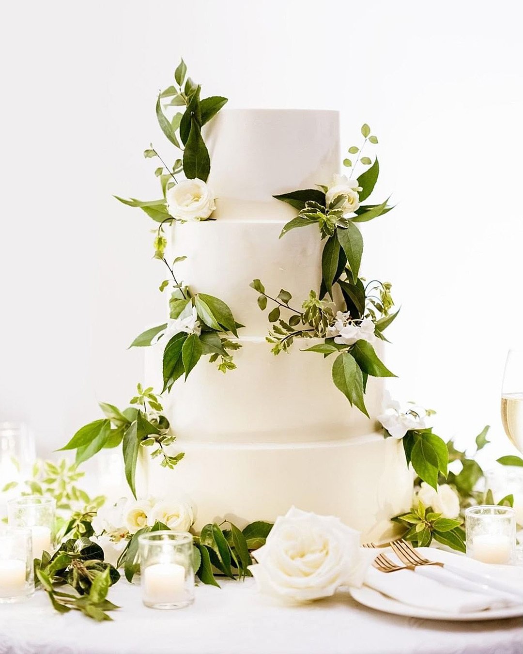
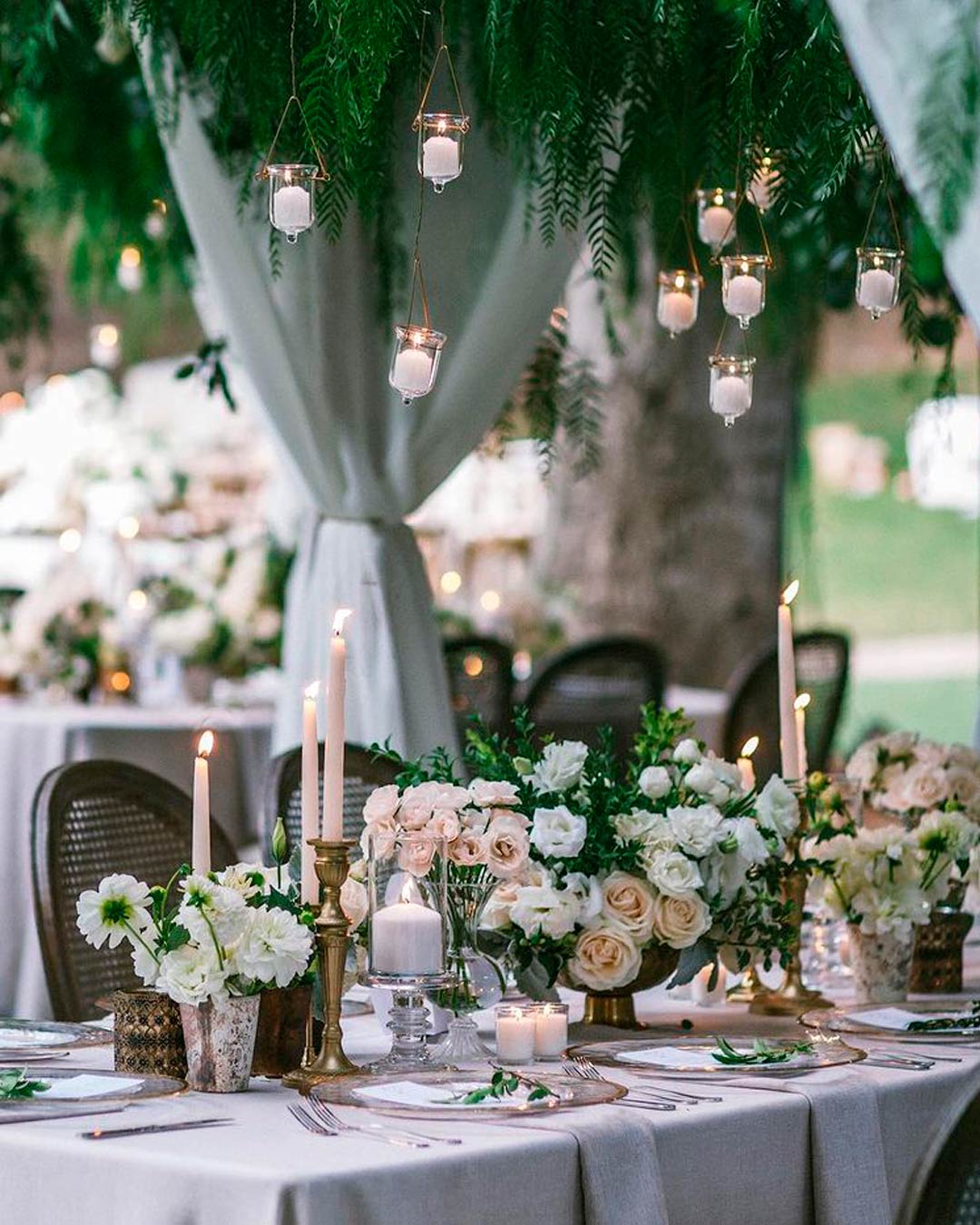

It’s A Match: If your heart is set on a nature inspired thread for your big day but you want to express it in the most refined way, the tried and true trio of forest green, classic white, and gold deserves your attention. Venue spaces like barns, working farms, or rustic settings feel exceptionally right with this palette because it highlights the organic backdrop of these locations while bringing in the sophisticated, elevated finish couples are after.


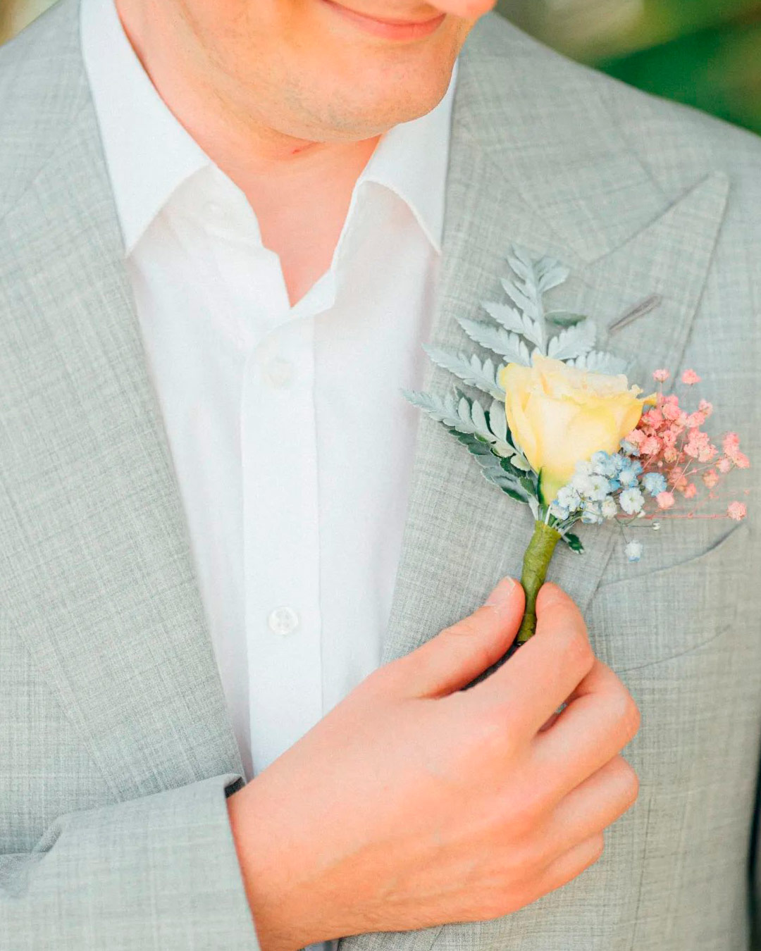
It’s A Match:
This fresh spin on dusty pastels introduces a lively primary color rhythm into the fold. Whether arranged side by side or graduating through an ombré layering, this mix triggers a feeling of joy and playful nostalgia.
This particular color grouping really shines in the late spring when local blossoms reach their peak, since the blooms have a powerful way of enhancing one another’s beauty.
Fall Wedding Colors
Autumn rolls in with a snap of coolness in the air, spectacular color transformations in the landscape, and dramatic natural scenery that provides an ideal canvas for a wedding celebration. When this beloved wedding season comes to mind, it’s simple to picture those familiar, gutsy wedding shades tucked within the orange, red, and green families, but genuine autumnal splendor reveals itself in so many different variations for a fall wedding color story.
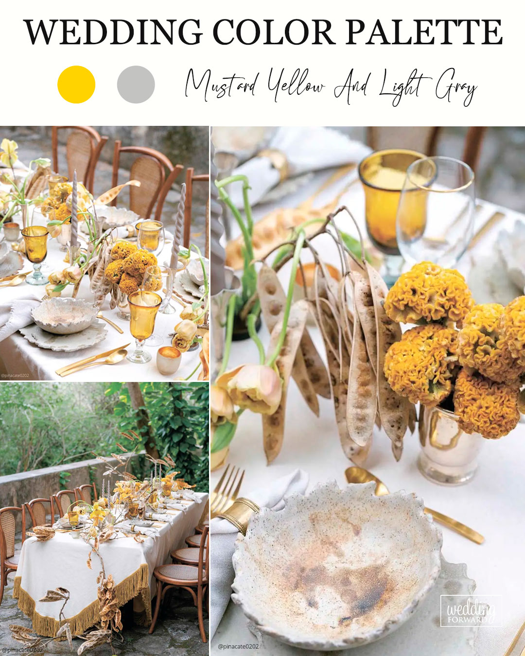
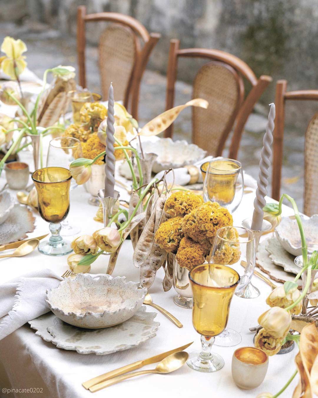
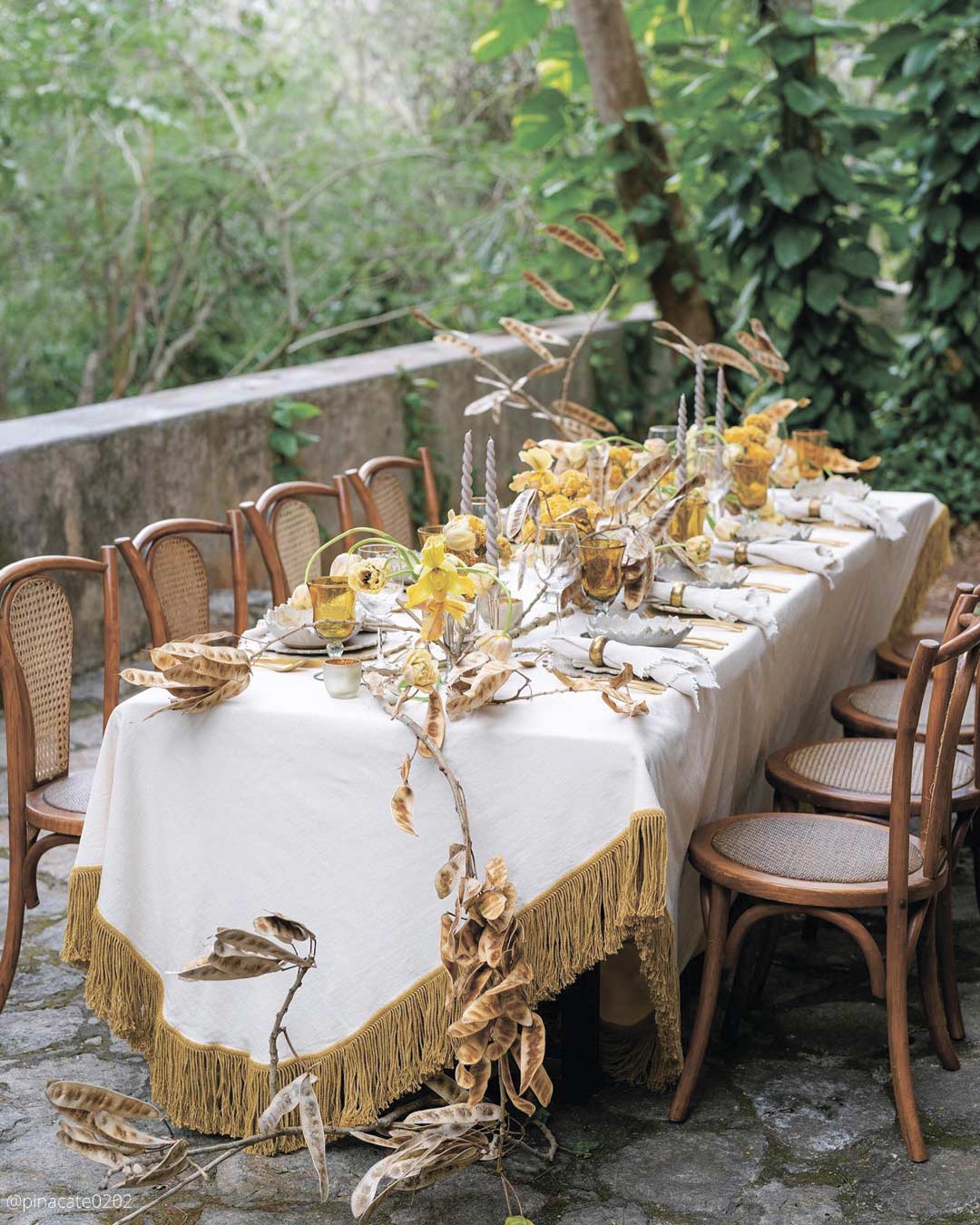
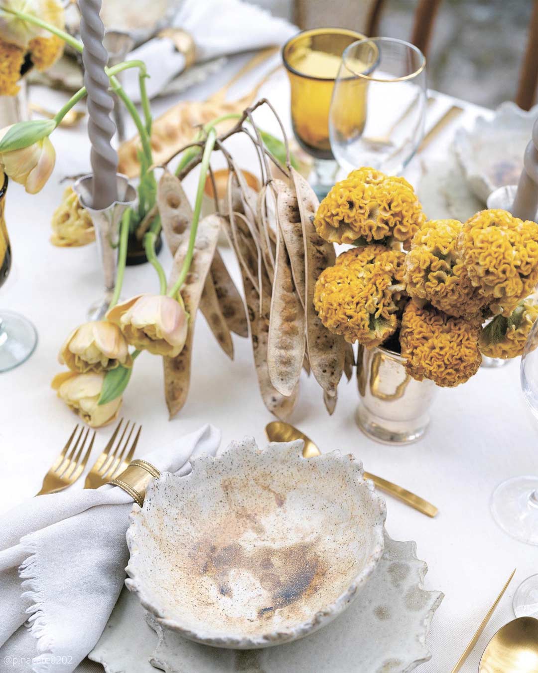
It’s A Match: Unite the magnetic charm of mustard yellow with the modern restraint of light gray. Gray’s calm backdrop makes mustard yellow’s brilliance pop even more, forming a beautifully balanced wedding color aesthetic.
An exceptional fit for urban venues or history-rich locations, this palette reshapes traditional beauty with a fresh, contemporary spin.
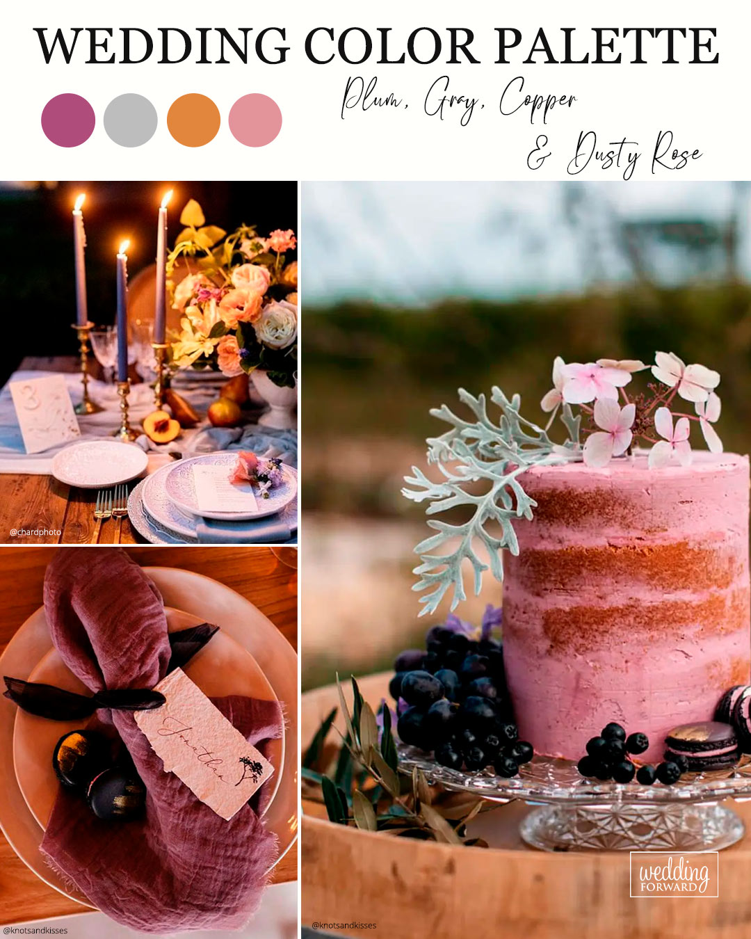
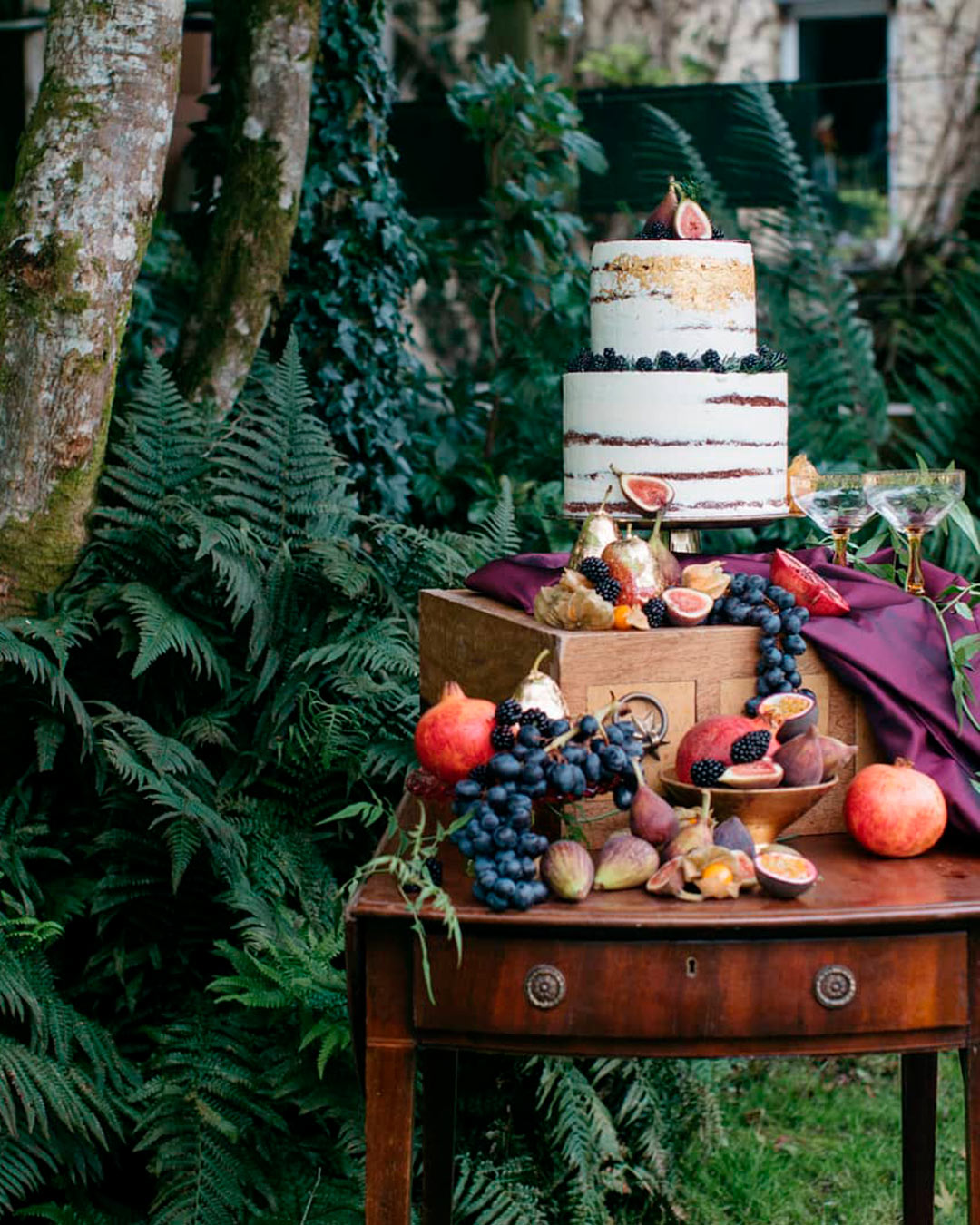
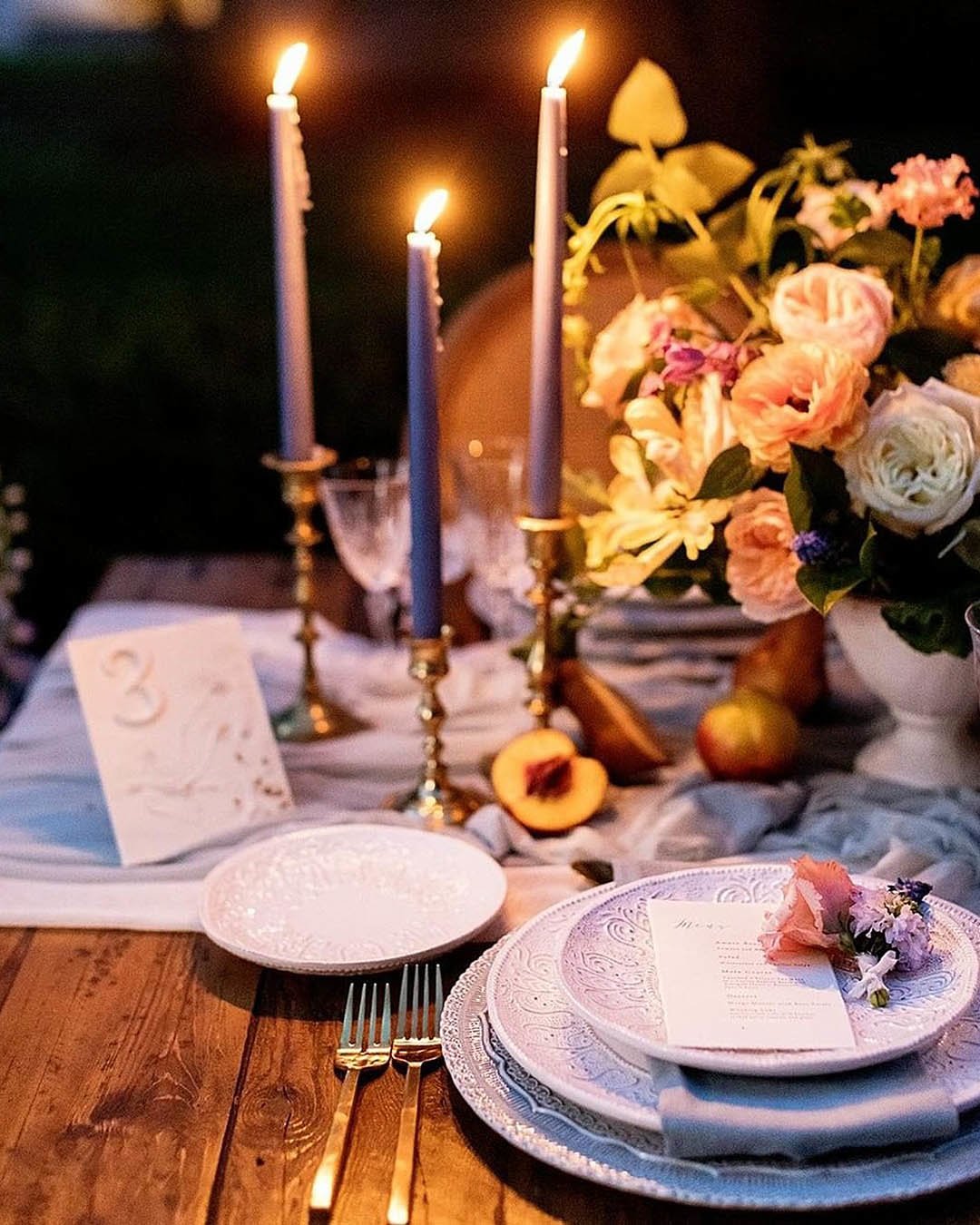
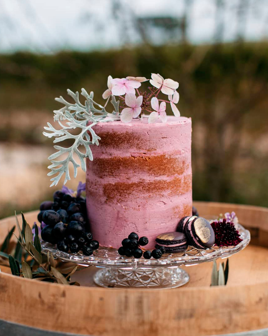
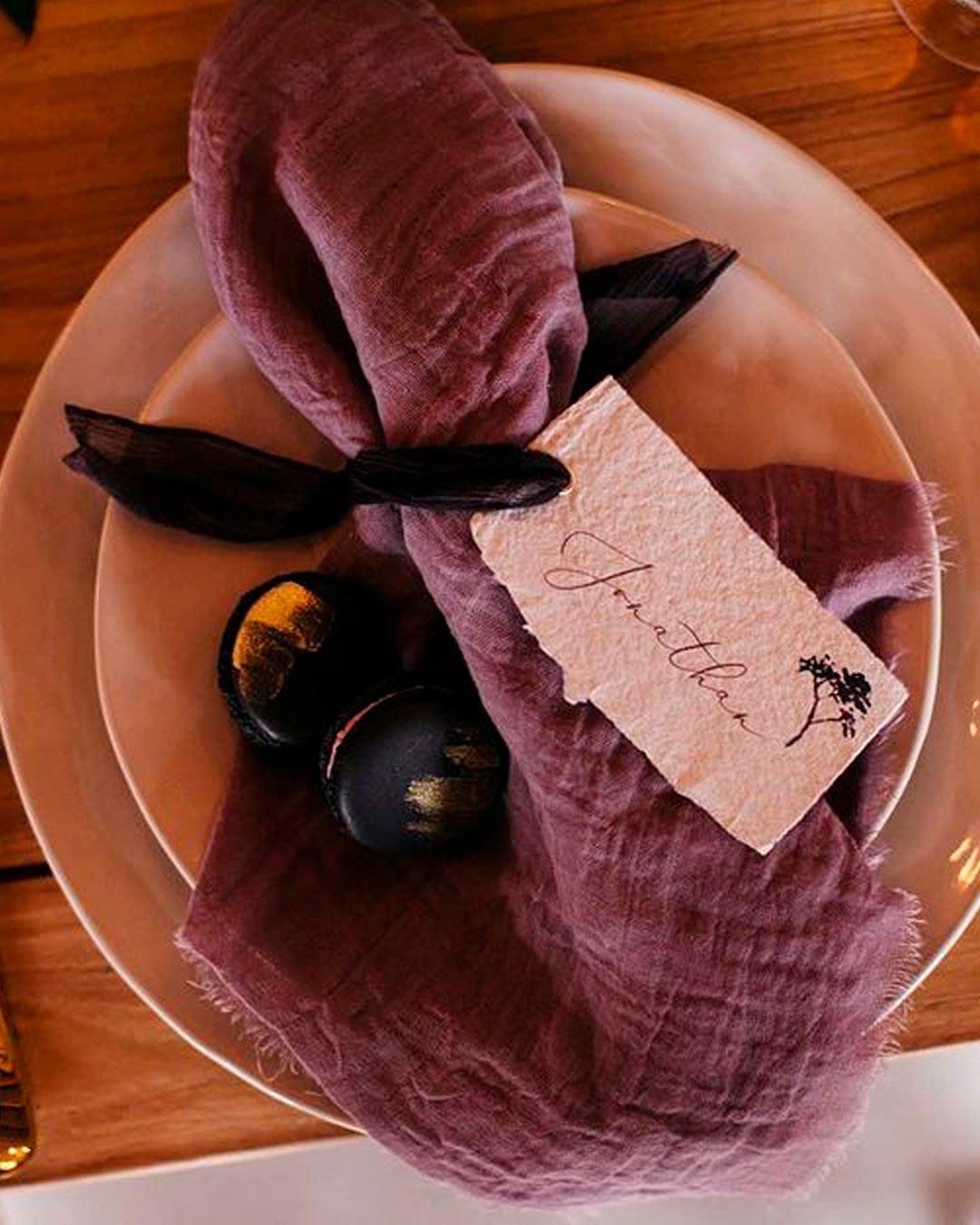
It’s A Match: When a heritage vintage tone like dusty rose and copper meets more current shades like gray and plum, the result is this absolutely gorgeous September ready wedding palette. The depth of the plum brings a theatrical touch to the theme, the gray and copper contribute layers of texture, and weaving in the dusty rose brings everything into equilibrium with a soft, airy sensibility.
Whether you’re planning a vintage styled event on a city rooftop or within a historic manor, this collection of colors brings your modern vintage vision into sharp focus.
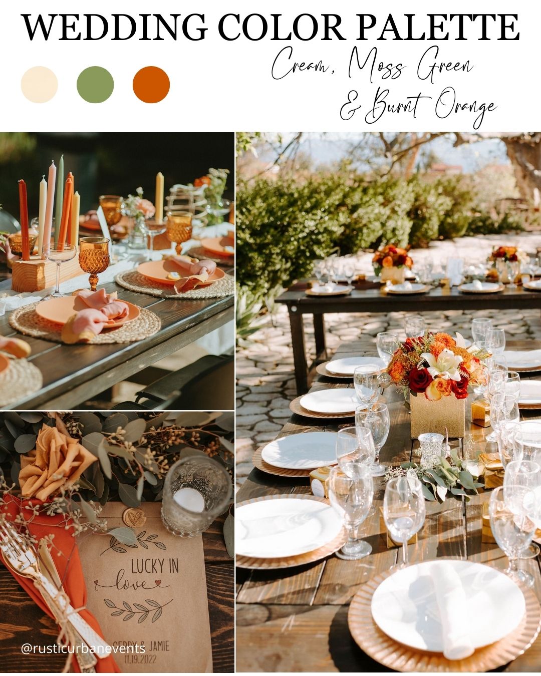

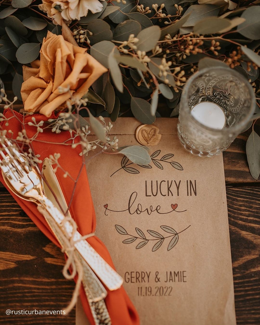
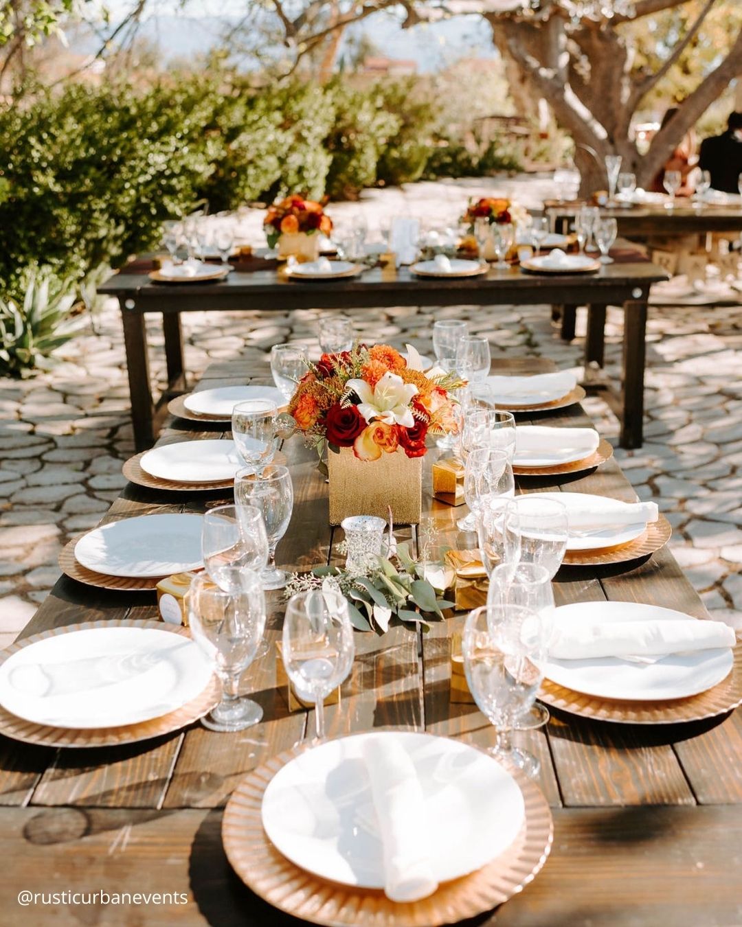
It’s A Match: Pulling directly from the glorious palette of autumn leaves, this October focused wedding color pairing feels polished but threaded with a country chic spirit, ideally suited to a breathtaking outdoor ceremony leading into a barn, farm, or vineyard reception. This burnt orange wedding color story makes you want to greet every guest with a steaming mug of apple cider and weave the natural world into centerpieces by artfully using foliage, moss, and tiny pumpkins.
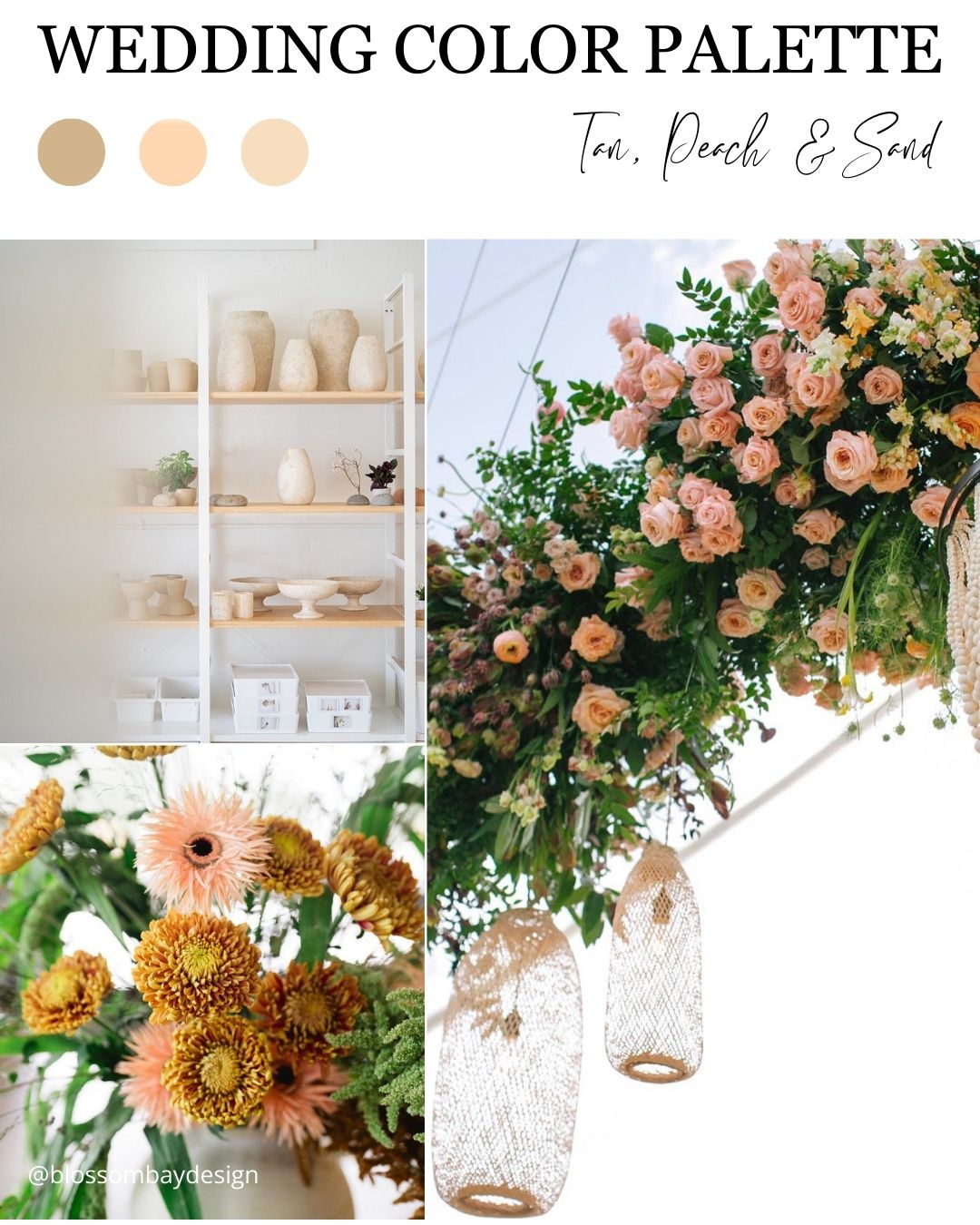

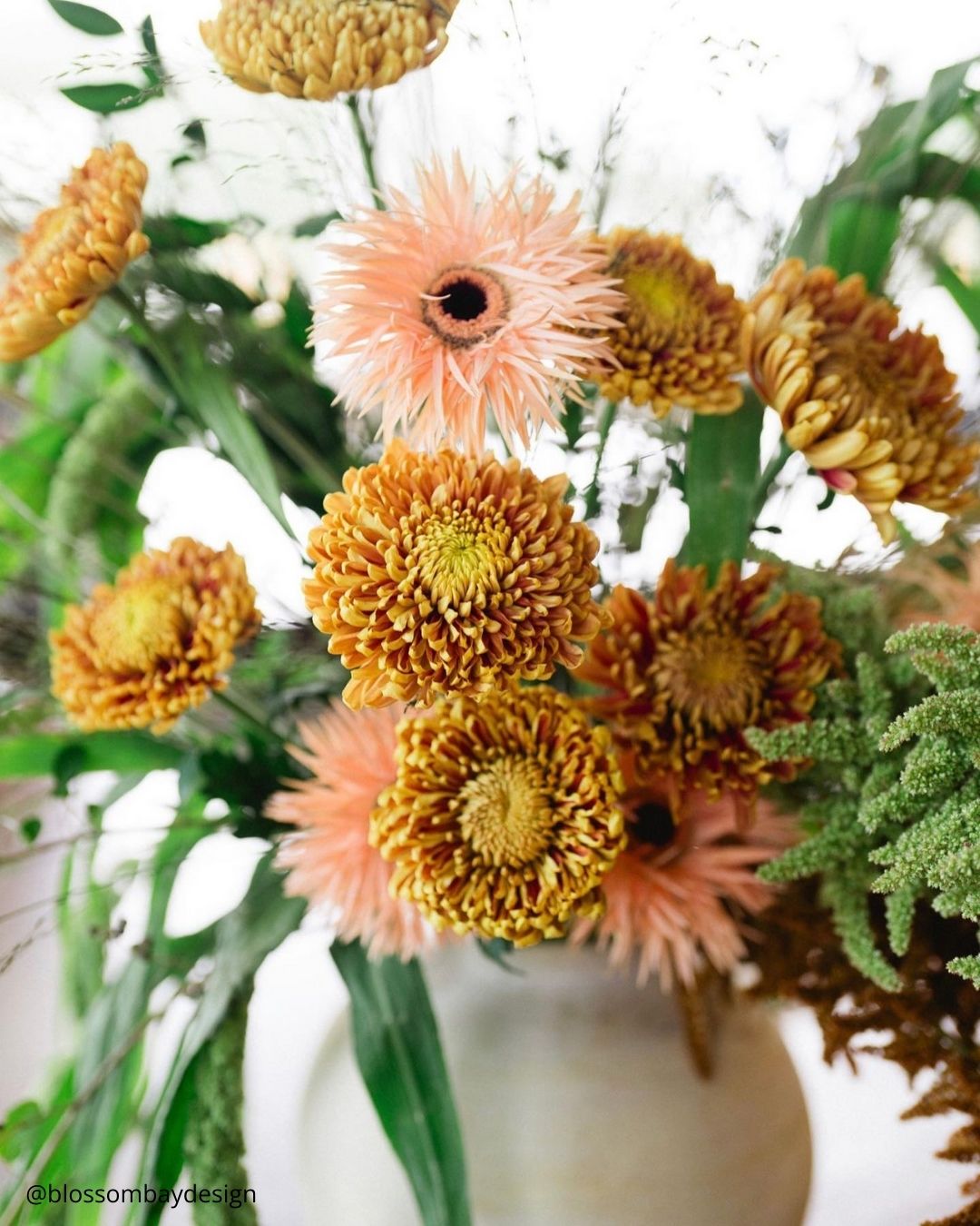
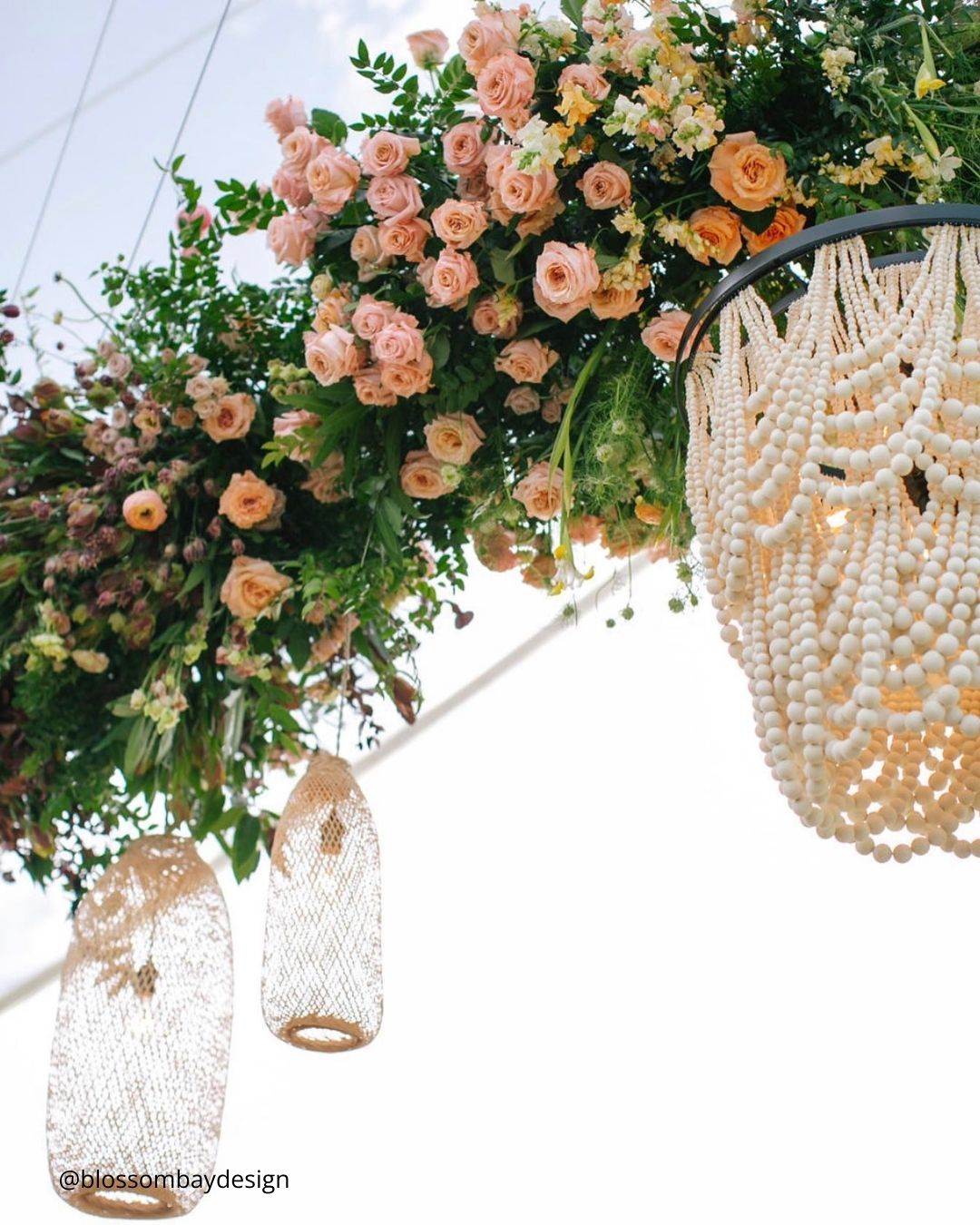
It’s A Match:
Tan, peach, and sand operate as laid back wedding theme colors seemingly custom made for outdoor settings. Beachside and garden celebrations call for breezy textiles and lighter tones that keep everyone feeling at ease.
Just as crucial, the visual sense of being relaxed and wholly content mirrors emotions that connect so directly to marriage itself. This monochromatic direction creates a lovely, effortless sense of style that neatly captures the sensible color trends rising right now.
Winter Wedding Colors
When your celebration falls within the winter stretch, you’ll find a treasure trove of beautiful wedding theme colors waiting for you. Pulling inspiration from color cues like frosty blues, sultry berry reds, and deep hunter greens, this season is brimming with memorable groupings.
Whether your heart is set on a cozy winter lodge feel, a snow draped mountain look, or a spirited holiday atmosphere, weaving the magic of the season into your planning is essential for a winter wedding.
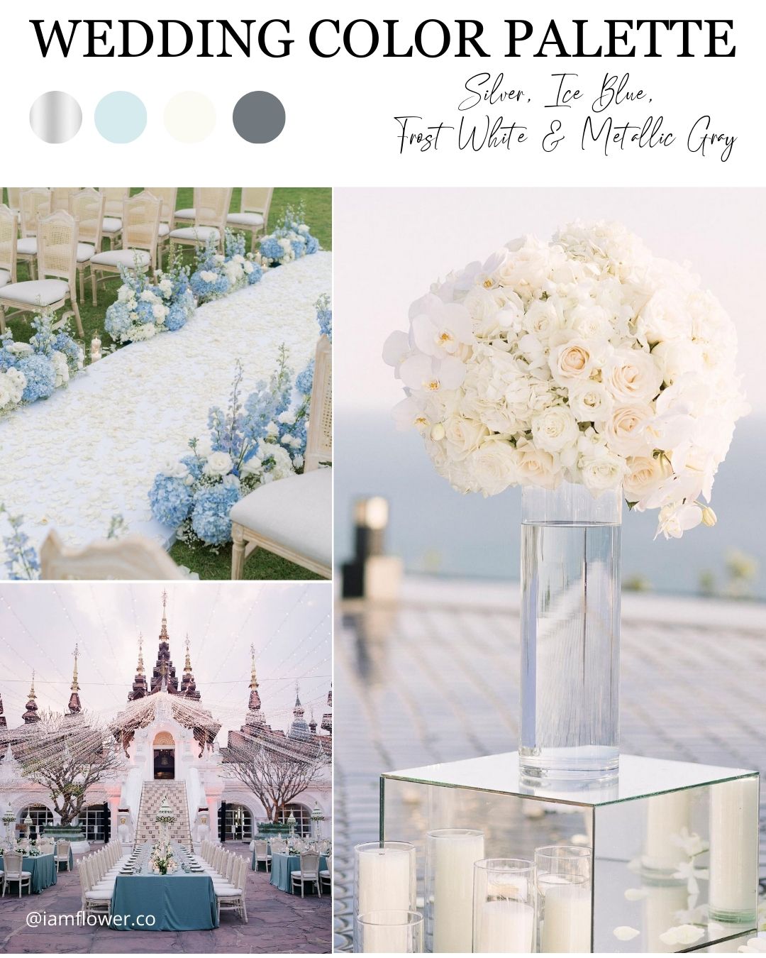
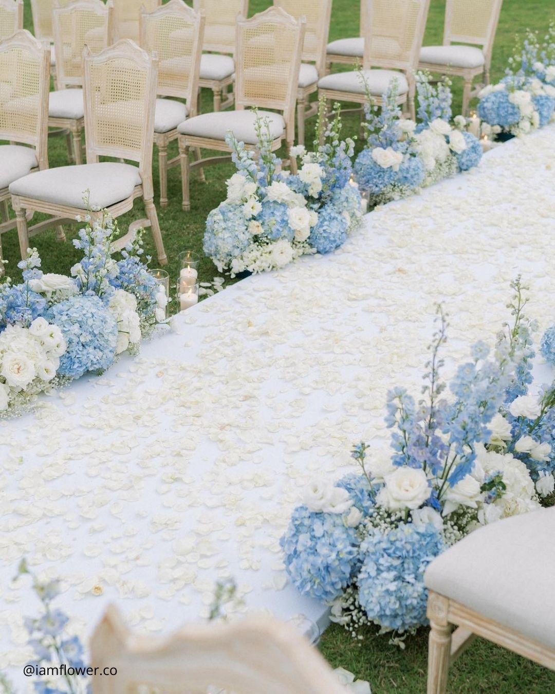


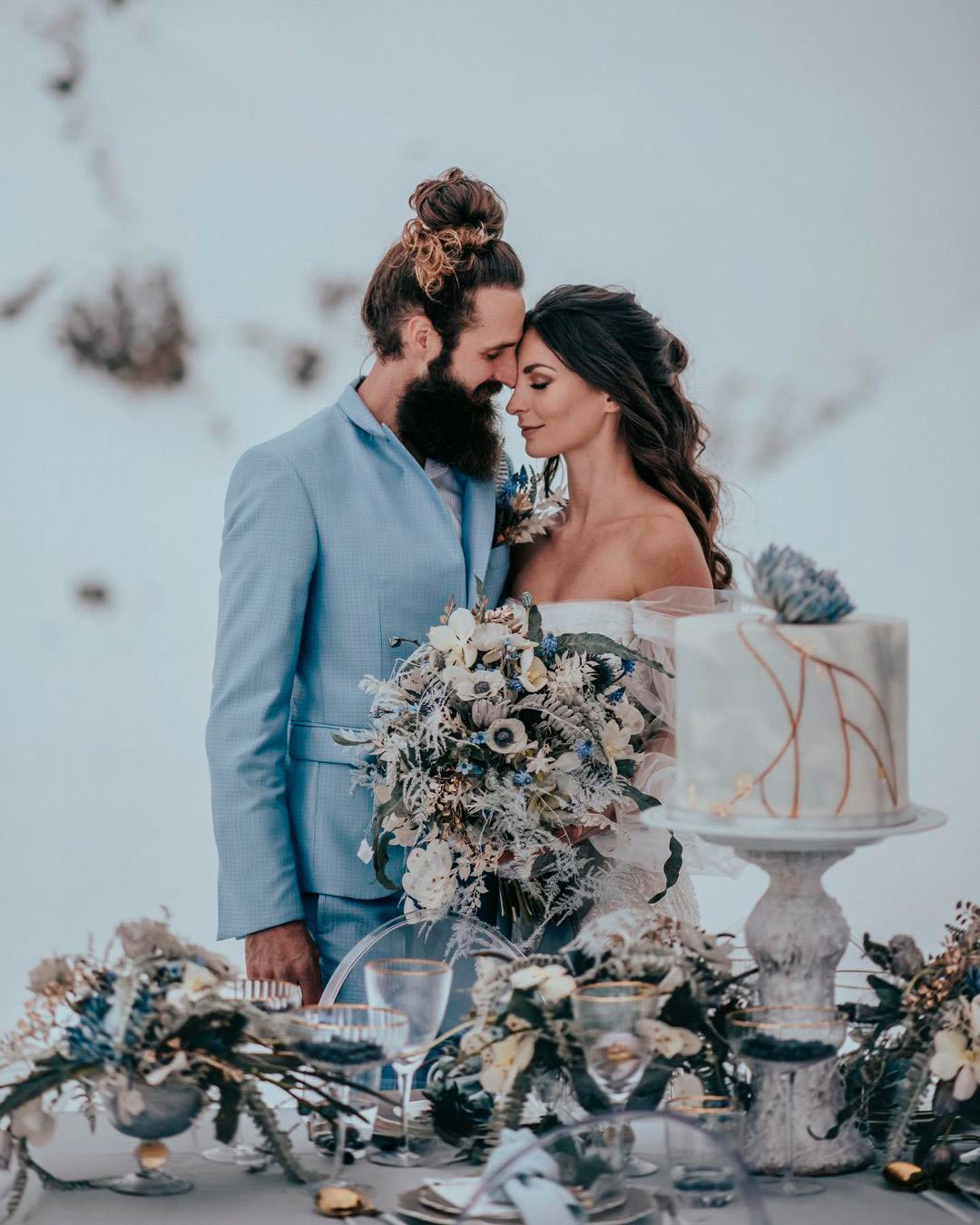
It’s A Match: The winter season carries a distinct beauty into a wedding landscape, and so many couples dreaming of a cold weather celebration want to channel the sparkle of snow and frost directly into their day. Why not select a color story that mirrors that exact magic?
The shimmer of silver echoes the seasonal frost, while ice blue, white, and gray introduce a snowy quietude to the design. Ideal for a mountain lodge or an opulent historic hotel, this wedding aesthetic manages to feel both coolly crisp and deeply inviting all at once.
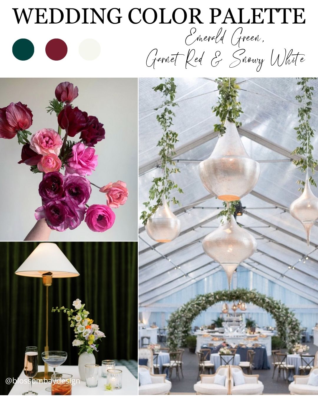
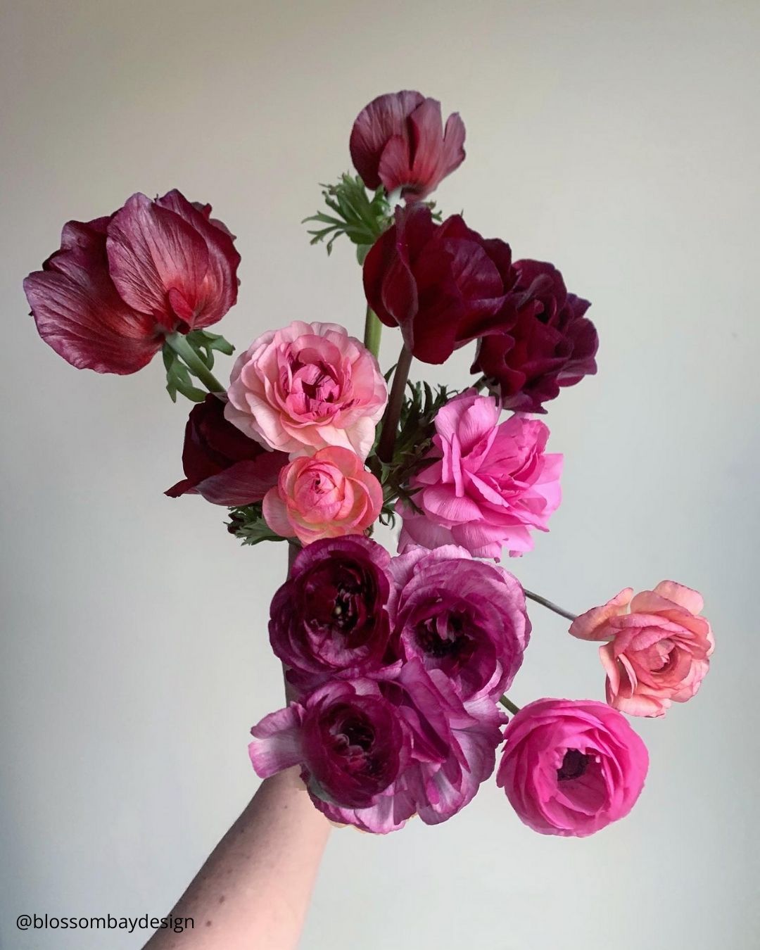

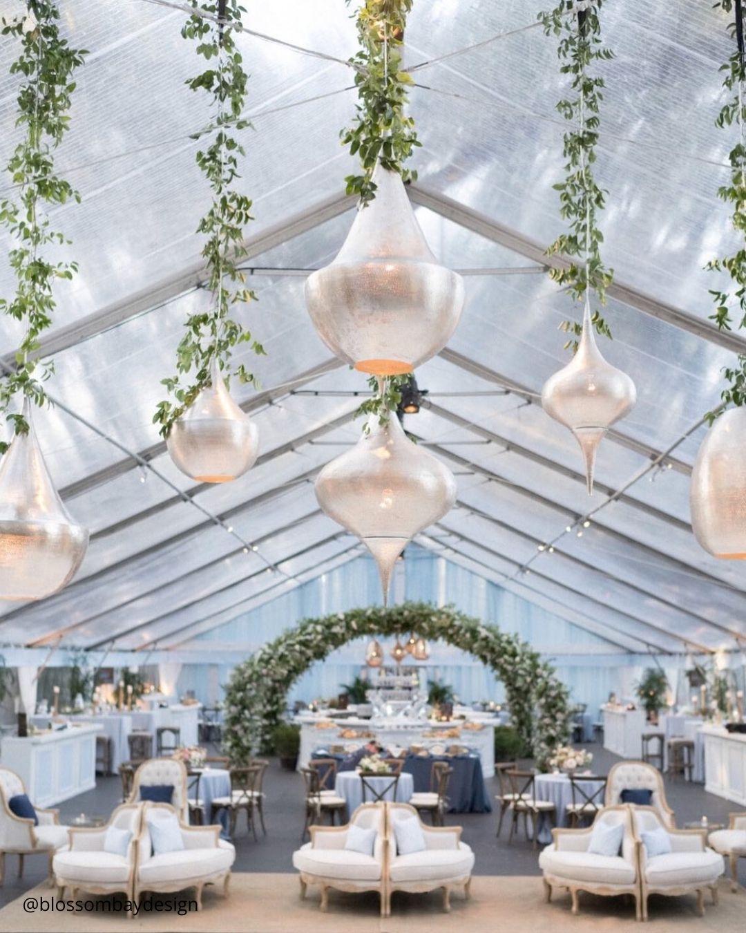
It’s A Match: Drawing directly from the Christmas holiday season, there is absolutely nothing wrong with celebrating the emerald green and red palette. A huge number of winter weddings fold in a festive spirit, so leaning into these classic holiday shades simply brings out more joy and merriment.
Flattering nearly any wedding venue or location, this color story proudly displays its enduring, timeless character.

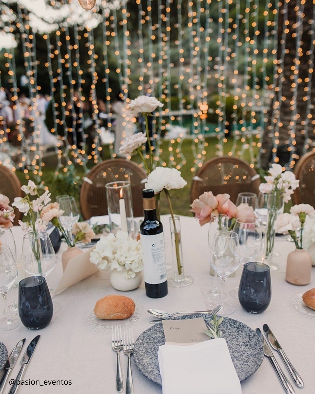

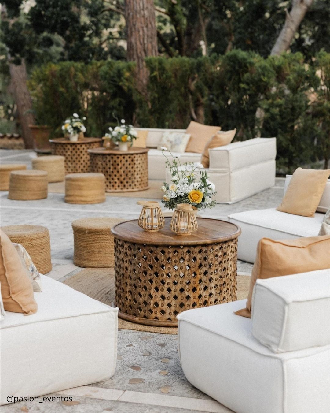
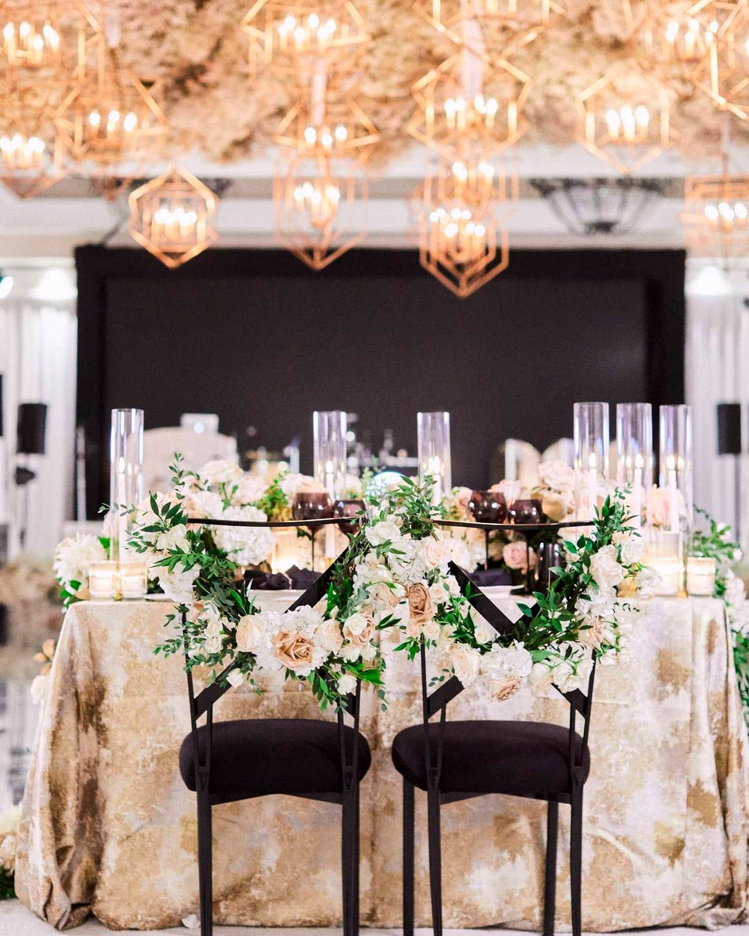
It’s A Match: Ready to lift your winter wedding color theme from simple to truly spectacular? Black, White, Taupe Gold, and Shimmery Gold tip their hat to the celebratory spirit of the season while weaving a layer of enchantment through the whole design.
Picture a timeless hotel ballroom dressed with towering gold candelabras, crisp white linens, and an exquisite floral focal point. That is the world you build by embracing this sophisticated color story.
Spring Wedding Colors
There’s truly nothing that compares to spring when the world bursts into bloom and the season’s signature shades suddenly appear everywhere. Spring signals fresh starts and rebirth, and with that feeling close at hand, couples who choose a springtime celebration discover wonderfully distinctive and charming wedding color groupings just waiting to be found.
Polished wedding colors typical of spring celebrations tend to center on pink, light blue, cream, and yellow palettes.
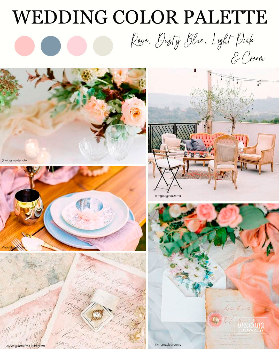


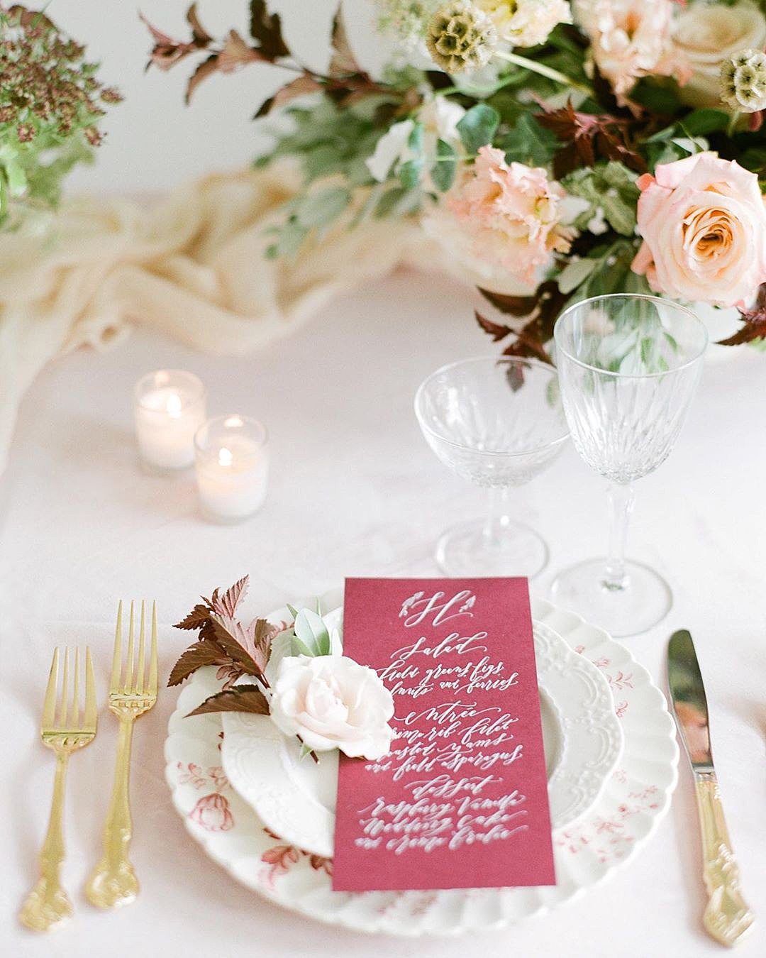
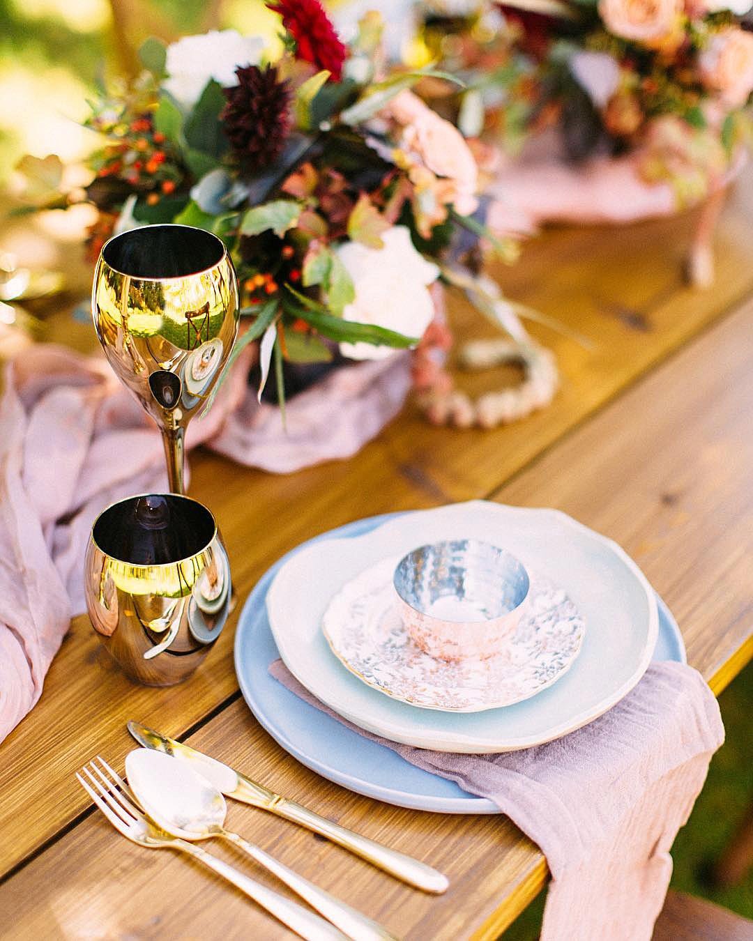
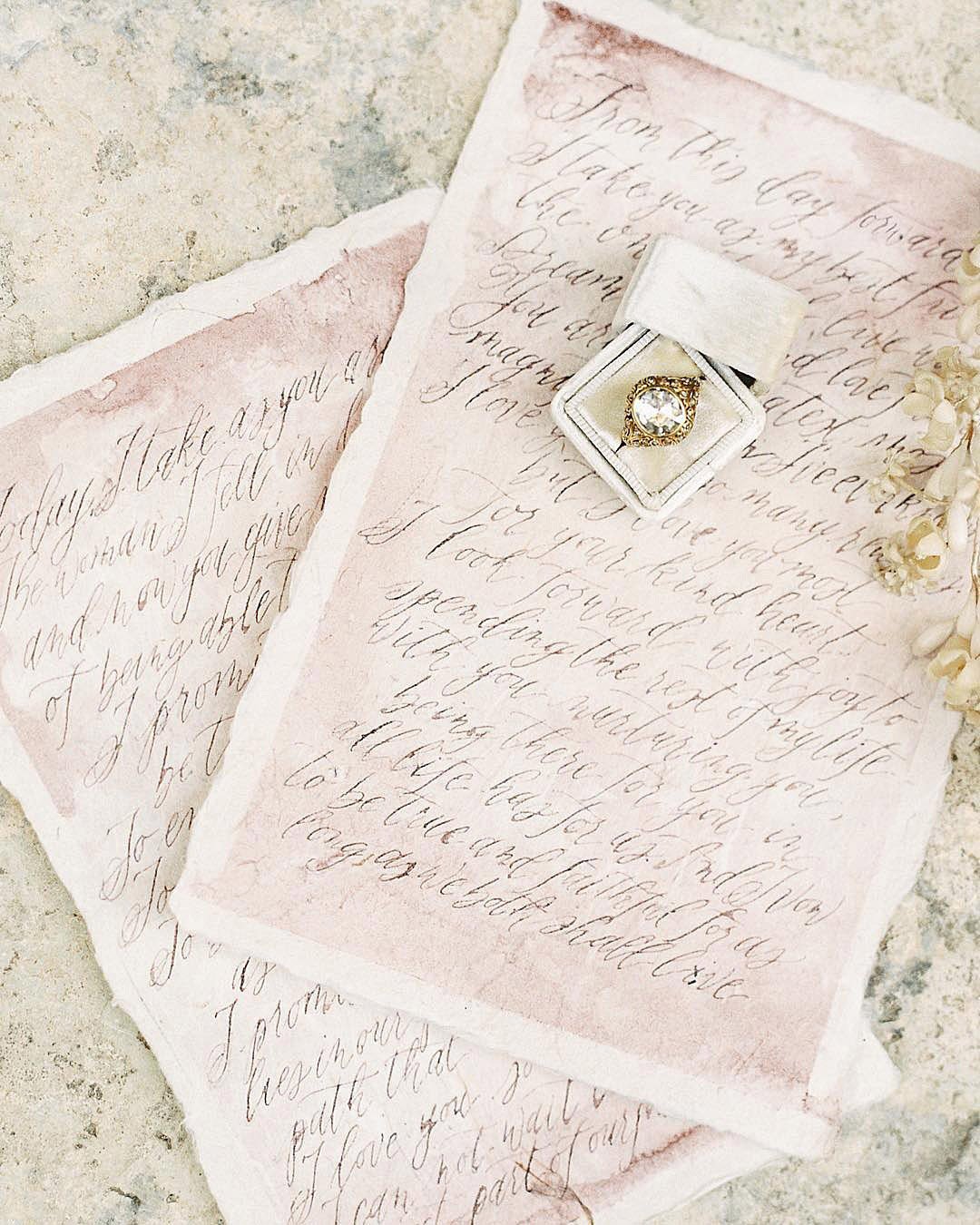
It’s A Match: When your search for a soft color palette that merges a whisper of vintage soul with full wedding day glamour finally ends, you land on this utterly unique combination. The blend of these gentle colors wraps the entire aesthetic in a kind of serenity and plays beautifully within the natural light tones of the spring season.
If a garden venue wedding or an elegant tented celebration is in your plans, dusty blue wedding color is the impeccable theme to lean into.
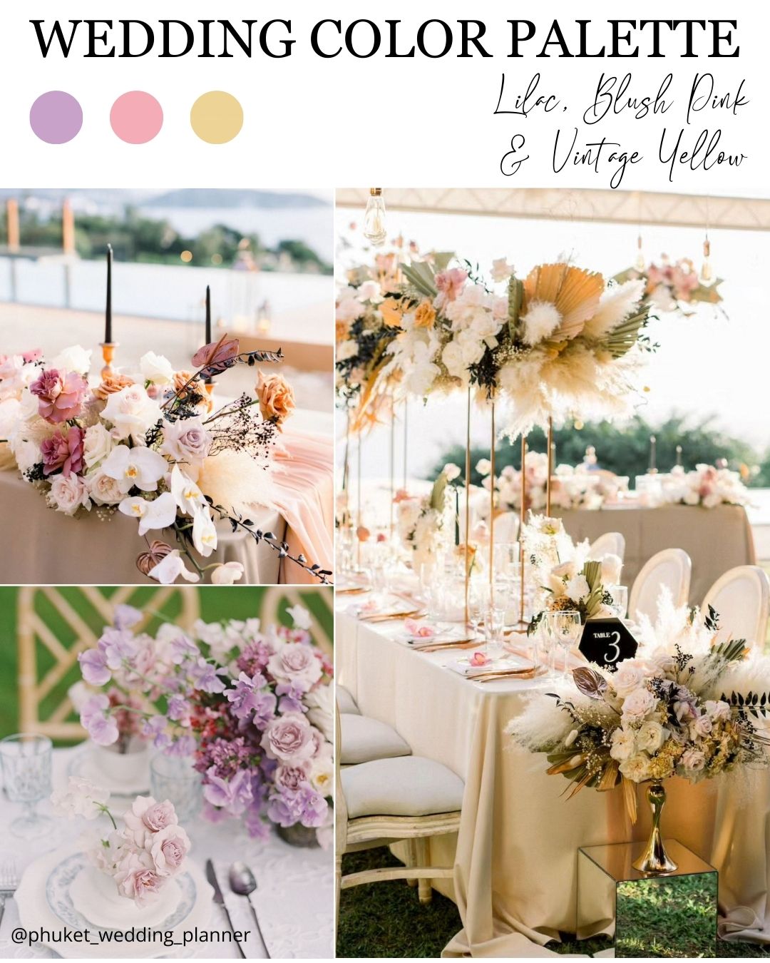


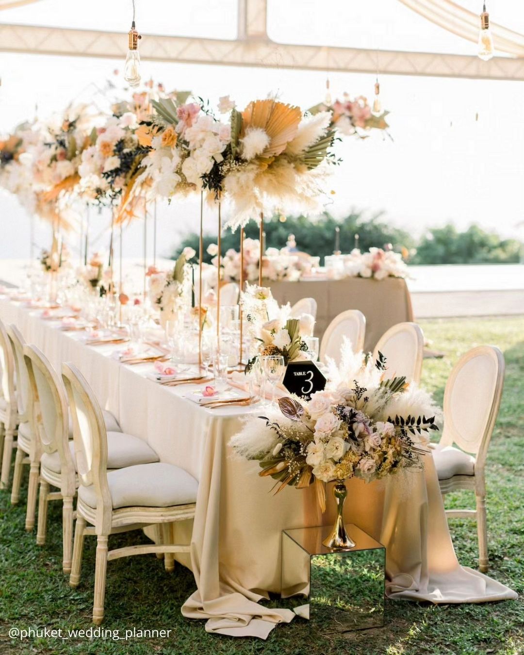
It’s A Match: A quintessential spring wedding color palette built around recognizable seasonal flowers, this trio is a flawless match for anyone organizing an open air celebration. These three pastel shades collaborate so effortlessly with virtually any bloom, decorative element, or wedding style, owing to their incredible flexibility and clean simplicity.
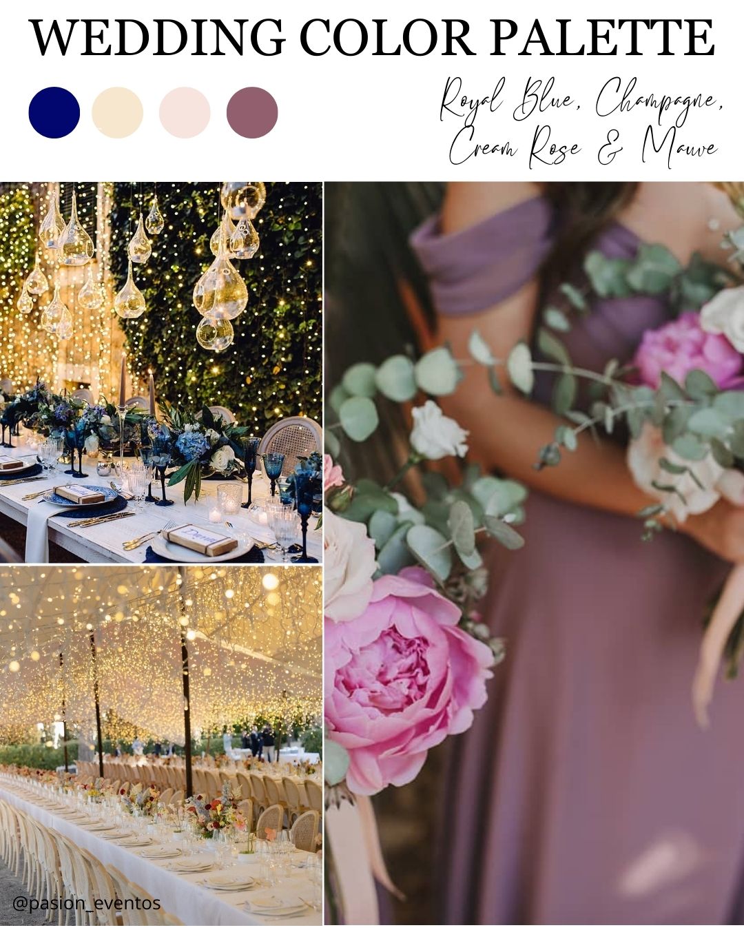
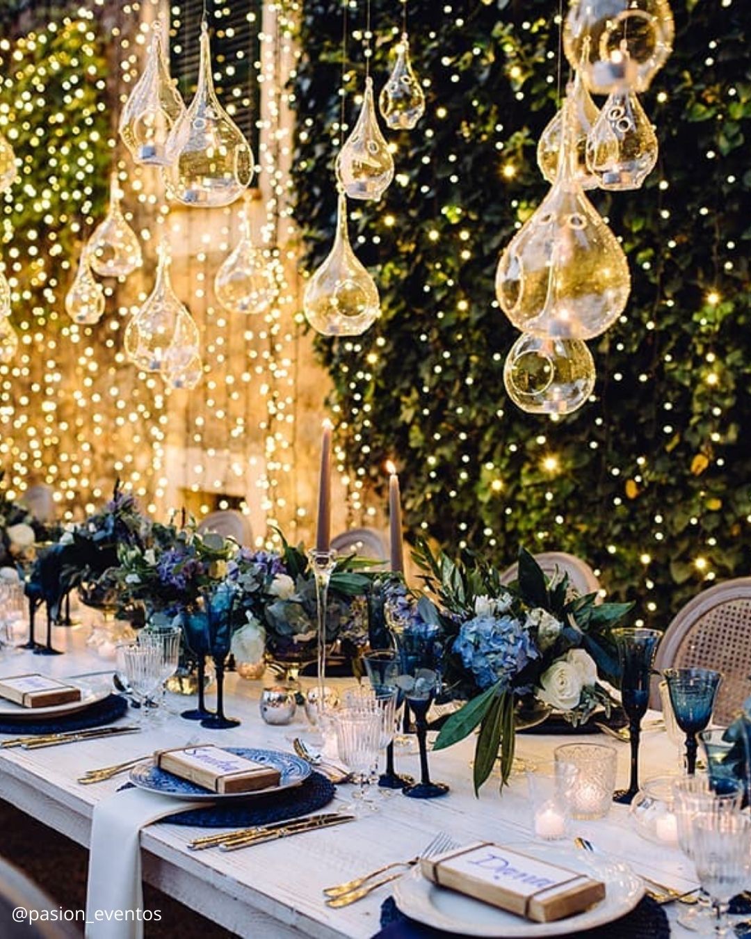


It’s A Match: A genuine cross pollination of color families, this quartet of spring wedding shades feels designed for the style focused bride. It’s perfect when you’re mapping out a country club reception or orchestrating a resort style event, since the royal blue and mauve function as refined grounding tones while the champagne and cream rose introduce a beautiful sense of visual poise.
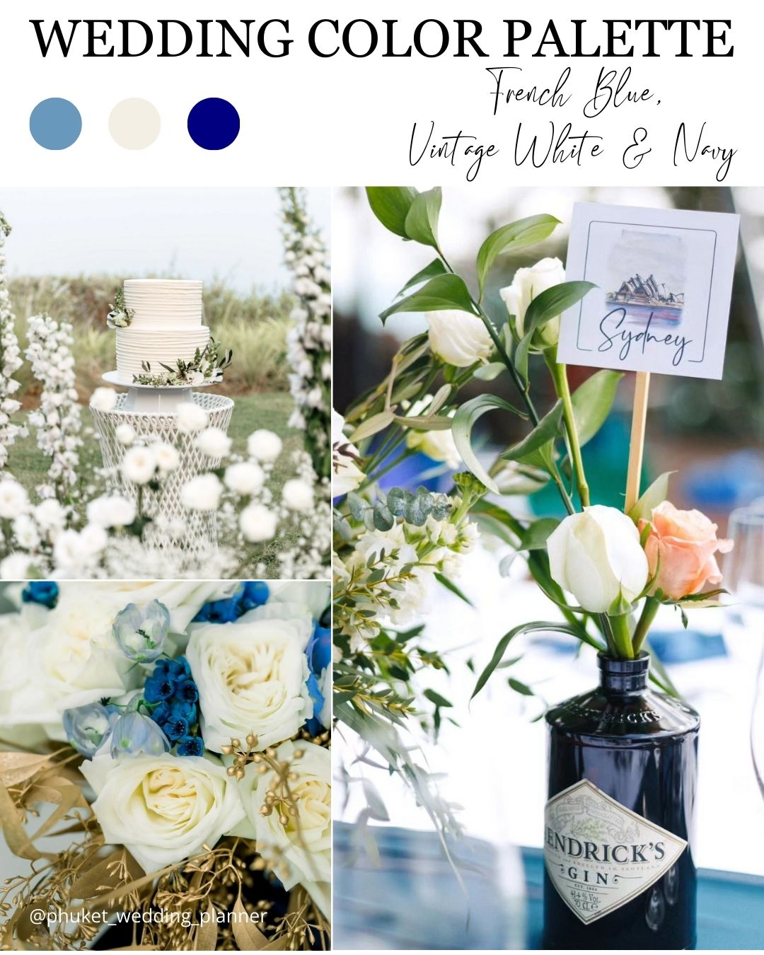

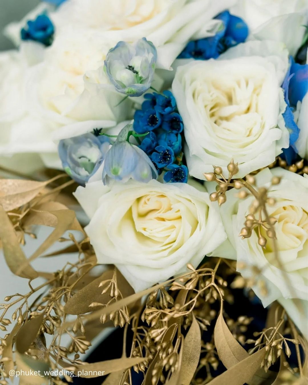
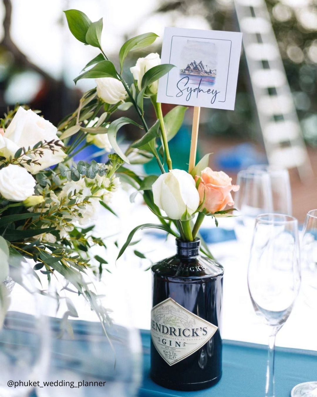
It’s A Match: This knockout color trio tips its cap to an old world sense of chic while bringing a fresh, current edge, especially when paired with a seaside backdrop or a venue with sweeping water views. French blue leaps forward with a vivid, cheerful energy that lifts the entire decor scheme, and when you temper it with a vintage white and weave in navy accents, the final effect is one truly magnificent presentation.
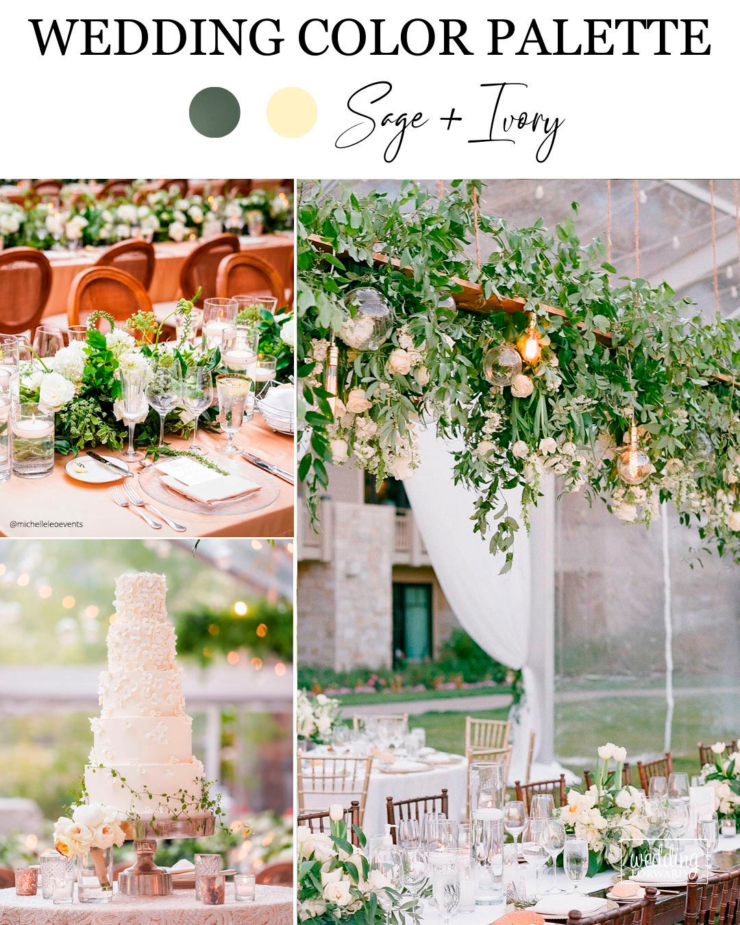
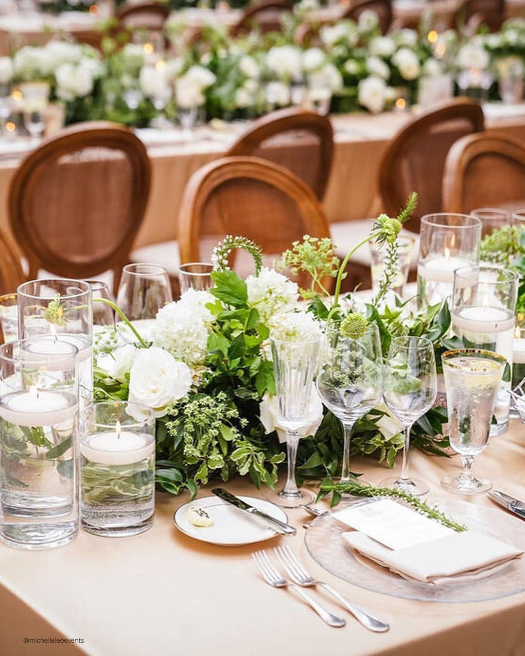
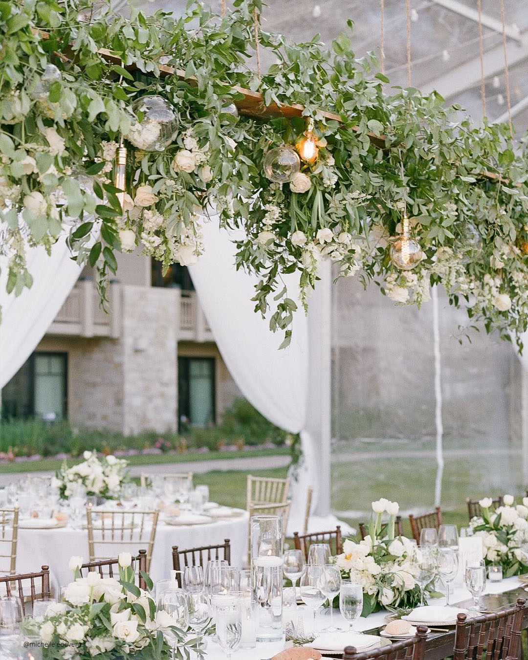
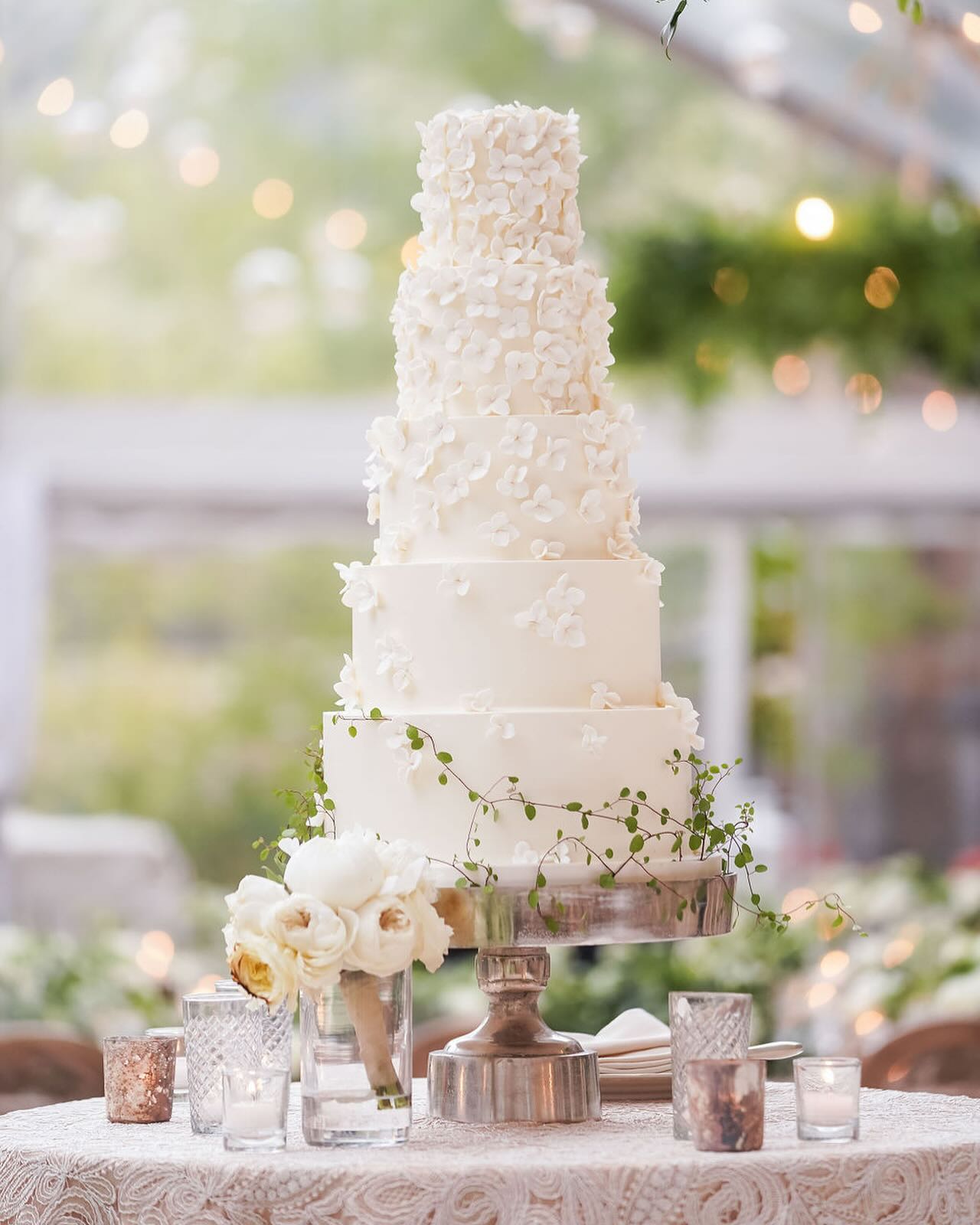
It’s A Match:
Color ideas for weddings zero in on clean lines and unpretentious beauty. This pairing of sage and ivory nails that vision by quietly borrowing from the classic color combinations found in the natural world.
Couples sprinkle a touch of these wedding theme colors across their decorative accents and paper goods without ever visually competing with the couple or the overall ceremony experience.
This palette is a beautiful fit for an elegant early spring traditional wedding or the grounded, organic simplicity of boho and rustic style celebrations.

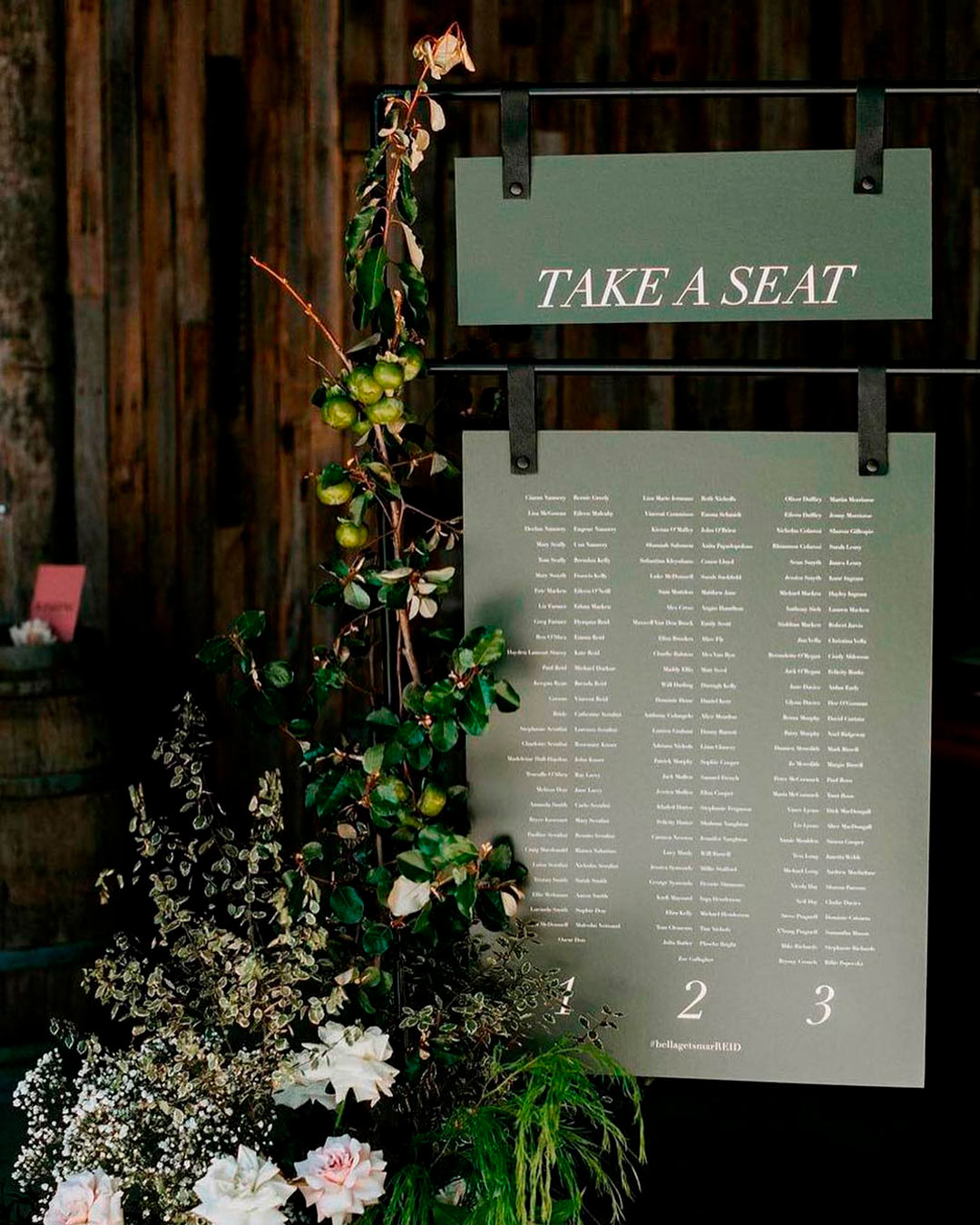

It’s A Match: Moss green is a shade typically linked to the outdoors and the living landscape. If your aim is a cozy welcoming atmosphere for your wedding, moss green is a wonderful direction.
When pulling this color into your wedding, remember it should act as a neutral anchor.
Opting for an overly bright moss green will feel visually out of step at a wedding. A smart method for working moss green wedding colors into your celebration is to use them as a foundational layer.
From there, you can layer in white florals, abundant greenery, and silver touches to make the complete composition sing while keeping the overall effect organic.
What Are The Most Popular Wedding Colors?
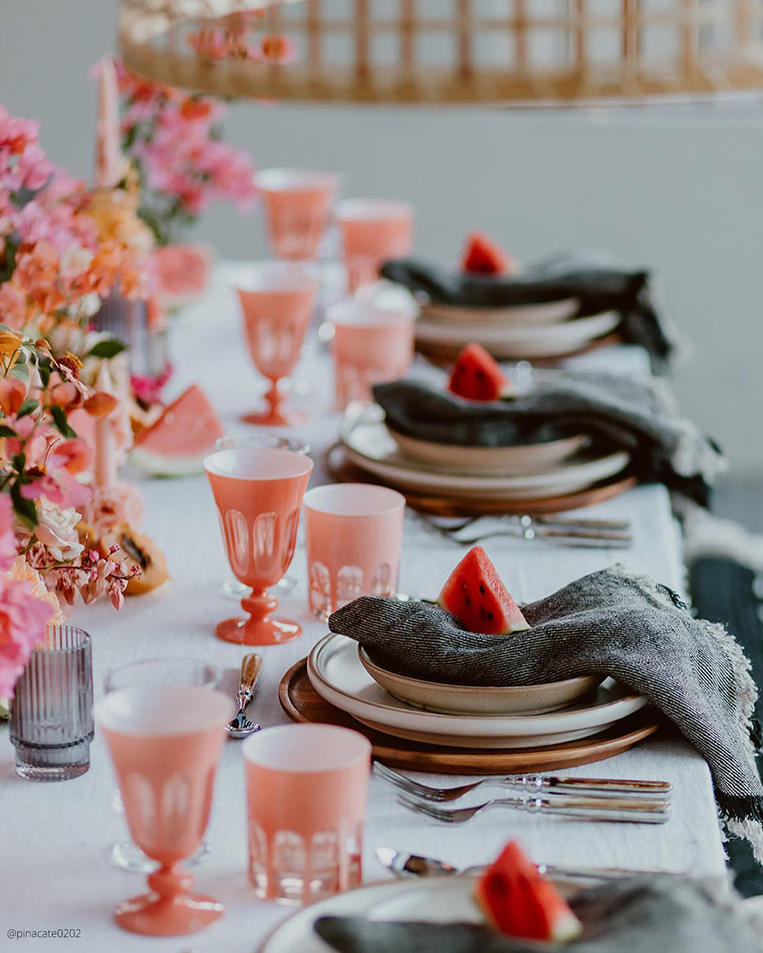
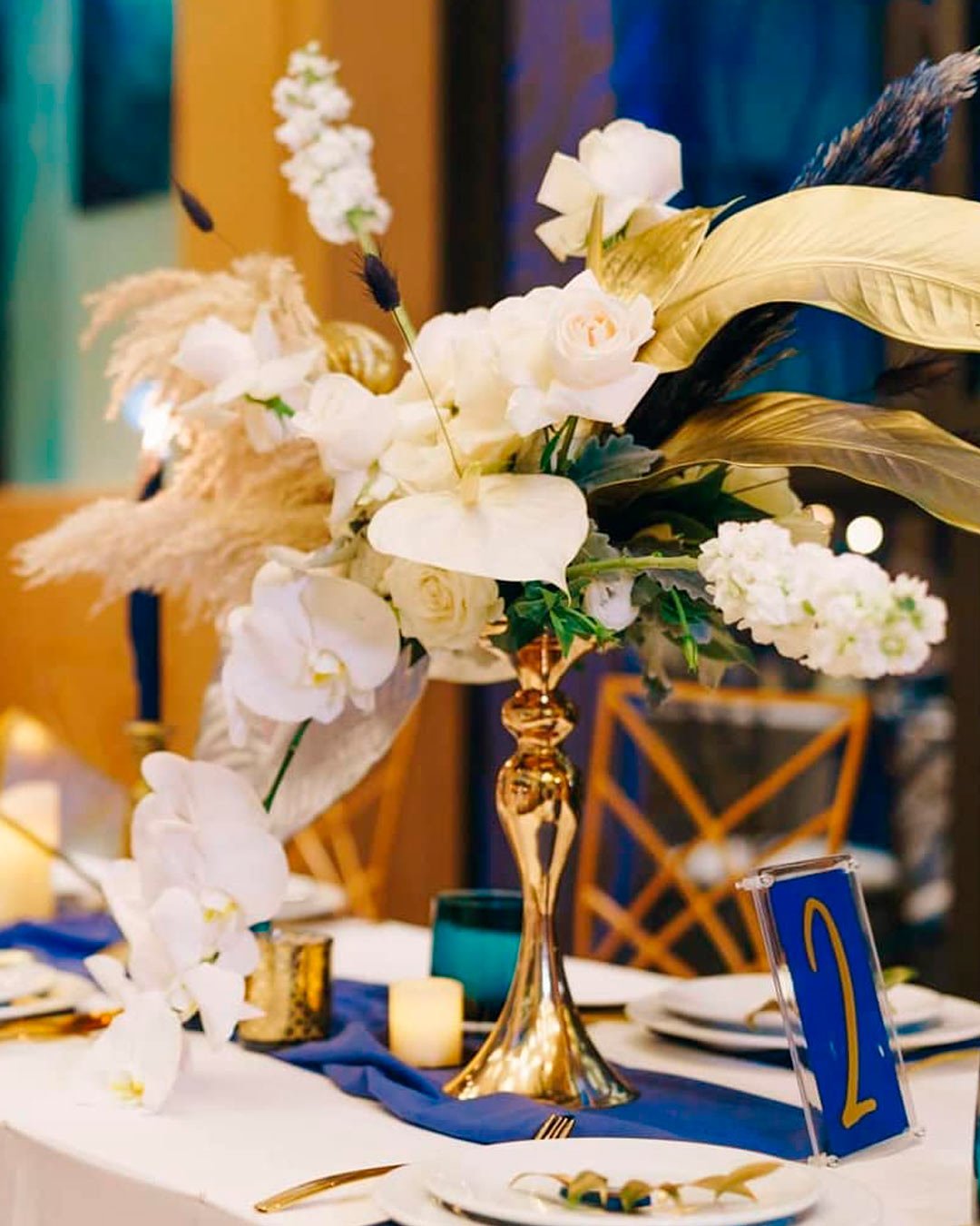
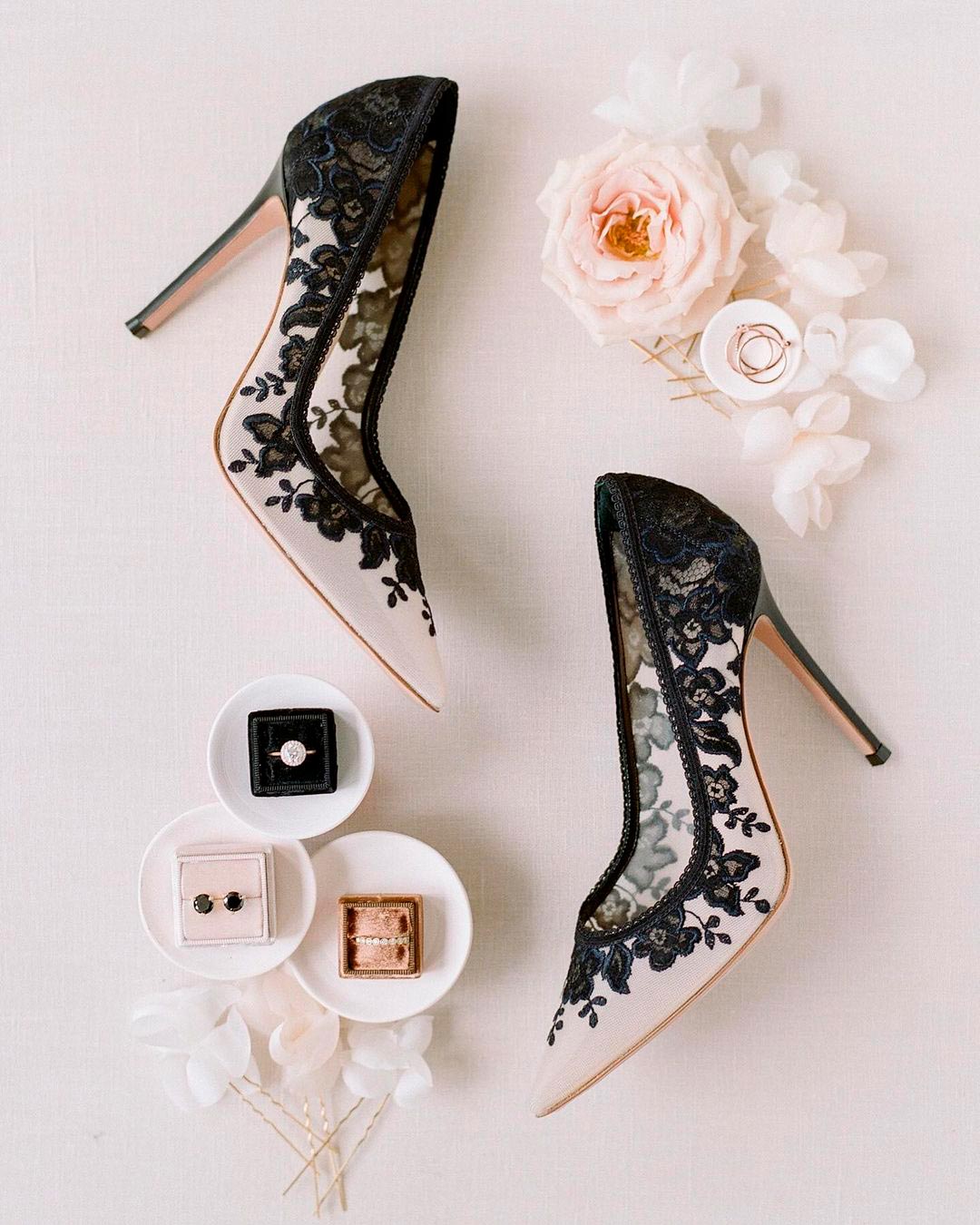
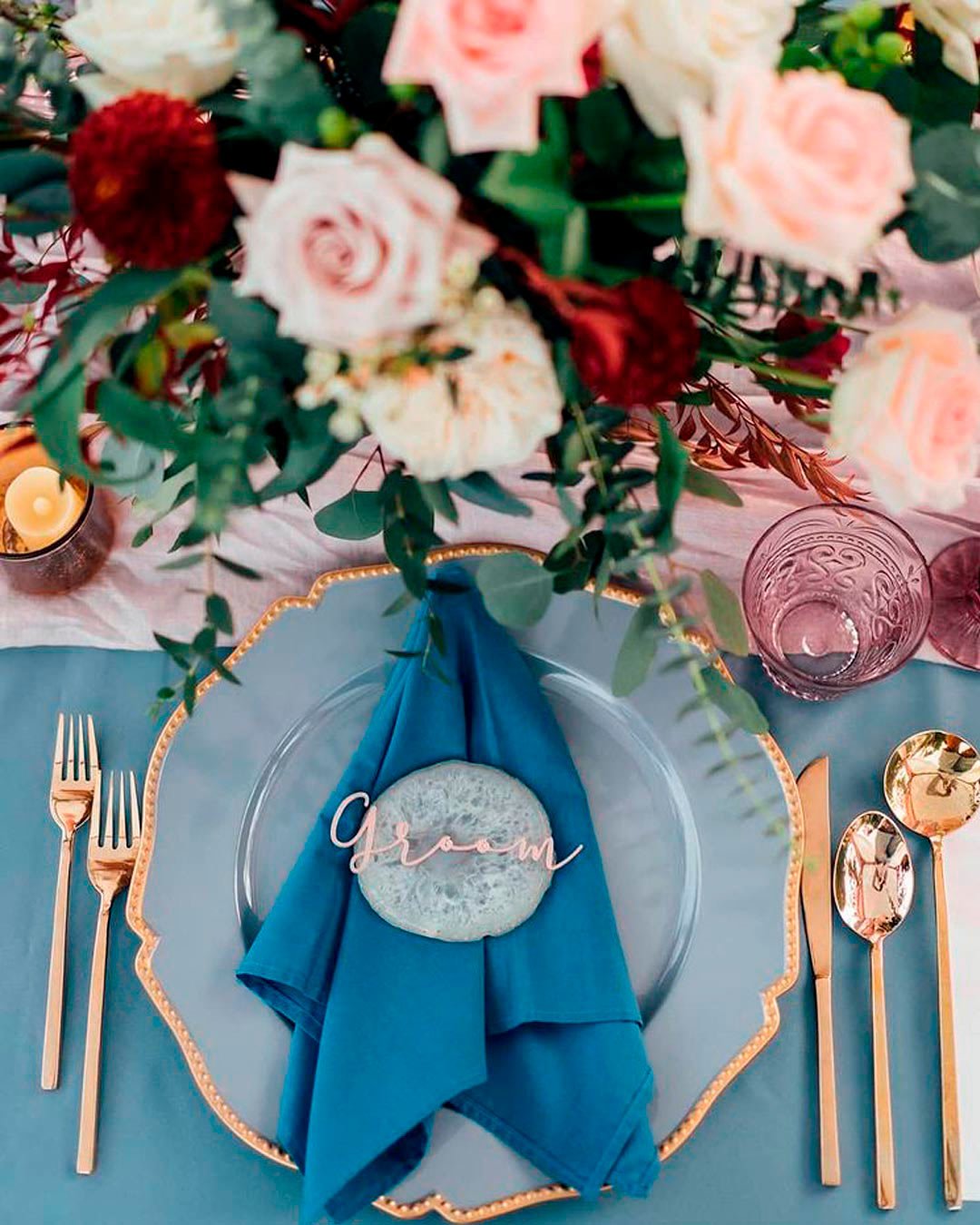
Here are the most popular wedding colors:
- Peach Fuzz – Pantone color of the year
- Navy, White, and Gold
- Black and White Combination
- Petal Pink, Cornflower Blue & Mauve Purple
Peach Fuzz was deliberately chosen to embody our collective longing for tenderness and nurturing deeper bonds with those around us. This gentle, velvety peach tone radiates a spirit that warmly envelopes the mind, body, and soul as a whole.
Jimmy Choo OBE, design director and creative director of The Atelier Couture, notes that the new Pantone Peach Fuzz alongside light shades of pink and blue, finished with silver and golden touches, will top the list of most popular wedding colors.
A wedding theme color duo that dominates nearly every year is Navy and White, often with Gold woven into the mix. Navy carries such an intrinsically polished quality that it naturally elevates any event, and when you bring Gold into the fold, the sense of occasion intensifies even further.
Another perennially trusted color union is the classic Black and White. Borrowing its DNA from the iconic men’s formal look, the tuxedo, black and white triumphs in every season and complements every location.
For couples craving something a bit more of the moment, the wildly popular Petal Pink, Cornflower Blue & Mauve Purple theme is taking over. This stylish color partnership has boho leaning brides, alfresco romantics, and modern whimsical couples everywhere filling up their inspiration boards.
Unique Wedding Colors

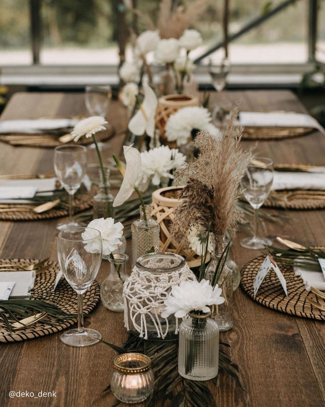

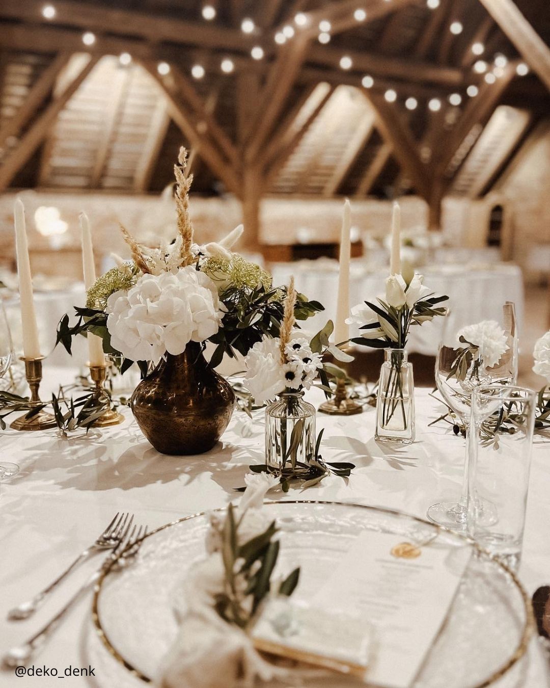
It’s A Match: Rustic style celebrations have surged in popularity in recent years, and one look at this color palette makes it easy to understand the appeal. A stunning choice for a barn venue or a rural outdoor spot like a farm or vineyard, this lush yet polished wedding color mix magnifies the beauty of the natural style wedding.

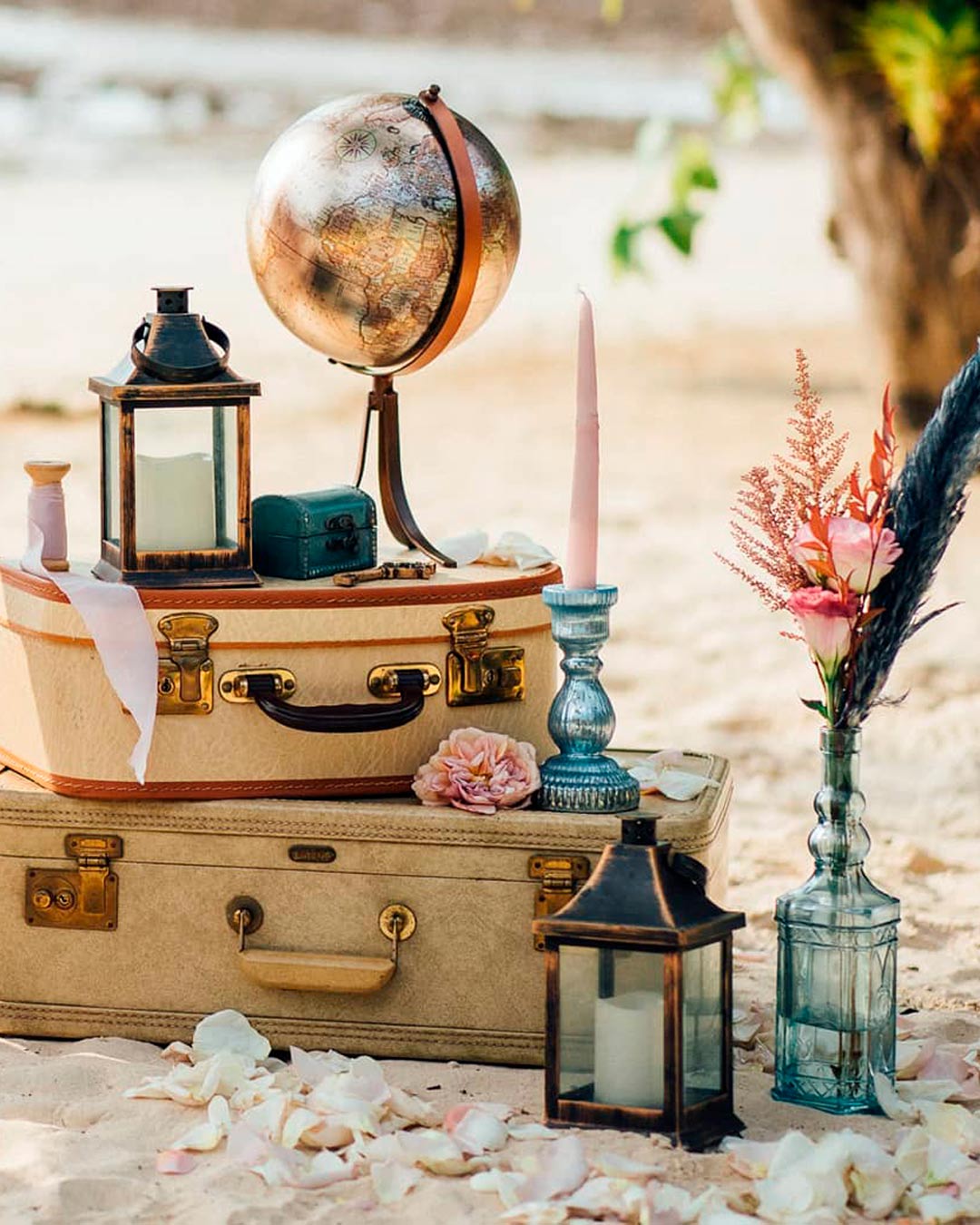
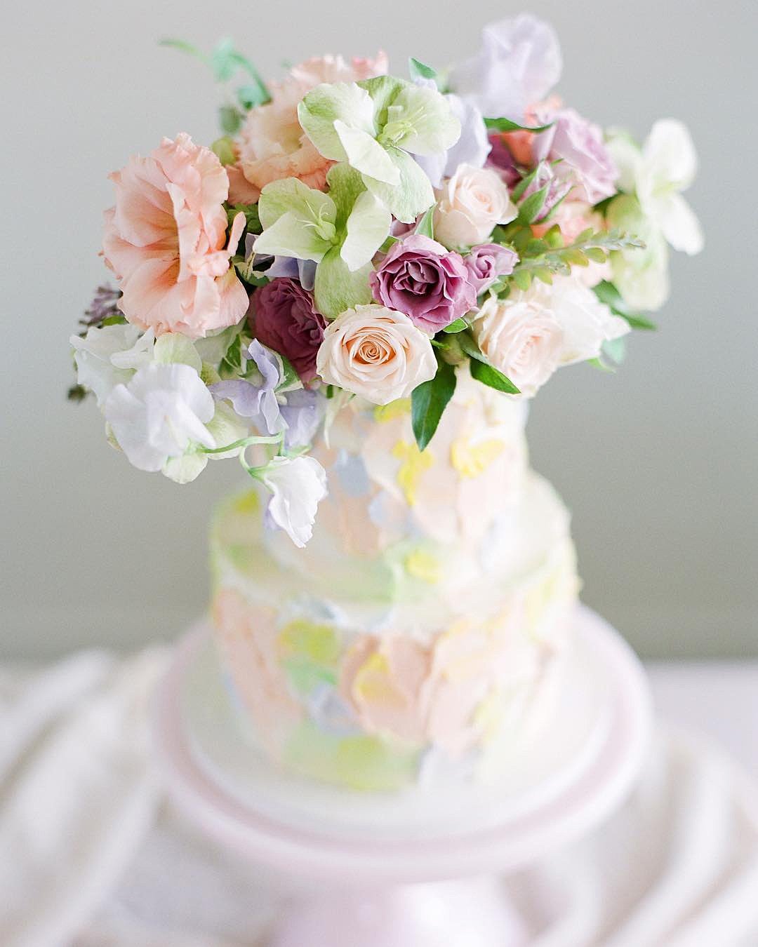
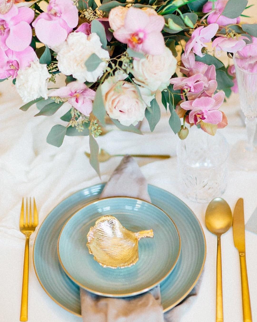
It’s A Match: Rolling surf, palm fronds swaying gently in the tropical air, and a glowing horizon at dusk are all essential elements of a dream beach wedding, alongside the colors in this beautiful mix. By blending two pink shades that dance beautifully off each other and introducing turquoise and sky blue which mirror the ocean’s depths, you might just land on the perfect beach wedding color theme.
If your nuptials are happening at a tropical resort or a far flung beach escape, this color direction sets you up for a seaside happily ever after.


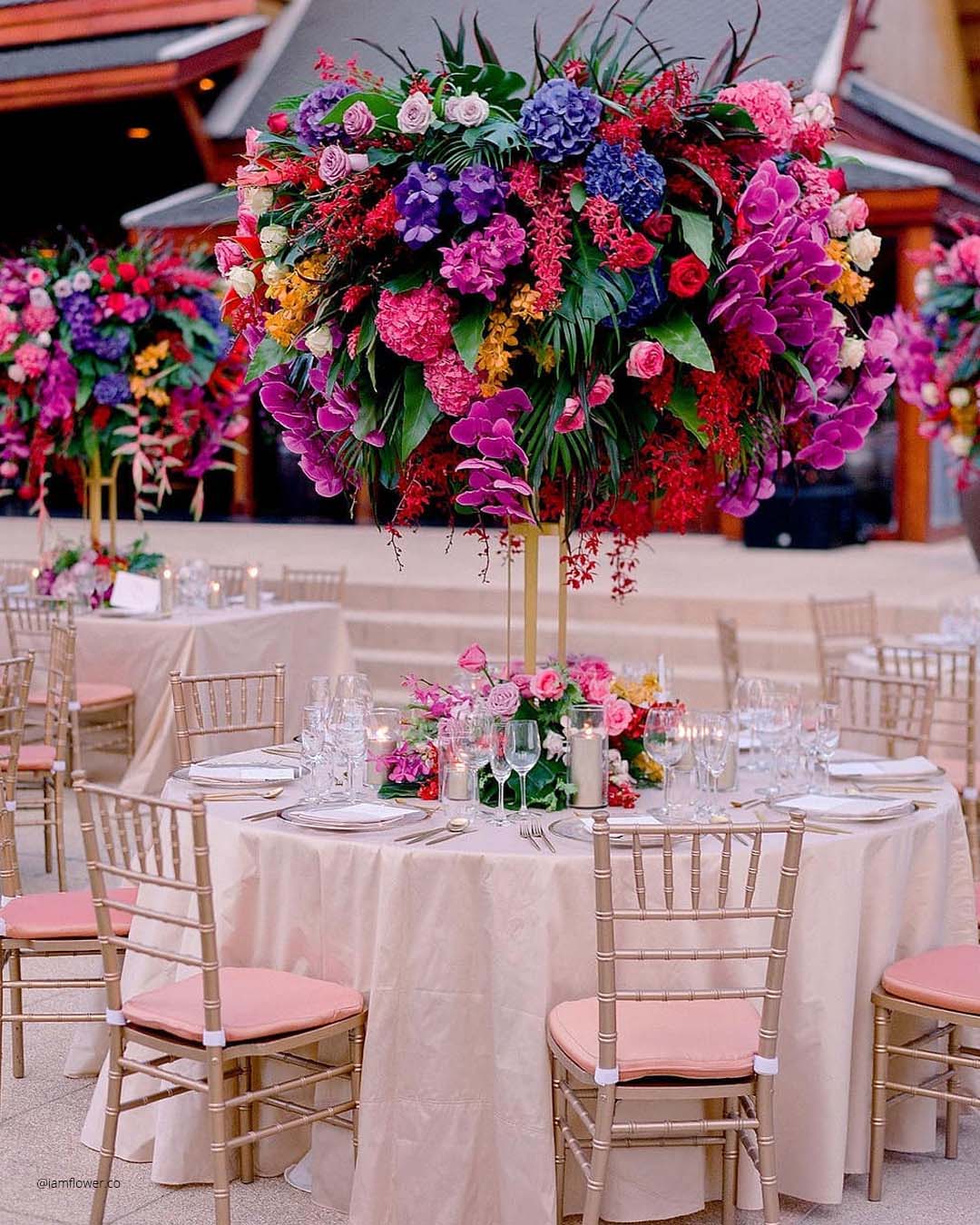
It’s A Match:
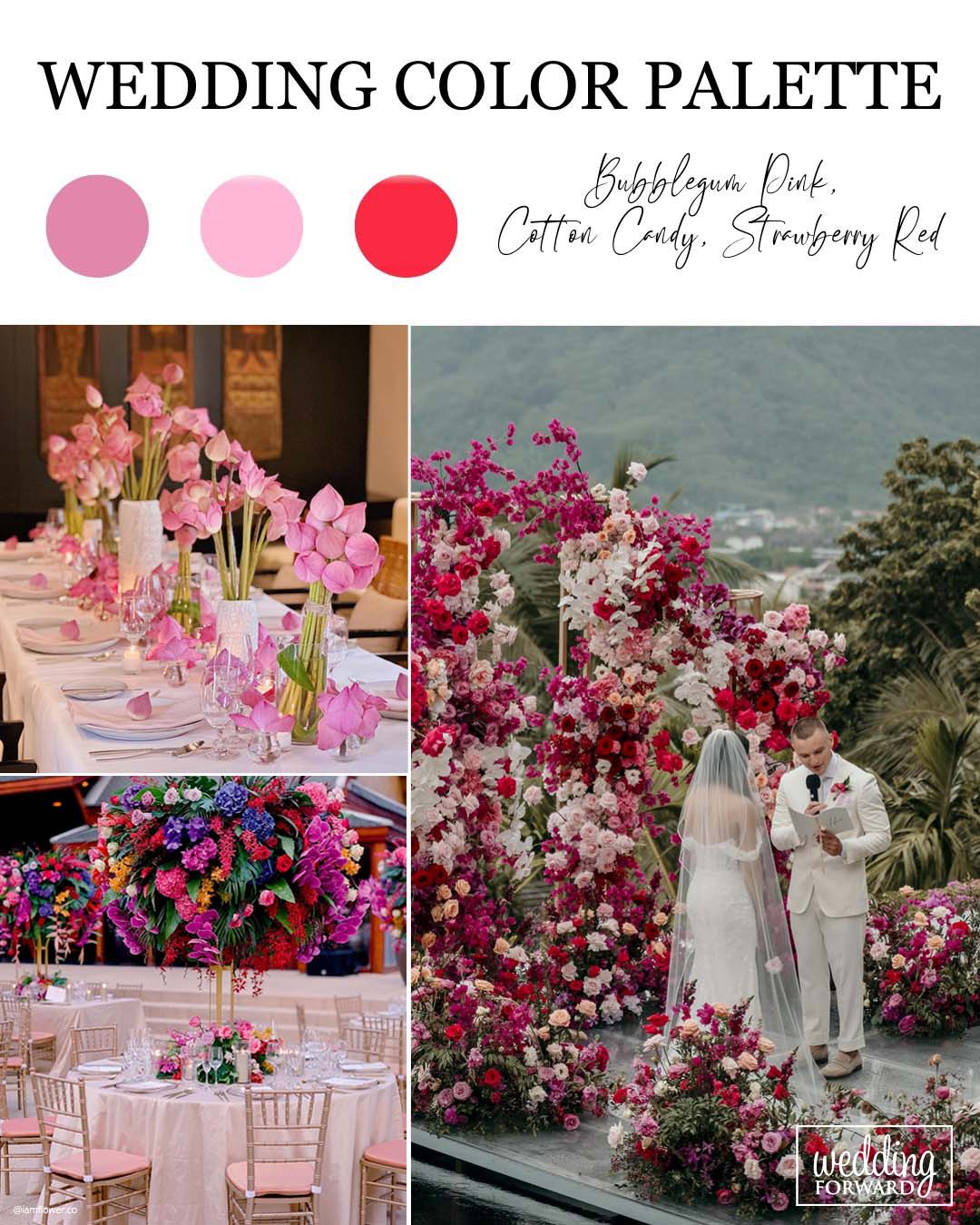
If playful, high energy wedding color combinations have been dancing through your imagination, you should seriously consider this pink and red classic. This buoyant wedding color arrangement thrives in the warm seasons, spring and summer, with alfresco settings like a tented reception or a garden style ceremony feeling like its natural home.
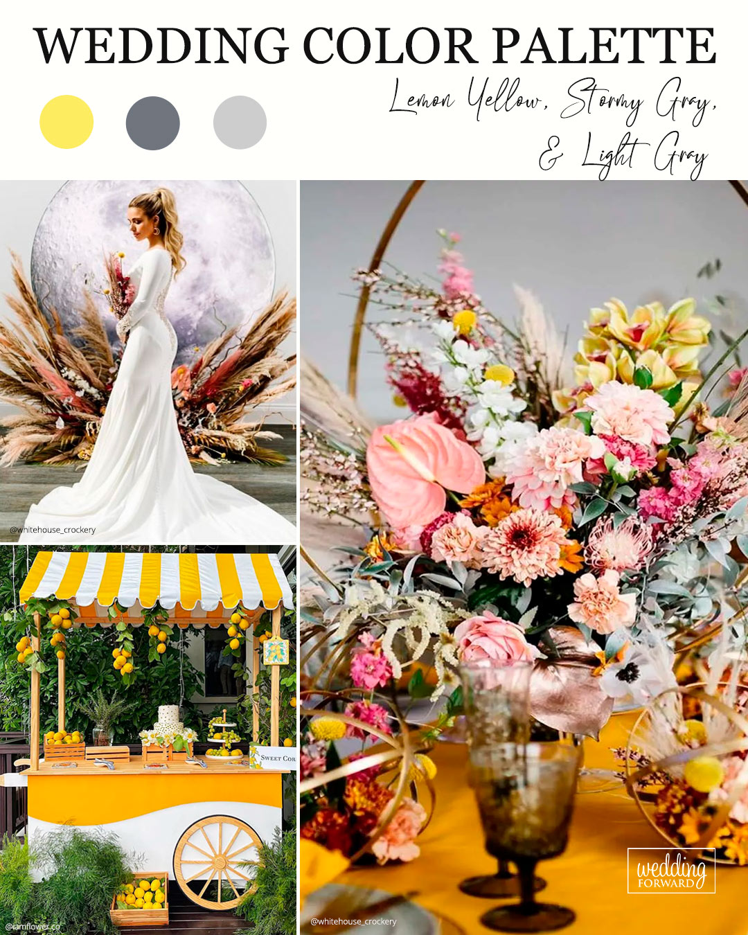
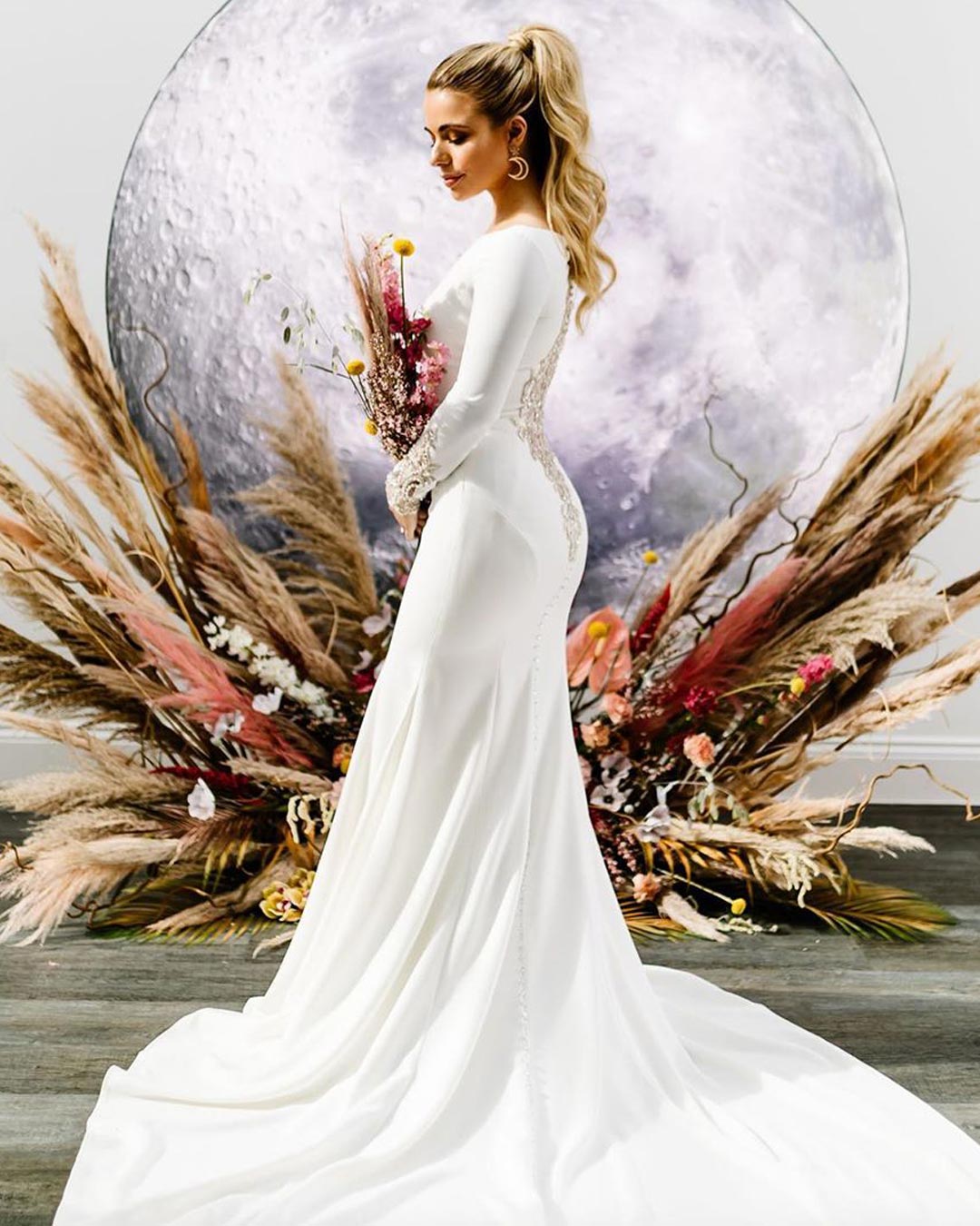

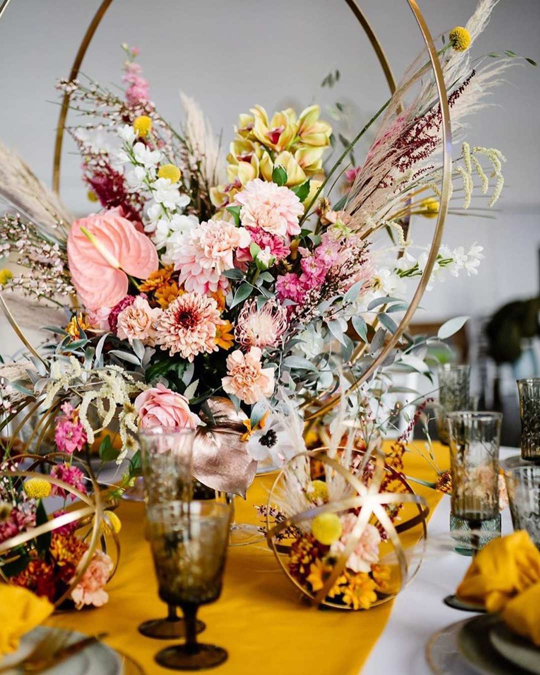
It’s A Match:
A growing number of couples are hunting for a truly distinctive, vibrant, and spirited wedding aesthetic, and if that sounds like your story, then think about the theme of lemon yellow, story gray, and light gray. This arrangement lets the yellow hue take center stage as the star accent while the two separate shades of gray introduce a nuance of shadow and contour.
Popular Color Combinations Of All-time
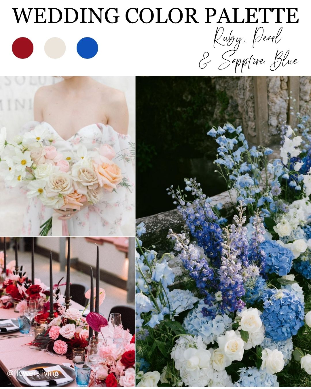
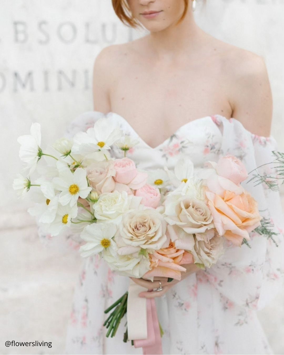
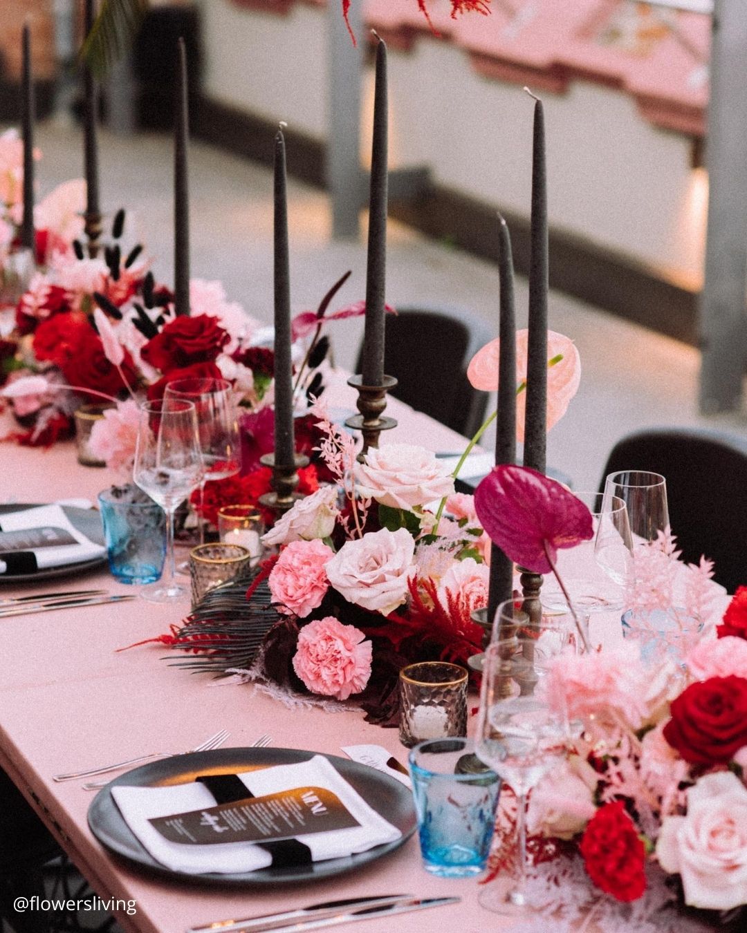
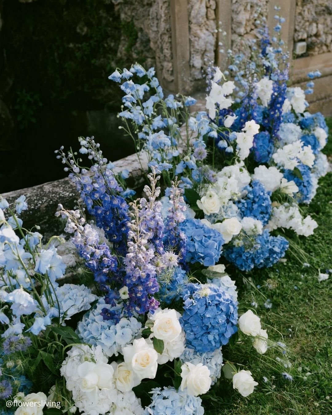
It’s A Match: For a wedding theme that reads as genuinely refined, fits any season, and adapts to nearly any venue, this is exactly the right direction. Jewel tone colors are deeply saturated shades named for precious stones including amethyst, citrine yellow, sapphire blue, red, purple, and emerald green.
There’s a very solid reason this classic jewel toned wedding mix has remained a longtime favorite, its timeless sophistication and understated glamour speak for themselves. Couples organizing a black tie affair can channel this theme to craft a celebration that defines pure elegance.

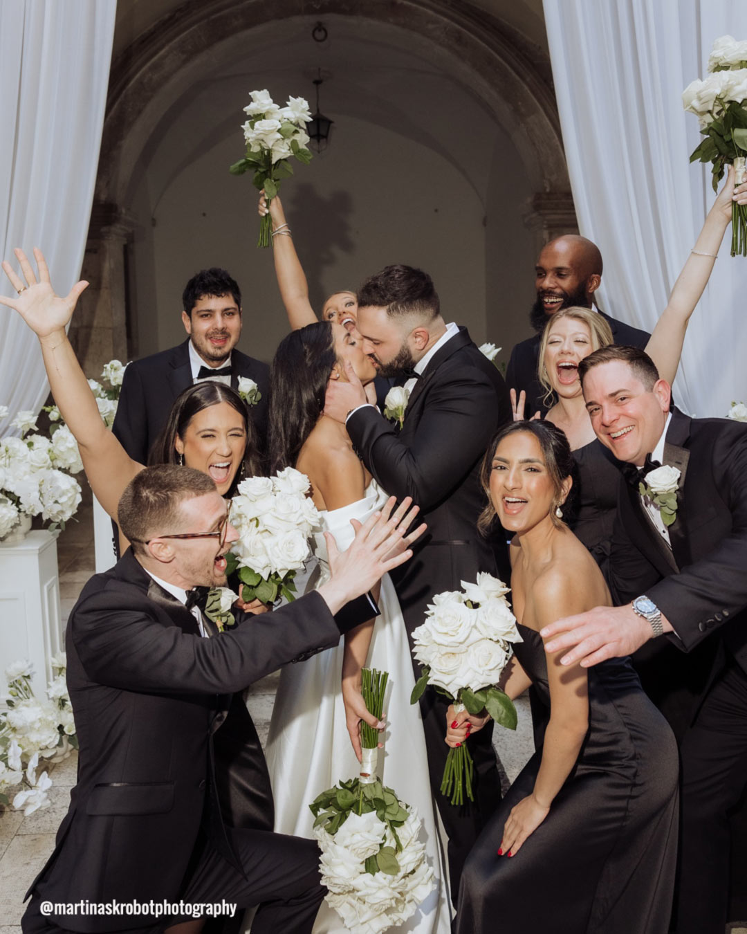
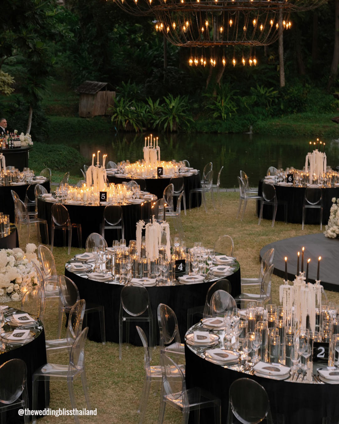
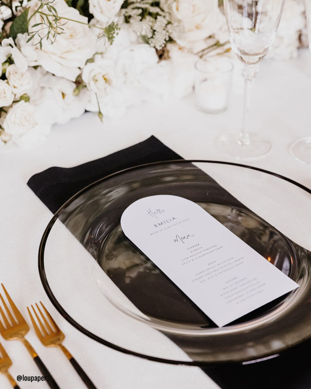
It’s A Match:
Black and white, that ageless and iconic pairing, crafts a visually striking and cultured atmosphere for weddings. The two opposing shades stand for elegance, equilibrium, and the coming together of contrasts.
From the sharp lines of the wedding party attire to the polished tablescapes and decorative touches, the black and white palette injects a dose of refinement and polish into every corner of the celebration. This flexible duo unlocks endless inventive possibilities and personalization, which makes it a superb pick for couples seeking a sleek and sophisticated wedding mood.
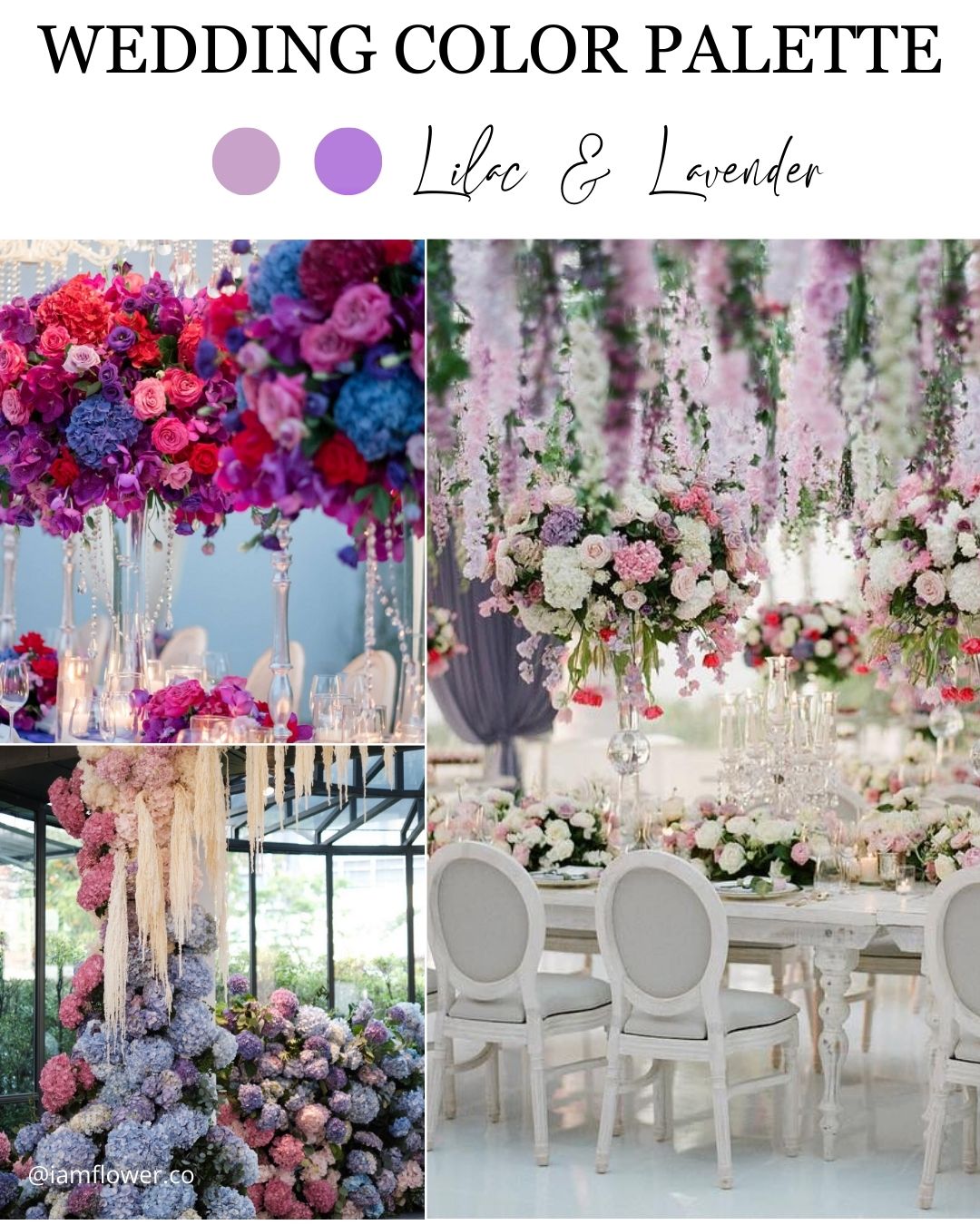
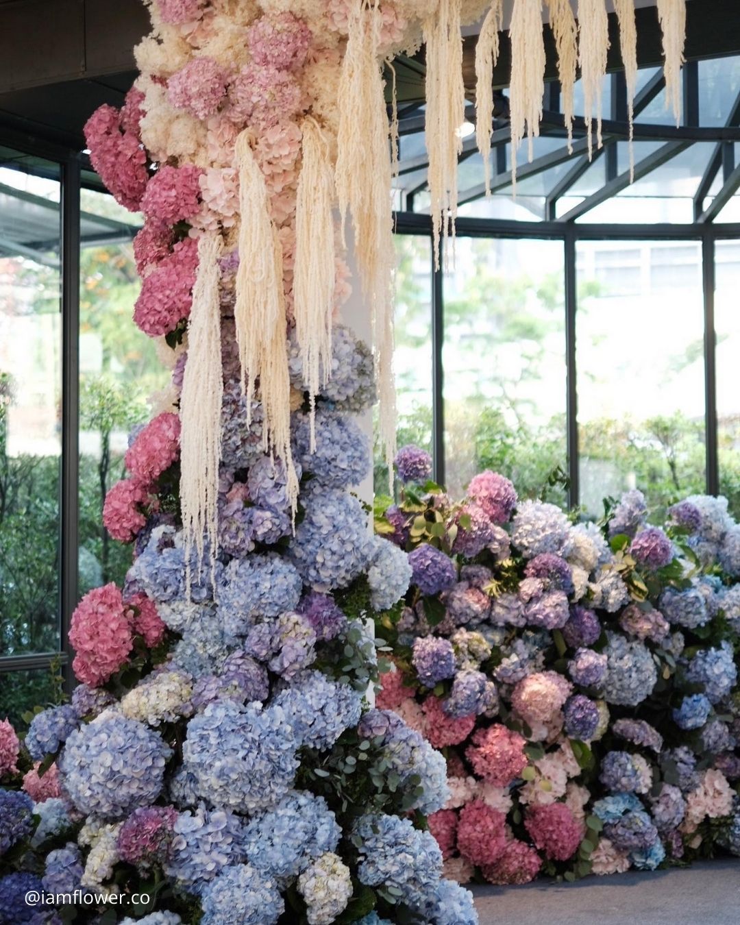
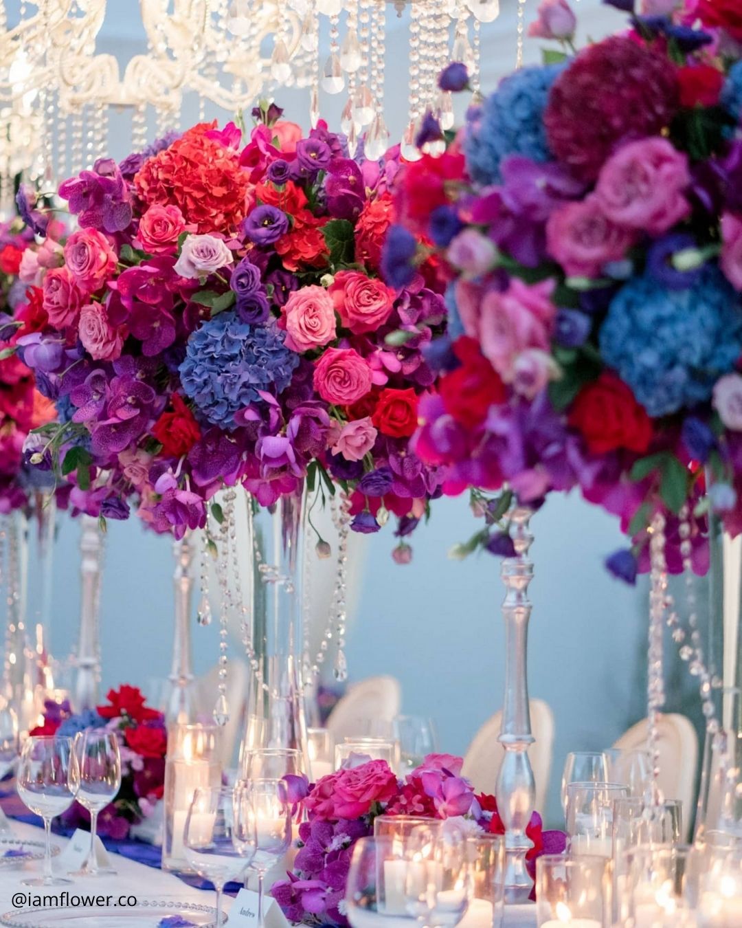
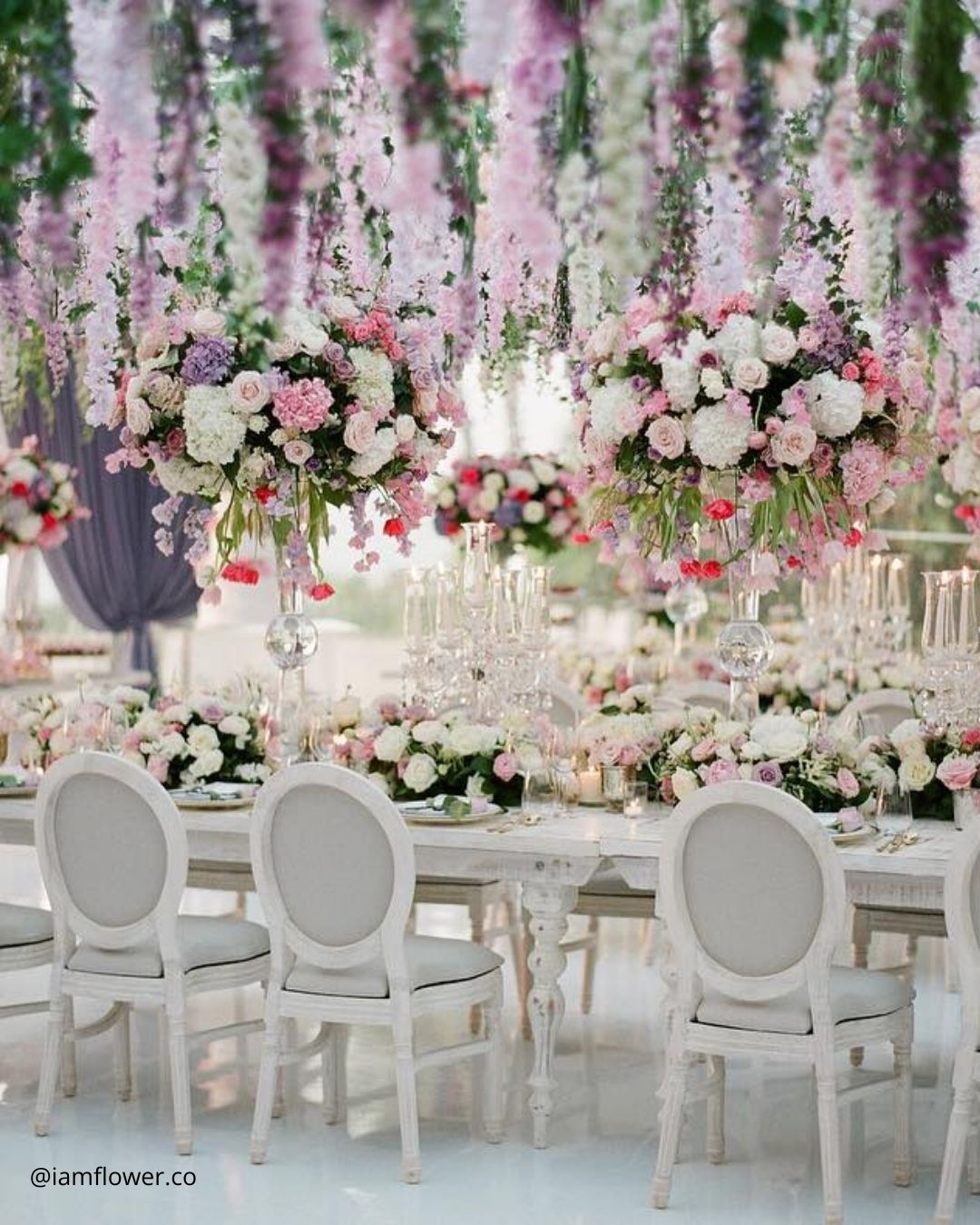
It’s A Match:
Lilac and lavender, two soft and captivating shades, blend together with ease to form a romantic and whimsical wedding color story. The gentle pastel tones call up feelings of calm, grace, and a soft feminine spirit.
Spilling from lush floral installations to bridesmaid ensembles and small decorative details, the lilac and lavender pairing weaves a note of sophistication and playful magic through your special day.
This spellbinding duo provides a peaceful and airy atmosphere, intentionally designed for couples in search of a romantic and captivating celebration. Allow lilac and lavender to spin their gentle spell, shaping a truly memorable and transporting mood for your wedding.
Wedding Color Pitfalls to Avoid
Stay aware of these common traps when settling on your wedding colors so you can build a celebration that feels balanced and welcoming for everyone.
- Overwhelming Color Schemes: Steer clear of gathering too many clashing shades that might create a visually chaotic result. Aim for a restrained color palette where each element supports the others, preserving a tight and intentional look.
- Neglecting the Practicality of Certain Colors: Give thought to the real world side of your chosen shades, like how readily they appear in floral selections or rental items, and how they might shift in different lighting scenarios or camera settings.
- Disregarding Cultural or Religious Significance: Hold space for the cultural or spiritual weight that certain colors can carry, making sure your choices sit comfortably alongside any meaningful traditions or rituals, honoring the couple’s background and creating space where everyone feels included.
- Failing to Consider Color Accessibility for Guests: Keep in mind possible color based sensitivities or vision differences among your guests, such as color blindness or other visual limitations, so that every single person can fully soak in and share the wedding experience.
Choosing your wedding color direction carries just as much weight as securing the venue, defining the theme, and curating the decor. The role your color palette plays in the planning journey is less about highlighting just one or two specific shades, and far more about bringing the entire visual spirit and emotional texture of the event into vivid reality.
Couples pour hours, weeks, and months into orchestrating the perfect wedding celebration, and by selecting a color story that harmonizes with their season, setting, and overarching vision, the day cannot help but become something truly unforgettable.