


Navigating the wedding planning maze is challenging enough. But crossing items off your checklist becomes significantly harder without a defined color palette.
That’s why figuring out how to choose wedding colors early in the process is so crucial. Locking in those hues early brings everything else into sharp focus.
Once you have your colors, you know exactly which dress to hunt for, how to style your venues, what stationery to pick, and how to weave a unified theme throughout the day. Colors also communicate unspoken messages and orchestrate the entire mood, so you really want to nail this decision.
The lingering question is, do you actually know how to pick your wedding colors? If you feel a bit lost, this guide on how to choose a wedding color palette is here to help.
This post addresses every one of your questions and lights the path forward.
Main things to consider when choosing wedding colors
Grasping how to choose colors for your wedding palette involves making a few thoughtful considerations. Here are the key factors to weigh before you finalize your color choices.
You don’t have to blindly chase a trend if it doesn’t resonate with you. But certain colors naturally elevate each season, as you’re about to discover.
Popular fall color combinations
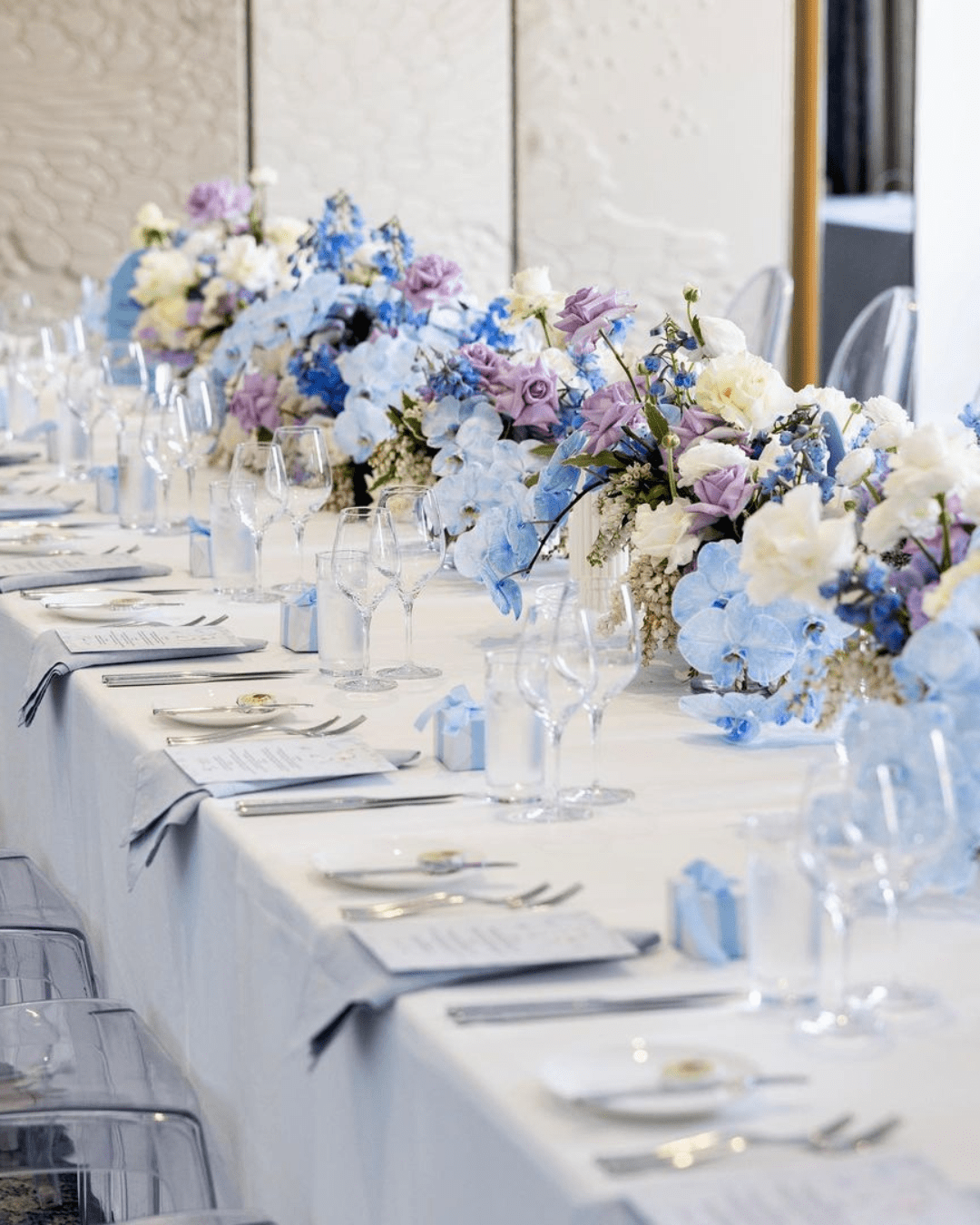
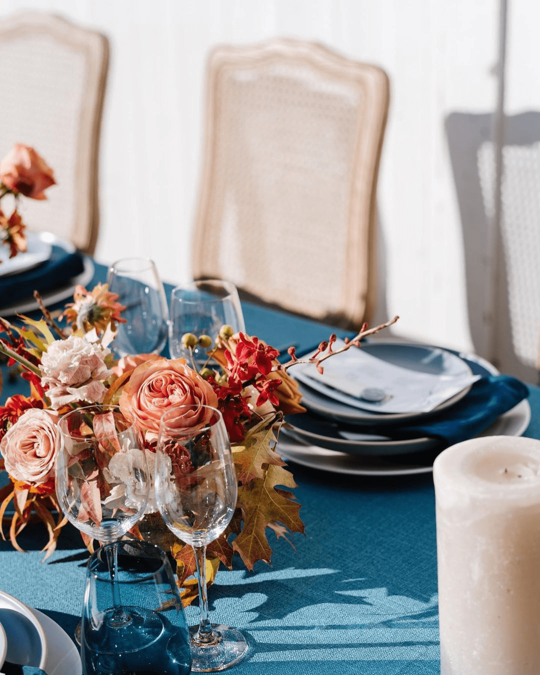
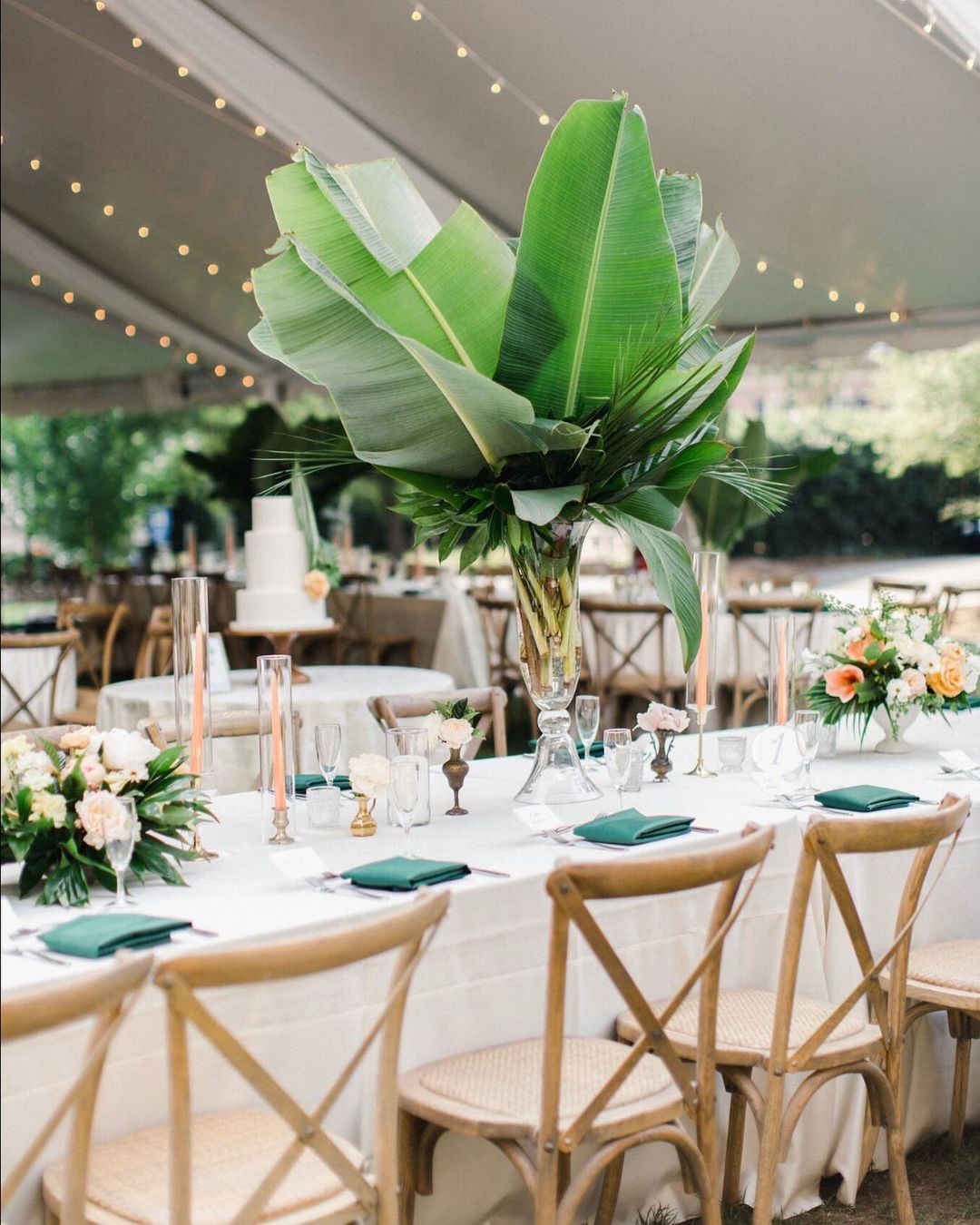
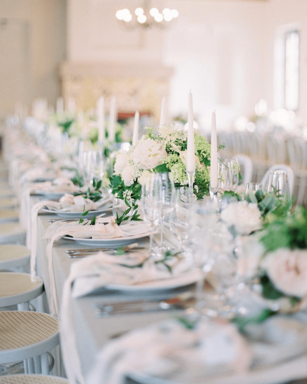
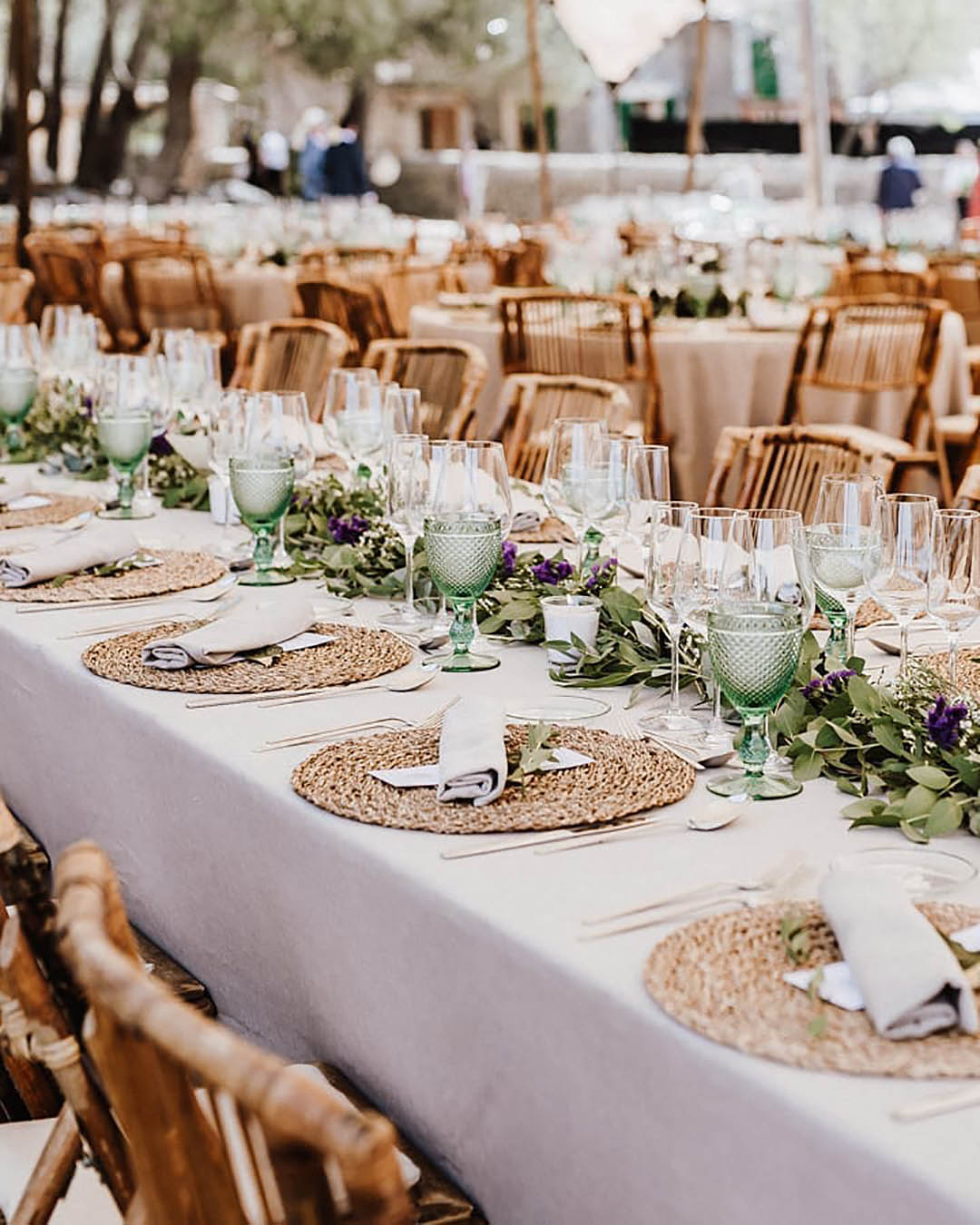
Blush, frost, and boysenberry feel calm, romantic, and brimming with rich fall color, perfect for Bohemian celebrations. Pineapple, charcoal grey, and Cardinal red create a bubbly yet laid back combo for industrial chic weddings. Hunter green, orange, and brown deliver a luxurious, lush, and energetic spirit for a country wedding theme. For a nautical or beachy setting, hot maroon, cameo pink, and Aegean blue are an absolutely perfect match. Silver, beige, and dove gray form a whimsical combination for the ideal fall wedding.
Nature inspiration examples for choosing fall colors
Fall might just be the single most stunning season of the year. When choosing your colors, draw inspiration from the red, orange, and yellow leaves changing all around you.
Absorb the warm and vibrant hues of the natural environment.
Meditate on the rich jewel tones painted across the landscape. Think about ripe, tastier fruits, seasonal foods, and the lively energy of the countryside.
Popular Winter Color Combinations
The winter season feels calm and deeply cold. But you can instantly bring the fire with a Marsala, Aubergine, and bright red combination.
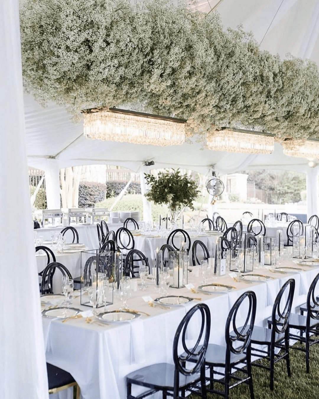
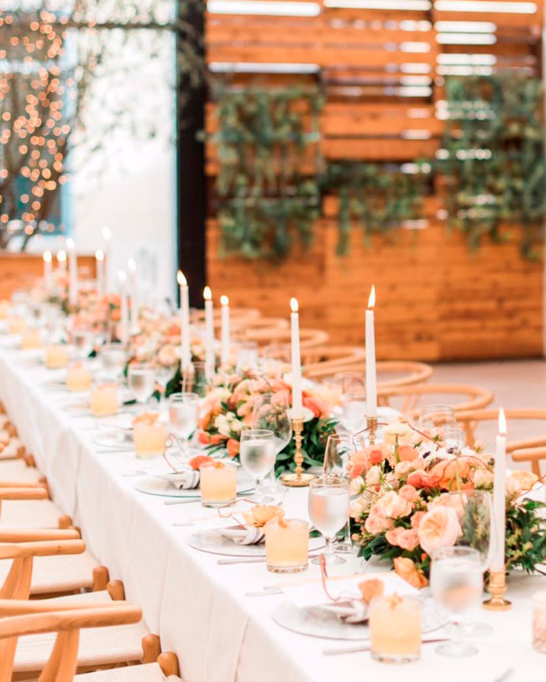
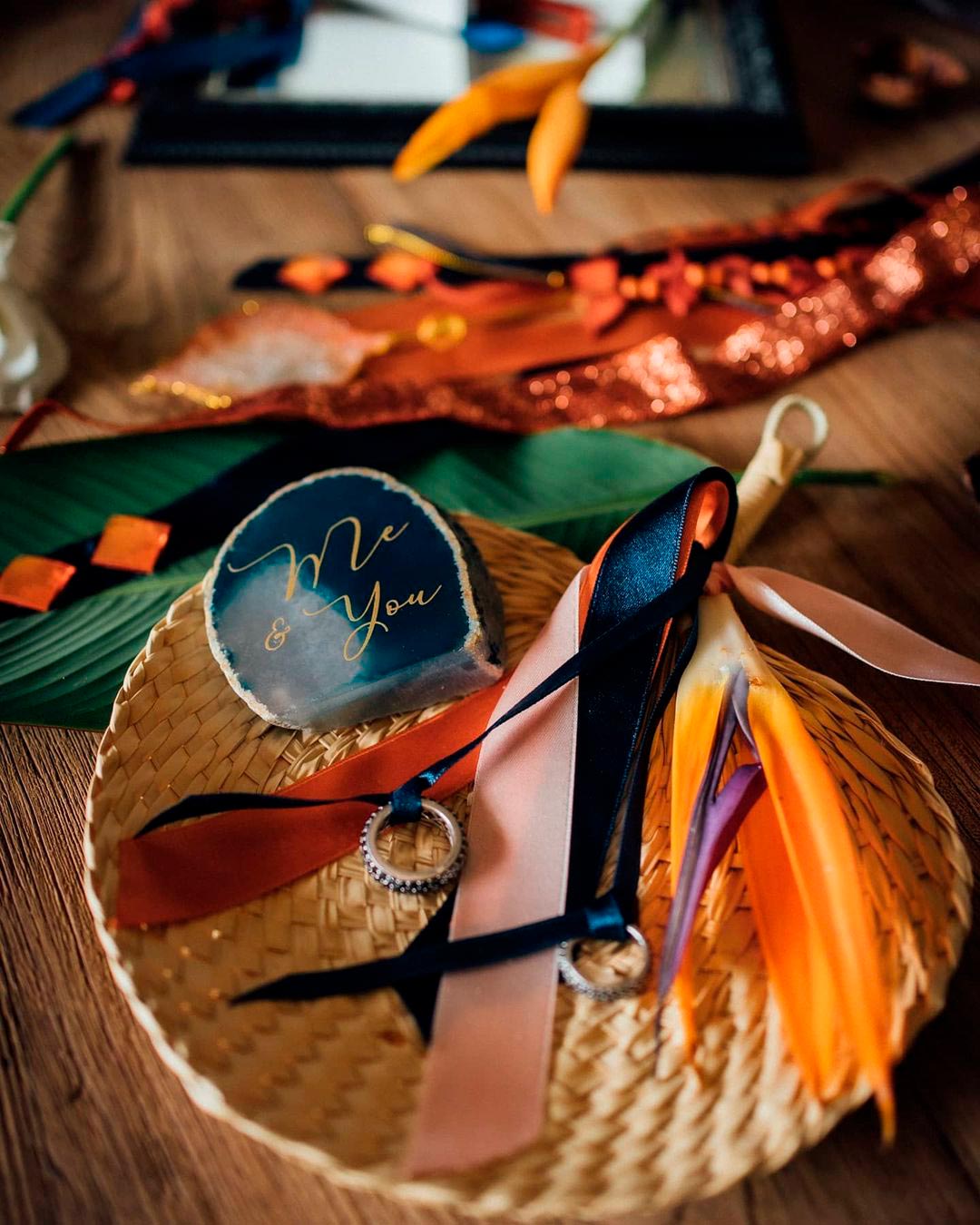
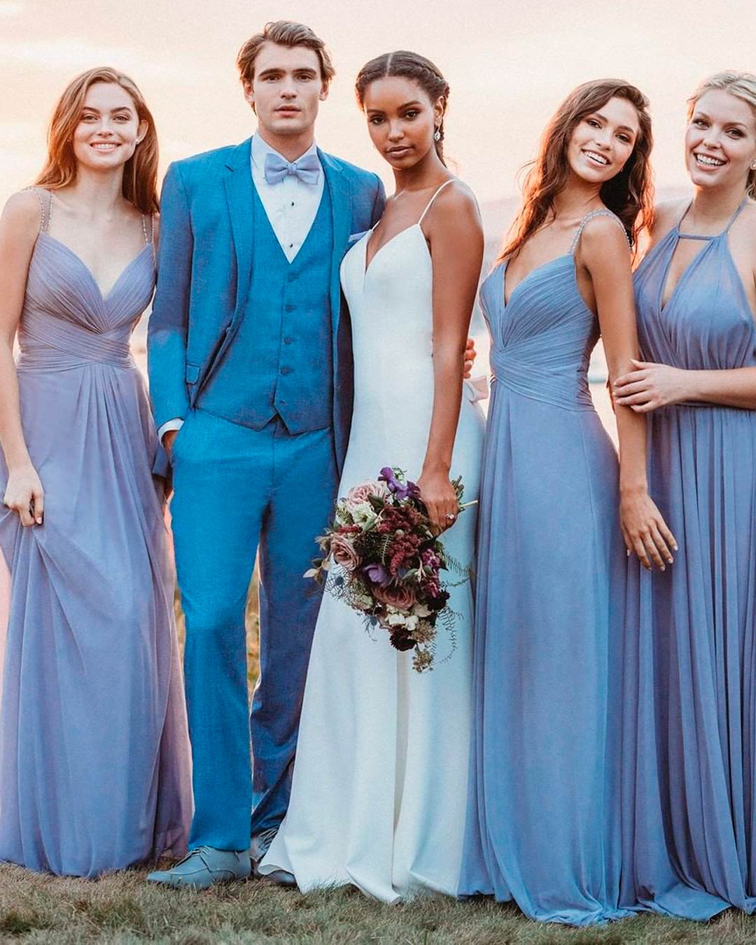
For a classic wedding theme, black, gold, and ivory make a perfect blend. Peach and forest green with a metallic accent will suit a rustic chic theme beautifully. Marigold, cream, and turquoise is a serene yet commanding palette fit for a whimsical celebration. And for the boho or waterside wedding, white and dusty blue or indigo and orchid combos are simply perfect.
Nature inspiration examples for choosing winter colors
Winter is chilly yet absolutely breathtaking. Natural elements like a fluffy white blanket of snow can craft a panoramic, picturesque scene.
The blazing orange, red, and blue cozy fires and colorful winter veggies with fruits keep your inspiration flowing. You can also pull ideas from winter blooms like roses, orchids, French tulips, mini gerberas, gardenias, Casablanca lilies, and so much more.
Popular spring color combinations
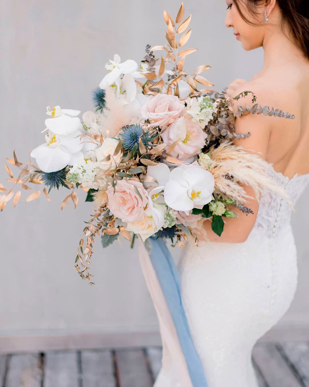
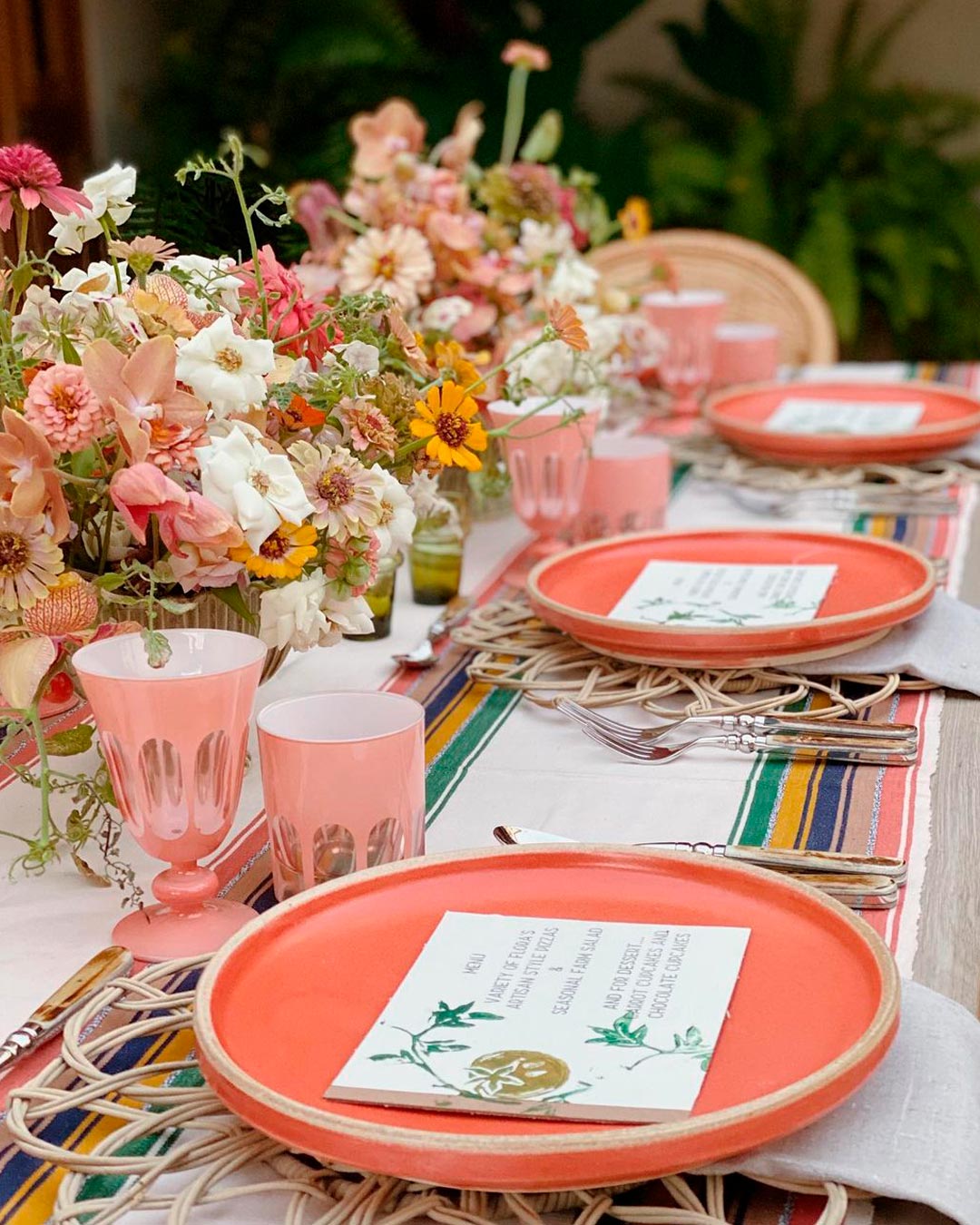
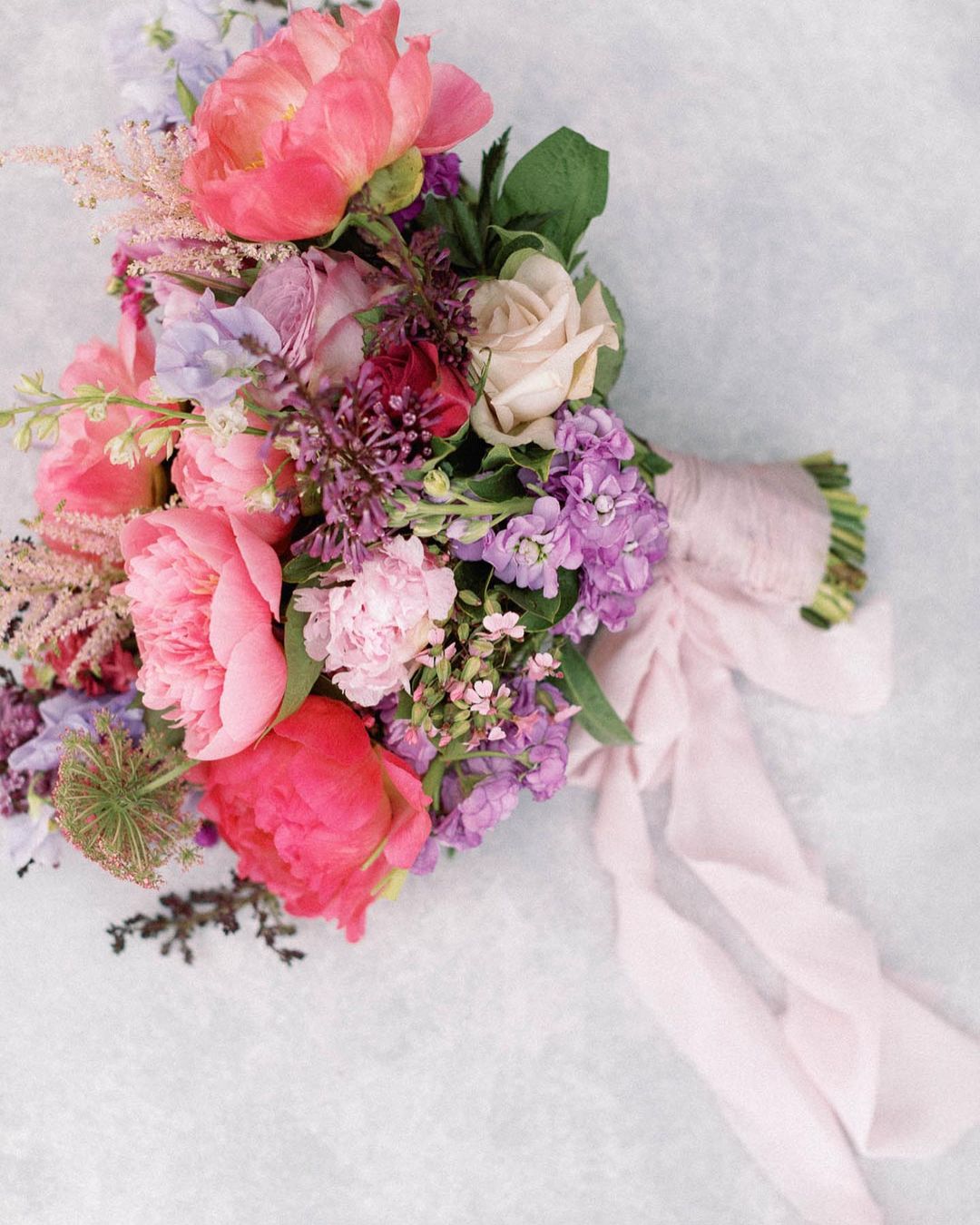
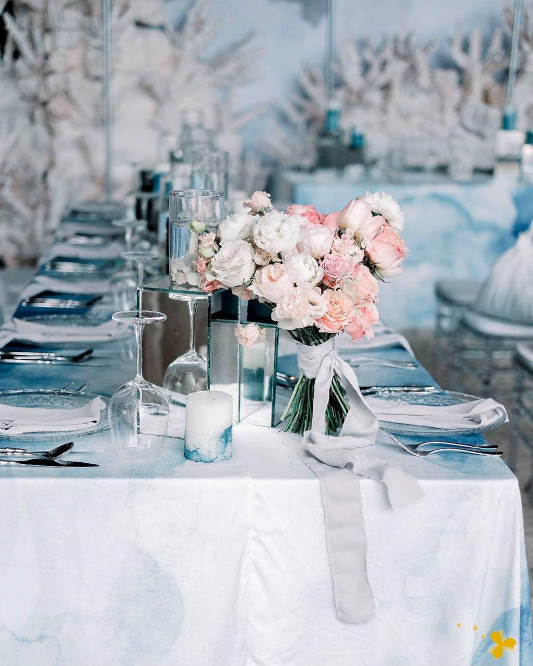
For a magical and elegant wedding with a rustic quality, build your palette around a dusty blue and white combination. The light pink, white, and ice blue combo is fantastic for rustic, vintage, and modern elegant themes. Green and coral make a refreshing and vibrant combo for country chic and outdoor wedding styles. The delicate gold and mint combination stands as a classic and refined choice for the truly timeless couple.
Nature inspiration examples for choosing spring colors
Spring is the prime season for hosting outdoor weddings. You can get inspired to choose your colors from the endlessly clear blue skies.
Think about the bright, lengthening days, the blooming bulbs, and the budding tree leaves. The earth also throws off rich tones as it comes alive, creating truly ethereal palettes.
Popular summer color combinations
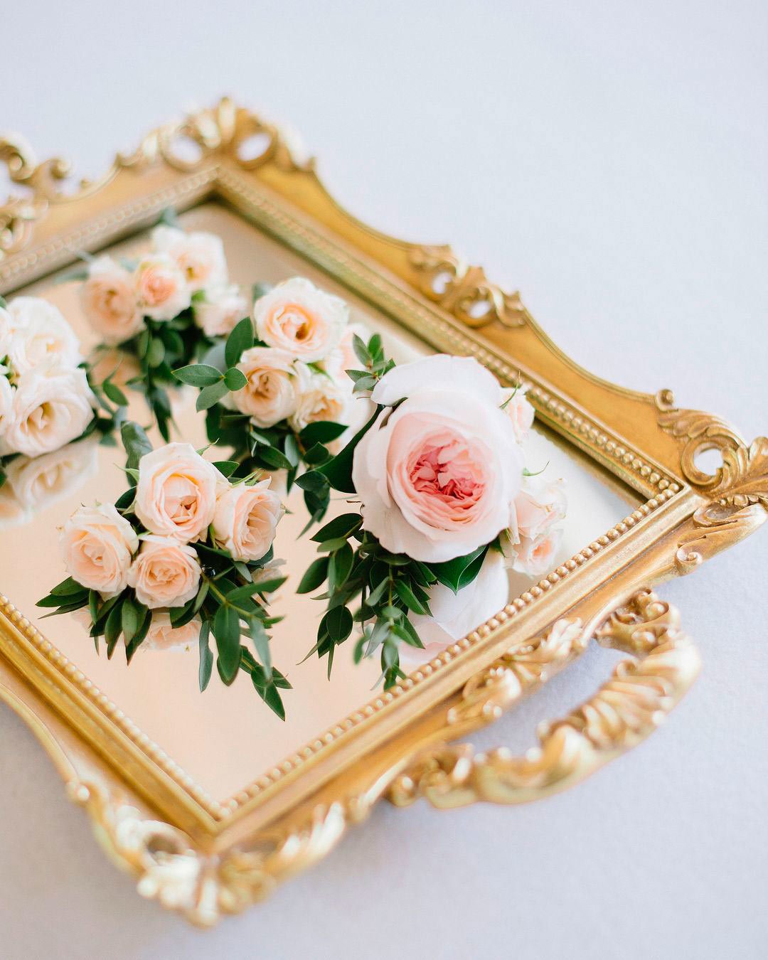
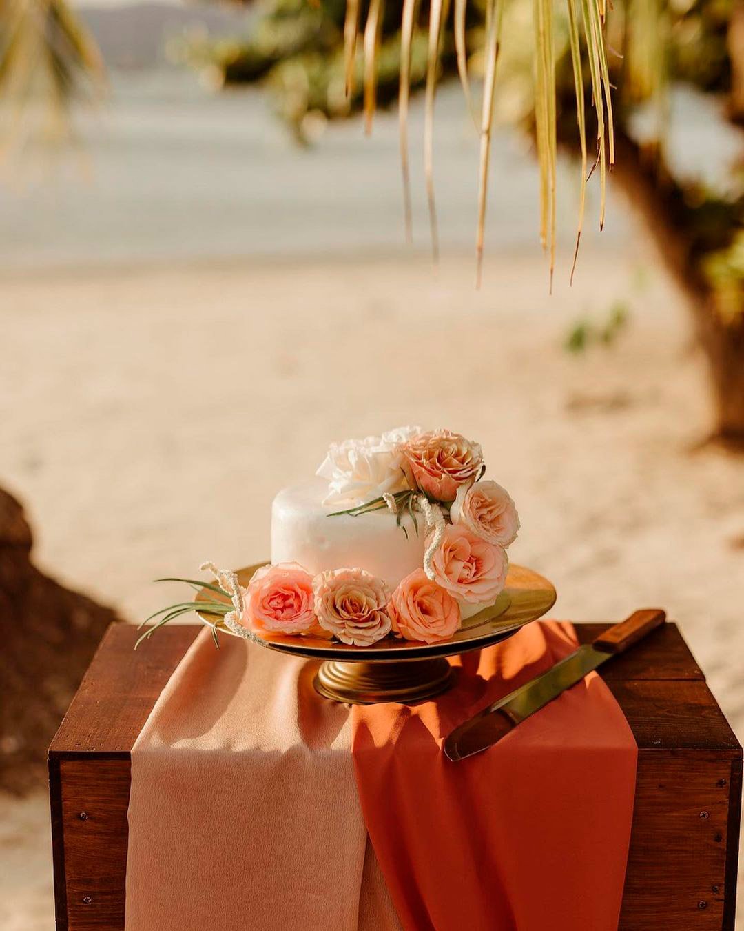
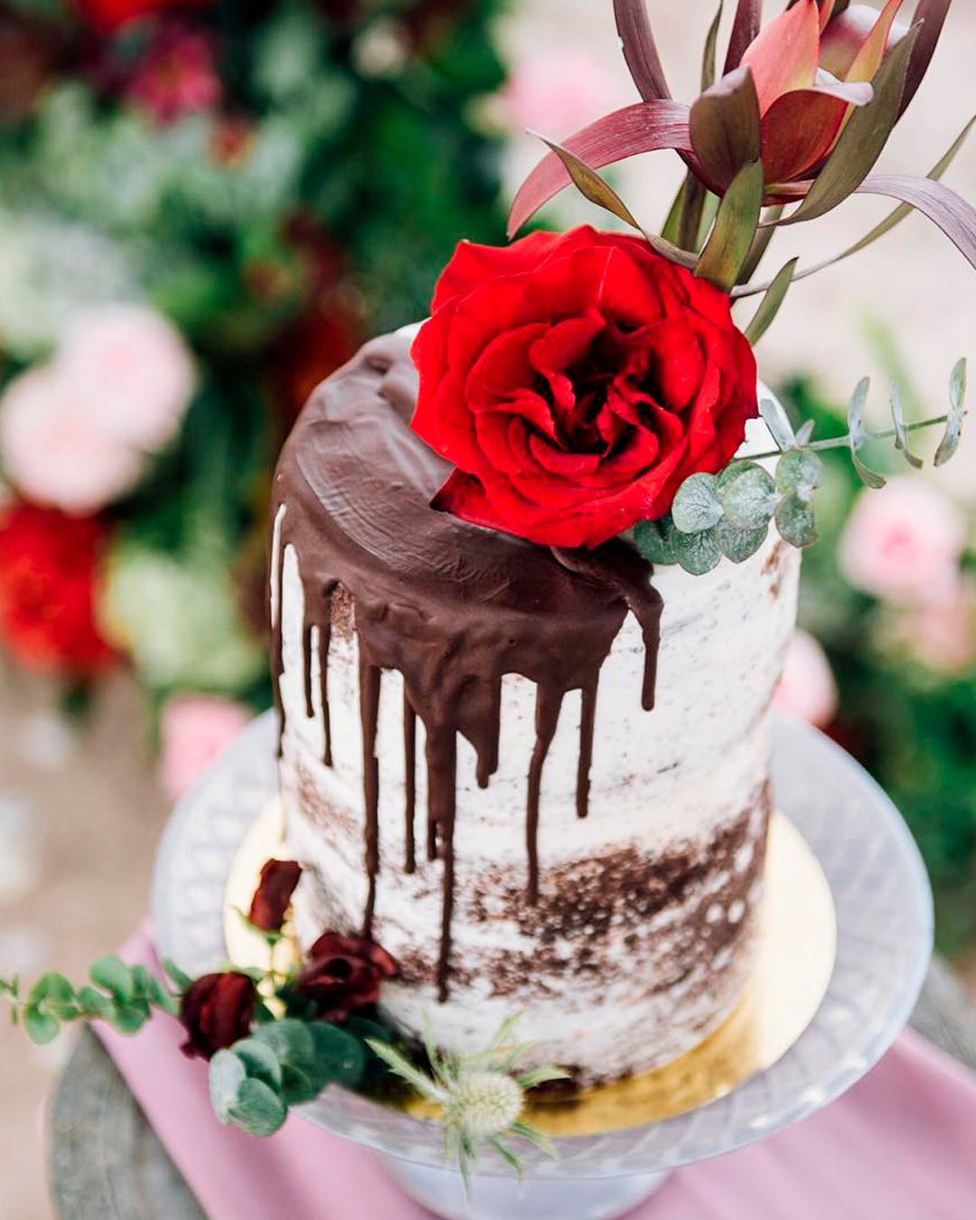
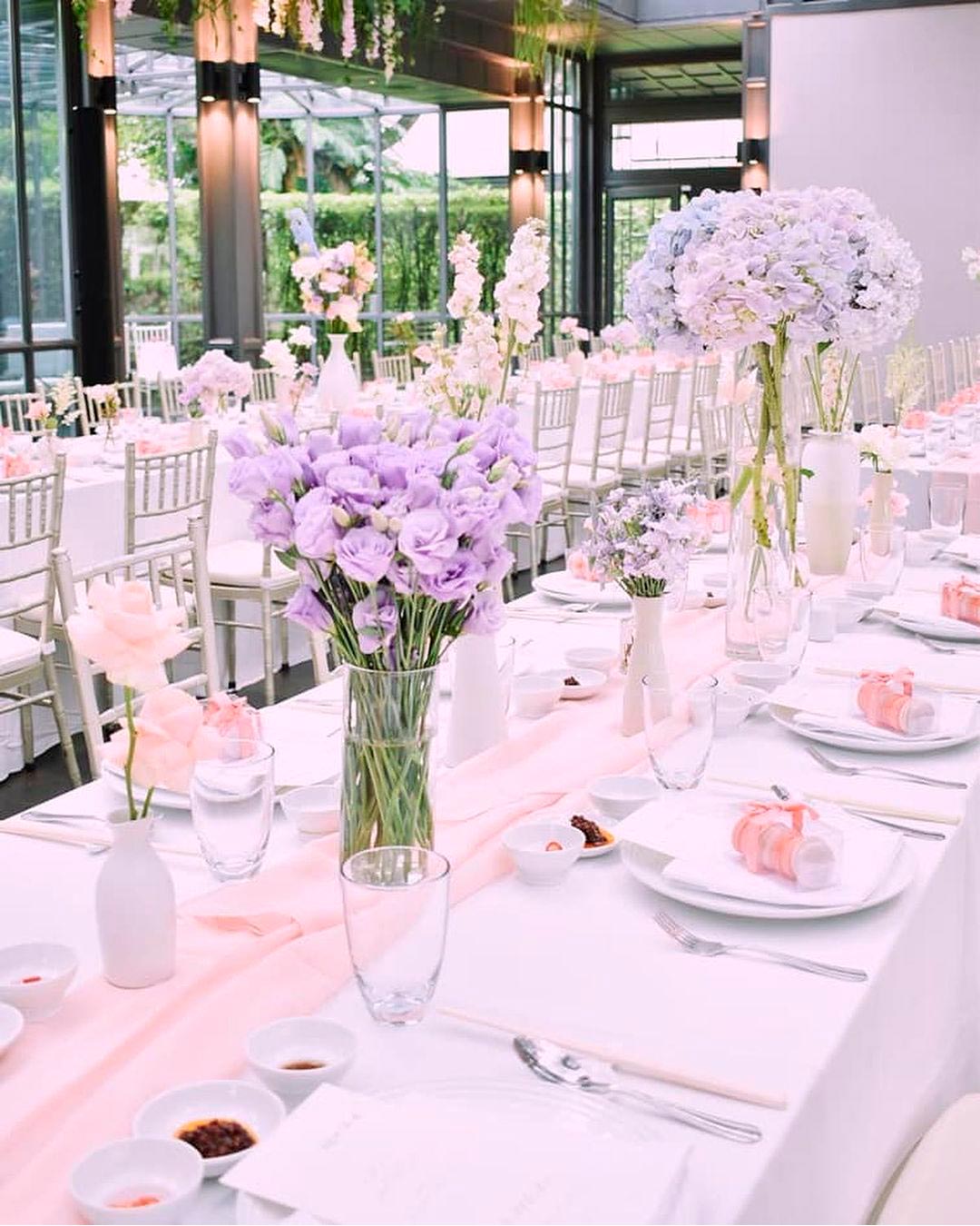
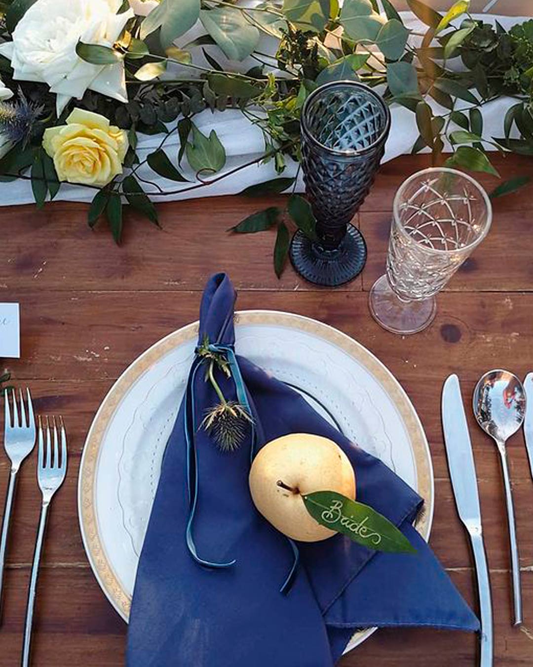
Sage and poppy is a warm yet serene combo that lends itself beautifully to tropical tones and leafy motifs. Green, white, and gold is a summer color combination for the classy, neutral, and glam loving palette. Cream, classic blue, and grey is simultaneously a romantic and hypnotic combination. Orange, pineapple, and pale pink is a vibrant, sorbet sweet combo for a playful or bohemian theme. And for every kind of outdoor wedding theme, wrap your arms around a lilac and lavender combination.
Nature inspiration examples for choosing summer colors
The fiery, vibrant sunshine during the day and that Tetrazzini sunset provide a glorious color inspiration. The sun transfers its energy to everything around it, bringing the whole world to life.
Also, look at the calm water, budding flowers, and sun bleached leaves. There is so much in summer nature to tickle your fancy.
How do I choose a color scheme for my wedding? I want something that’s unique and will stand out to my guests.
A PANTONE obsessed approach is the name of the game here, constantly renovating style by following the latest seasonal color palette and proposing innovative ideas for a unique wedding design. Trends research and development happens partially “live” while traveling and discovering the world, and partially online with a press review of the most famous Wedding and fashion Blogs worldwide.
Then Pinterest becomes the tool to collect the ideas and give the choices to couples.
– Ilaire, Phuket Wedding Planner
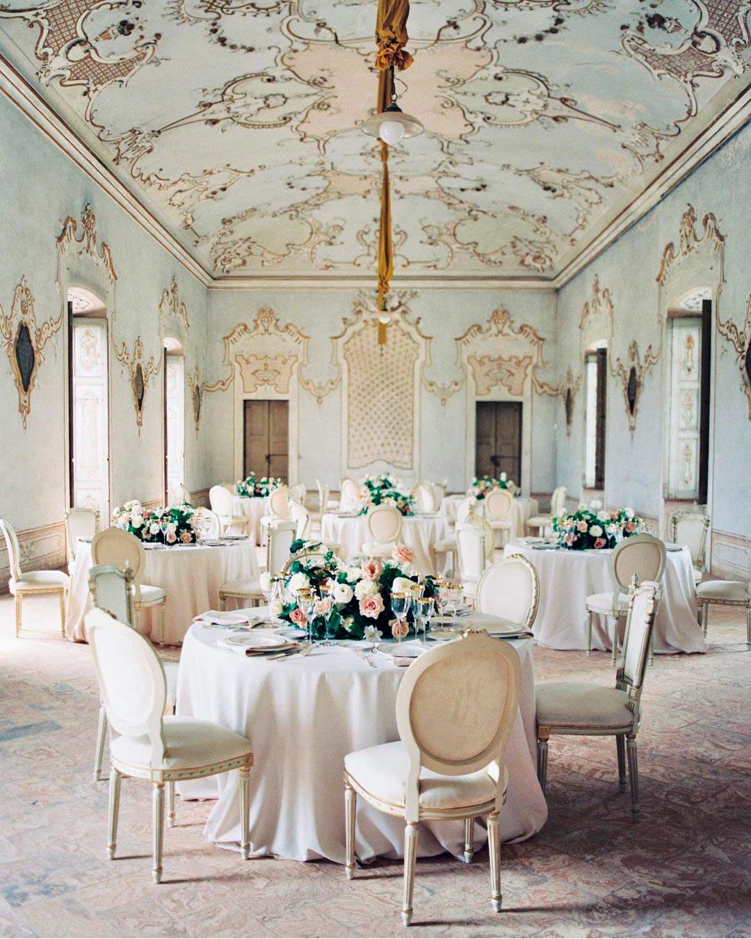
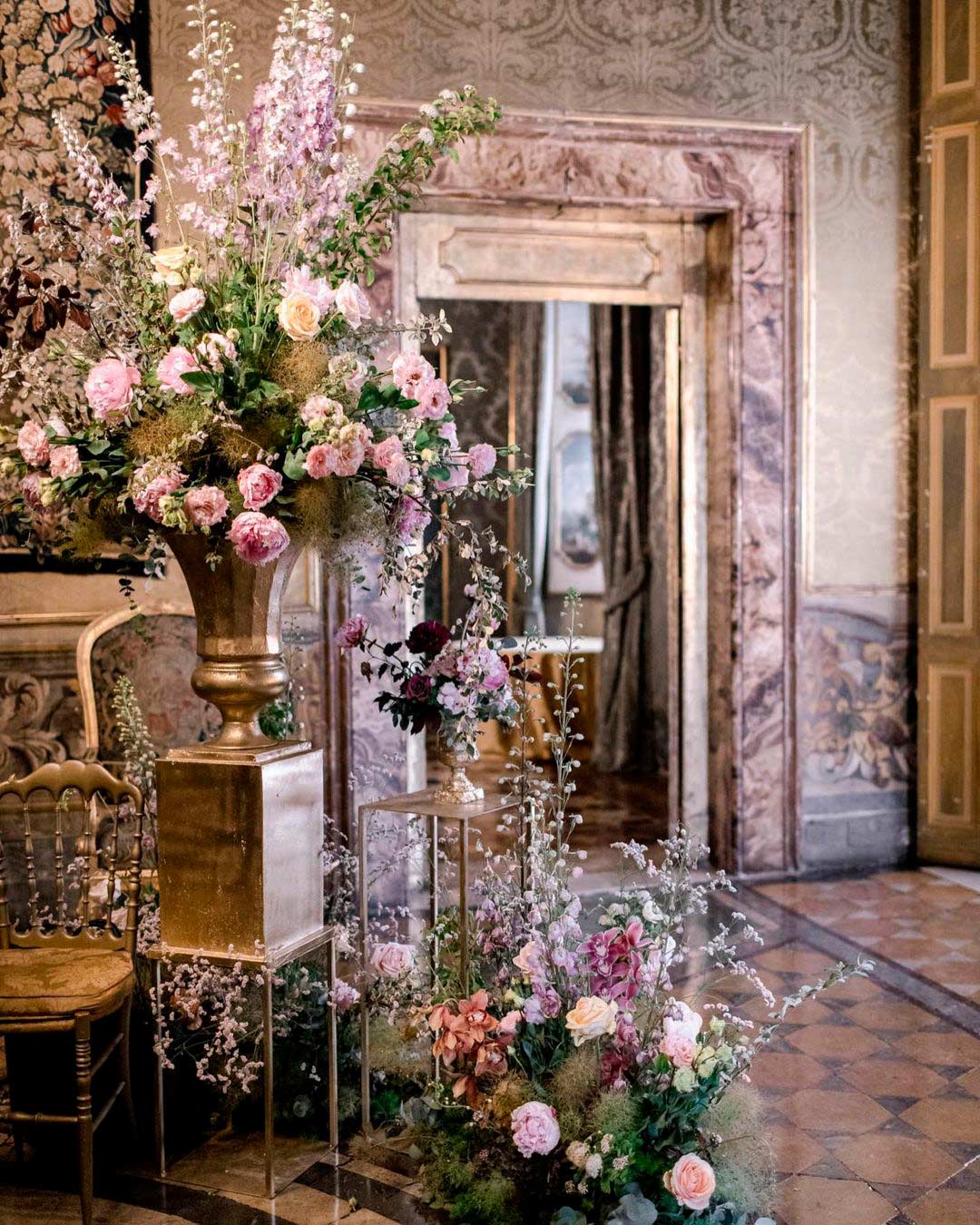
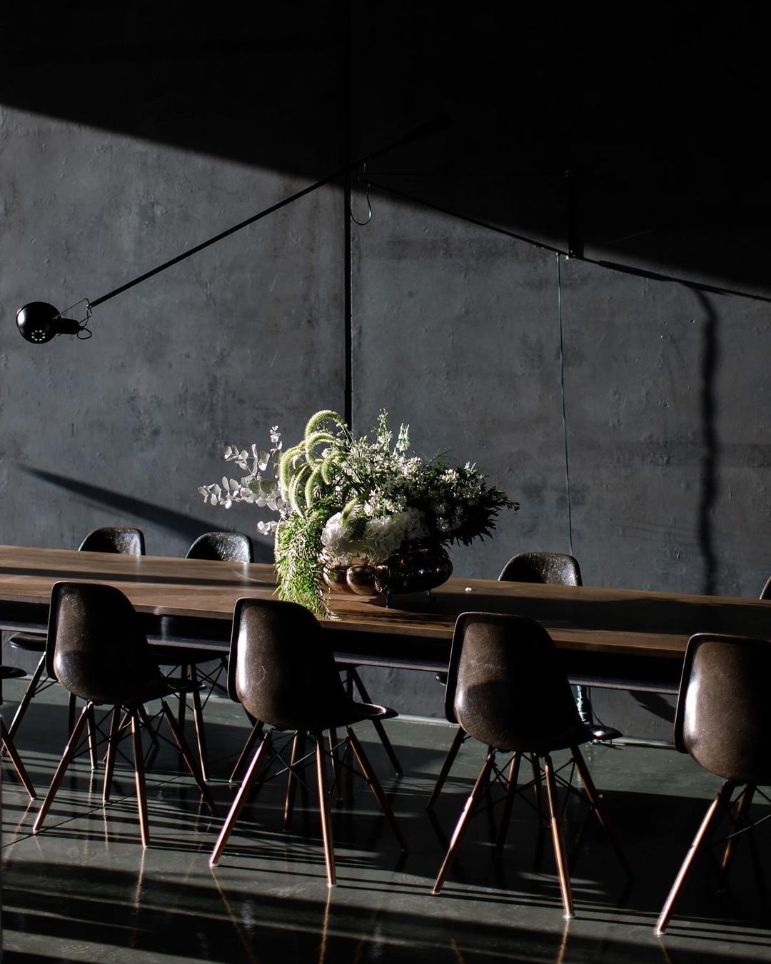
The layout of your wedding venue directly dictates the kind of colors you should choose from. Is your wedding happening outdoors and surrounded by nature?
Then choose colors that seamlessly blend into the surroundings instead of competing with them.
Go for earthy tones, or bold and bright palettes. If you’re working within an ornate indoor venue, embrace neutrals and pastels.
These tones enhance the existing aesthetic presentation. But if the venue feels completely bare, then you get to work your magic by assembling your colors entirely from scratch.
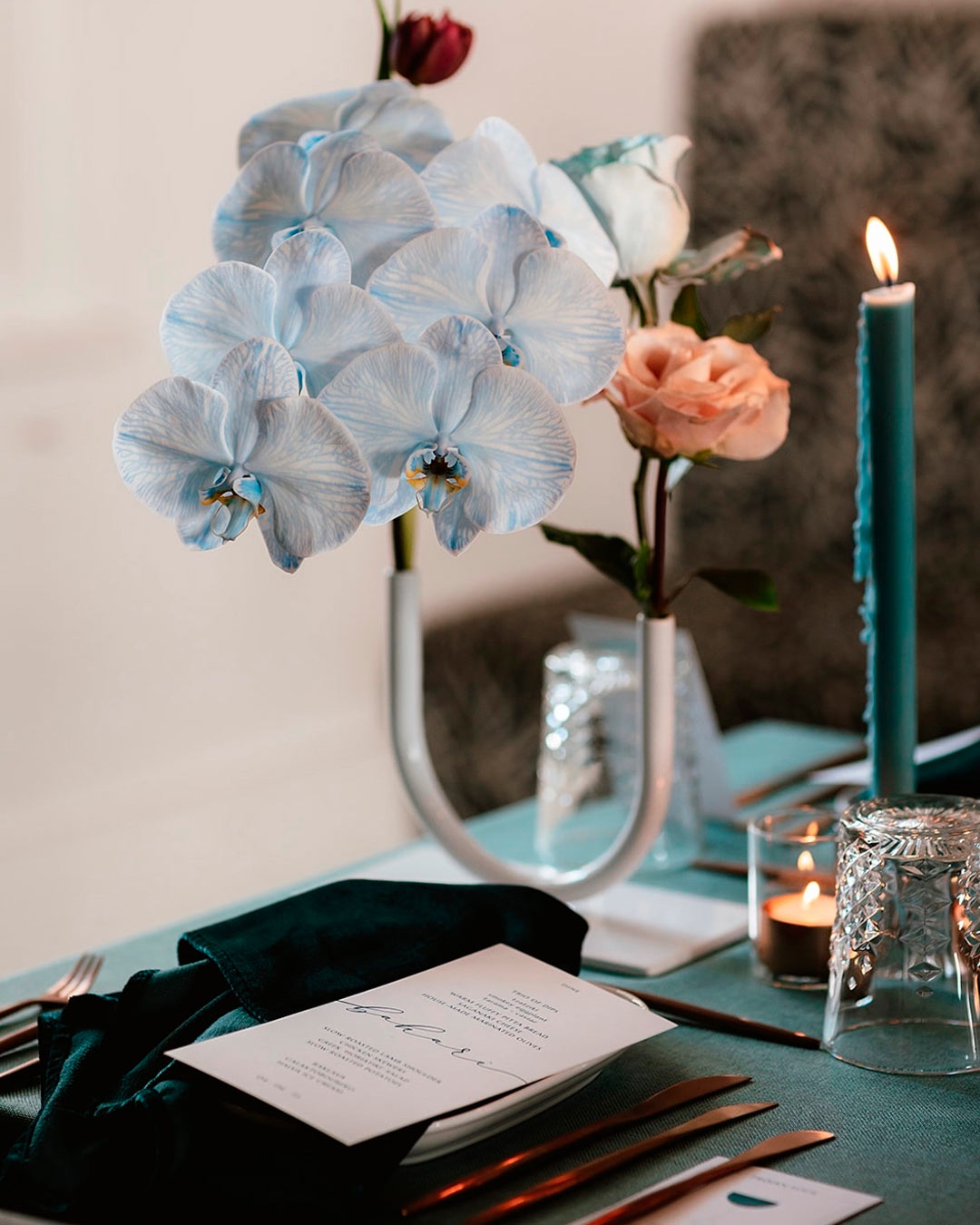
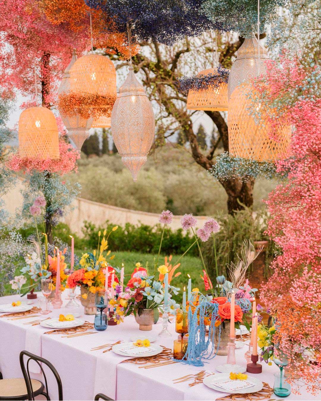
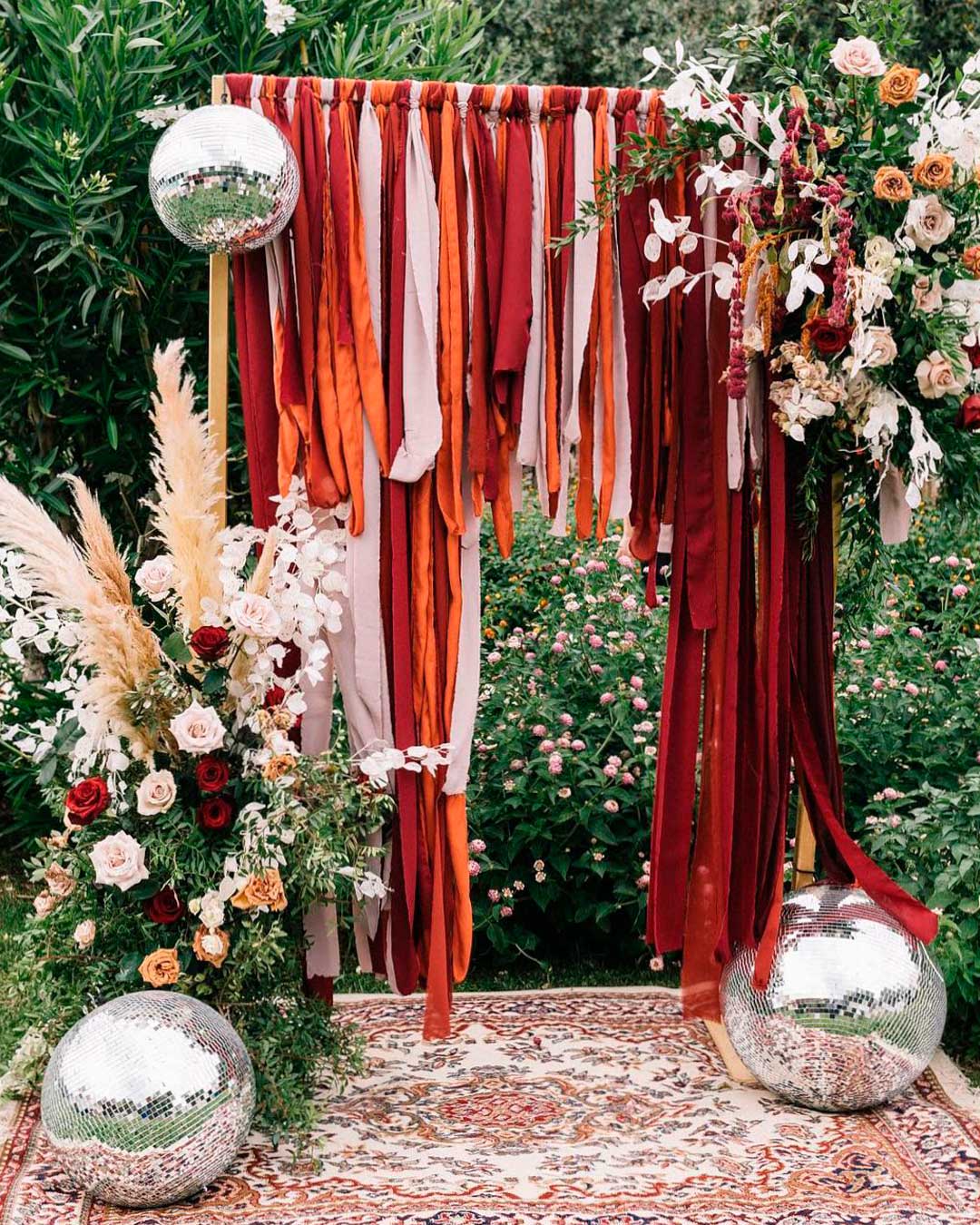
Before you lock in your final color palette, you need to do a bit of research. Some of your favorite hues might not be easily found in nature.
So you have to look closely at your choice of flowers to ensure your specific colors are actually available.
Learn how to choose linen colors for curtains and tables by thoroughly checking your textiles. Check for the hues available in stationery card stock, decorative accents, and various accessories.
Also, pore over real weddings and look out for color combinations that genuinely appeal to you. Judge them based on cohesion, photograph compatibility, accessibility, and your own personal style.
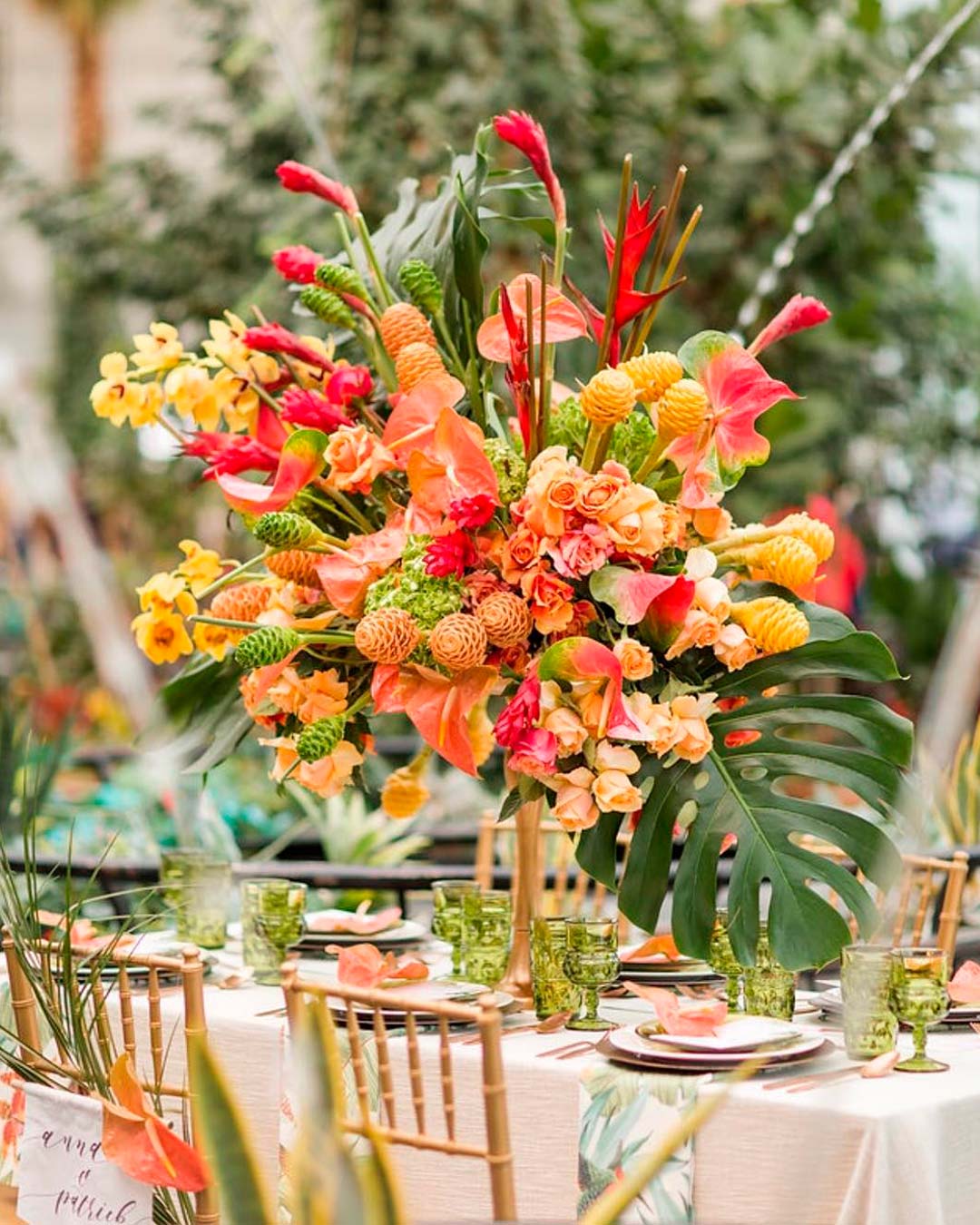
As you choose your colors, always remember that they should be direct expressions of your personalities. So choosing your colors mustn’t be exclusively about trends, but rather what you genuinely love.
What is your signature color?
Check your dress closets, your makeup box, your shoe collections, and even your own kitchenware. Chances are high that you consistently buy the colors you love the most.
Incorporate them directly into your wedding because, as the mantra always goes, it’s all about you.
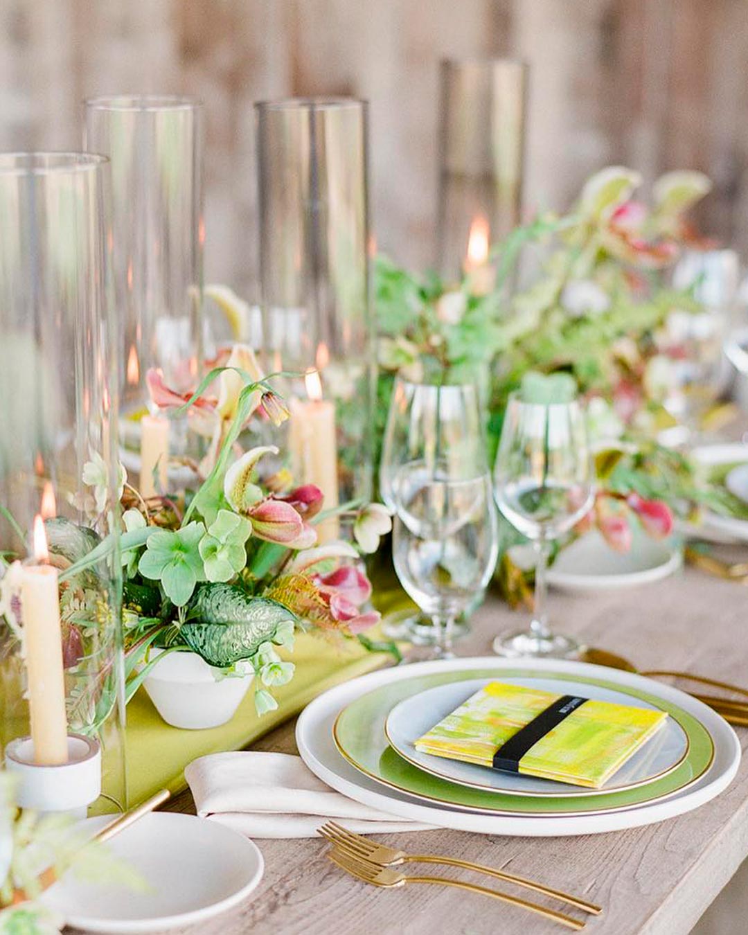
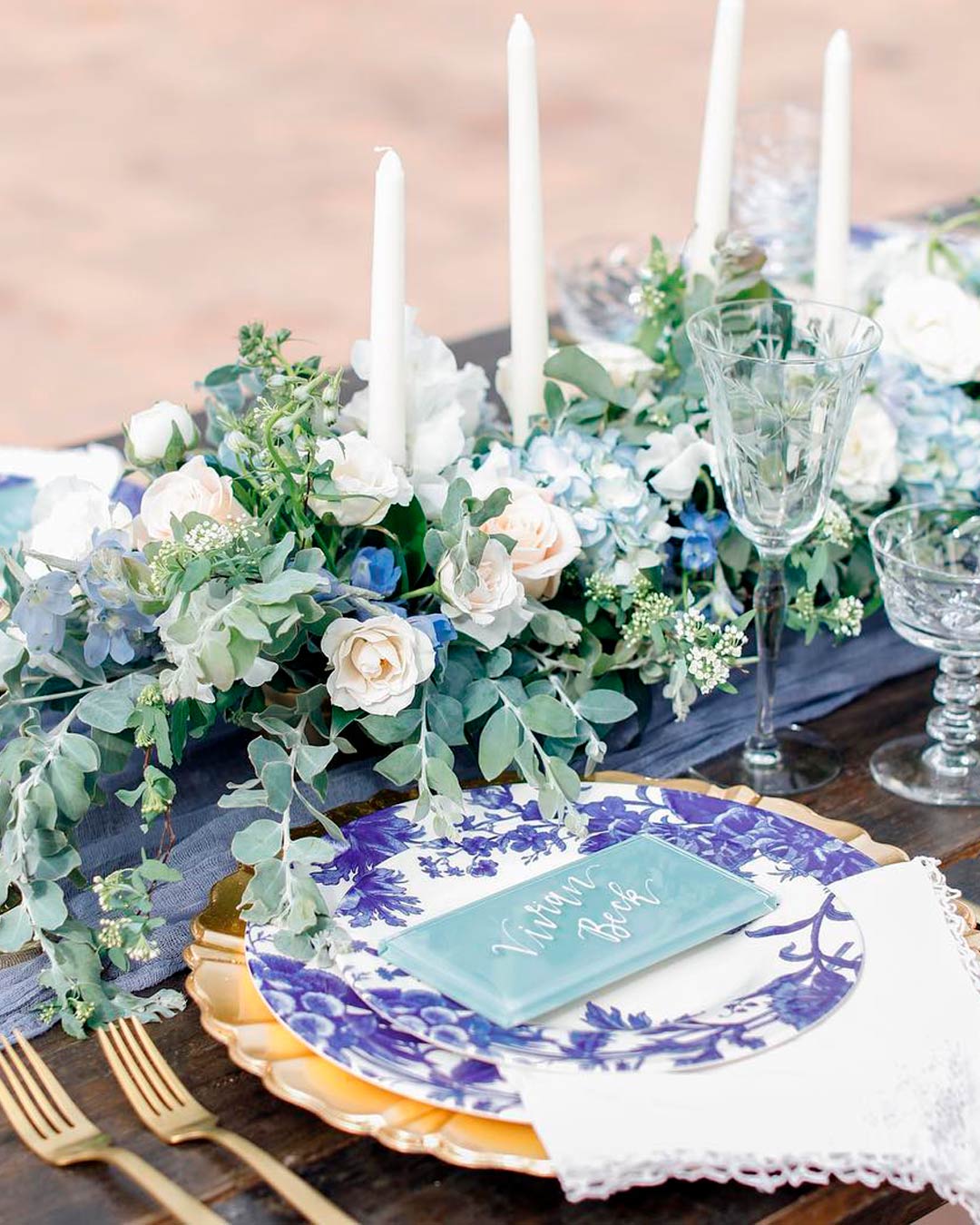
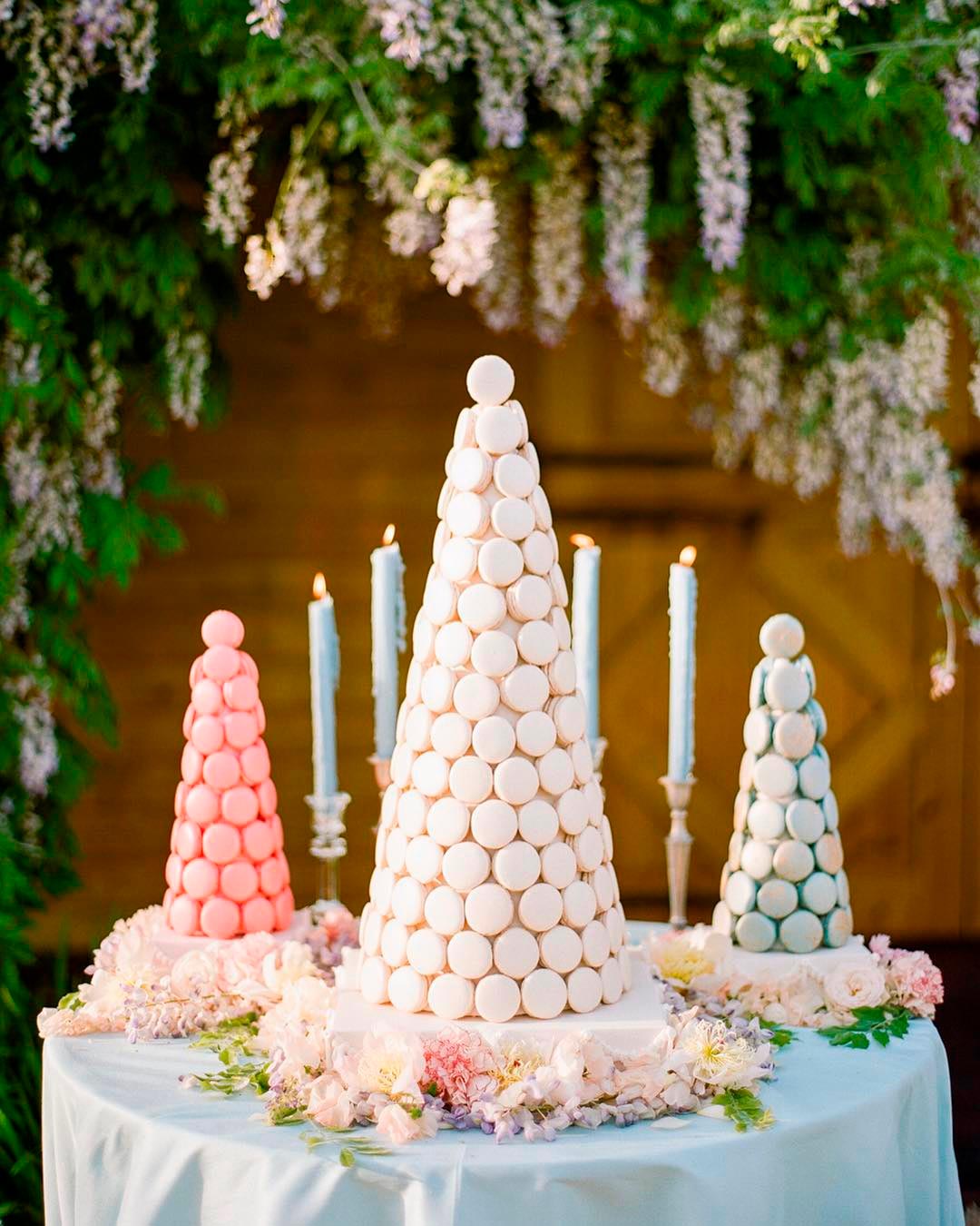
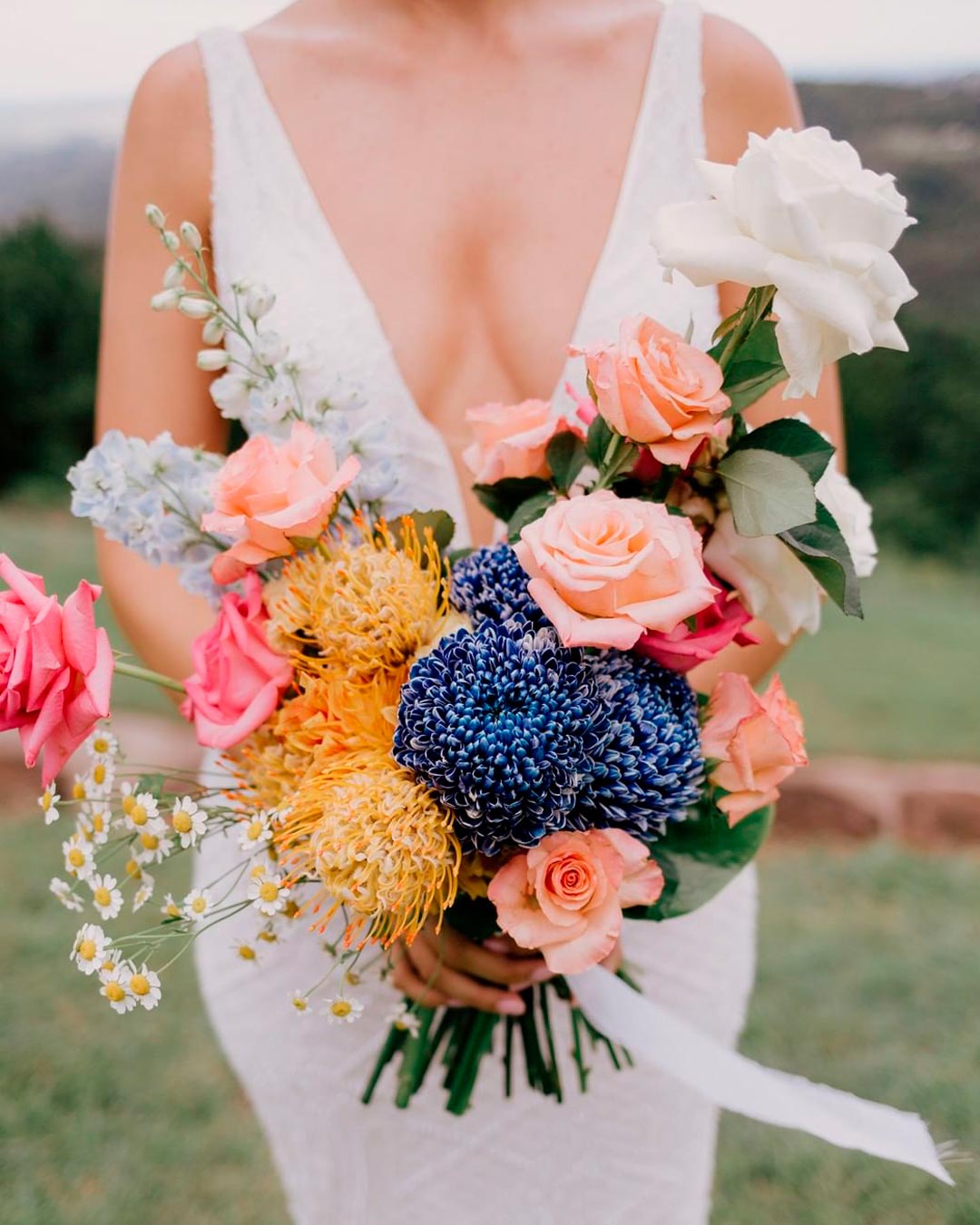
Many beautiful wedding color trends have surfaced. But if you don’t care for chasing trends, the ultimate goal is to remain classic and timeless.
Shades of green like pistachio, avocado, and matcha will be the toast of nature that has inspired countless weddings. Light blue tones like cornflower, periwinkle, French blue, and powder blue are great additions to modern and romantic themes. Elegant pastels like mint green, lavender, lilac, and bubblegum pink are everything whimsical. Throwback brights are also here to stay, like yellow, fuchsia, teal, cobalt, and bright red for a glam and classic look.
However, rather than working with trends you don’t care for, go deeply personal. What do you love doing?
What destination do you want to host your wedding?
Who is your dream designer? What are your absolute favorite flowers and music?
What time of the day do you want to have your wedding? When you figure these things out, your wedding is halfway planned already.
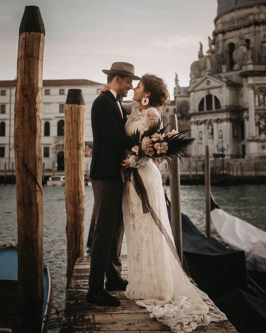
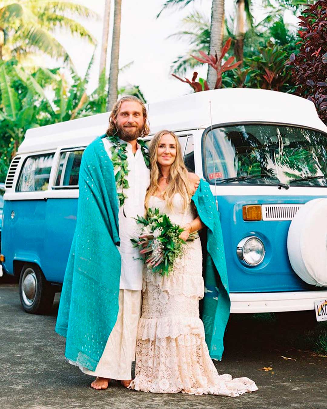
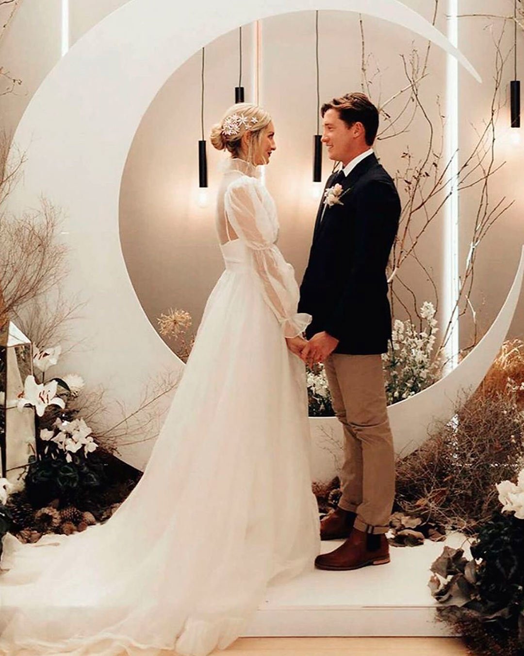
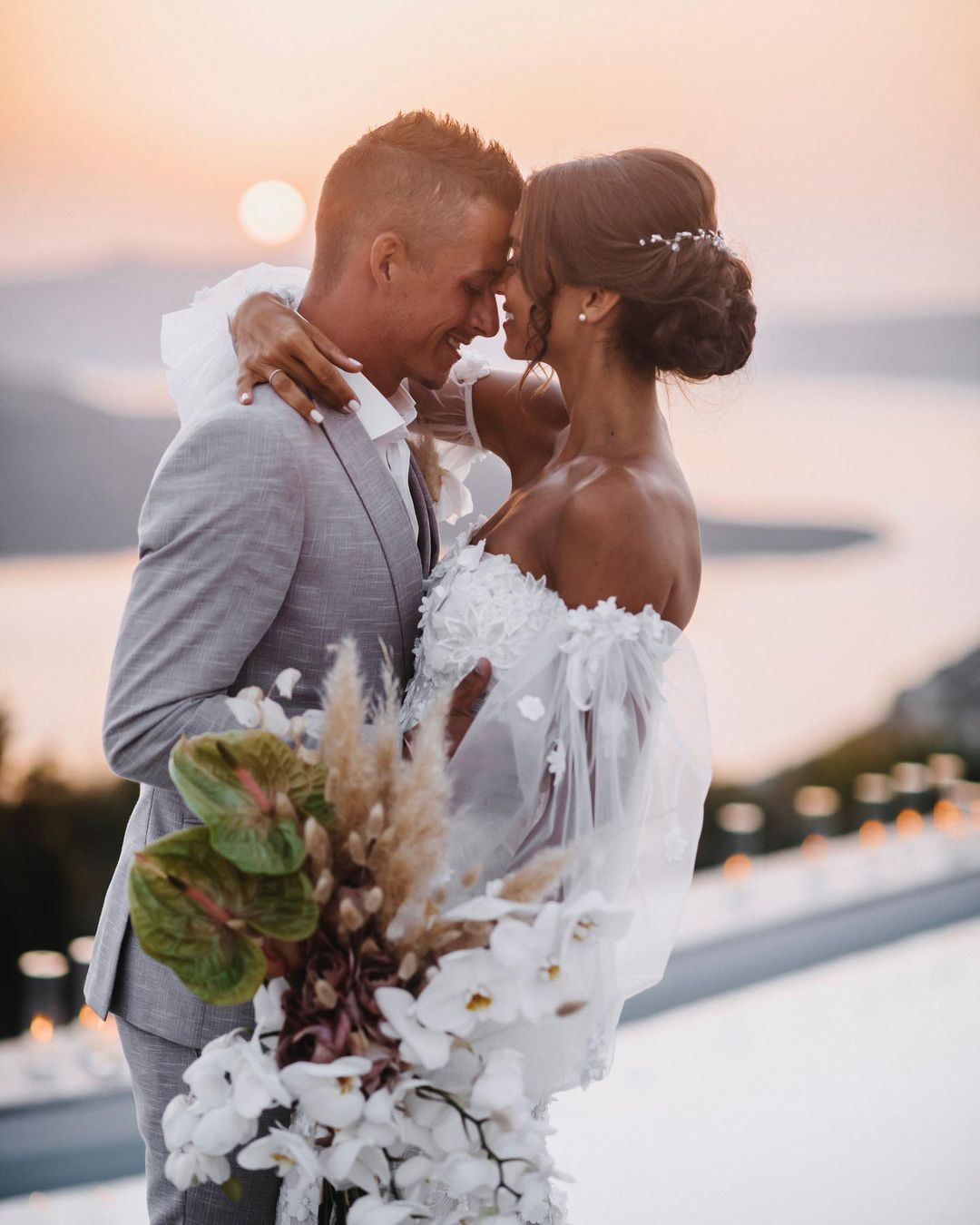
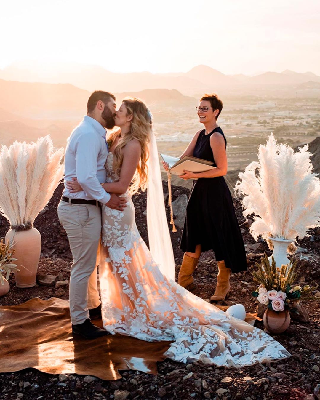
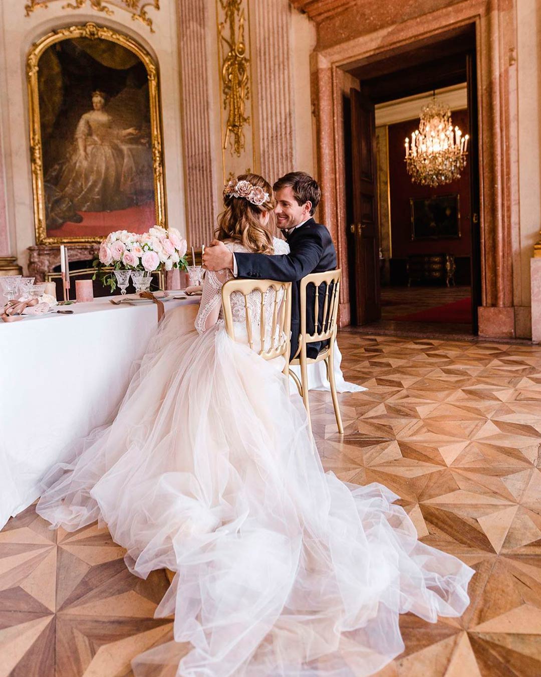
It’s certainly not cast in stone that one must go buy specific colors for a wedding style. But some wedding styles simply must have a touch of specific colors to pull them off beautifully through the seasons.
Romantic Shades of pink, blue, and ivory.
Vintage Gold, turquoise, light blue, cantaloupe, apricot, moss, and honeydew.
Whimsical or Boho Yellow, blush, white, salmon, daffodil, mohair, and muted neutrals.
Modern Contemporary Shades of blue, red, green, neutrals, and metallic.
Rustic Country Jewel tones, greenery, grey, lavender, champagne, and hazelnut.
Garden Lavender, green, blush, coral, peach, yellow, and pastels.
Southern Golden pumpkin, navy blue, green, ivory, and gold.
Classic Formal Black, white, pink, blush, and grey.
Nautical Sea glass blue, coral, fuchsia, navy, and silver.
Eco-Natural Olive, mint, sage, emerald, and grayed jade.
Tropical Teal, Purple, Green, Silver, Beige, and orange.
Christmas Shades of red, brown, green, neutrals, and gold.
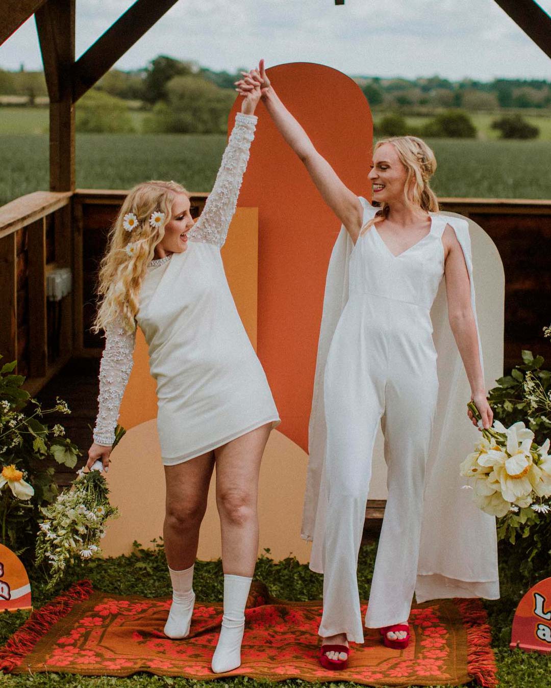
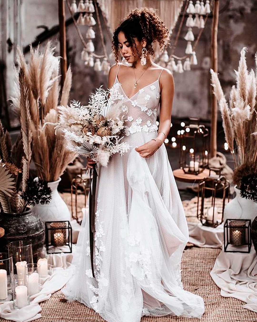
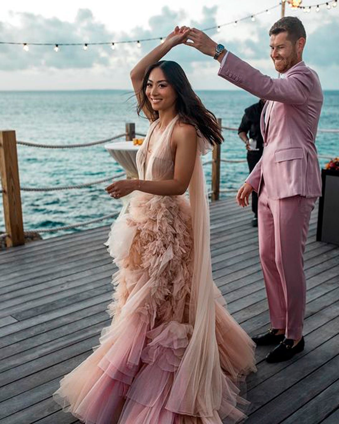
When you’re choosing wedding colors, always consider how they complement your specific skin tone. Let’s look at them in categories.
Light For light skinned beauties, ivory color best complements your skin tone, while others may make you look washed out and pale. The best textiles for this color are lace and crepe.
Build around it by incorporating pastel metallic Champagne, pale pink, and taupe. Add one vibrant color for a pop of life.
Medium Beauties with pink and gold undertones will look absolutely stunning in champagne and blush colors. Buy these colors in lace, tulle, chiffon, and organza textiles.
Build around them with taupe, greyish green, greenery, and gold for an ultra romantic look.
Dark While paler skin tones will appear quite subdued, dark or olive skin tones will truly shine through in diamond white. Source this color in satin and crepe, while you go minimal on the accents.
Build around the color with bright coral, sorbet hues, blush pink, and buttercream yellow. Together, they look effortlessly chic.
How/Where Do I Use Wedding Colors?
Whether you go monochrome, ombre, or a collected palette of colors, moderation matters. You can infuse them into your theme without ever going overboard, as we’re about to see.
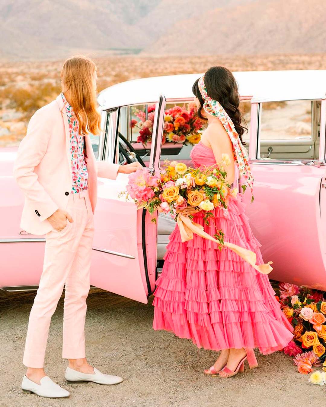
You can add your colors as subtle accents to your dress. Also, incorporate them right into the shoes, jewelry, and hairpieces.
For the men, it can be a shirt, a pocket square, a cummerbund, socks, or ties. For the bridesmaids, make it a beautiful blend of dress, shoes, corsages, and hair and body accessories.
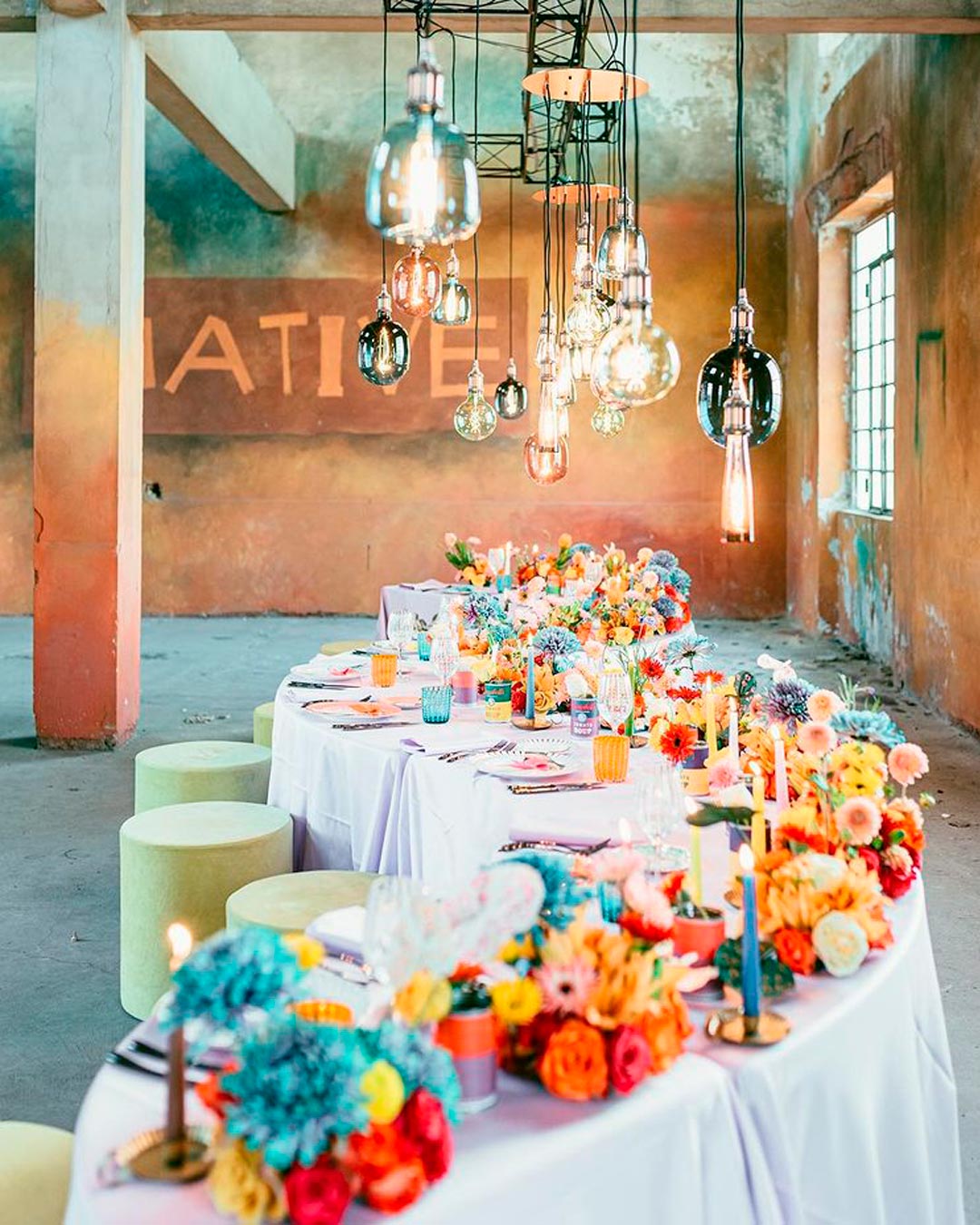
Incorporate your colors into bouquets, bouquet wraps, corsages, venue floral arrangements, centerpieces, and all of your decor.
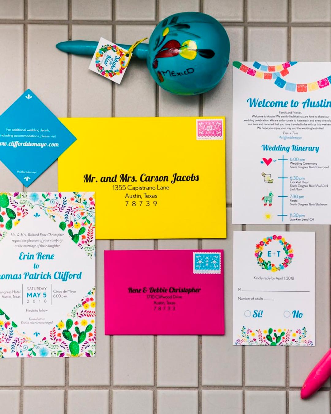
Distribute your colors right through the entire invitation suite, like the box, envelopes, save the dates, invites, and RSVP cards. Take it a step further to create fully cohesive program cards, place cards, menu cards, escort cards, and thank you cards.
Then scrawl on them with matching expert calligraphy.
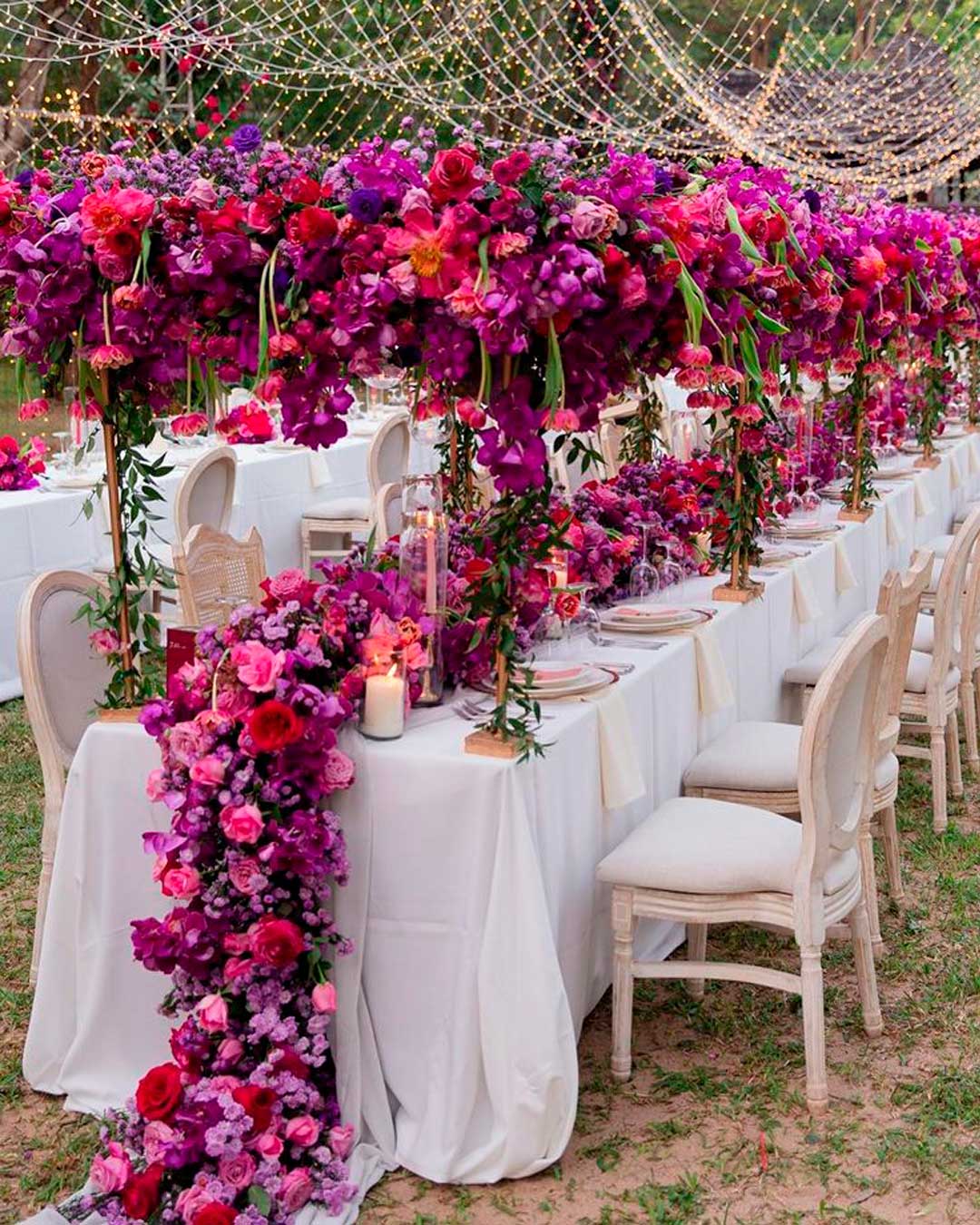
Incorporate your main color as a base for dinner napkins, dinner table linens, chair covers, drapes, or sashes. Also, think about cocktail linens, table runners, the aisle runner, pew, or chair swags.
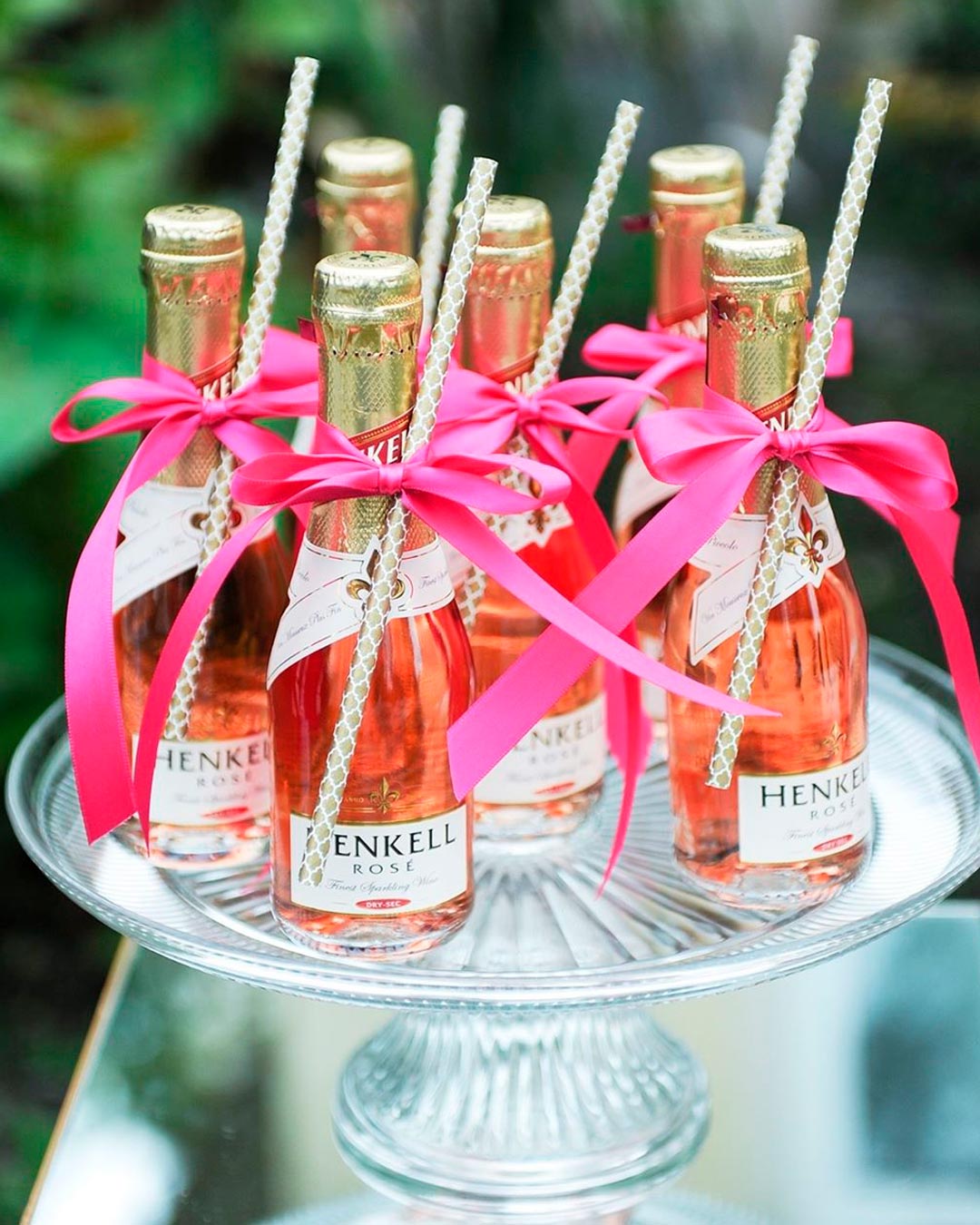
There are so many unique ways to infuse your wedding colors right at the bar. They include mugs, decanters, custom drinks, ice buckets, straws, and cocktail napkins.
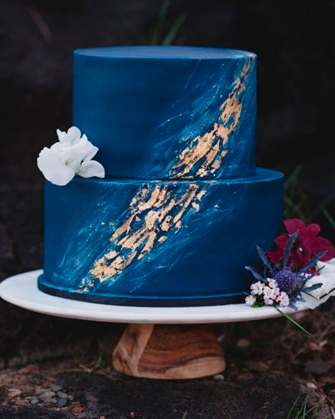
Feed your colors directly into the cake aesthetics. It could be the color of the icing itself, the toppers, and all the other accents.
If you’re opting for cake alternatives, infuse your colors throughout the dessert display. Alternatives give you even more to work with creatively.
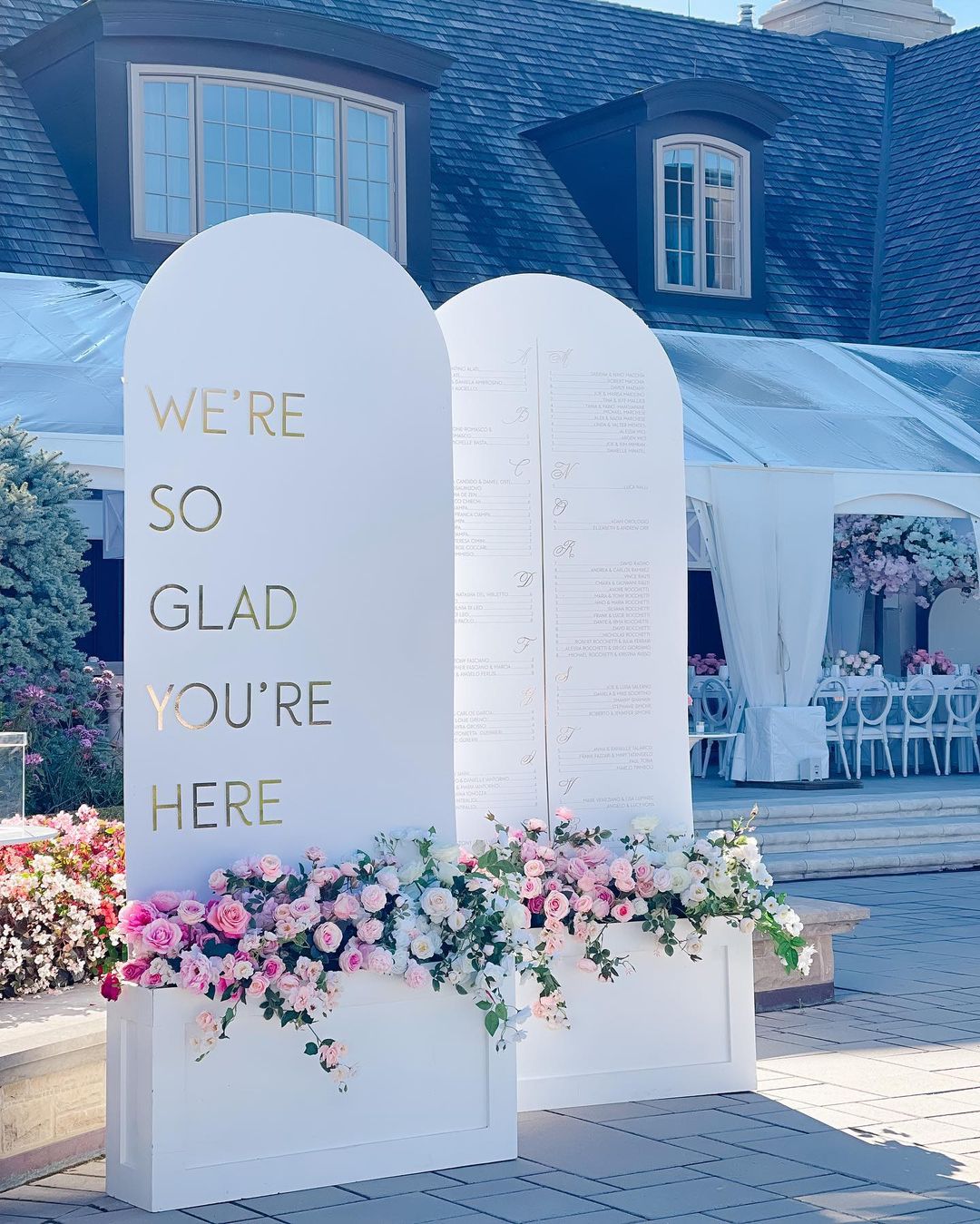
Look out for lighting that perfectly matches your color palette. They range from torches to lamps, flameless lanterns to string lights, chandeliers, and more.
Choose mismatched colorful vases and potted plants for your floral arrangements.
Opt for a seating chart, wreaths and garlands, favors, and candles all in your chosen color palette. If there’s a real need for blankets, shawls, parasols, and flip flops for guests, create a colorfully cohesive look.
Mistakes to Avoid When Choosing Wedding Colors
Colors are the absolute core of every creative affair, and weddings are no different. Find out how to maintain a stunning yet sane palette by sidestepping these classic mistakes.
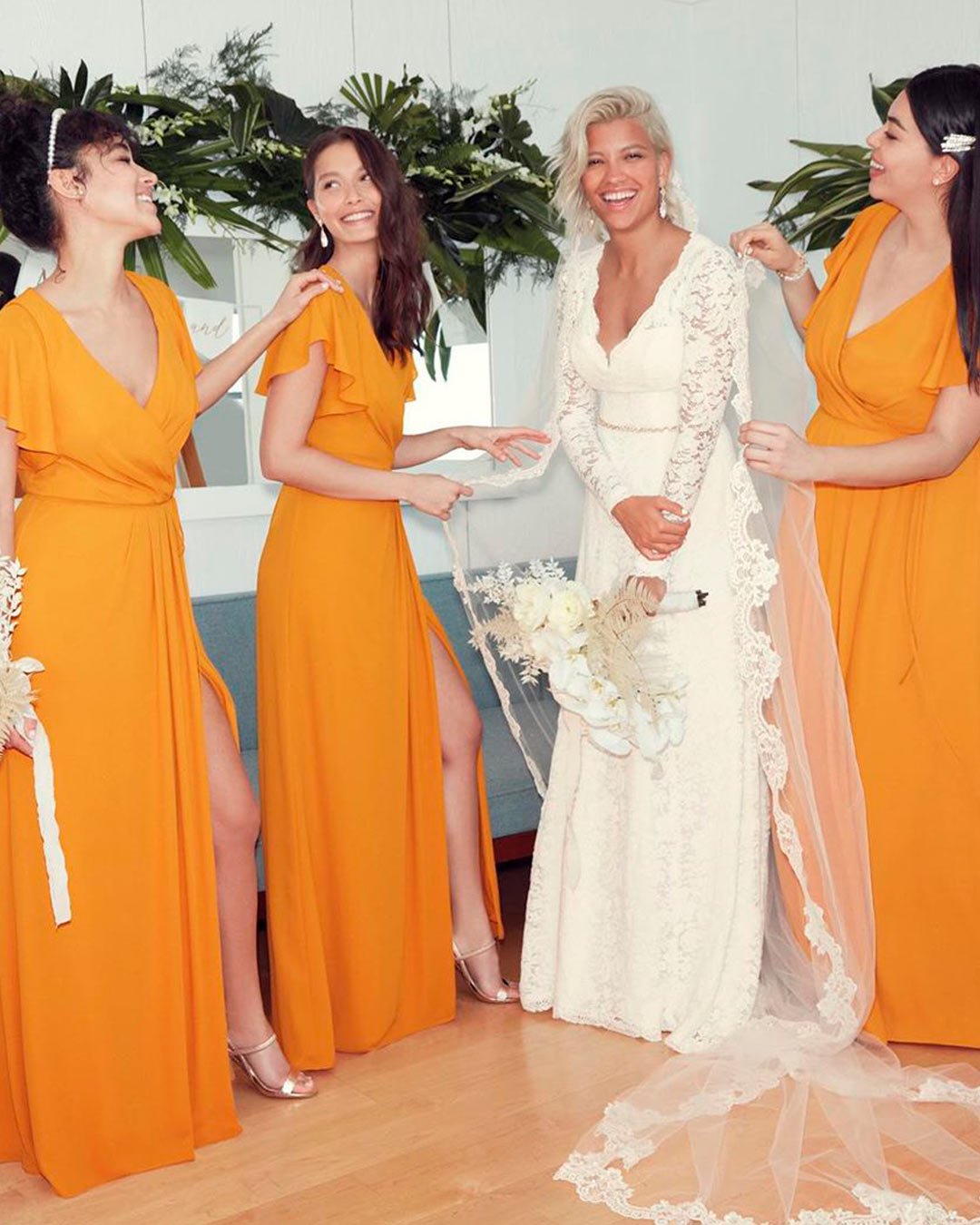
It’s a simple fact that trending colors emerge every single year. But don’t let yourself be forced into choosing trending colors if you aren’t genuinely big on them.
Trends will eventually fade but you, yourself, are timeless. How to avoid: Opt for what actually defines you.
Choose your own “best colors.” Colors that purely define you. They don’t have to be in season.
It’s entirely about what you will always love. Throw in a neutral, pastel, or metallic accent depending on the specific style you’re going for.
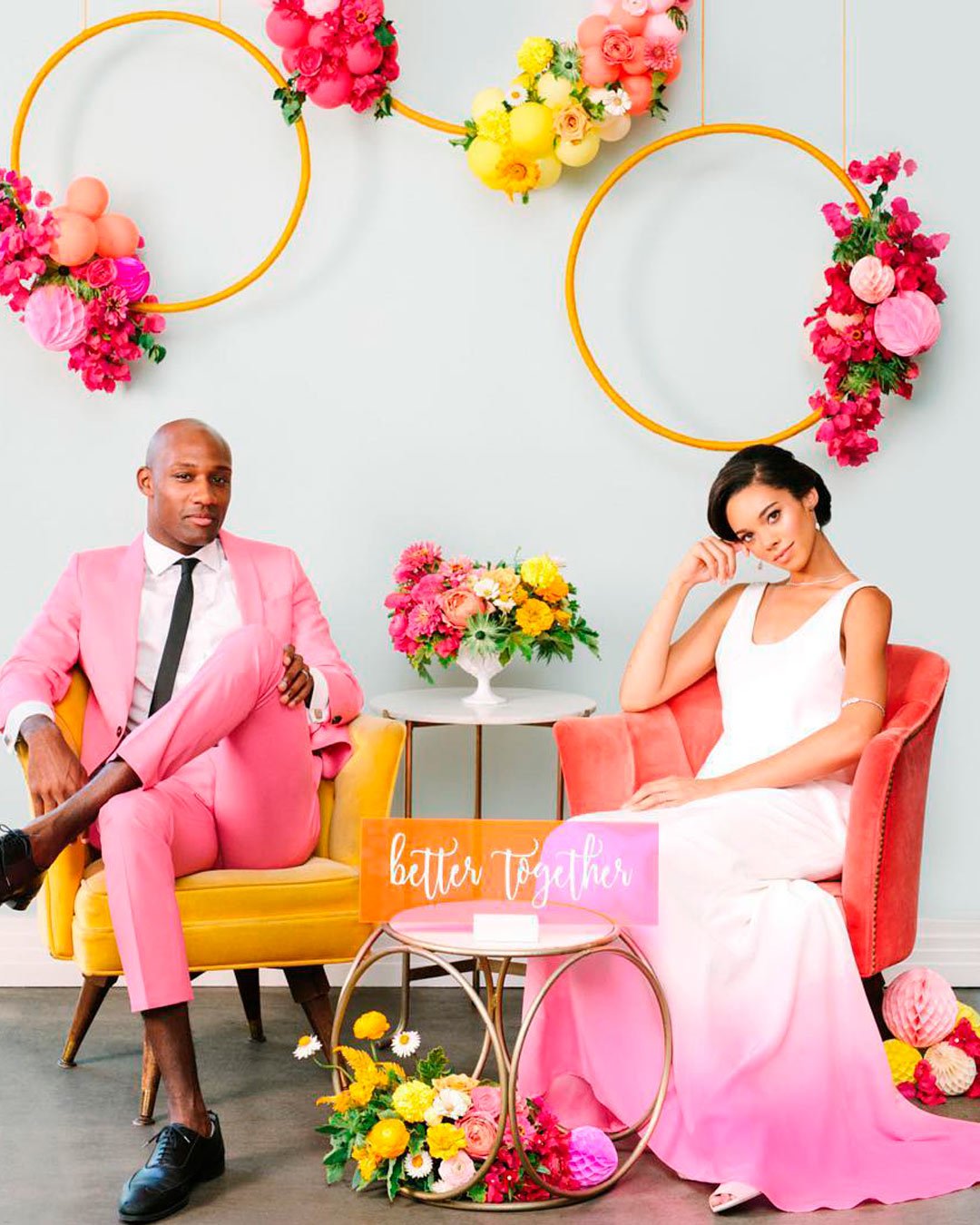
This is probably the single biggest knock when choosing wedding colors. You forget that the eyes desperately need a place to rest.
Everywhere looks lit up and it becomes blinding and distracting.
How to avoid: They may be your all time favorite colors but balancing them is the key. Pair a bright color with a muted one.
Also, opt for tones that live in between the standard colors.
Choose cranberry instead of straight red, coral instead of bright orange, or plum in place of amethyst. This way, even the most blinding color combinations look classic, sophisticated, and impossibly chic.
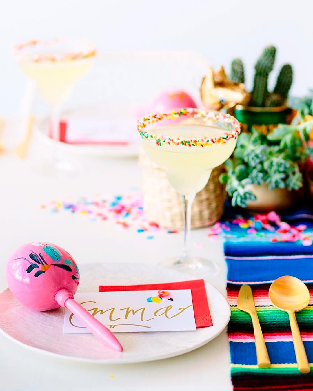
Unless you are literally planning a circus, picking too many colors is a disaster waiting to happen. Your wedding will either end up looking ratchet or completely disjointed.
The guests could also feel unsettled having to process so much visual chaos going on.
How to avoid: If you feel the undeniable need for many colors, go calm. Incorporate pastels and neutrals, such as cream, ivory, whites, nudes, grays, and beiges.
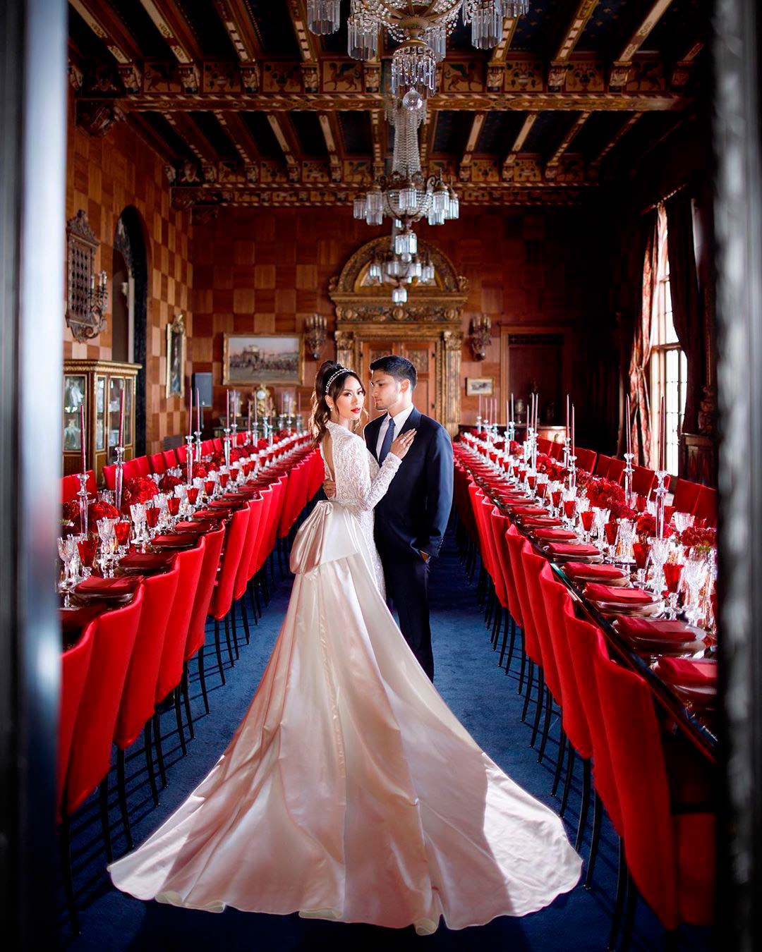
For natural and aesthetic venues, you absolutely must consider the colors they already bear. If you bring your own colors in without any due diligence, they’ll clash horribly.
This will, in turn, give the venue a look that is entirely not commensurate with your wedding event.
How to avoid: Don’t try to scrape off the colors present, rather work your own colors directly into the venue. Highlight specific accents from the venue that you love instead of trying to hide them away.
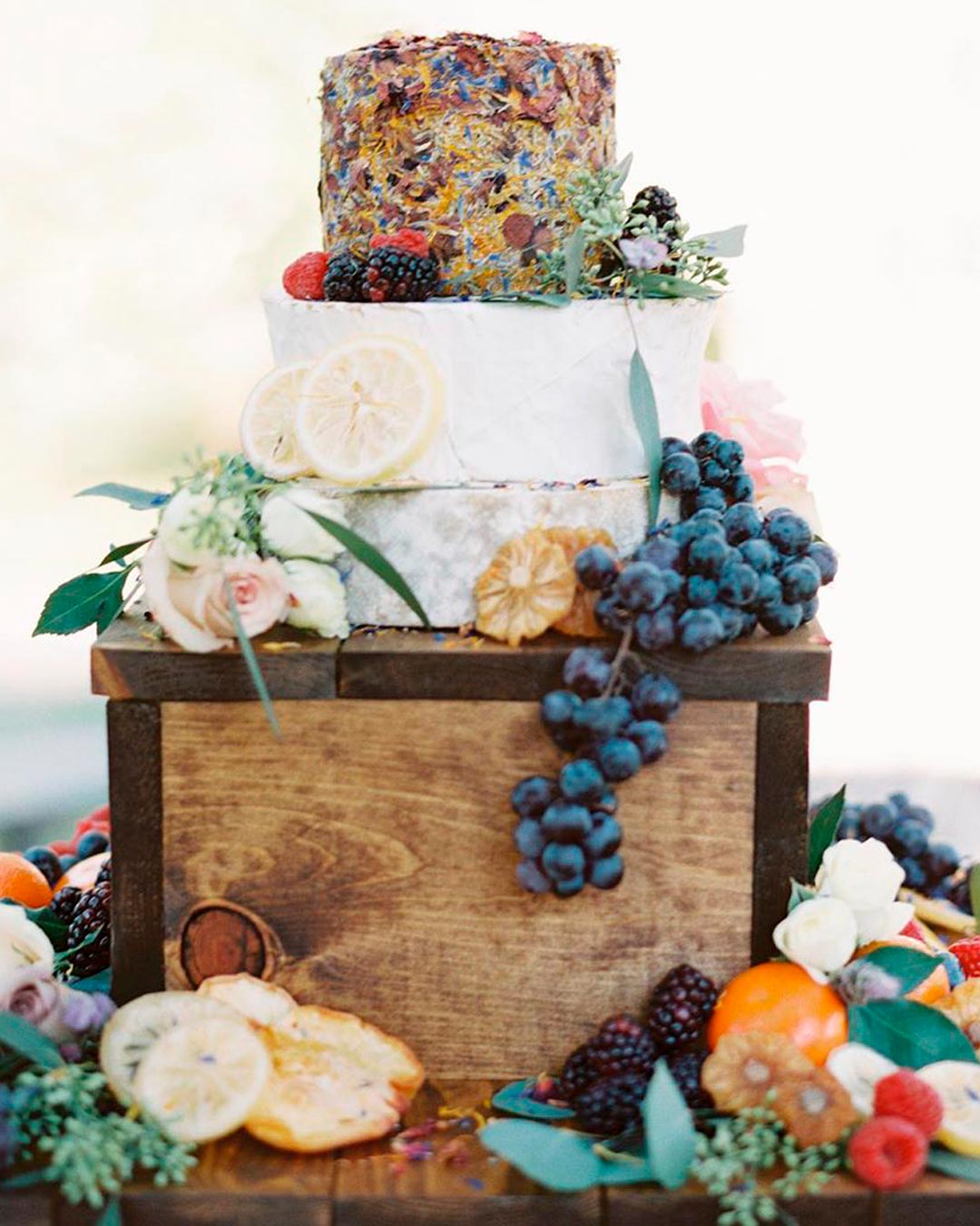
While the goal is absolutely to avoid a color riot at your wedding, don’t play it too safe, either. Picking just one or two colors will give your whole wedding a boring, drab, and lifeless look.
How to avoid: If you’re naturally laid back, play with colors that are serene yet still lively. Cobalt, cerulean, peach, blush, lilac, emerald, Fuchsia, coral, teal, and violet are all great options.
Choose any three, throw in some pastels, neutrals, or a metallic, and you’re completely set!
Knowing how to choose wedding colors is a “course” that every intending bride must take. This will help you tie all the wedding details together in a way that is both cohesive and efficient.
A complete guide has been put together to help you when choosing your wedding colors.
From FAQs to colorful seasons, skin tone, how to apply, and mistakes to avoid, you are covered!