


The arrival of Pantone’s annual color reveal is a genuinely thrilling moment. For anyone who lives and breathes creativity, design, or the visual arts, this announcement sparks a wave of fresh inspiration.
The wedding world pays especially close attention. Color shapes everything, from our moods to our memories, and the subtle shift of a tone can transform a space from chilly to intimate or from chaotic to serene.
This singular shade tends to ripple across the cultural landscape in a major way. The esteemed institute has unveiled Cloud Dancer.
“At this time of transformation, when we are reimagining our future and our place in the world, PANTONE 11-4201 Cloud Dancer is a discrete white hue offering a promise of clarity,” explains Leatrice Eiseman, Executive Director of the Pantone Color Institute.
What Is The Pantone Color Of The Year?
The Pantone Color Institute has chosen PANTONE 11-4201 Cloud Dancer, a lofty white saturated with a sense of tranquility. This otherworldly white tone stands as a beacon of soothing influence within a chaotic society that is learning to treasure thoughtful pauses and silent introspection.
A whisper of color whose misty, airy presence softly brightens and clarifies, PANTONE 11-4201 Cloud Dancer delivers a murmur of stillness into a clamorous universe.
Pantone Color In Wedding Attire
Bridal Dresses
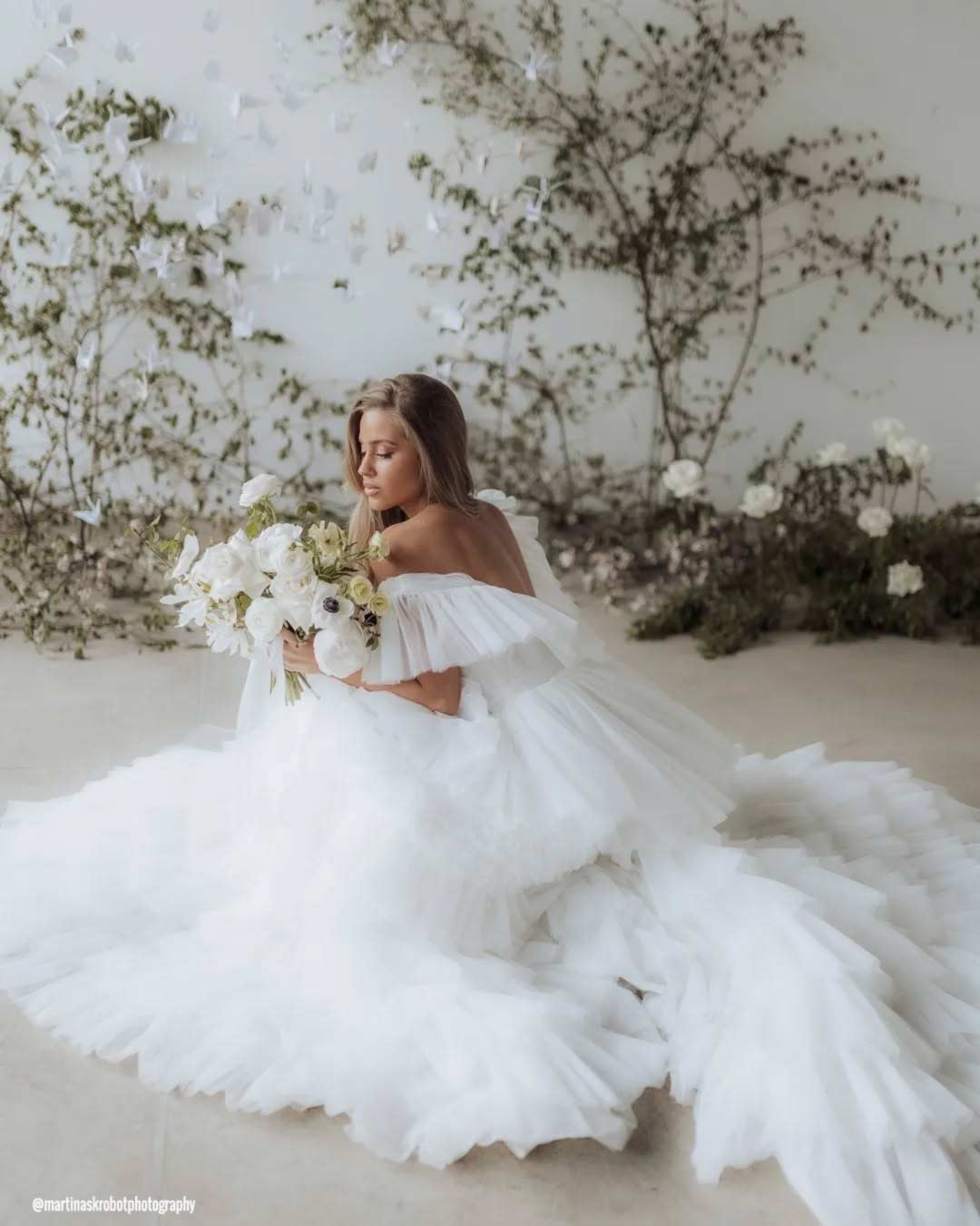
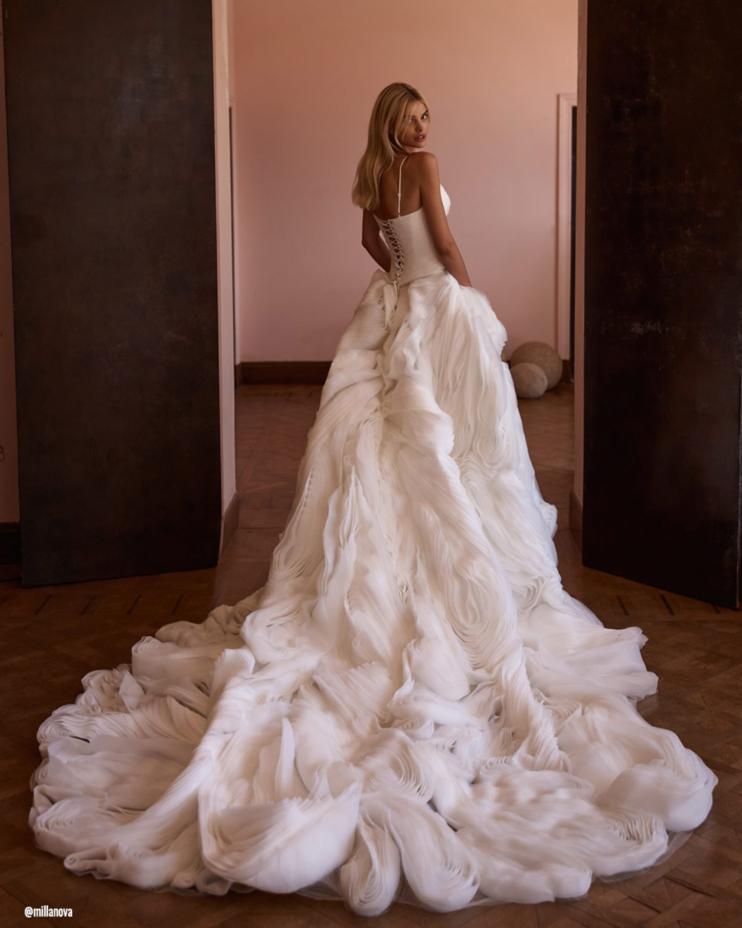
Selecting a wedding dress in the Pantone 11-4201 Cloud Dancer shade delivers a look that is both effortlessly graceful and enduringly classic. This delicate, polished white offers a crisp, elegant silhouette that looks stunning on every body type.
A traditional A-line, a dreamy ball gown, or a streamlined modern sheath all benefit from the way Cloud Dancer amplifies the fabric’s innocence and buoyancy.
Finish the ensemble with subtle jewelry in pearl, silver, or a soft champagne shimmer to preserve the gown’s breezy refinement. Accessories featuring pearls, crystals, or gentle metallic gleams sit perfectly alongside Cloud Dancer’s tender tone.
For your footwear, lean into ivory, nude, or a metallic finish to round out the outfit without stealing focus from the gown’s peaceful beauty.
Bridesmaids Dresses
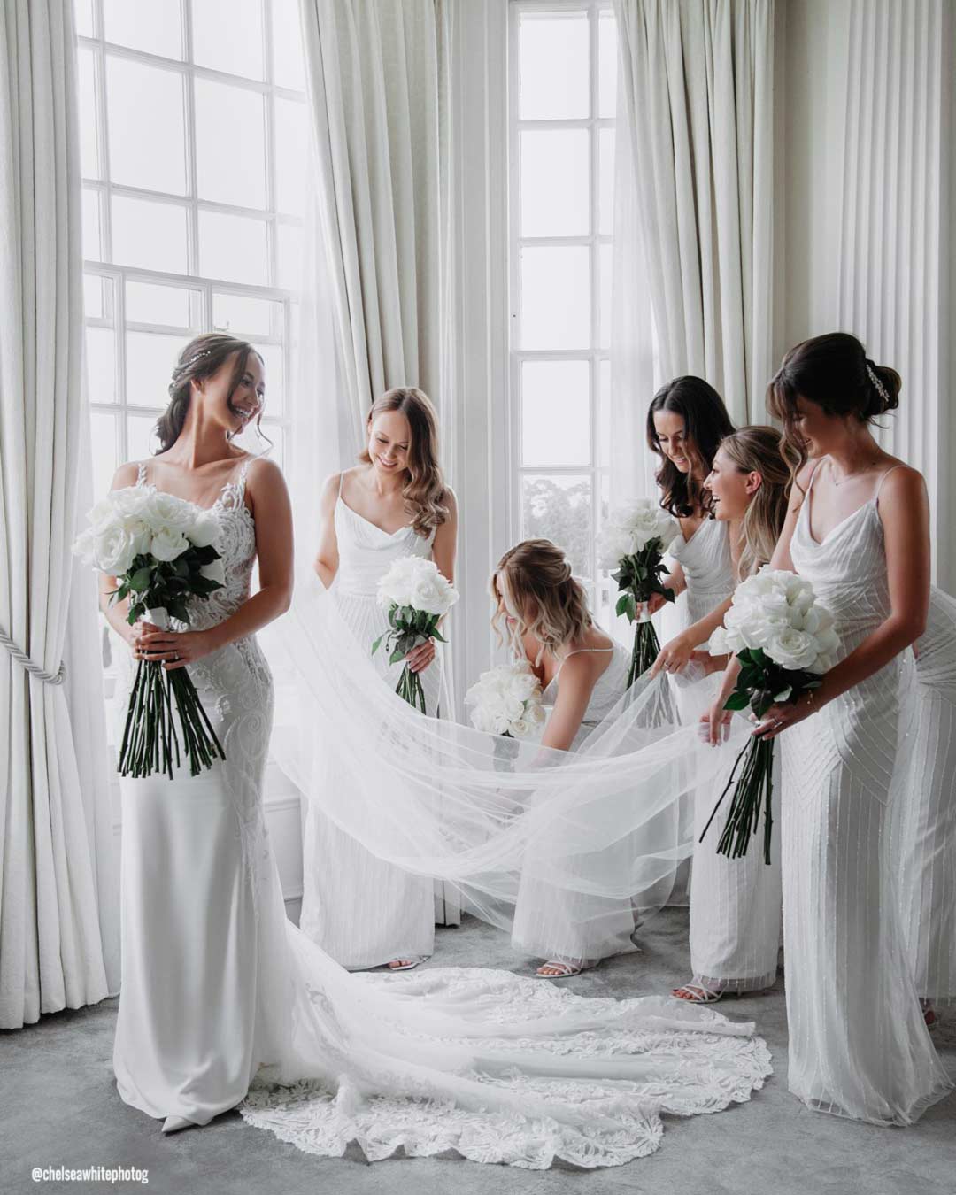
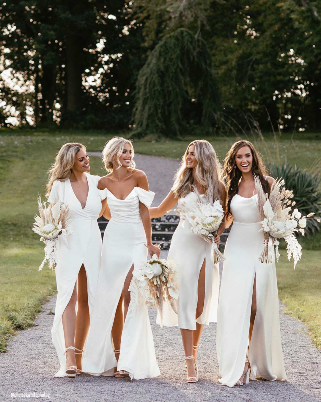
Dressing your bridal party in Cloud Dancer creates a heavenly, coordinated vision right beside you. This gentle white shade builds a seamless, pulled-together look for the whole crew and photographs gorgeously against any backdrop.
Cloud Dancer shines equally well in mixed-palette arrangements, where bridesmaids can incorporate other soft neutrals or whispers of pastel for a beautifully balanced, airy effect.
This hue pairs effortlessly with accessories in silver, pearl, nude, or blush, giving each member of your party the flexibility to showcase her own style while preserving a completely unified group aesthetic.
Flower Girl Dresses
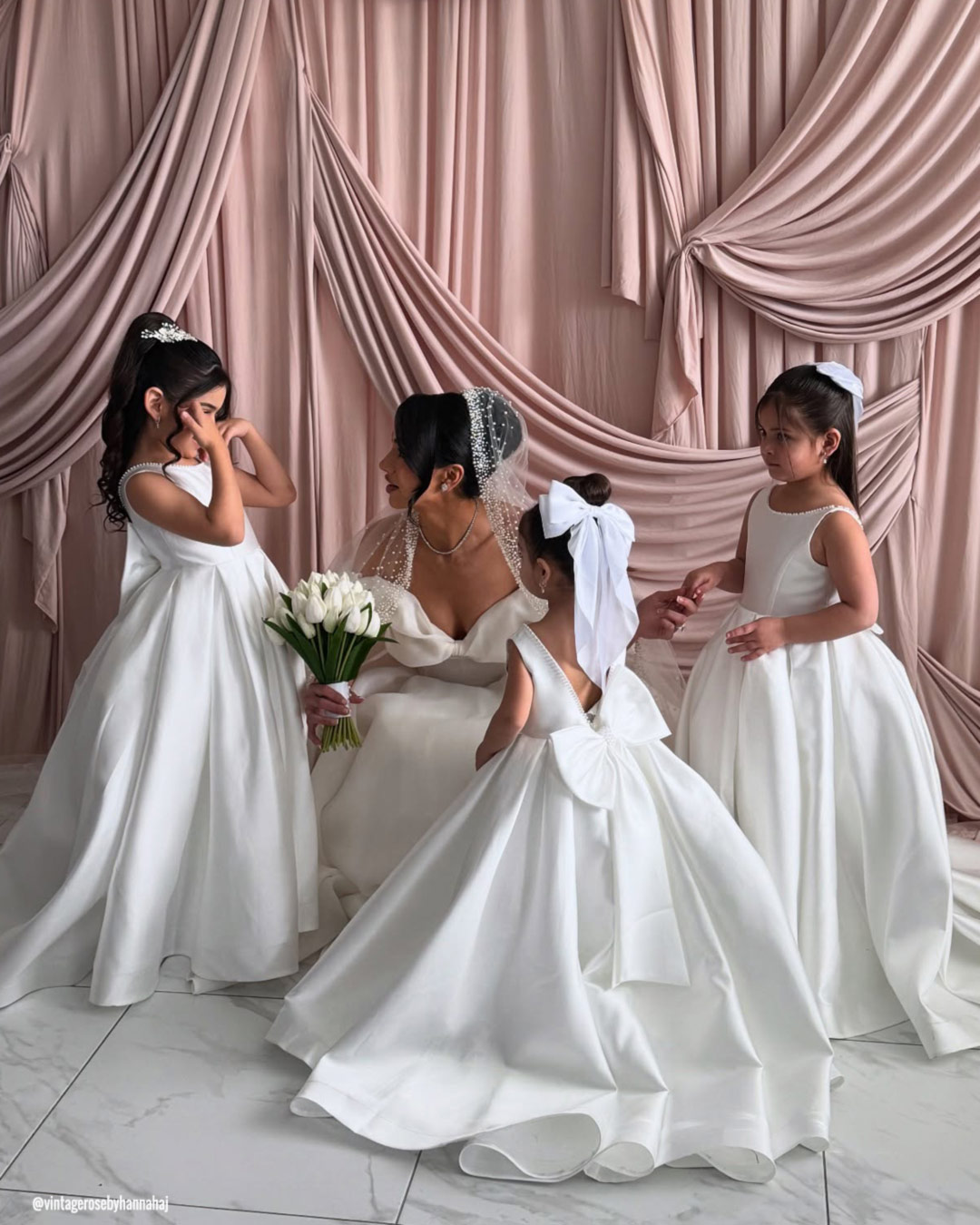
Outfitting the littlest members of your wedding in Cloud Dancer brings an utterly sweet, cherubic charm straight down the aisle. The pale white shade reads as timeless and innocent, making a perfect canvas for floral halos, delicate lace touches, or simple satin ribbon accents.
This tender hue flatters every age and complexion, layering in a moment of soft heartwarming magic to your overall wedding vision.
Pantone Wedding Decor
Wedding Arches
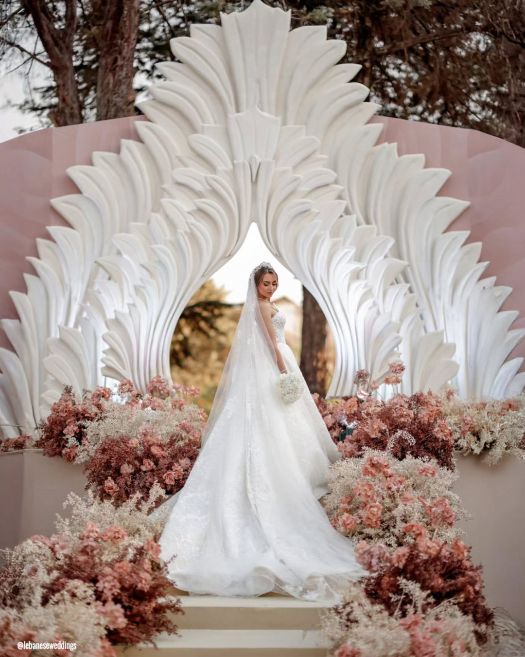
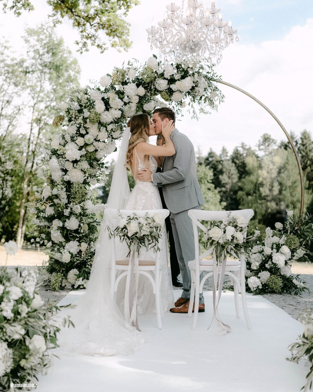
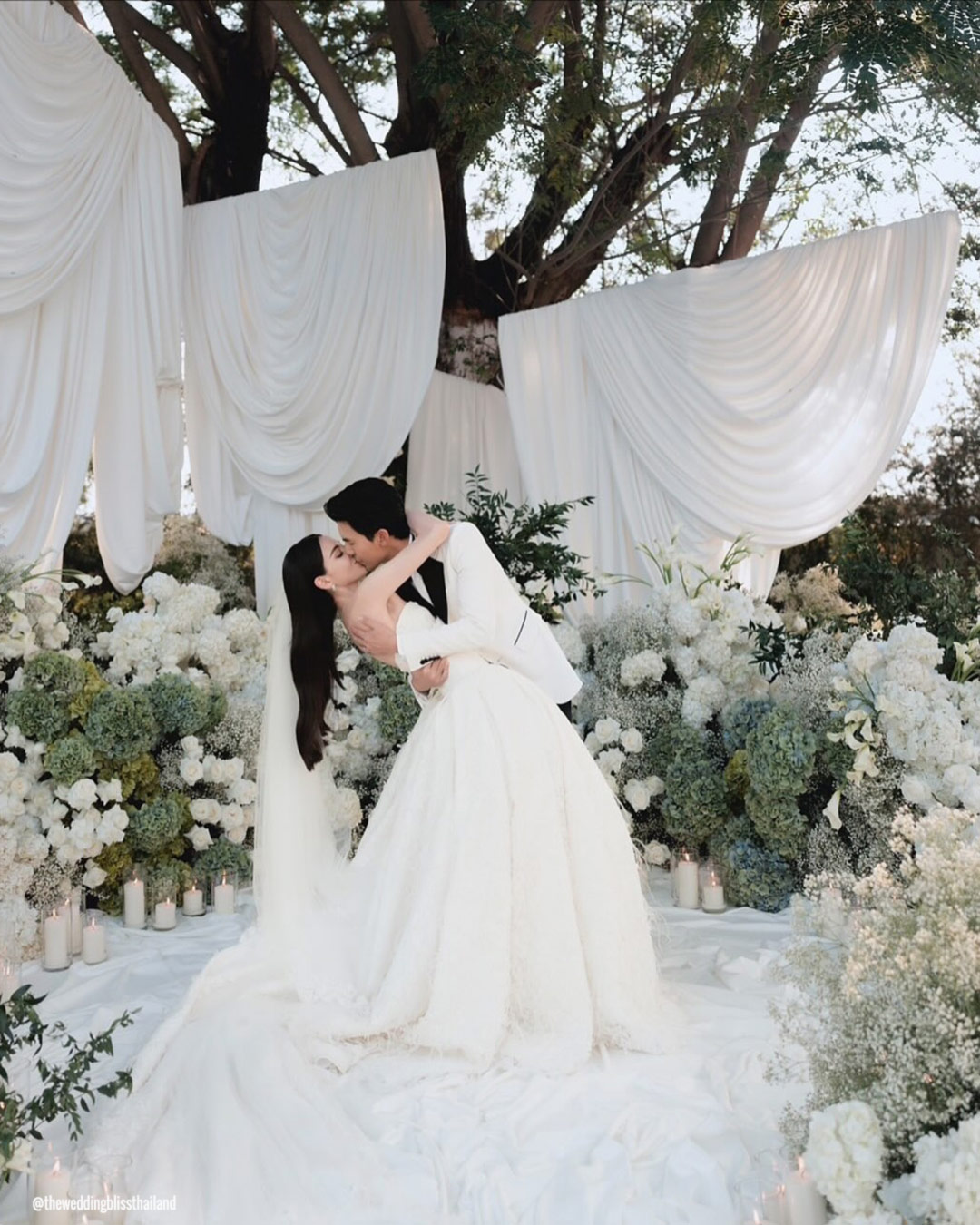
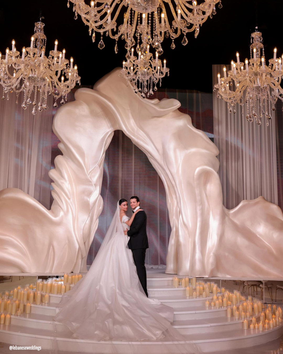
A ceremony arch inspired by Cloud Dancer constructs a luminous, romantic anchor for your “I dos.” Swathed in gossamer fabrics or lavishly dressed with blooms, this breathy white shade represents innocence, connection, and fresh starts. Cloud Dancer plays beautifully with trailing greenery, blush petals, champagne florals, or hints of metallic shimmer, building an effortlessly graceful frame for your vows.
Wedding Table Decor

Laying down Cloud Dancer tablecloths or runners establishes a tranquil, pristine foundation for your reception design. Nestle them among gentle florals in ivory, blush, sage, or champagne to carve out dimension and a subtle sense of contrast.
Flatware and chargers in gold, silver, or warm neutral tones lift the sophisticated palette, while candles glowing in soft creamy whites pour on a romantic, flickering warmth.
Wedding Signs
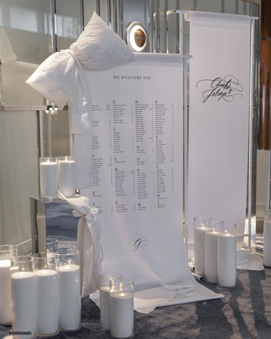
Signage executed in a Cloud Dancer palette provides a fresh, elegant stage for graceful lettering. Turn to calligraphy in gold, silver, charcoal, or champagne to guarantee clear readability and a note of plush distinction.
These detailing choices slide seamlessly into a hushed, refined color story, tying the entire décor scheme together with polish and style.
Hanging Decorations
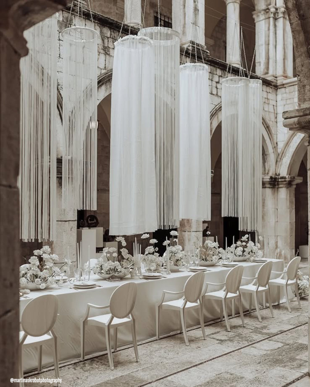
Look to Cloud Dancer lanterns, flowing fabric panels, or suspended floral installations to inject an immediate sense of buoyancy and lightness into your venue. Weave in subtle hints of pastel or a metallic glint for extra richness and depth.
These airy overhead touches craft a lifted and tranquil mood, deepening the dreamy emotional pulse of your celebration.
Wedding Centerpieces
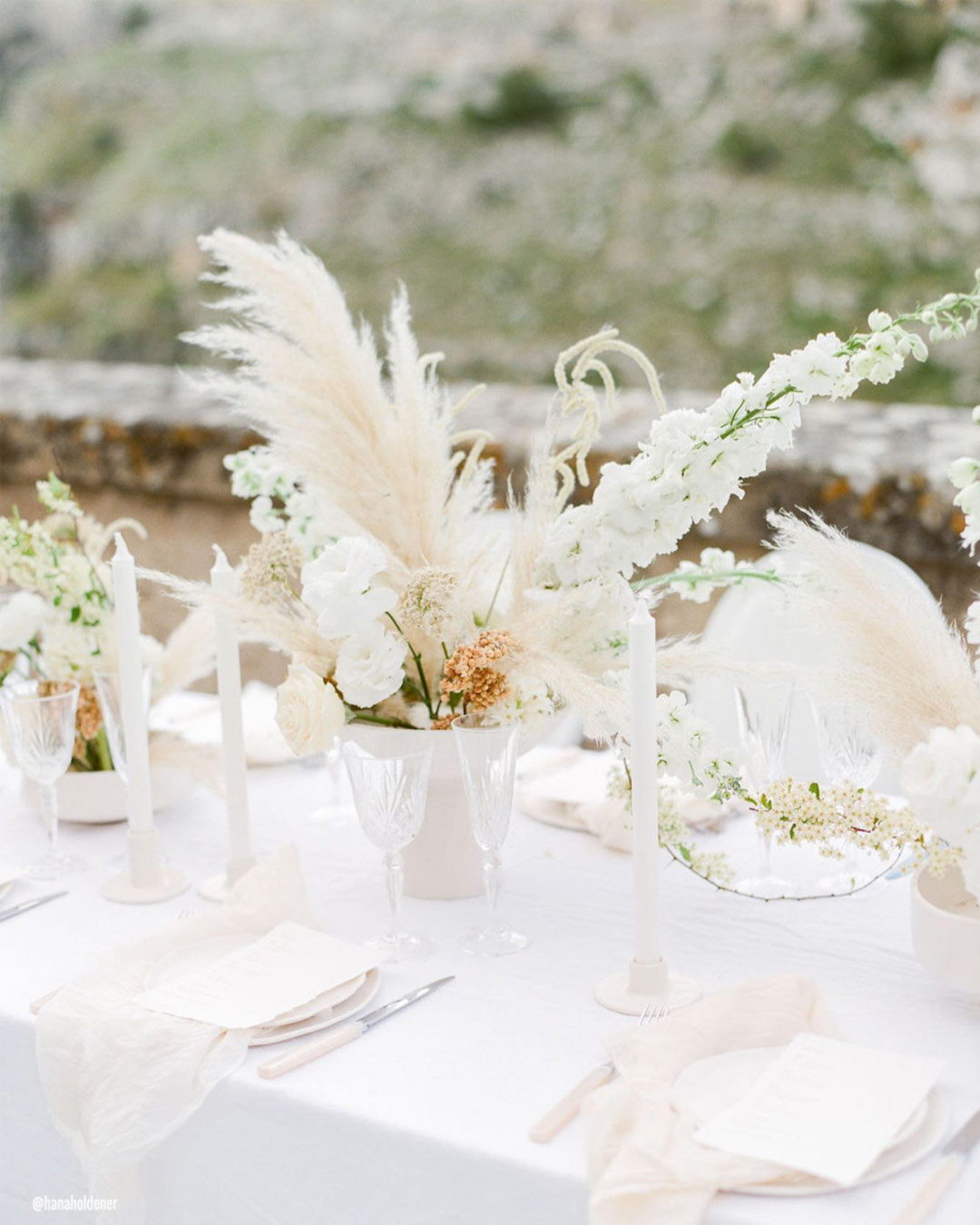
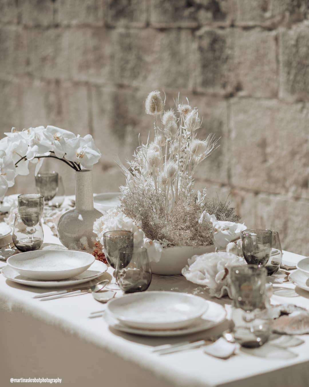
Centerpieces saturated with Cloud Dancer nuances deliver fresh sophistication to every single tabletop. Gather white and ivory blossoms like roses, peonies, ranunculus, or hydrangeas, then tuck them alongside whisper-soft greenery or champagne-colored accents.
Set the arrangements in clear glass, luminous pearl, or metallic containers for a sense of lasting polish. This color grouping generates a radiant, elegant atmosphere that suits both timeless celebrations and sleek modern affairs.
Pantone Wedding Bouquets
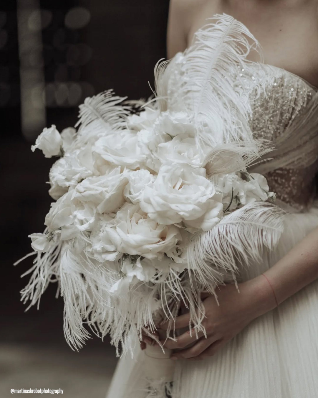

When crafting a bouquet around Cloud Dancer, reach for soft white florals, think garden roses, peonies, calla lilies, or ruffled ranunculus. Introduce a touch of greenery or the faintest whisper of blush for a gentle layer of dimension.
Bind the stems with a Cloud Dancer ribbon or a wrap of pearl-kissed fabric. For an extra note of magic, consider delicate flecks of sparkle from pearls, crystals, or muted gold detailing.
Pantone Wedding Stationery


A stationery suite built on Cloud Dancer forms a crisp and elegantly restrained foundation for your entire wedding theme. Enrich the invitations with gold, silver, charcoal, or soft blush calligraphy for a truly polished presence.
Layer in botanical illustrations or minimal, clean-lined patterns in coordinated neutral hues to achieve a refined, beautifully harmonious look that threads through every paper piece.
Pantone Wedding Cakes

A wedding cake pulled from a Cloud Dancer dream speaks in a language of simple, graceful beauty. Go for smooth white buttercream, fragile sugar blossoms, or soft dimensional details like gentle ruffles or intricate lace piping.
Fold in accents of metallic gold, silver, or a blush of subtle pastel to bump up the sense of luxury. This enduring design vocabulary feels equally at home anchoring a classic celebration or a chic modern gathering.
Pantone Color Of The Previous Years
Over the last two decades, the Pantone Color Institute has debuted a total of twenty-four color of the year selections. Both 2016 and 2021 featured two distinct shades each, all serving as a forecast for global color direction.
Mocha Mousse
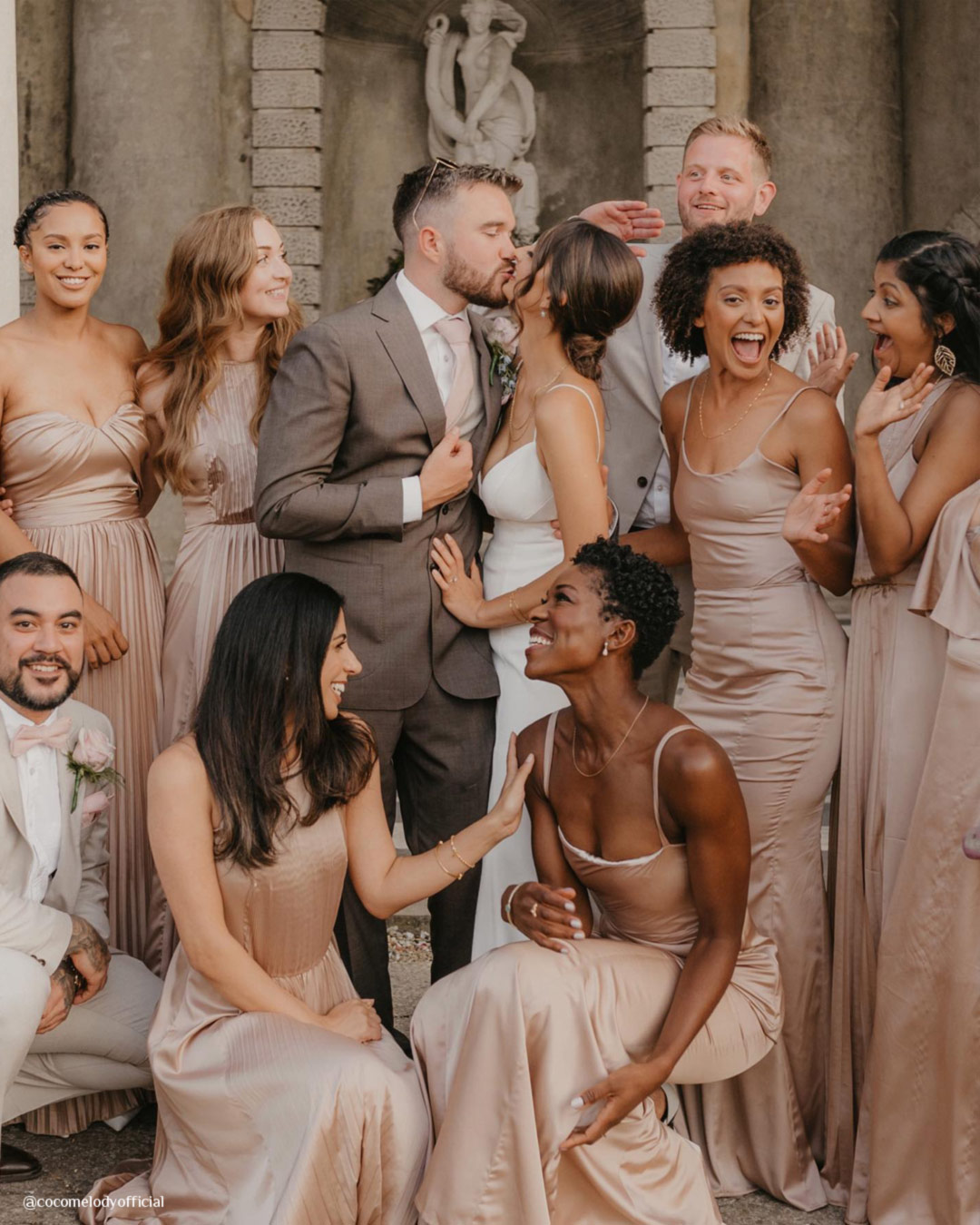
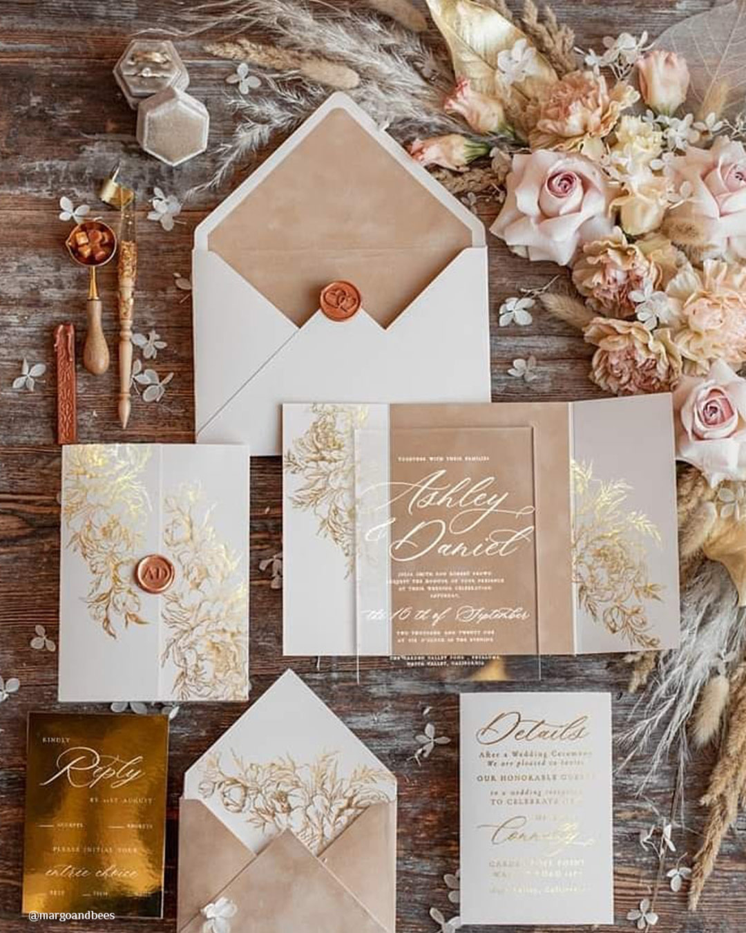


Pantone Mocha Mousse radiates comfort, richness, and a grounded sophistication, presenting a lush, enveloping tone that pulls a sense of steadiness and refinement into any environment. This velvety, earthy brown cultivates a snug and polished mood, perfectly suited for weddings, festive gatherings, and the rhythms of daily design.
A fit for every season on the calendar, its cozy undertones read as welcoming in deep winter, naturally organic in autumn, and wonderfully fresh throughout spring and summer. It pairs without effort alongside ivory, blush, champagne, gold, sage, and muted neutrals, enriching both cozy and crisp color stories.
Adaptable and gorgeously even-keeled, it opens the door to creative expression while holding fast to a luxuriant and cohesive look.
Pantone Color
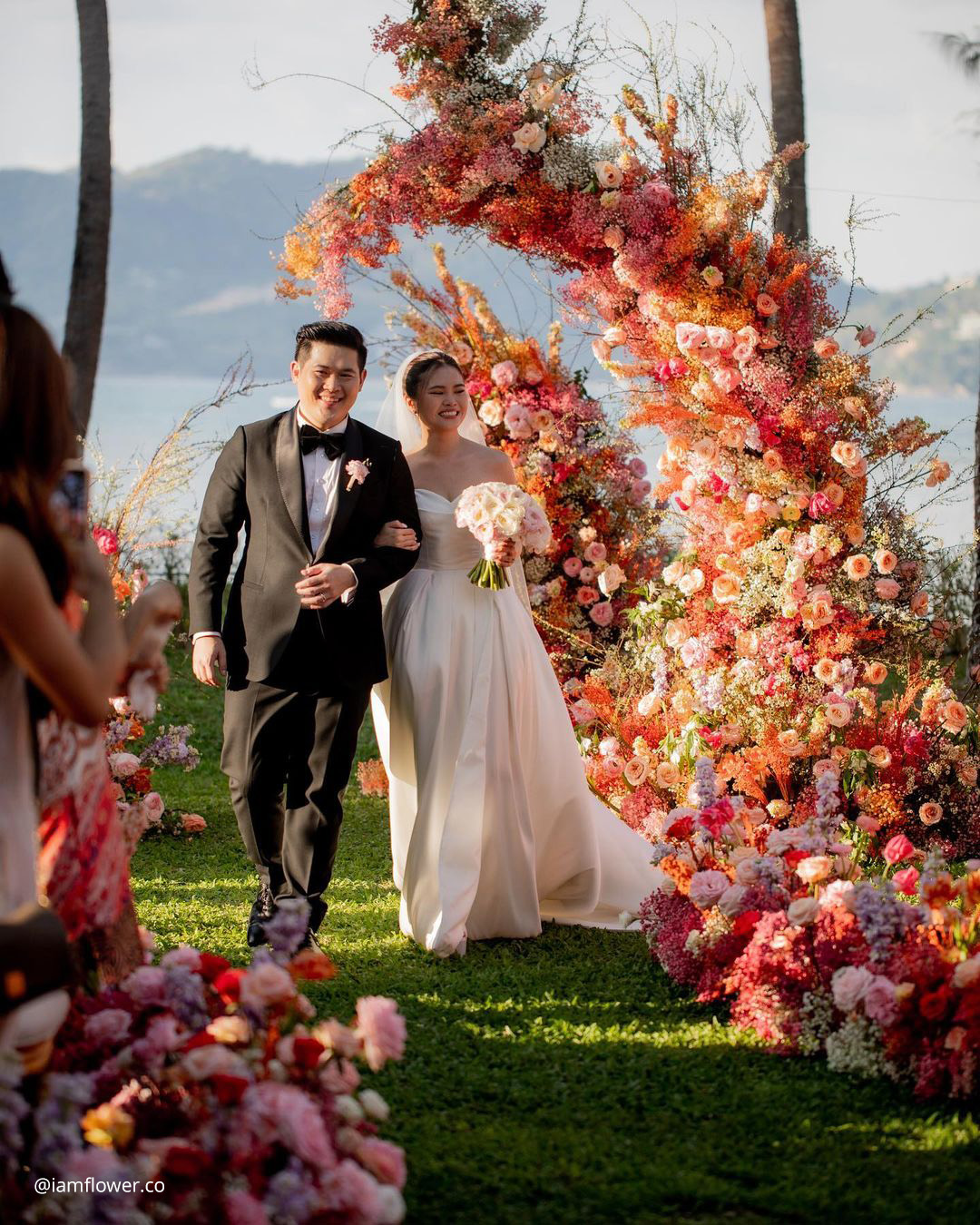

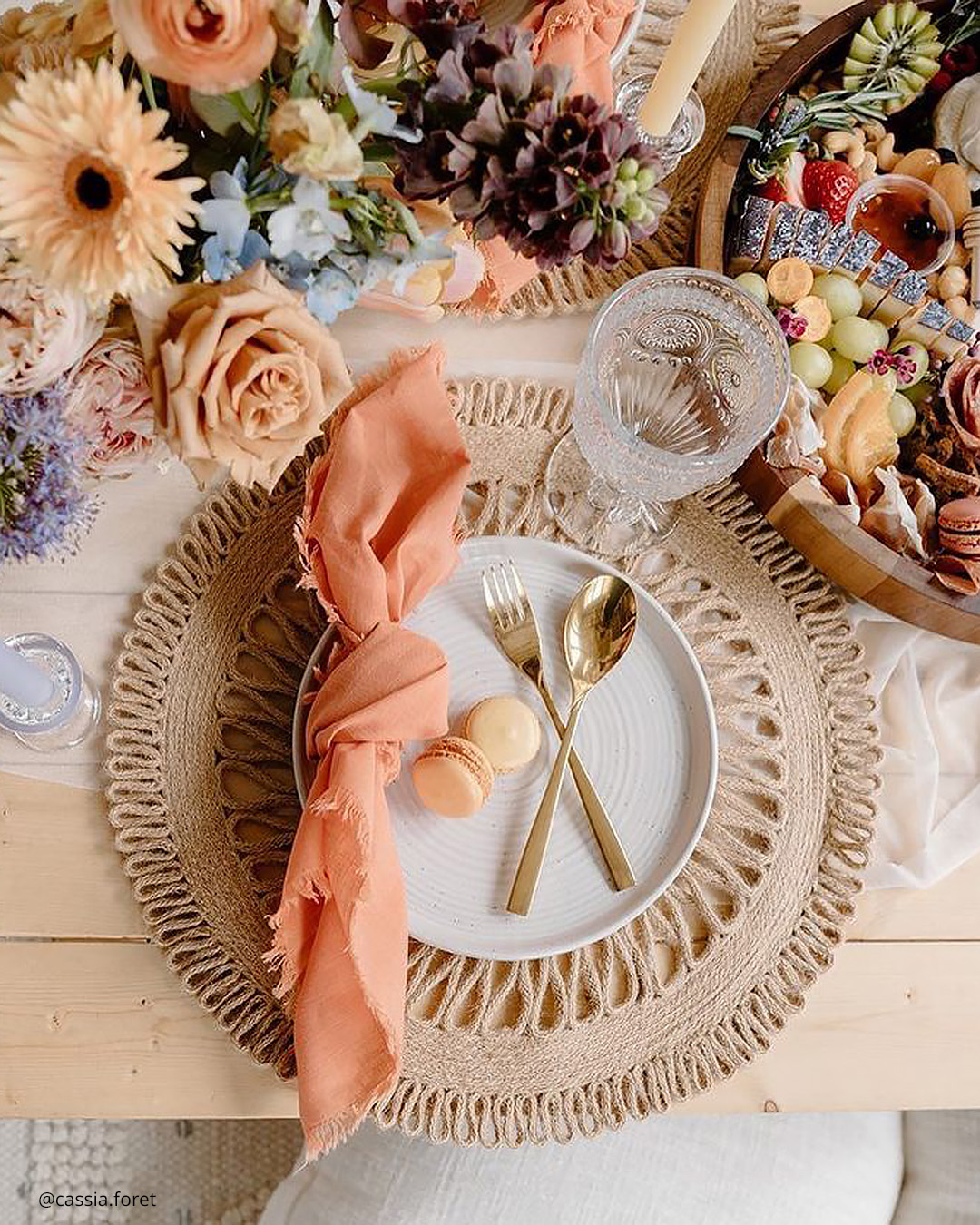
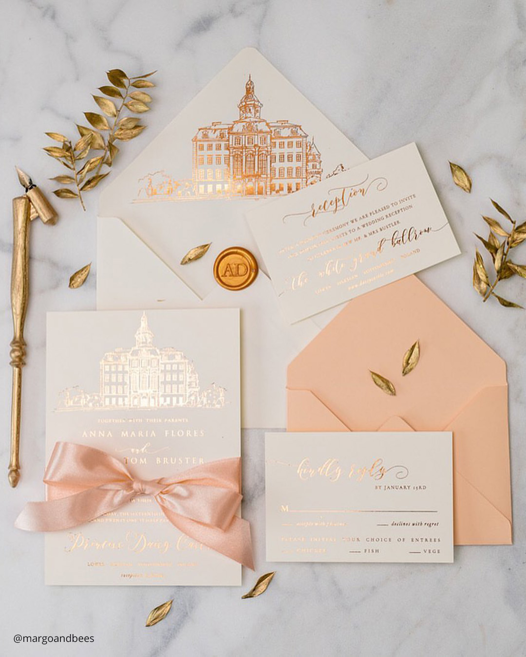
Peach Fuzz captures the essence of tenderness and mindful nurturing, bringing a gentle, comforting tone that lifts both the heart and the space around it. This mild peach shade weaves a calming, balanced atmosphere suited to any type of gathering.
Slides gracefully into all four wedding seasons: the blooms of spring, the sunshine of summer, the crispness of fall, and the hush of winter. Matches gorgeously with whites, lush greens, pinks, and metallic gold touches.
Adaptable and gracefully poised, it invites creative play without ever drowning out the surrounding hues.
Pantone Color
Viva Magenta arrives loaded with symbolism for this moment in time. It channels the fierce vitality and vigor we uncover as we move through challenging periods.
The shade simultaneously honors the present and sparkles with a shared hopefulness for what lies ahead. It’s electrifying and calls forth the raw power of, and a restored bond with, the natural world.
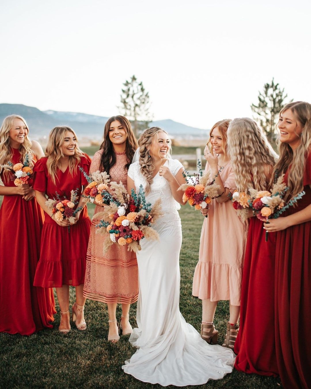
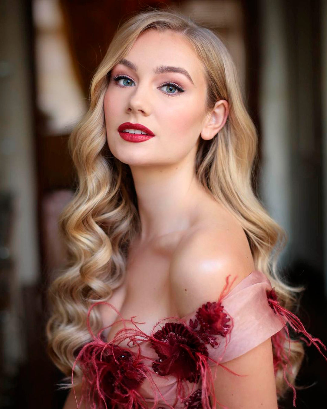
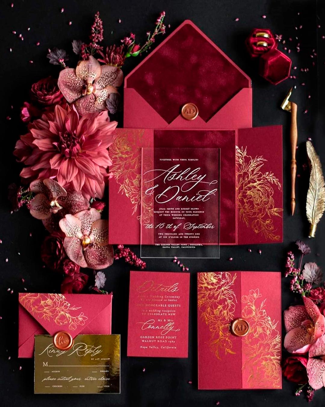

Viva Magenta slips into nearly any wedding style with ease. Guests dressed in this color will enrich the harvest tones of an autumn celebration, the garden blooms of a summer party, the steadfast spirit of a winter union, and the lively energy of a spring affair.
The shade unlocks endless bouquet possibilities.
Pair it with white petals and abundant greenery for a timeless path forward. Shift with the season and blend in other pinks, reds, purple tones, or soft blues.
Though it’s a deeply expressive hue, Viva Magenta somehow refuses to clash with other vibrant colors.
This particular Pantone selection also doesn’t scream for the spotlight. Feel liberated to play with every shade on the spectrum without worrying the result will slide into visual noise.
Pantone Color
Conceptually, Very Peri fixes its gaze firmly on tomorrow. It reaches to embody the shared emotional landscape we all carry about the near horizon.
At the same moment, the shade captures how we arrived at this point and channels those collective feelings, too.
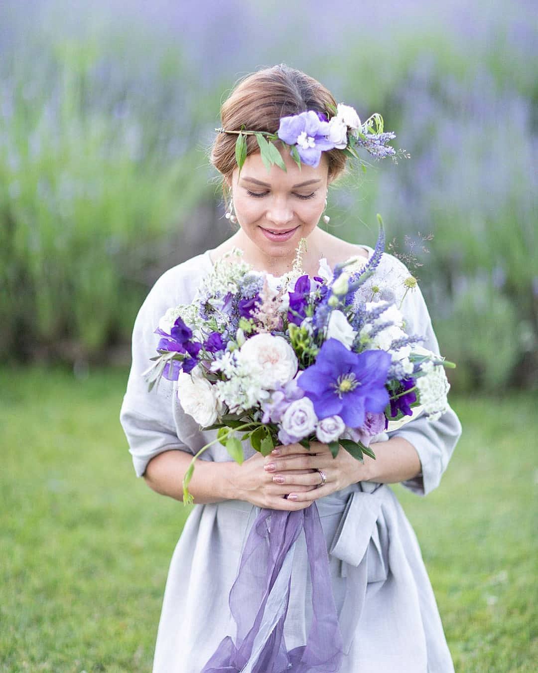
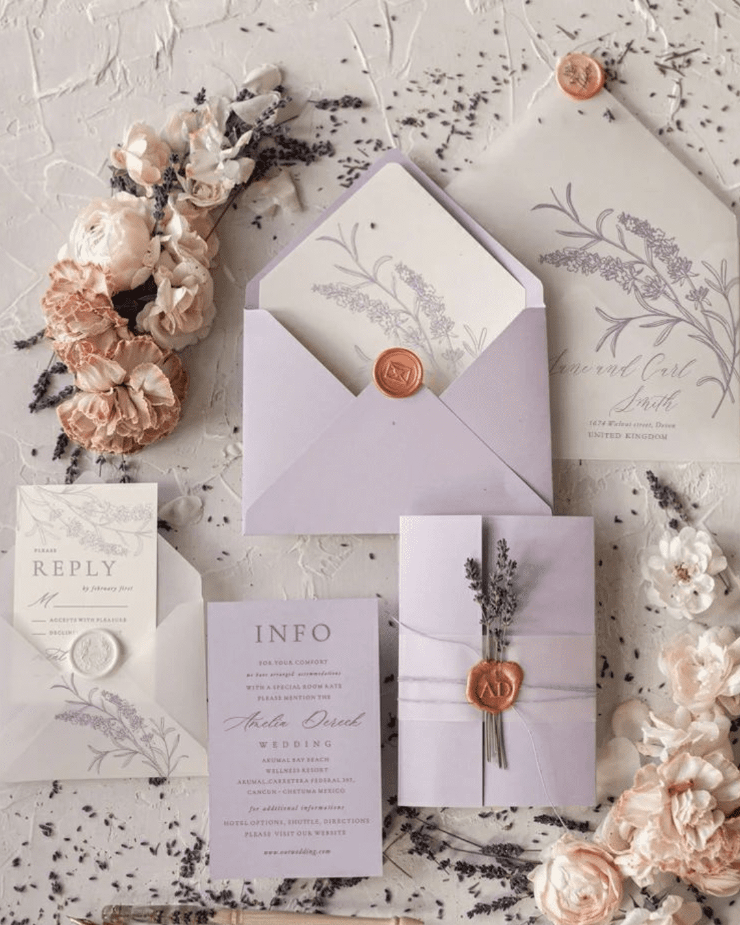
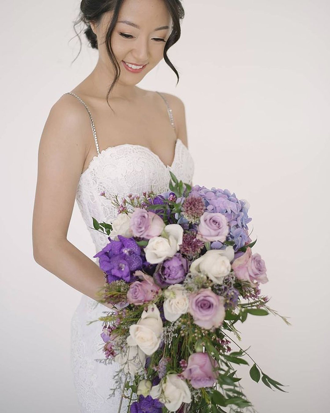
Opting for Very Peri as the anchor of your wedding color scheme would be an undeniably daring move. Most couples will gravitate toward a more familiar path, punctuating sleek black tuxedos and ivory wedding gowns with pops of this celebrated hue.
For grooms, that means pocket squares, boutonnieres, ties, vests, footwear, and similar accents.
Proceed thoughtfully here. A pale purple laid over a white background can become tricky to decipher.
If you follow this design direction, confirm the lettering sits at a scale large enough for every grandparent in the room to read.
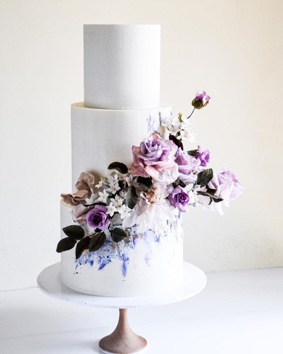
The shade translates into a genuinely mouthwatering icing color. Use it as a bright accent on a classic white cake, scattering dried purple petals for extra decorative texture.
Locating a precise Very Peri match in the natural world presents a challenge.
Still, several near-identical options work wonderfully. Lavender, bellflower, balloon flower, and allium represent just a handful of the choices you have at your fingertips.
Round out those purple notes with a rich variety of greens, creams, and contrasting textures for the most stunning result.
Pantone Colors
The year brought a pair of shades, combining a steadfast Ultimate Gray with a bright, hopeful Illuminating yellow. Ultimate Gray 17-5104 speaks of solidity, quiet, dependability, endurance, reassurance, and grit.
Spotting brightness on the path forward is where Illuminating 13-0647 steps into the frame. Carried by a vivid yellow, it stands for optimism, forward motion, expectancy, and the living world.
Its sunlit nature forms a harmonious counterpoint to the steady Ultimate Gray.
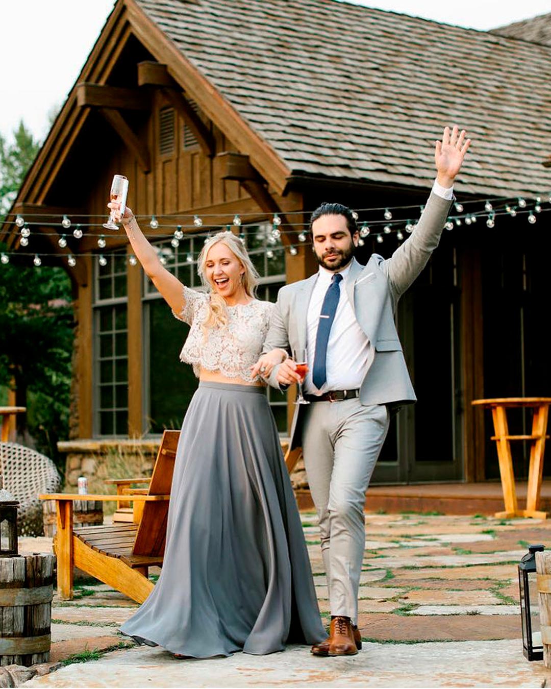
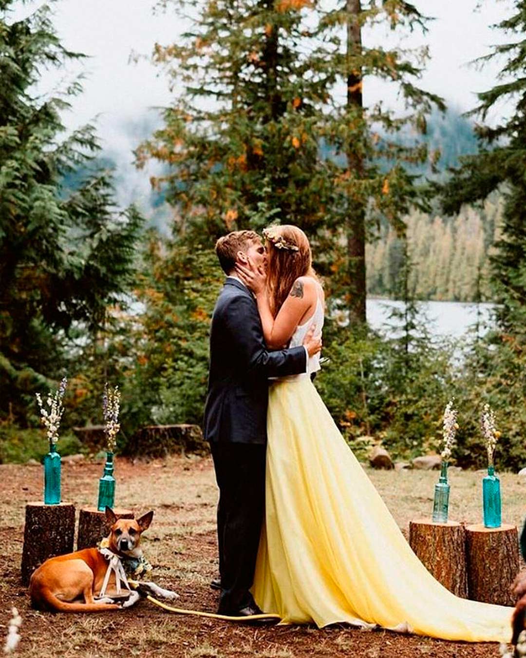
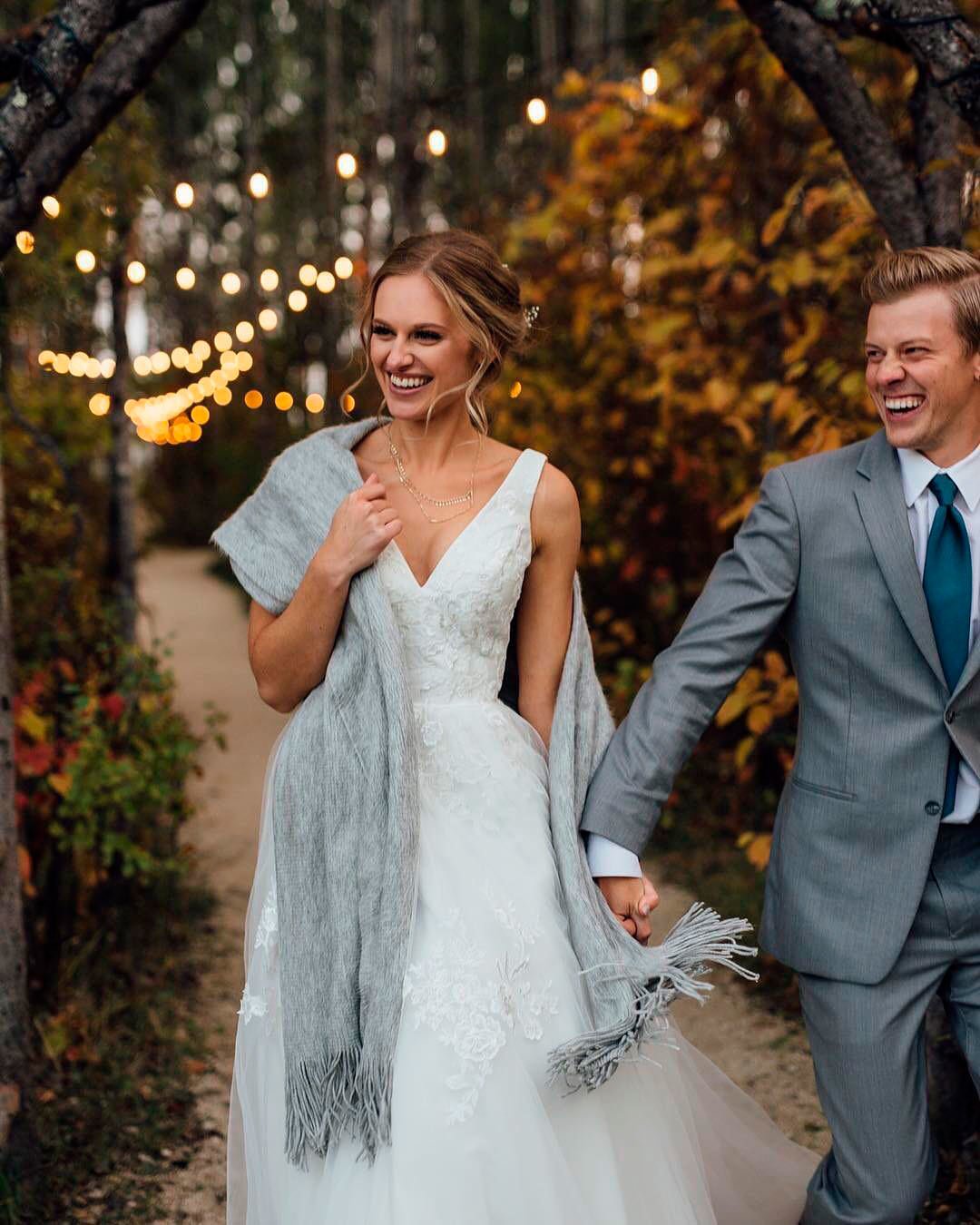
A groom’s ensemble doesn’t need to rigidly mirror the bride’s look or even the rest of the groomsmen. Still, to weave together a unified palette, a shared visual thread needs to run through everything.
Illuminating can arrive in the form of embroidery, a waistband accent, or a floral motif on the attire.
A bride might pair this with touches of Ultimate Gray for her shoes and Illuminating jewelry plus hair embellishments. These finishing details can lean simple and understated or shimmer with bejeweled glamour.
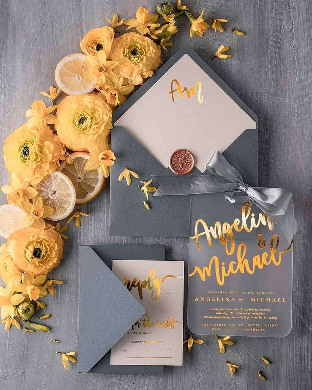
Your paper goods offer a wide open field to play with your wedding palette.
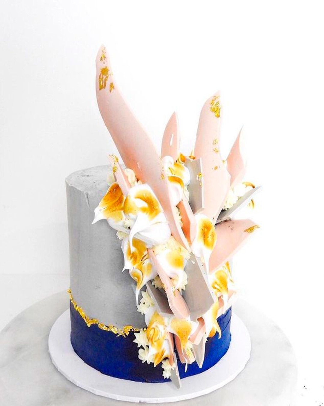
The pairing of Illuminating and Ultimate Gray sits beautifully across different wedding styles. These two selections reinvent what’s possible with wedding cake artistry through their marriage of soothing stillness and bright vitality.
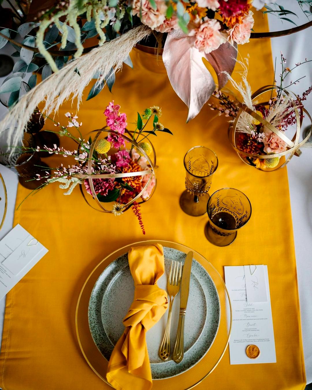
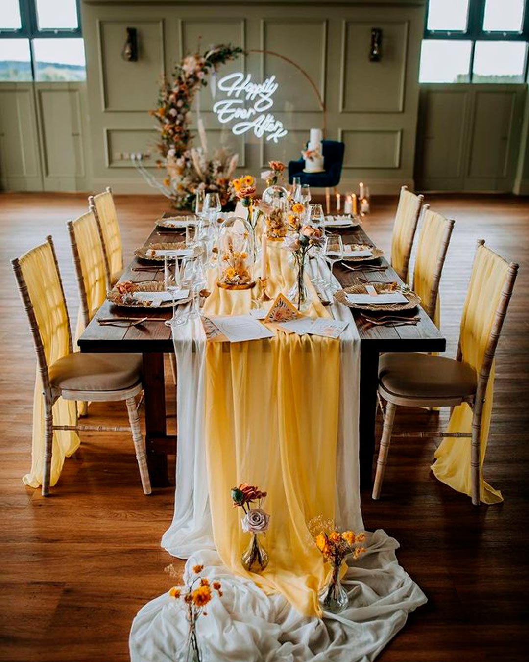
Bring energy to your tabletops by choosing a vivid scheme.
Feature uniquely shaped Illuminating place and menu cards. Rotate between gray and sunny yellow dishes and stemware.
Coordinate napkins and centerpieces with this approach and scatter in some white chargers for a crisp finish.
Pantone Color
The Pantone selection landed on Classic Blue, a shade reminiscent of the evening sky and deeply linked to the promise of a fresh sunrise. It signals reliability, steadfastness, faithfulness, and integrity.
These are qualities that feel profoundly necessary within our current high-pressure reality. The hue is both profound and peaceful, which explains its deep connection to so many individuals.

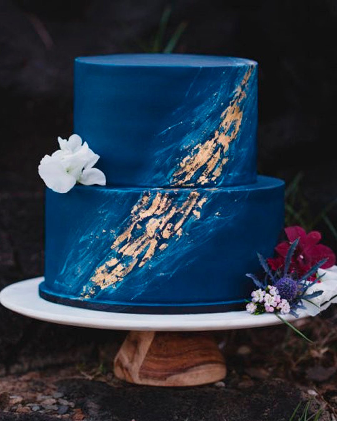
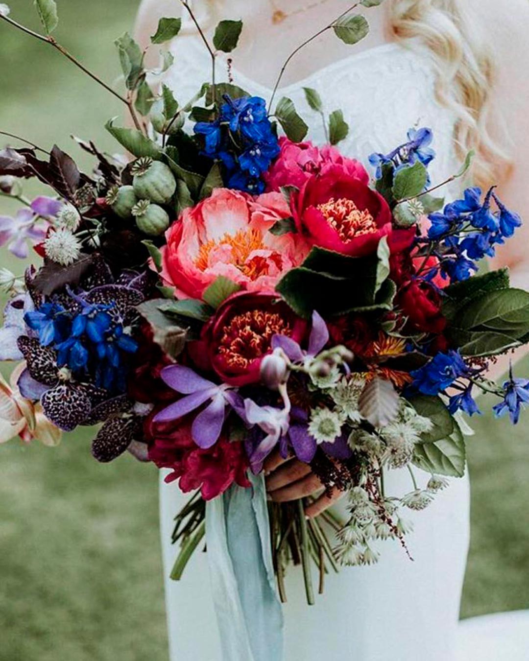
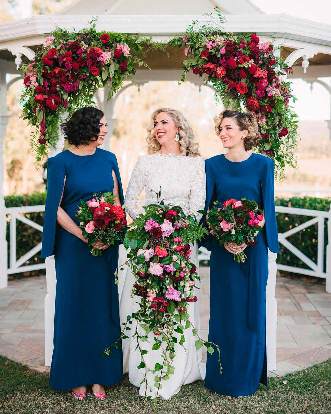
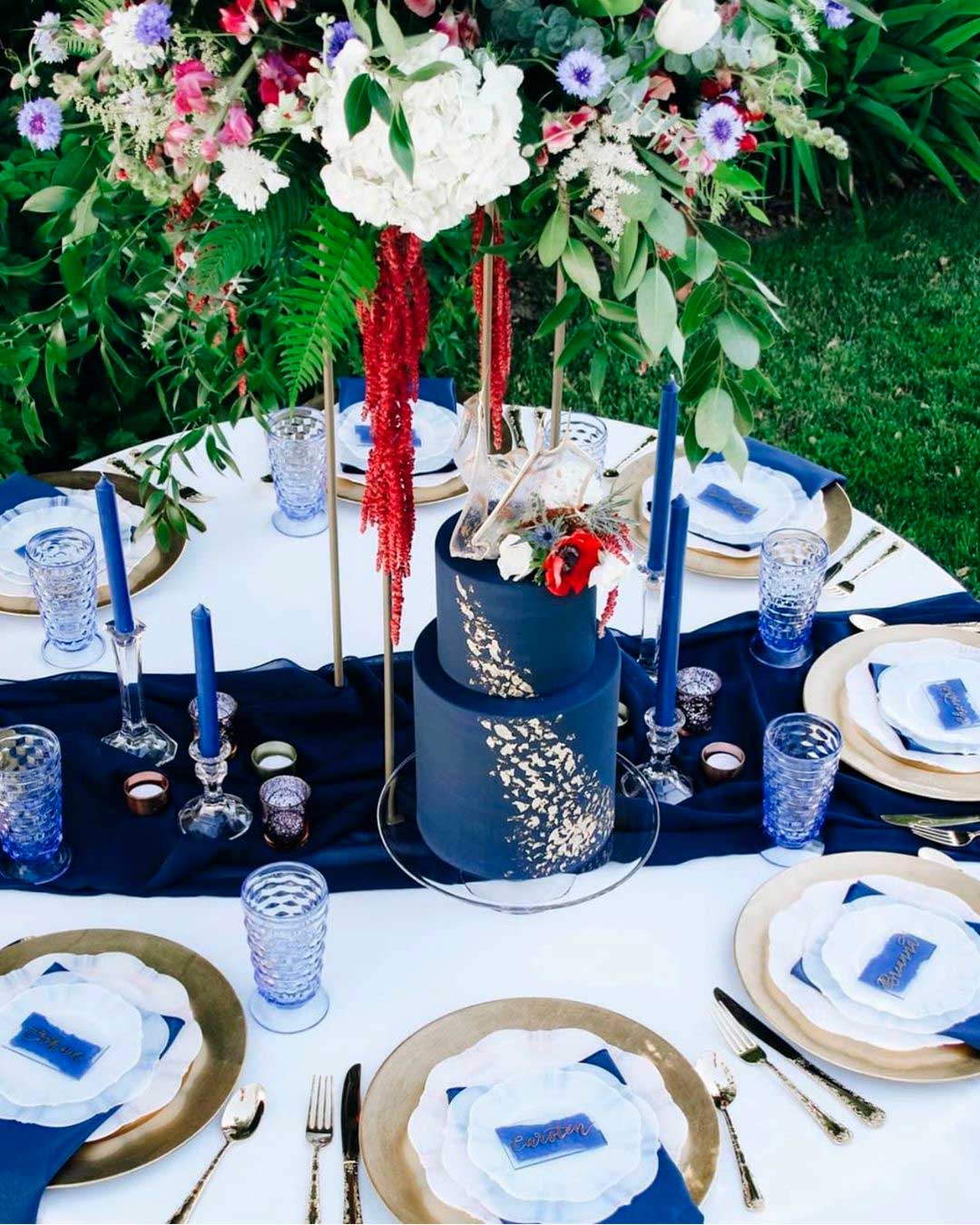
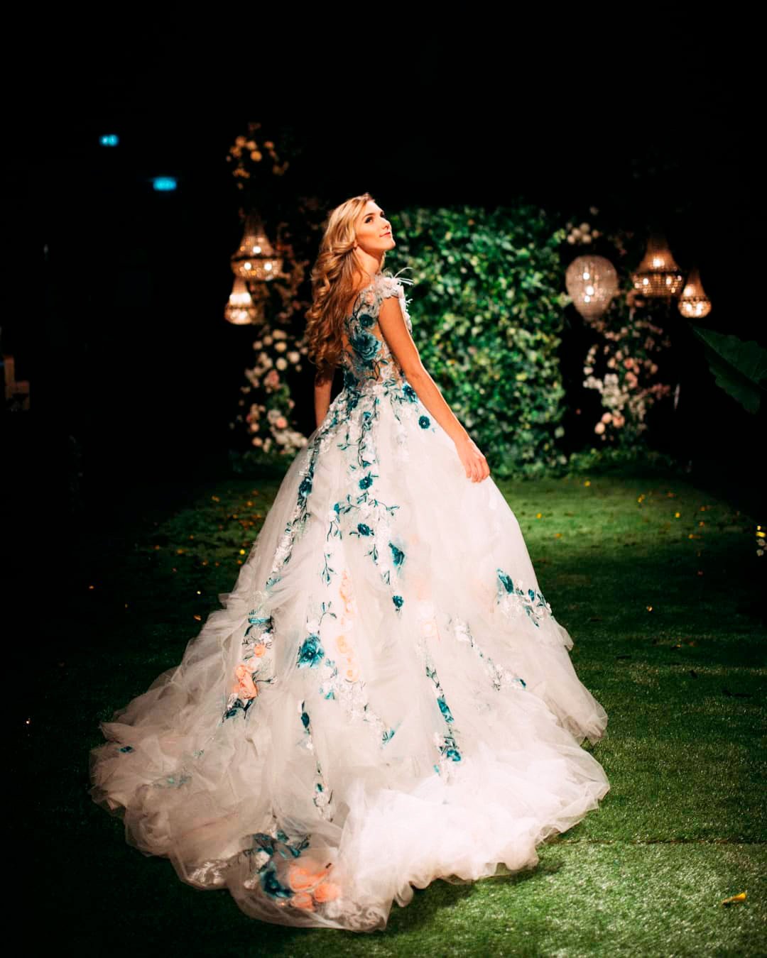
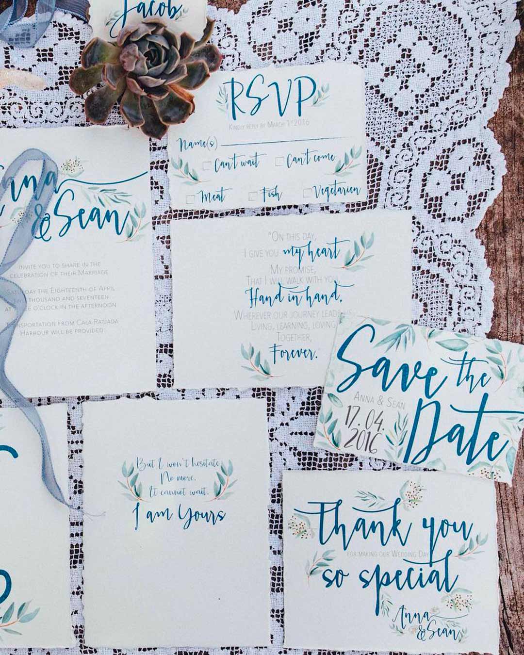
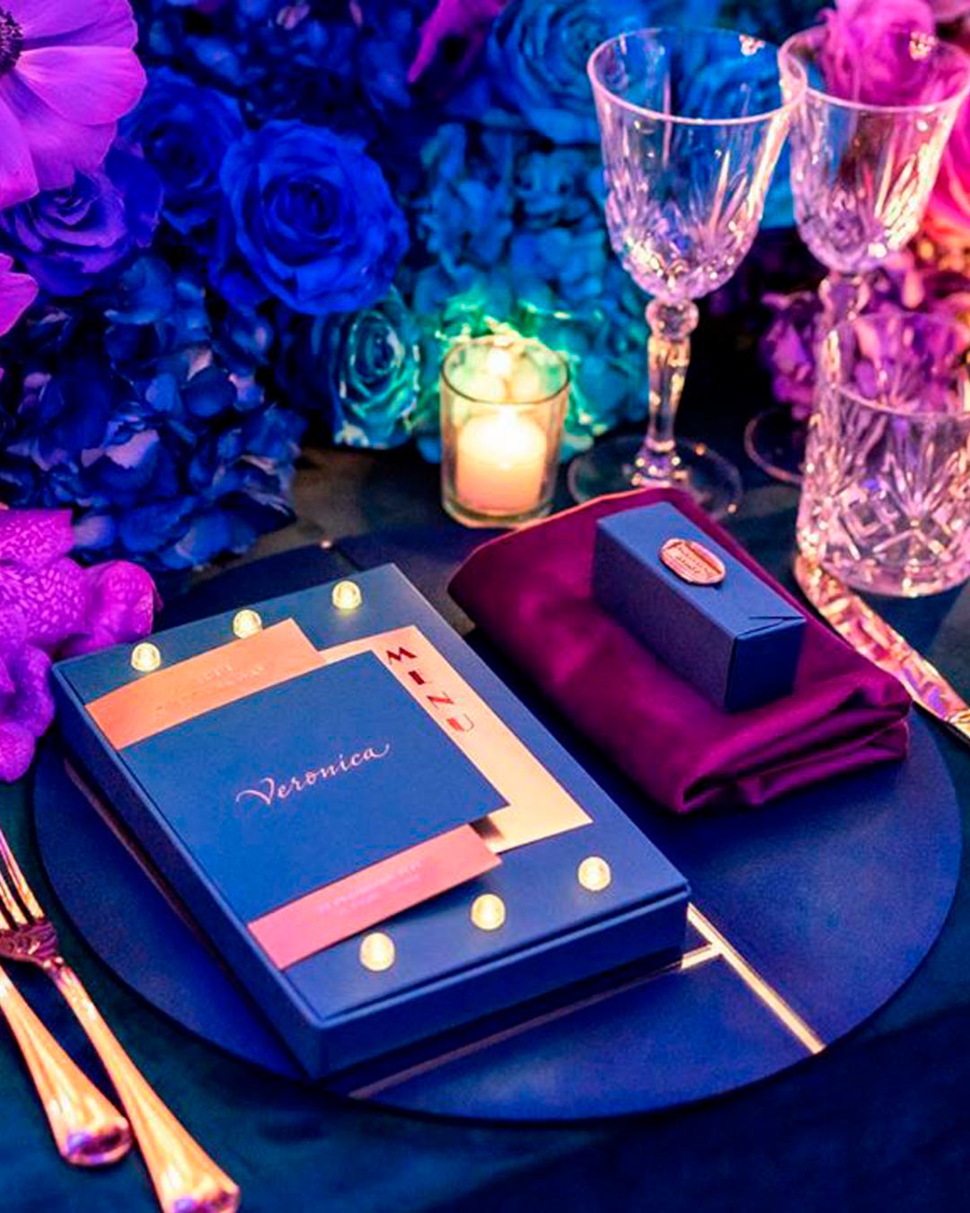
Classic Blue is an incredibly flexible color, strong enough to command attention solo and gracious enough to blend with other shades seamlessly. To use…
Classic Blue behaves as a genuine piece of artistry, so whether applied in delicate touches or full coverage, it delivers magnificently for cakes. Feature it as crystalline geode details, adorned colorful blooms, ombré buttercream accents, or painterly watercolor artwork.
If stepping back from a fully blue bouquet feels right, weave it in as delicate accents.
Options range from Classic Blue streamers to a sprig of thistles tucked into your bouquet or buttonholes. Dress your bridesmaids in Classic Blue gowns or unify them with matching Classic Blue fabric swatches.
As the bride, carry a small Classic Blue element into your day.
That could be a detail on your gown, a ribbon in your bouquet, or a piece woven into your hair. To keep the visual impact elegant rather than overpowering, arrange the reception tables with restrained touches of Classic Blue.
Position it thoughtfully across varying heights, like the charger plates, the goblets, the taper candles, and the candelabra.
Transform your venue from a formal seated meal to a dance floor ready space in a flash. For example, build a backdrop of mixed Classic Blue and neon heart-shaped lights behind the reception area.
Foster a snug atmosphere in your lounge spaces by layering Classic Blue throw pillows over muted tone couches. At the ceremony itself, shape the altar with flowing Classic Blue drapes and asymmetrical cascades of greenery.
The Pantone color of the year did not disappoint! Viva Magenta is a powerful yet gentle color that perfectly captures the sentiment of today and our collective aspirations for the future.
The wedding industry is sure to have a lot of fun with the possibilities this color brings, and we look forward to seeing it absolutely everywhere.